
Tutorial | Geo join recipe#
Get started#
Dataiku has a visual Geo join recipe for joining datasets based on geographic conditions. Let’s see how it works!
Objectives#
In this tutorial, you will:
Use the visual Geo join recipe to combine datasets based on geographic properties.
Confirm the results on a geometry map.
Prerequisites#
Dataiku 12.0 or later.
Reverse geocoding / Admin maps plugin (included by default on Dataiku Cloud).
Basic knowledge of Dataiku (Core Designer level or equivalent).
Create the project#
From the Dataiku Design homepage, click + New Project.
Select Learning projects.
Search for and select Geo join Recipe.
If needed, change the folder into which the project will be installed, and click Create.
From the project homepage, click Go to Flow (or type
g+f).
Note
You can also download the starter project from this website and import it as a ZIP file.
You’ll next want to build the Flow.
Click Flow Actions at the bottom right of the Flow.
Click Build all.
Keep the default settings and click Build.
Use case summary#
The project has three data sources:
tx |
Each row is a unique credit card transaction that has been either been authorized (a score of 1 in the authorized_flag column) or flagged for potential fraud (a score of 0). |
cardholders |
Each row is the latitude and longitude coordinates of a unique credit card holder. |
merchants |
Each row is the latitude and longitude coordinates of a unique merchant, all of which are gas stations. |
The Flow joins a small random sample of these three datasets together so that every record in tx_joined is a unique transaction, enriched with data about the location of credit card holders and merchants for that transaction.
Joining vs. geo joining datasets#
The standard Join recipe combines datasets based on exact name matches. For example, the Join recipe in this Flow returns a match when the value in the merchant_id column in the tx dataset exactly matches the value of the merchant_id column in the merchants dataset.
By contrast, the Geo join recipe makes it possible to join datasets based on geographic information. Using this recipe, you can, for example, match all points within (or outside) a particular distance of another point (or another type of geometry). This kind of join opens the door for much more interesting geographic analysis!
Sample data#
Depending on factors such as the size of the dataset, the complexity of the geometries, and the engine in use, computations with geographic data can be time-consuming. Accordingly, let’s work with small datasets to make life easier for this tutorial.
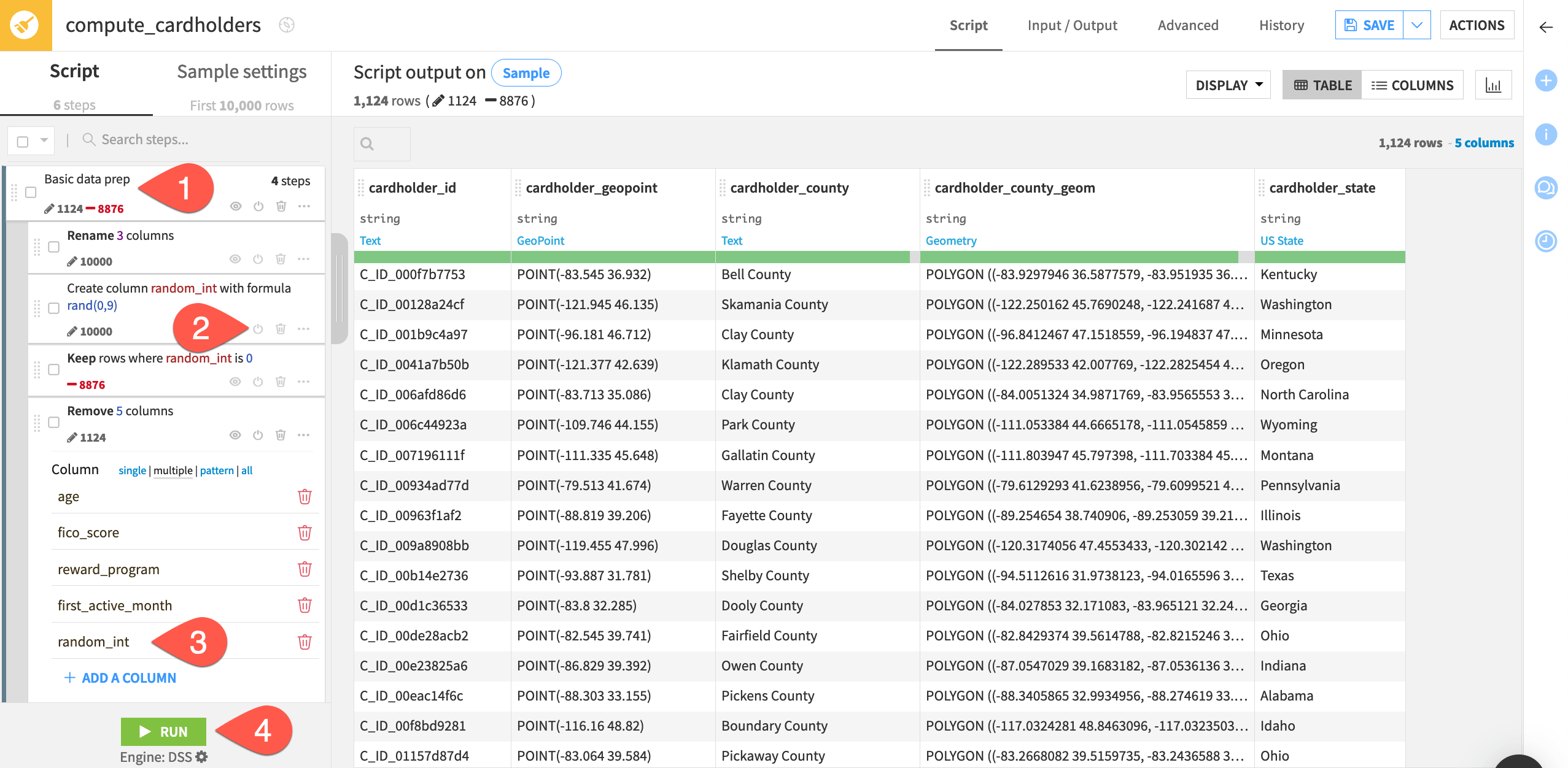
The Prepare recipes that create the cardholders and merchants datasets already have sampling steps, but they’re deactivated. Let’s enable them before beginning.
Open the Prepare recipe that creates the cardholders dataset, and expand the Basic data prep group.
Click the power (
 ) button to enable the two deactivated steps that create a random integer and filter for this value.
Add random_int to the following Remove column step.
Click Run to build a small sample of the original dataset. Use the Run Only This option.
Open the Prepare recipe that creates the merchants dataset, and repeat these same steps.
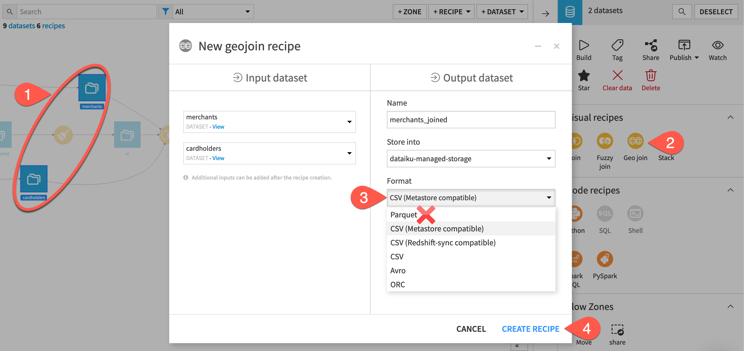
Create a Geo join recipe#
With two small inputs datasets, let’s join them. The dialog for starting a Geo join recipe is just like that of other visual recipes.
From the Flow, select first the merchants and then the cardholders dataset.
Open the Actions tab on the right, and select the Geo join recipe.
You may have a different default storage location and format depending on your instance settings. If using an S3 storage, choose a format other than parquet, such as CSV (Metastore compatible).
Click Create Recipe.
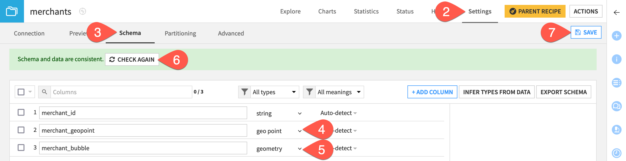
Change schema to geographic storage types#
On the Join step of the recipe, you’ll find that there are no available join columns! To geo join datasets, we need the GeoPoint or geometry columns to be stored with their geographic types. It’s not enough to have string columns that Dataiku has autodetected to be GeoPoints or geometries.
In the Geo join recipe, click Save and Save Anyway.
Open the merchants dataset, and navigate to the Settings tab.
Navigate to the Schema subtab.
Select the storage type dropdown for merchant_geopoint, and choose geo point.
Select the storage type dropdown for merchant_bubble, and choose geometry.
Click Check Now.
Click Save.
Go to the cardholders dataset, and repeat the same steps to store cardholder_geopoint as a geo point and cardholder_county_geom as a geometry.
Set the condition of a Geo join recipe#
The mechanics of the Geo join recipe are similar to the Join recipe.
Both recipes include steps for Pre-filters, Join, Selected columns, and Post-filter.
On the Join step, both recipes can perform left, inner, and other types of joins.
The difference is in the type of join conditions available.
Now that you have the right data types, let’s use the Geo join recipe to find, for every merchant, every card holder within 10 kilometers. Also, let’s keep the default left join to retain all merchants in the output, including those that don’t have any card holders within this distance.
Return to the Join step of the Geo join recipe.
Click (and click again) on the default join condition to edit it.
Set the join condition to match when a merchant_geopoint is within distance of
10 Kilometersfrom a cardholder_geopoint.Click OK to accept the new condition.
Click Run to build the output.
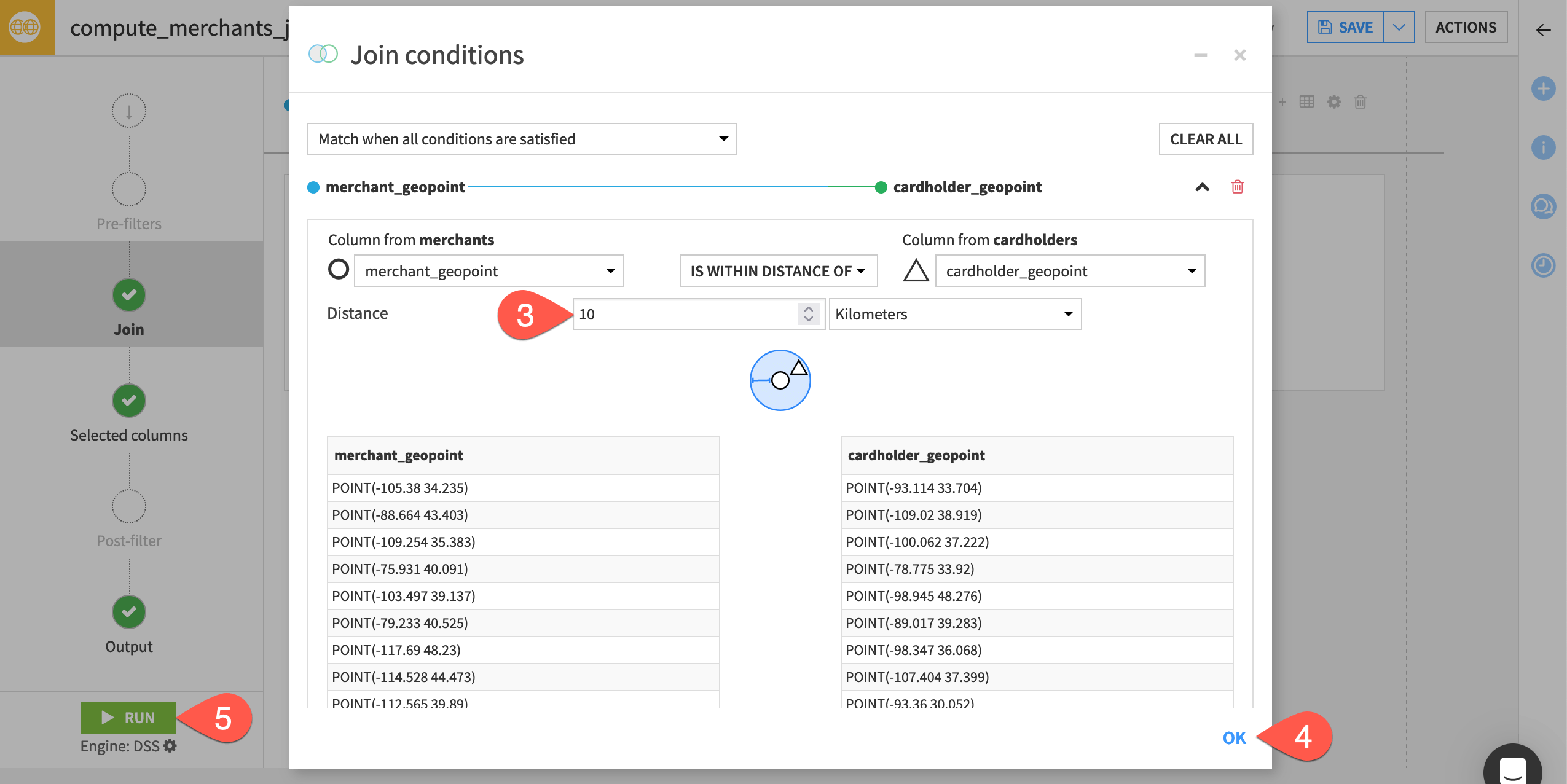
Important
The position of the left and right datasets is important. However, to make this flexible, every condition has its opposite operation (for example, “Contains” and “Is contained within”).
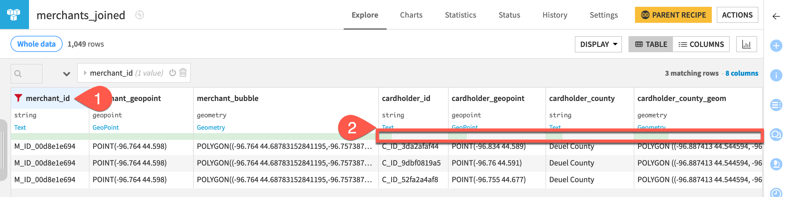
Examine the Geo join recipe output#
Take a close look at the output, and confirm a few details for yourself.
Filter for one specific merchant_id to see that some merchants have multiple rows because they have more than one card holder within 10 km of their location.
Filter for empty values of any cardholder_ column to see that some merchants have blank values for the cardholder columns. Given this is the output of a left join, it’s reasonable to expect that some merchants have no card holders within 10 km!
Tip
Because of the random sampling step at the beginning, you won’t have the exact same results as shown here.
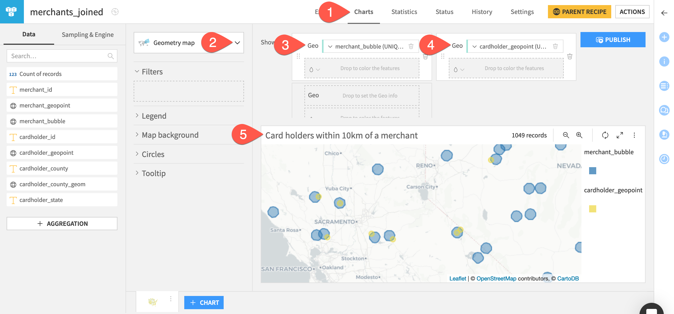
Visualize results with a map#
It’s always a good idea to confirm results with a visualization. Luckily, there is already a merchant_bubble column that’s a circle with a 10 kilometer radius drawn around every merchant.
Navigate to the Charts tab of the merchants_joined dataset.
From the chart picker, select the Geometry map.
Drag merchant_bubble to the Geo field. Open the dropdown, and select Make unique for the aggregate setting since some merchants appear more than once.
Drag cardholder_geopoint to the second Geo field. Again, select Make unique since it’s also possible card holders appear multiple times. Open the color droplet (
 ), and change the point markers to yellow.
Rename the chart
Card holders within 10km of a merchant.Zoom in to explore the map. Confirm that indeed every cardholder point is within 10 kilometers of a merchant.
Tip
For more resources on visualizing geographic data, see Tutorial | No-code maps.
Next steps#
Congratulations! You’ve joined two datasets based on geographic information, and confirmed the results with a map.
After this geo join, it would be natural to continue preparing the data with other visual recipes. For example, you may use a Group recipe to count the number of card holders within a 10 kilometer radius of each merchant.
You can also explore other geographic relationships. For example, how would you use the Geo join recipe to find all merchants contained within a card holder’s respective county?
See also
For more information on this recipe, see the Geo join recipe article in the reference documentation.
For some use cases, the “as the crow flies” distance used here isn’t sufficient. Instead, you can compute isochrones and actual travel routes. Try that in Tutorial | Compute isochrones and routes with the Geo Router plugin!
Tip
You can find this content (and more) by registering for the Dataiku Academy course, Geospatial Analytics. When ready, challenge yourself to earn a certification!