
Tutorial | Causal prediction#
Get started#
Although interactive what-if analysis can provide fast answers about a model’s prediction given a new set of input values for exploration purposes, it doesn’t provide any guardrails nor a way to evaluate the causal assumptions.
However, causal prediction (also known as uplift modeling) helps you quantify cause and effect relationships by modeling the differences between outcomes with and without controllable actions-—-or treatments-—-applied, so you can make better decisions and improve business results. In other words, it helps you determine the causal effect of an action or treatment on some outcome of interest.
This AutoML feature makes it simple to set up the prediction experiment, develop an optional treatment propensity model, and evaluate causal performance metrics, all in Dataiku’s familiar visual ML framework.
Objectives#
In this tutorial, you will:
Create and configure a causal prediction model with one or multiple treatments.
Train it.
Evaluate it.
Score new data with it.
Prerequisites & limitations#
To complete this tutorial, you’ll need:
Dataiku 12.0 or later.
A Full Designer user profile.
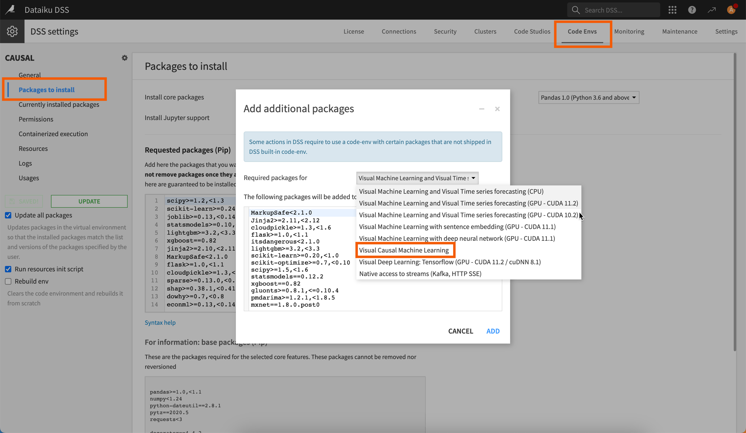
A compatible code environment to train and run causal models. This environment must be created beforehand by an administrator and include the Visual Causal Machine Learning package.
Warning
Causal prediction is incompatible with the following:
MLflow models, custom models & custom metrics
Models ensembling
Model export, Model Document Generator
SQL, Spark or Java (optimized) scoring
Model Evaluation Stores
Use case summary#
Let’s say our marketing team wants to tackle a customer churn problem.
We want to offer a renewal discount to only the customers most likely to respond positively to a promotional campaign since it’s costly-—-and counterproductive-—-to distribute the offer to everyone.
How can we effectively prioritize which customers to treat with this promotion? Dataiku has a dedicated AutoML task for causal predictions, so we can measure the likely difference in outcome with and without the marketing treatment.
Create the project#
From the Dataiku Design homepage, click + New Project.
Select Learning projects.
Search for and select Causal Prediction.
If needed, change the folder into which the project will be installed, and click Create.
From the project homepage, click Go to Flow (or type
g+f).
Note
You can also download the starter project from this website and import it as a ZIP file.
Once you have this project, you can decide whether you want to use one or multiple treatments.
Single treatment#
From the Flow:
Double-click on the Causal prediction - single treatment Flow zone to focus on this part of the project.
Open the clients_training dataset and look at the values in the discount_treatment column, which we’ll use later on to indicate if the clients received a discount or not.
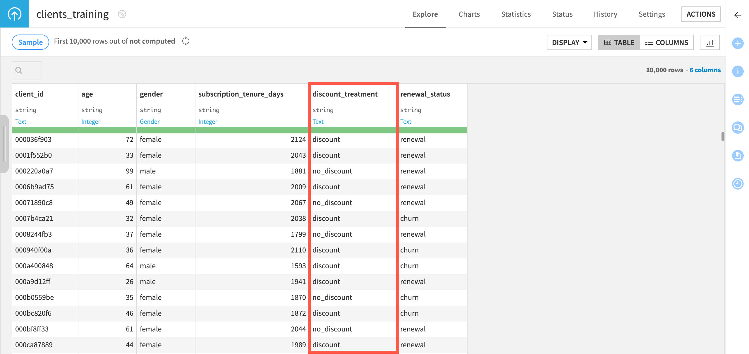
As you can see above, since this Flow is used to build a causal prediction model with a single treatment:
There’s only one value to indicate that a client received a discount: discount.
The other value, no_discount, is our control value.
Multiple treatments#
From the Flow:
Double-click on the Causal prediction - multiple treatment Flow zone to focus on this part of the project.
Open the clients_training_multi_treatment dataset and look at the values in the discount_granted_% column, which we’ll use later on to indicate if the clients received a discount or not, and the amount of said discount.
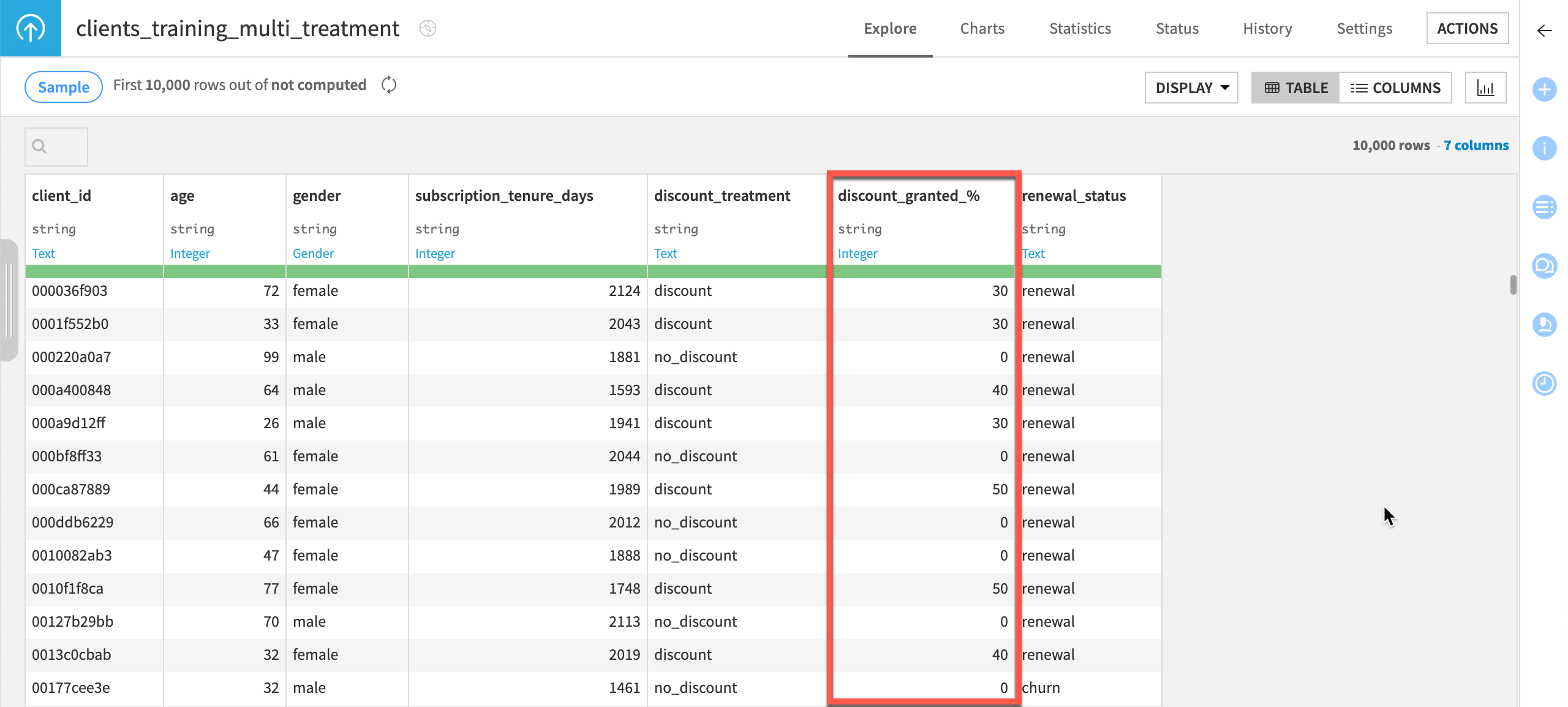
As you can see above, since this Flow is used to build a causal prediction model with multiple treatments:
The column includes several amounts for the discount received by clients who received the treatment: 30%, 40% or 50%.
For clients who weren’t treated, 0 is our control value.
Create the causal prediction#
Let’s create the causal prediction model.
Single treatment#
To create a causal prediction model with only one treatment, follow the steps below:
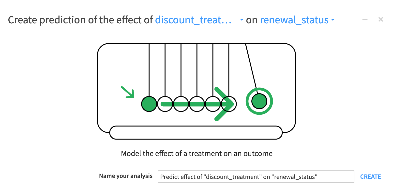
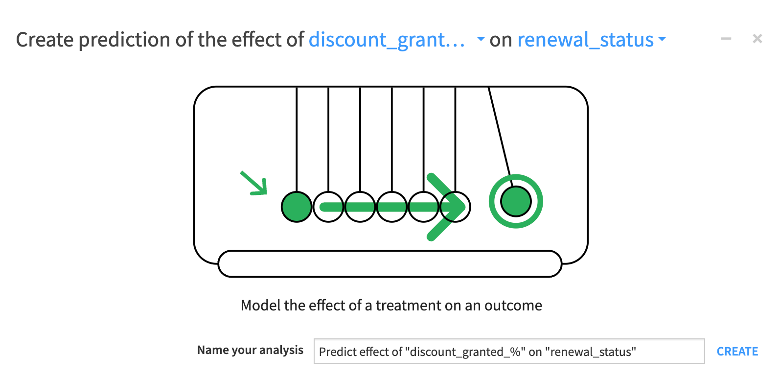
From the Causal prediction Flow zone, select the clients_training dataset, and in the Actions panel on the right, click Lab > Causal Prediction.
In the new window, select discount_treatment as the treatment and renewal_status as the outcome.
Click Create.
Multiple treatments#
To create a causal prediction model with multiple treatments, follow the steps below:
From the Causal prediction Flow zone, select the clients_training_multi_treatment dataset, and in the Actions panel on the right, click Lab > Causal Prediction.
In the new window, select discount_granted_% as the treatment and renewal_status as the outcome.
Click Create.
Configure the causal prediction model#
In the Design tab, let’s now configure the causal prediction model.
Set the outcome & treatment#
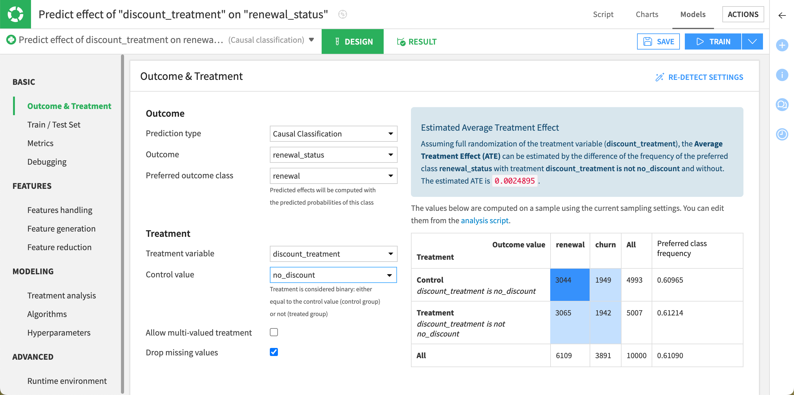
First, let’s configure the basic settings required for causal prediction. By default, you should already be into the Outcome & Treatment panel of the Basic section.
Important
Selecting the appropriate outcome and treatment parameters is crucial for accurately calculating the predicted treatment effect, which is defined as the probability of renewal with discount minus the probability of renewal without discount.
If you misconfigure one of these parameters, you will end up with the opposite effect!
Single treatment#
For this model using a single treatment, the Outcome option is already set to renewal_status and the Treatment variable to discount_treatment as we set them upon creating the causal prediction.
Configure the remaining options as follows:
In the Outcome section, set the Preferred outcome class to renewal, which means that the customer renewed their subscription.
In the Treatment section, set the Control value to no_discount which means that no offer is sent to the control population.
Click Save.
Multiple treatments#
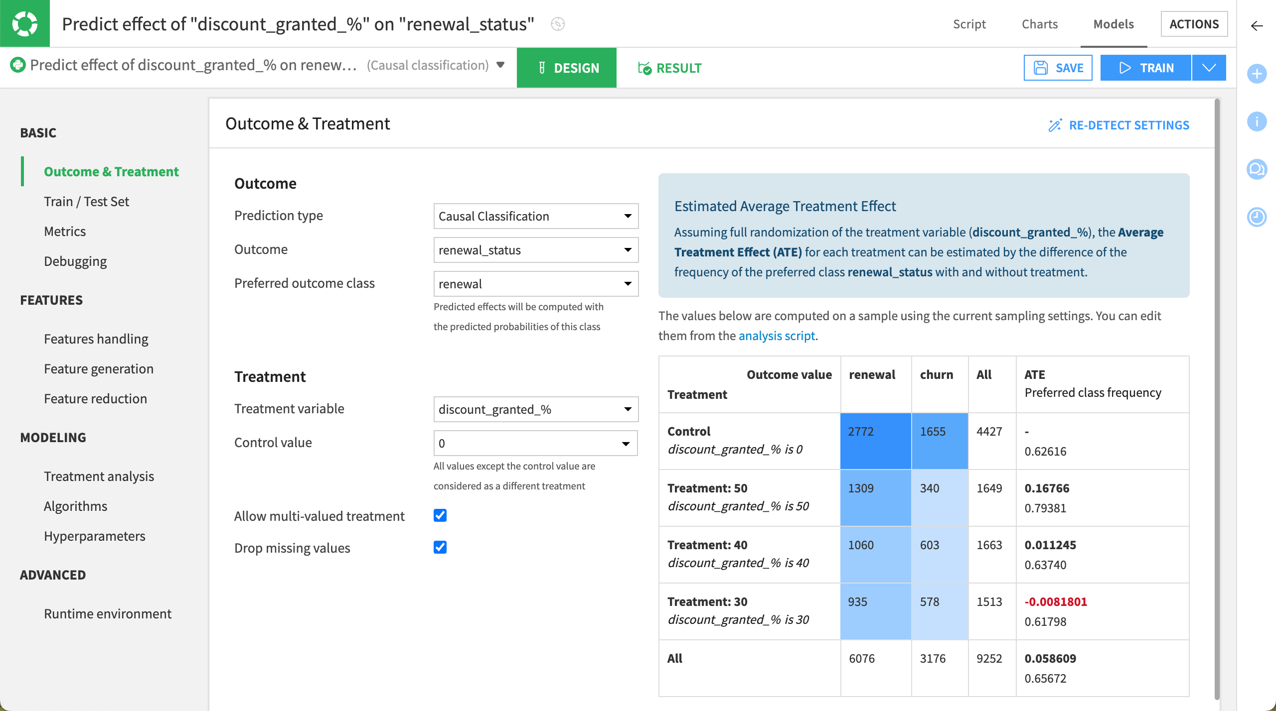
For this model using multiple treatments:
The Outcome option is already set to renewal_status and the Treatment variable to discount_granted_% as we set them upon creating the causal prediction.
The Allow multi-valued treatment option is checked.
Configure the remaining options as follows:
In the Outcome section, set the Preferred outcome class to renewal, which means that the customer renewed their subscription.
In the Treatment section, ensure that the Control value is set to 0 which means that no offer is sent to the control population.
Click Save.
Configure the other model settings#
Important
From now on, whatever the project you’re using in this tutorial (single or multiple treatments), the configuration remains the same.
For the sake of clarity, we’re focusing on the project with a single treatment.
Set the train/test set#
This section allows you to define the split policy upon training the data. By default, when you train the model:
80% of the data is used for training.
20% of the data is used for testing.
For this tutorial, we’ll keep this default setting. However, we’ll use the whole dataset and not just a sample. To do so:
Under the Basic section, select the Train/Test Set panel.
In the Sampling & Splitting section, set the Sampling method to No sampling (whole data).
Click Save.
Configure the treatment analysis#
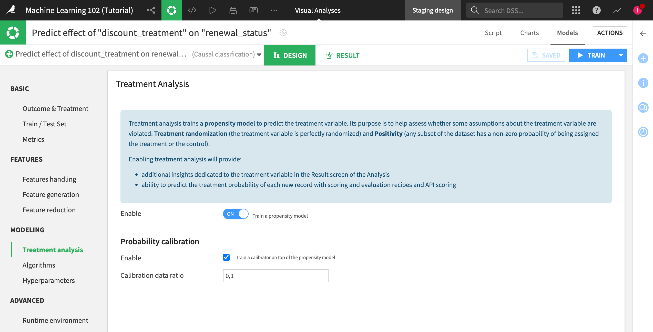
Though the design settings for causal prediction are similar to that of other prediction tasks, there are some notable differences, including the possibility of simultaneously training a treatment propensity model to predict the probability of receiving the treatment.
In our tutorial, we’ll enable a treatment propensity model to predict each customer’s likelihood of being treated with a discount offer.
We’ll also enable probability calibration to predict treatment probabilities that are as well-calibrated as possible. This is required to test the positivity assumption because it helps detect if there are major differences between the treated vs. untreated customers in our training sample, which can lead to an unreliable model.
To do so:
Under the Modeling section, select the Treatment Analysis panel.
Turn the propensity modeling on.
Enable the use of a calibration model.
Click Save.
Select the algorithms#
For algorithms, you have a variety of causal methods to choose from, including:
Meta learners, with a variety of base learners.
Causal forest.
To configure the algorithms:
Under the Modeling section, select the Algorithms panel.
Let’s keep the default settings (T-learner meta learner and Causal forest).
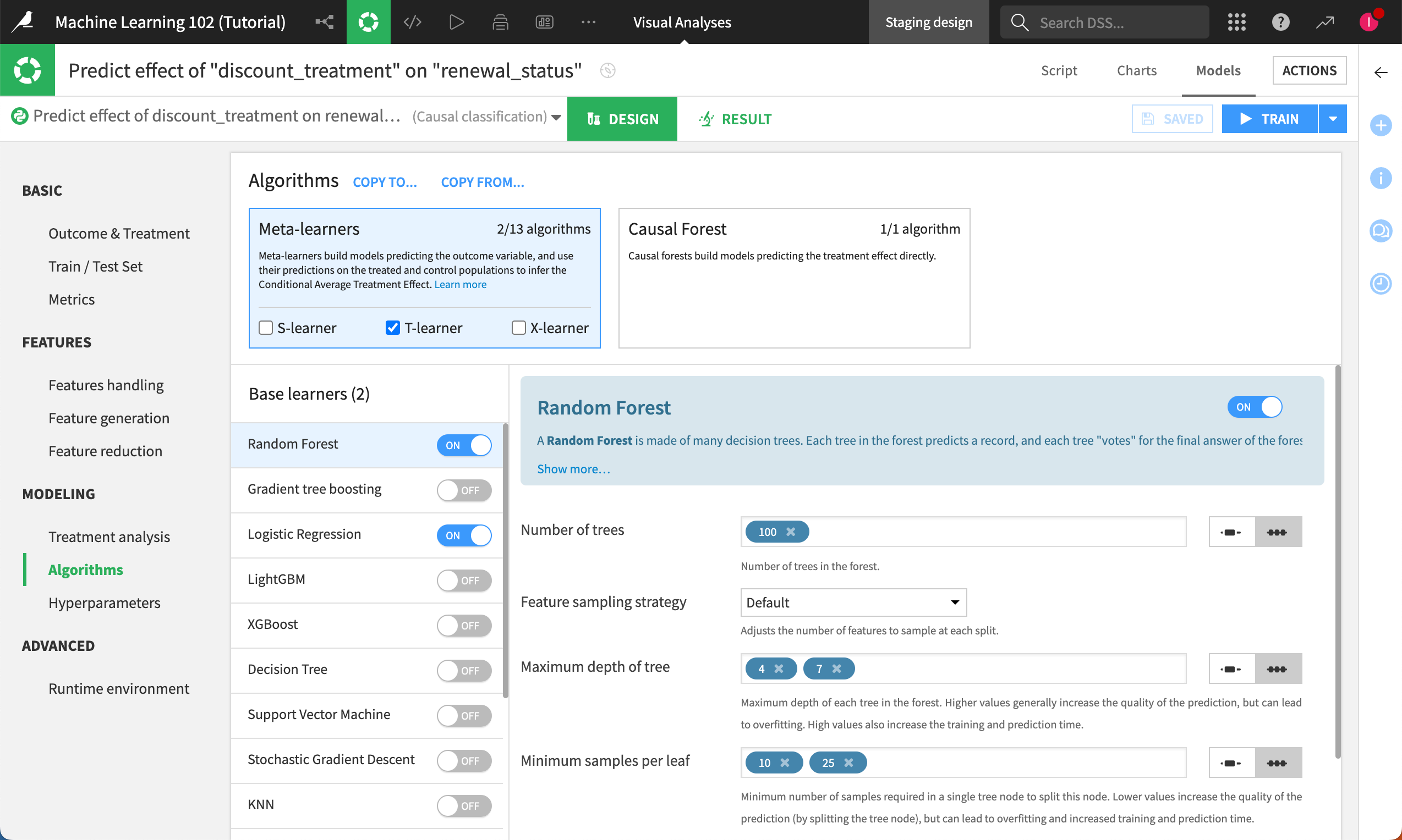
Note
For more information on the different settings, see the Causal Prediction Settings page in the reference documentation.
Set the runtime environment#
In the Runtime environment panel:
Indicate the correct code environment that includes the Visual Causal Machine Learning package.
Click Save to save all your changes.
Train the model#
Once the model is configured, train it. To do so:
Click Train on top of the Design tab.
In the Training models dialog, optionally name and describe the model.
Click Train again.
Evaluate the training#
As always, after we click train, let’s head over to the Results tab to evaluate the models in our experiment.
Remember that unlike other types of predictive models you may have built with Dataiku, these evaluation metrics don’t measure the model’s ability to predict the outcome-—-in our case, renewal. Instead, they measure the model’s ability to predict the treatment effect on the outcome. In other words, how well can this model predict the difference between subscription renewal with and without the promotional offer, all else being equal?
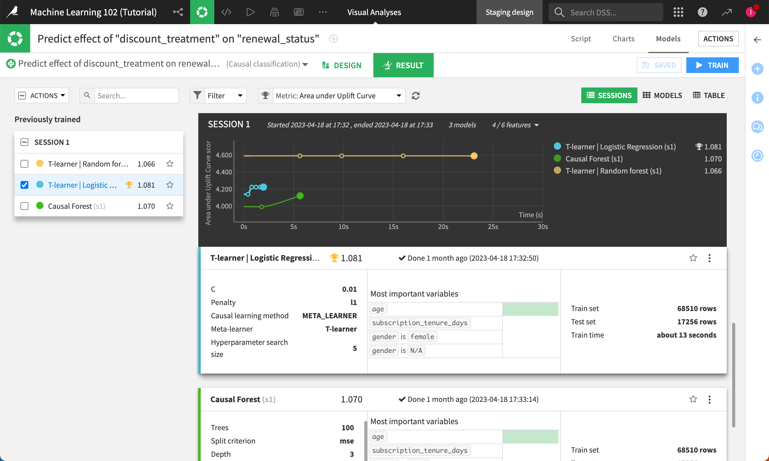
The score next to each model trained can be interpreted as below:
A score lower than 0 indicates performance worse than random.
A score around 0 (close to 0) suggests performance similar to random.
A score higher than 0 indicates performance better than random.
The higher the score, the better the model’s performance. Unlike other metrics like AUC, there is no upper bound for this metric, meaning higher values are preferred.
Since the T-learner | Logistic Regression model is the best-performing model here, let’s click on it to check the results in greater detail.
Note
For causal prediction models with multiple treatments, training results are visible per each treatment value. In the model report, you must select a value to see the results in detail for this value.
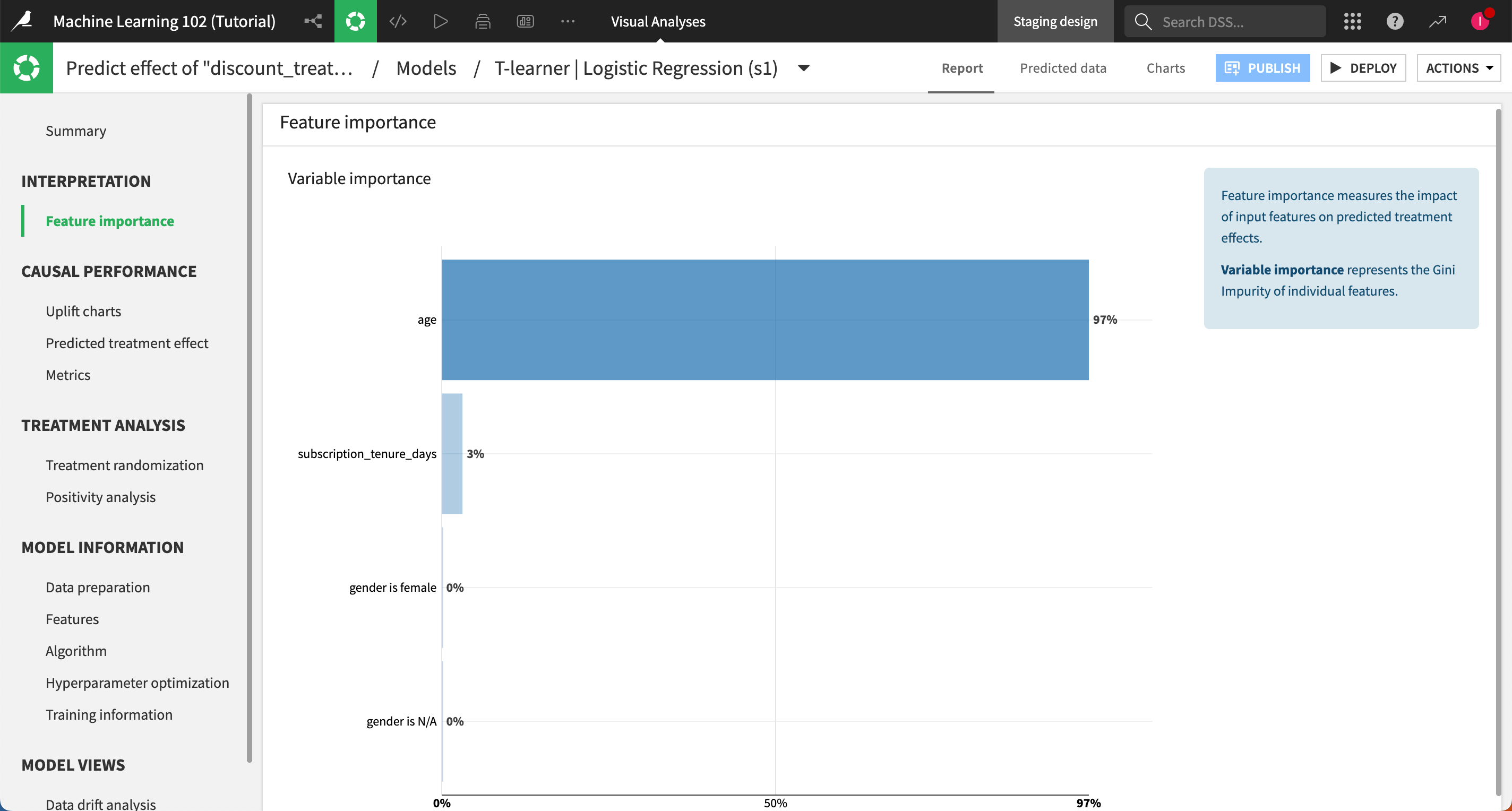
Feature importance panel#
Let’s look at feature importance. The age of a subscriber being the important feature doesn’t mean it has the strongest impact on the likelihood to churn, but rather that it has the strongest impact on how a customer reacts to promotions.
Note
For more information, see the Feature importance section in the reference documentation.
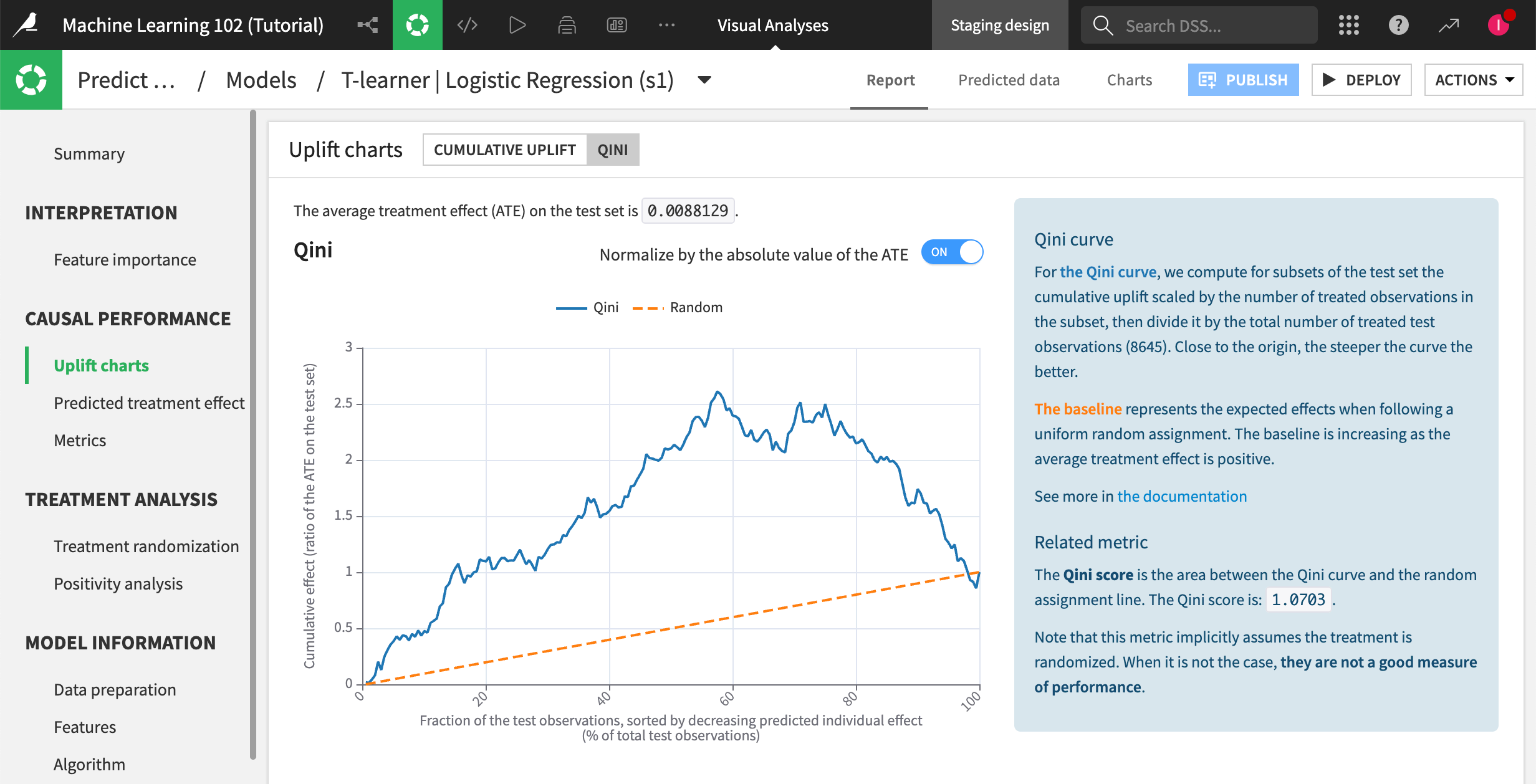
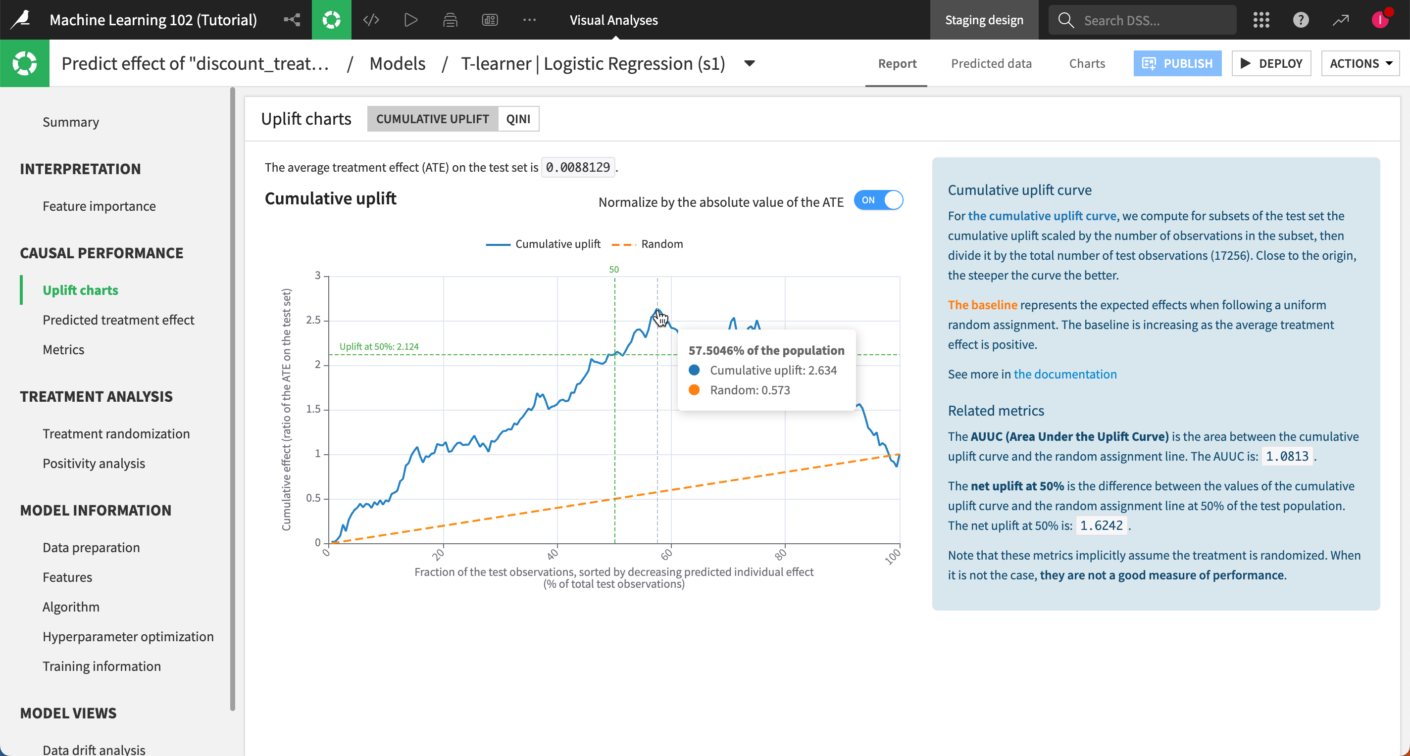
Uplift charts panel#
Uplift charts show us the conditional average treatment effect as compared to a random baseline. An upward curve shows a positive average effect of the treatment (that is, the discount generally encourages people to renew their subscription). A downward curve shows a negative average effect (that is, offering the discount generally deters people from renewing their subscription).
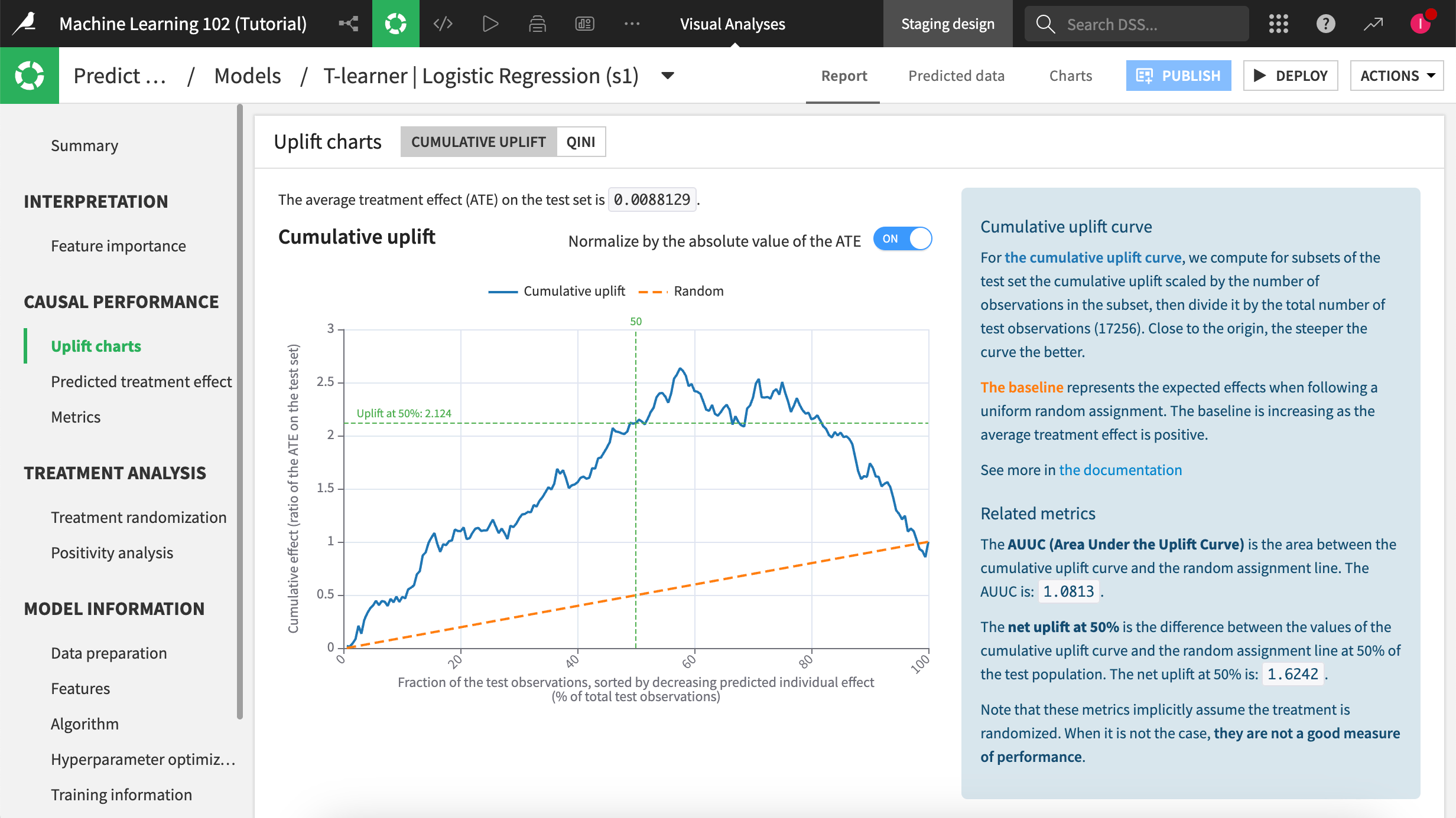
Note
For more information, see the Uplift and Qini curves section in the reference documentation.
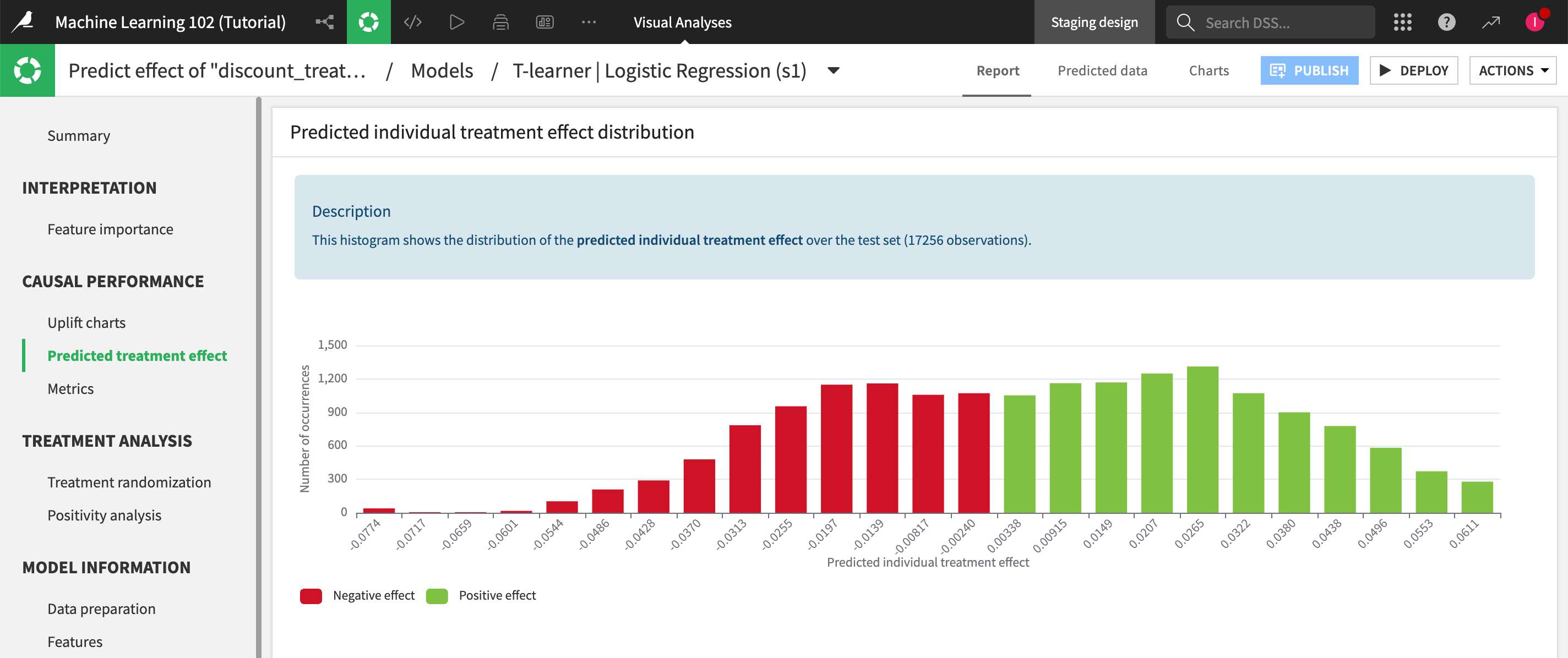
Predicted treatment effect panel#
In the Predicted treatment effect panel, the histogram shows us the distribution of the predicted individual treatment effect. The X-axis shows the predicted effect while the Y-axis shows the count in each predicted-effect segment. We can use this chart to help us determine an appropriate predicted treatment effect cutoff threshold for our marketing action.
Notice that some customers have a negative treatment effect, so sending them the promotion would actually be counterproductive to our renewal goals.
Treatment randomization panel#
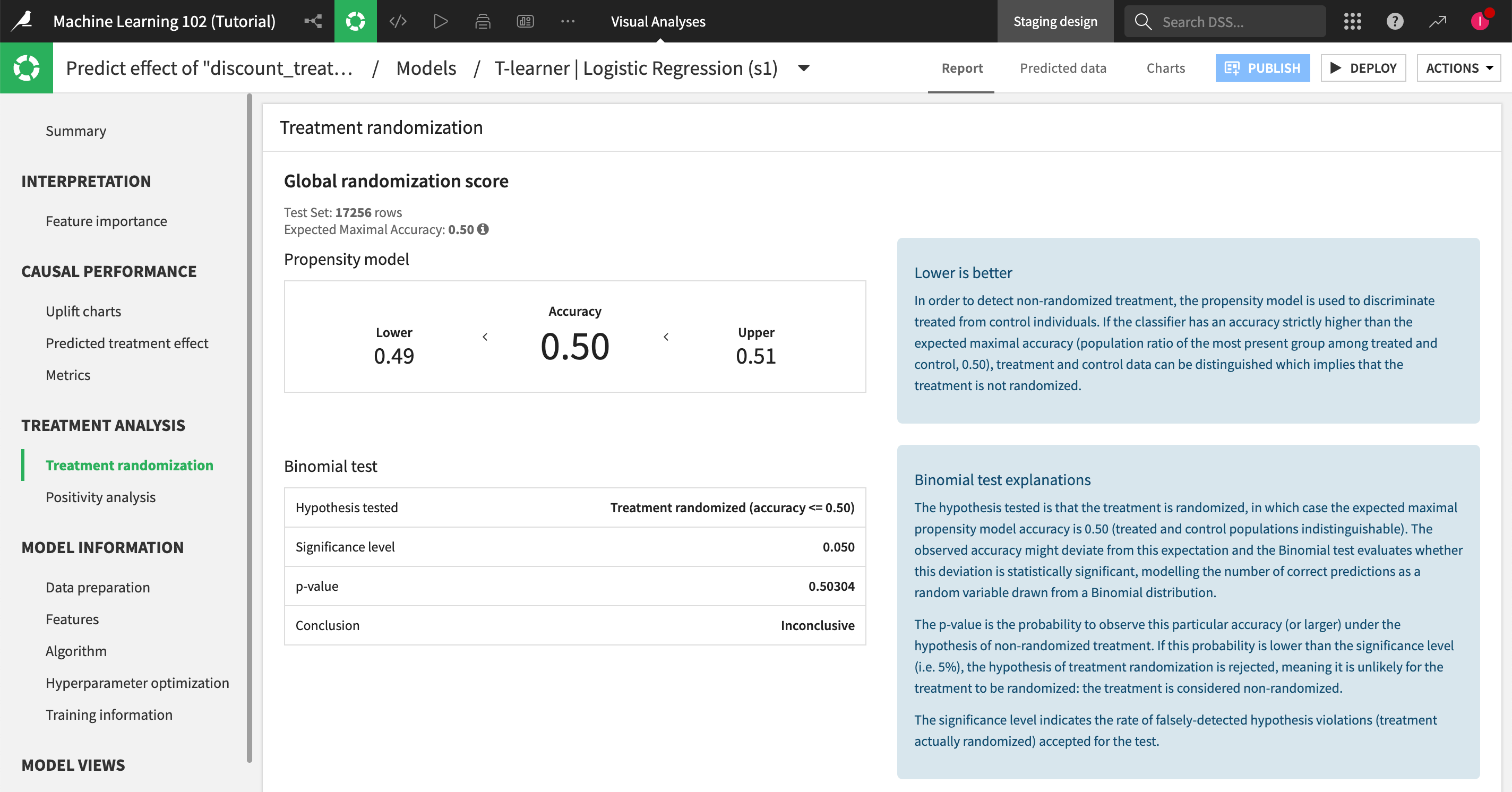
To achieve reliable results, remember to use a training dataset with a randomized treatment allocation to ensure that some customers won’t be systematically excluded from the offer for one reason or another. When you enable treatment analysis to the causal prediction analysis, this panel helps you assess your data for treatment randomization, to see whether you need to make any adjustments to your training dataset.
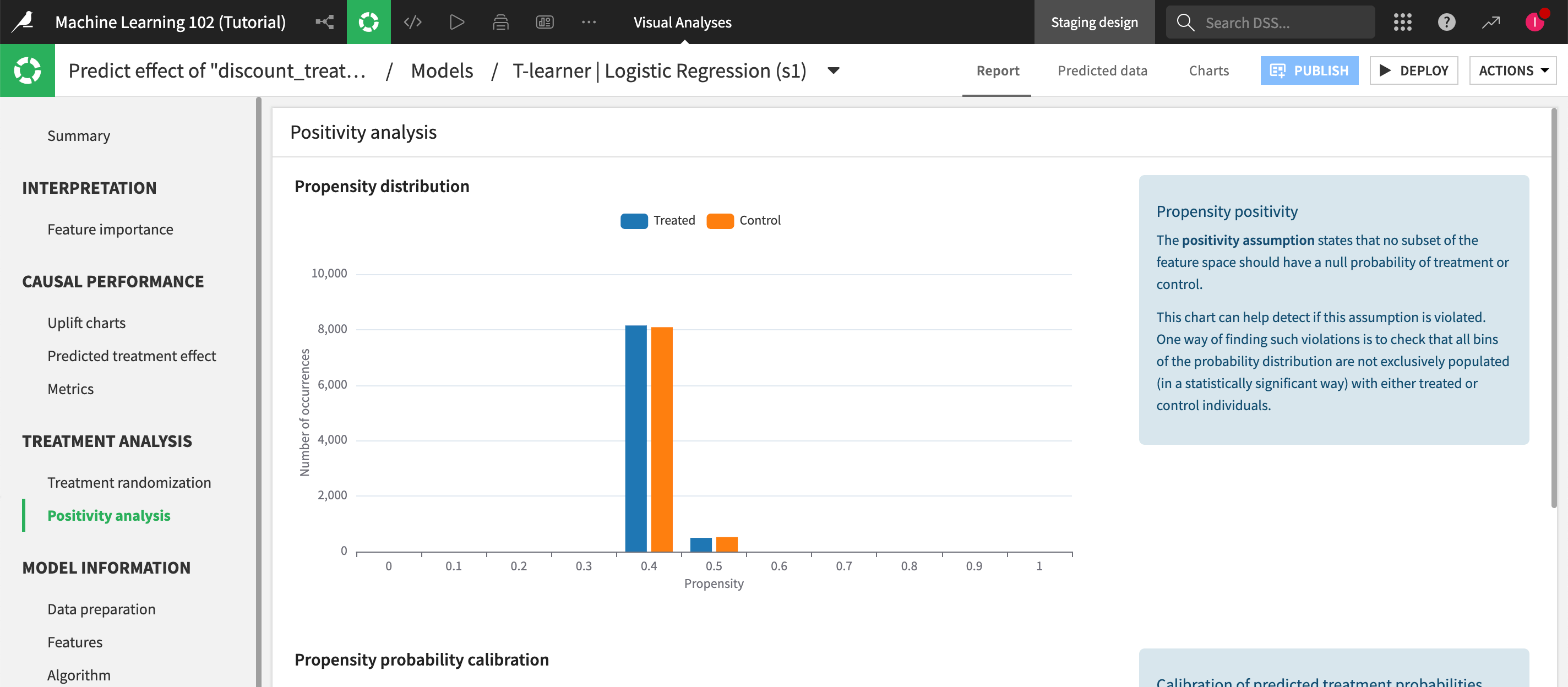
Positivity analysis panel#
Use positivity analysis charts to further examine treatment assumptions and consistency between predicted and observed frequencies.
Deploy the model to the Flow#
When you have sufficiently explored building models, the next step is to deploy one from the Lab to the Flow. Here, we’ll deploy the T-learner using the logistic regression algorithm as it’s the one with the most positive treatment effect.
From the Result tab of the modeling task, click on the T-learner | Logistic Regression (s1) model to open its summary page.
Click the Deploy button in the upper right corner.
Keep the default settings and click Create. You are automatically redirected to the Flow.
Evaluate the model#
In the Causal prediction Flow zone, select Predict effect of discount_treatment on renewal_status, which is your deployed model.
In the right panel, under the Evaluate model on already-known data section, click on the Evaluate recipe. This opens the Evaluate a model’s performance window.
Choose clients_evaluation as your input dataset.
In the Outputs section, set an output dataset named
model_scoredand a metrics dataset namedmodel_metrics.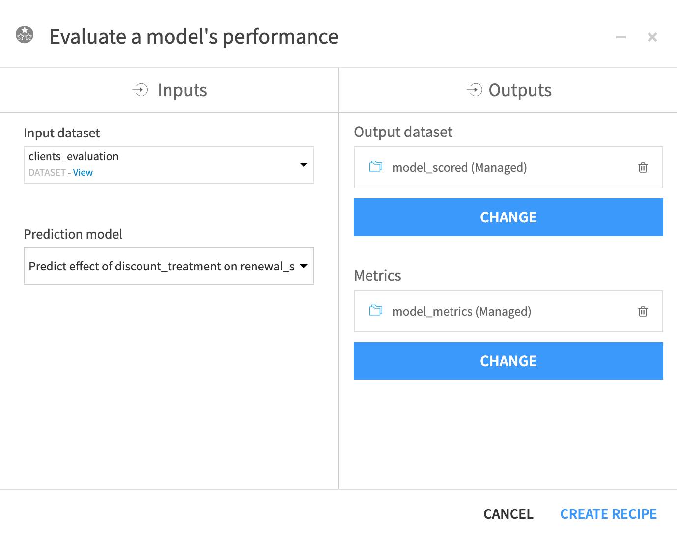
Click Create Recipe.
Keep the default settings and click Run.
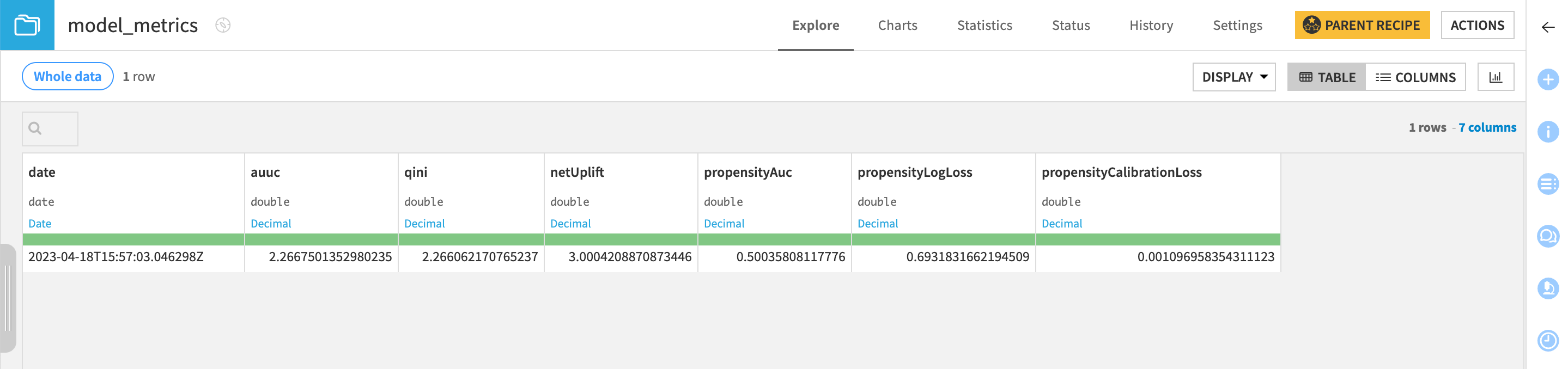
The Evaluate recipe generates two output datasets.
Model_scored in which the recipe has appended the predicted effect and propensity measure (that is, the probability to be treated).
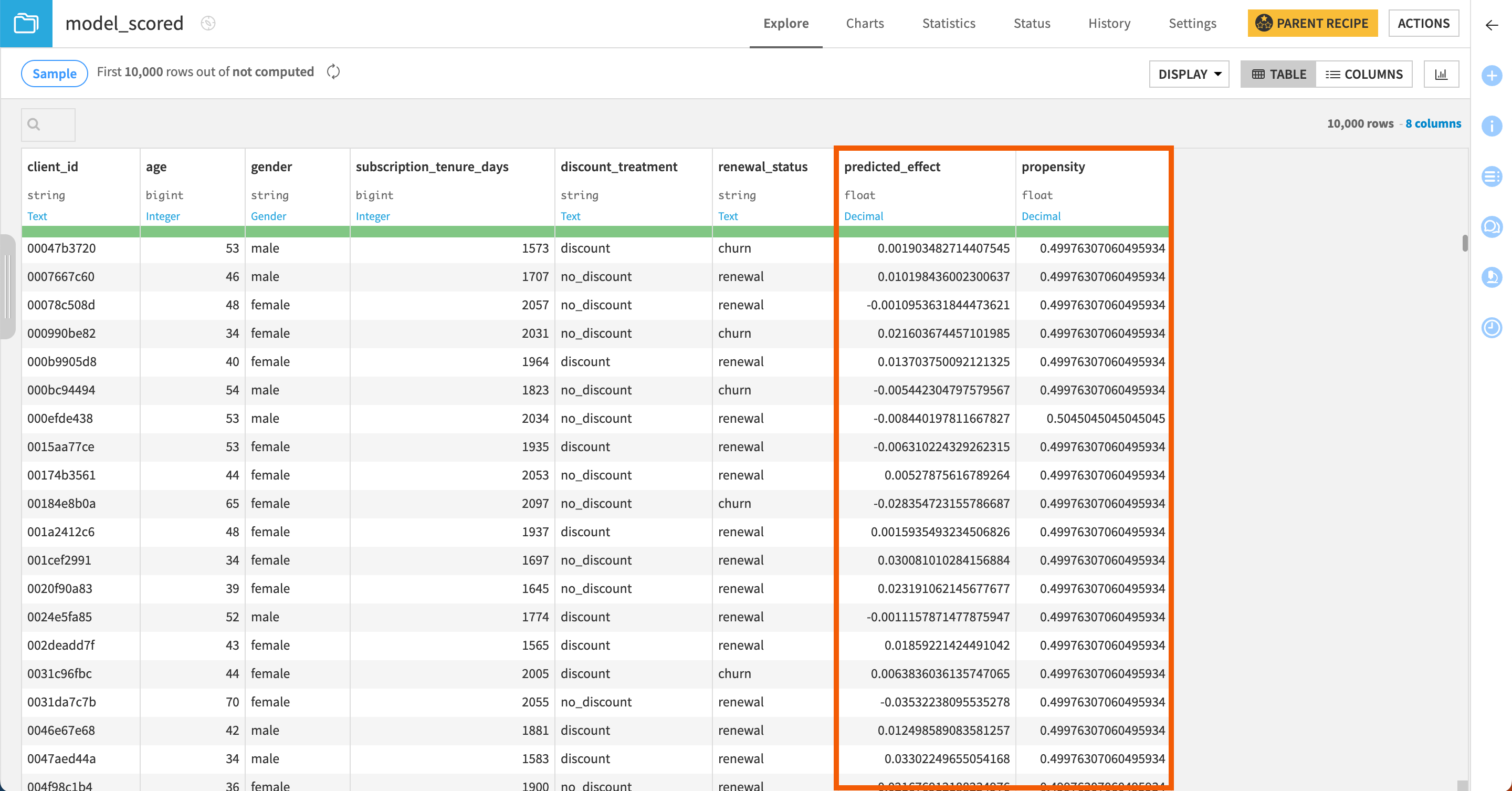
Model_metrics that logs the performance of the active version of the model against the input dataset.
Score new data using the model#
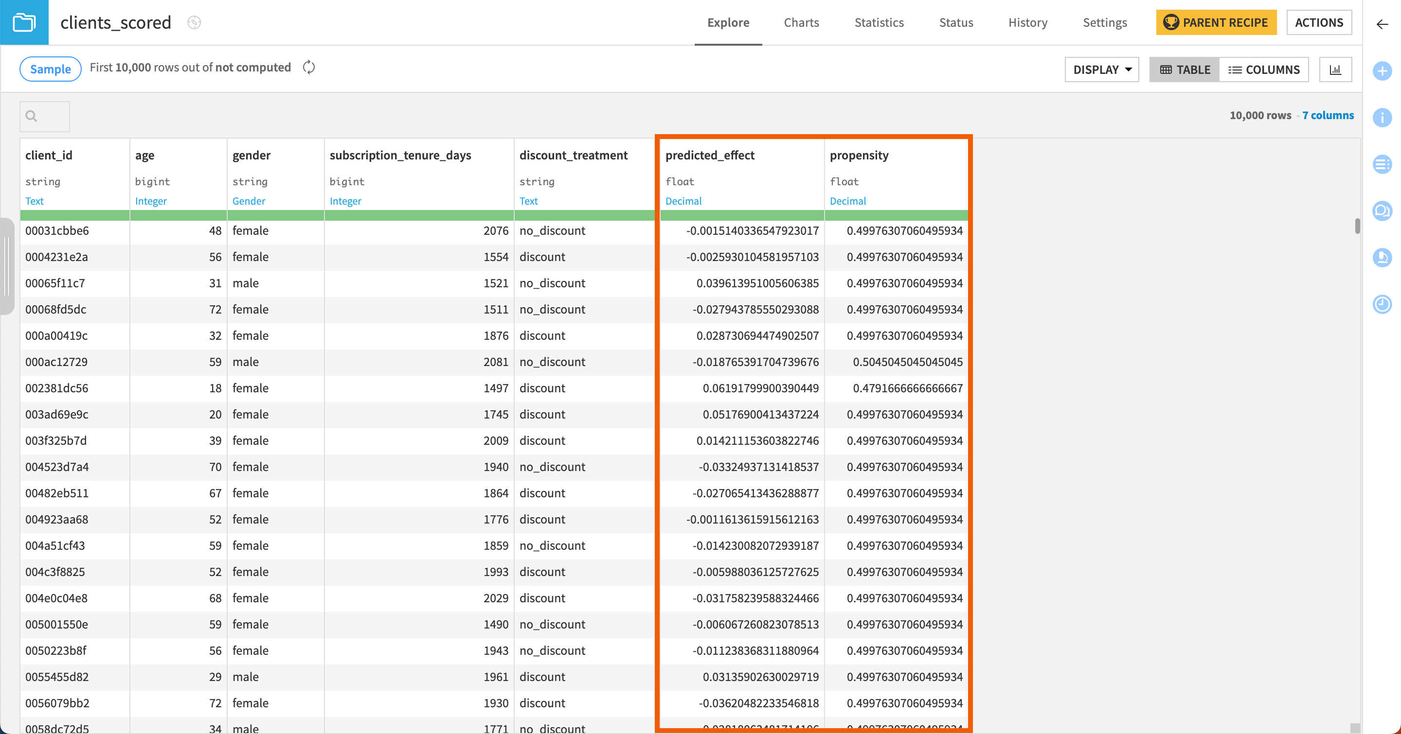
Run a Score recipe#
Let’s now use a Score recipe to apply our model to new and unseen data.
Go back to the Flow and click Predict effect of discount_treatment on renewal_status within the Causal prediction Flow zone.
In the right panel, under the Apply model on data to predict section, click on the Score recipe. This opens the Score a dataset window.
Choose clients_scoring as the input dataset.
Name the output dataset
clients_scored.Click Create Recipe.
Keep the default settings and click Run.
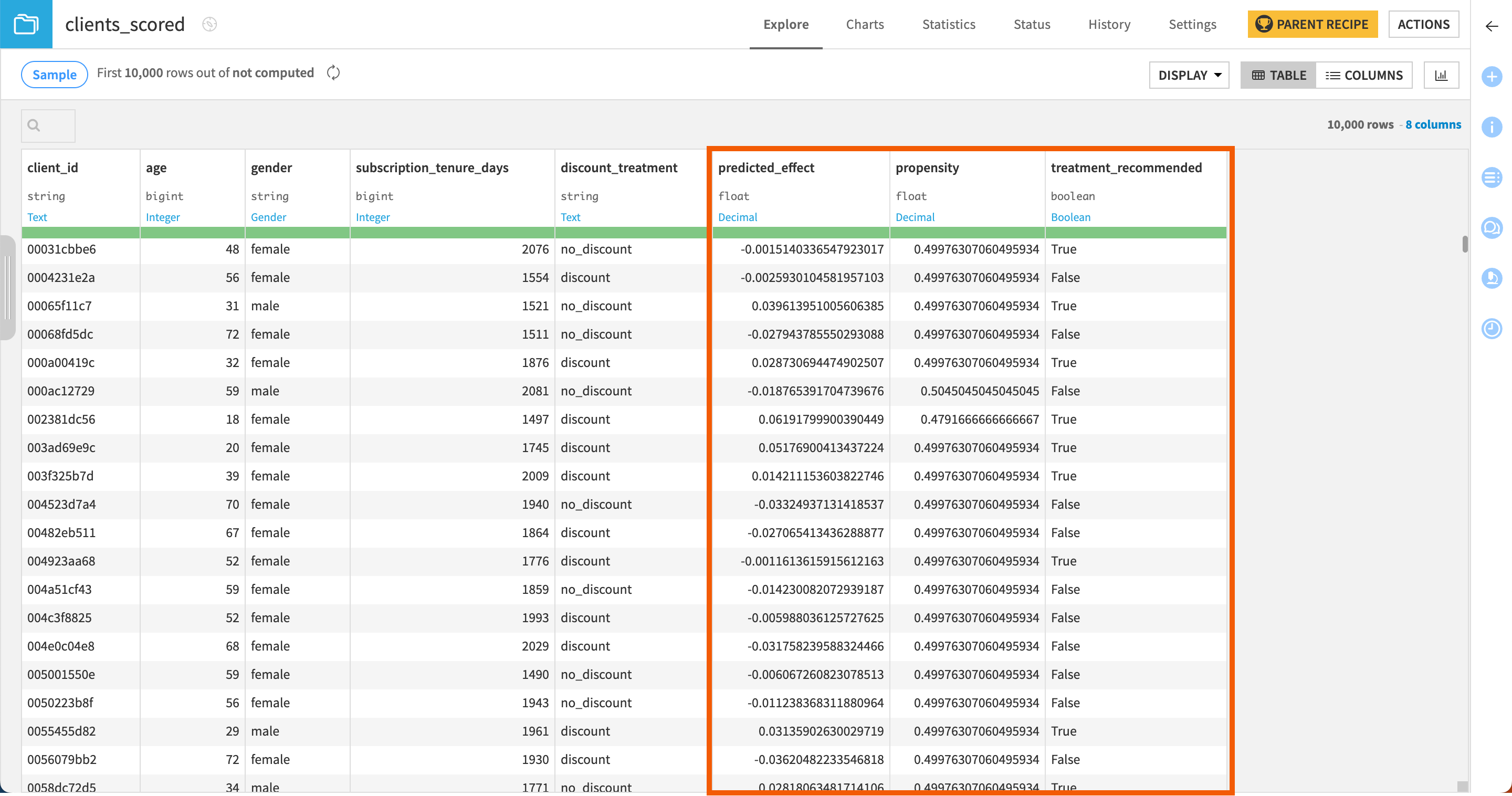
The Score recipe produces a dataset that appends two new columns to the input dataset:
predicted_effect that predicts for each row whether the treatment has a positive, negative, or neutral impact on the customer.
propensity that gives the probability for each customer to be treated.
Specify a treatment ratio when scoring#
If you simply want to target percentage records with the highest predicted effect, you can specify a treatment ratio in the scoring recipe.
If you remember our uplift curve, the curve increased up to 57% of the population, which indicates that the treatment effect is positive on this part of the population. So in our tutorial, we’ll score the dataset targeting this population.
To do so:
In the Flow, click on the Score recipe to open its settings page again.
Enable the treatment recommendation.
In the Assignment method option, select Ratio of the data (approximate).
Set the Treatment ratio to
0,6, namely the 60% of the population that interest us based on the uplift curve above.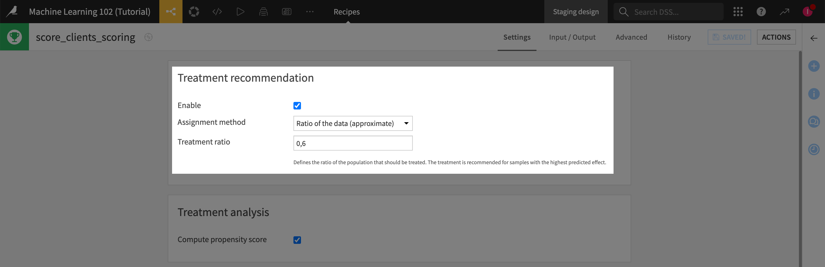
Click Run.
Now, if you look at the clients_scored dataset, in addition to the predicted_effect and propensity columns, you have a third column named treatment_recommended that indicates for each customer whether the model recommends treating him/her with the discount.
Next steps#
Congratulations! You’re all set. You can now try it on your own use cases.