Tutorial | Responsible AI training#
Get started#
Welcome! You’ve made it to the beginning of our series of tutorials on Responsible AI. If you know a little bit (or even a lot) about ML in Dataiku, you might want to implement some Responsible AI strategies into your workflow. Let’s begin!
Note
This tutorial trains you to apply the Responsible AI framework to your entire data pipeline. As such, this tutorial is longer and more conceptual than others. If you prefer a more guided structure, you can follow the tutorials in our Responsible AI Academy course.
Objectives#
The objectives of this training can be grouped into three themes:
Data bias identification
Learn the importance of using datasheets for datasets and create your own.
Investigate the dependence between sensitive attributes and our target variable.
Check for human bias during collection, cleaning, and other data processing.
Test the dataset for potential proxy variables that relate to our sensitive attributes.
Model fairness and interpretability
Use a Model Fairness Report to measure model fairness metrics.
Cover model debugging, assertions, metrics, and features handling.
Determine the most important or useful variables in determining churn predictions.
Model explainability and reporting
Calculate and interpret individual explanations using the Shapley method.
Share those explanations using an API endpoint.
Build a custom metric check to alert you if a metric falls outside an acceptable range.
Export project and model documentation that can also be shared with stakeholders or regulators.
Prerequisites#
To complete the following exercises, you will need:
Dataiku 12.0 or later.
The Model fairness report plugin on your Dataiku instance. This only applies to the Model fairness report section.
An understanding of the concepts presented in the Responsible AI topic page.
Use case#
To ground our understanding of Responsible AI in practice, we will focus on a single use case: churn prediction for a telecommunications company called Dataiku Wireless.
Dataiku Wireless, a major internet and cell phone provider, wants to prevent customers from leaving their service. The company’s marketing team believes that sending promotional pricing offers to at-risk clients will reduce the chance of churn. To do this, the team has asked you to predict which clients will churn in the next three months to send them targeted offers.
On paper, this is a straightforward use case — one that you may not initially think is subject to bias or unfairness. However, let’s take a moment to think about why this example is relevant for RAI considerations, especially when it comes to understanding how data bias might arise in this case.
Biases in churn prediction#
Let’s think about different ways biases might appear in our use case — specifically in the datasets we’ll use to build churn predictions. Here are some ways biases can be reflected in the data used for this task:
Sampling bias can occur because of bad collection processes, like only surveying customers via landline phone calls.
Human interpretation of behaviors can become encoded in data, such as when a store representative assigns an expected value of customer churn to a customer based on their appearance or interactions.
Proxy variables that are inextricable from systemic biases might impact the data. For example, using ZIP codes that reflect economic class to train data may result in unintended economic distinctions in your predictions.
In an ideal world, we could use the data provided by the business to create a perfect predictive model: one that can identify potential all churn and prevent it. However, we live in a world where bias, noise, and error influence our data and models and thus influence how we interact with the world.
Knowing this, what can we do to anticipate and reduce the impact of these biases? In the next section, we will go hands-on with Dataiku to identify and measure the impact of biases in our example dataset.
Create the project#
From the Dataiku Design homepage, click + New Project.
Select Learning projects.
Search for and select Responsible AI.
If needed, change the folder into which the project will be installed, and click Create.
From the project homepage, click Go to Flow (or type
g+f).
Note
You can also download the starter project from this website and import it as a ZIP file.
We’ll use this project throughout all tutorials in this course.
Tip
Download our example completed RAI project to compare your progress along the way!
Question the data#
Vetting your data is a key first step in building models responsibly. Using a churn prediction use case, we’ll teach you strategies to check your data for bias.
This section will cover the question step of the QOT framework, where we’ll investigate the data from our imported project.
Record your questions#
Throughout this series of tutorials, we’ll document our decisions and progress on each step we take. In this section, we’ll record how we question our data.
Open the Responsible AI project.
Navigate to the wiki (
) from the top navigation bar.
Here you see the Datasheet for historic_export article that we’ve included in the project. This datasheet provides a short analysis of the historic_export dataset for our awareness.
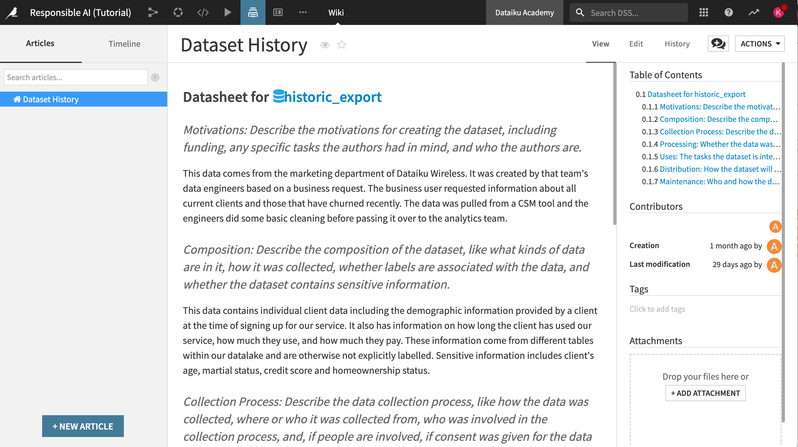
Note
The structure of the datasheet is based on core concepts covered in Datasheets for Datasets, which proposes topics to investigate before using a new or unknown dataset.
Creating this type of documentation is crucial for better communication between dataset creators and dataset consumers. This methodology should be applied to all origin datasets in a project to ensure the quality of and highlight discrepancies in the data used for analysis. In a real-world situation, you or your team would have to address each prompt on your own.
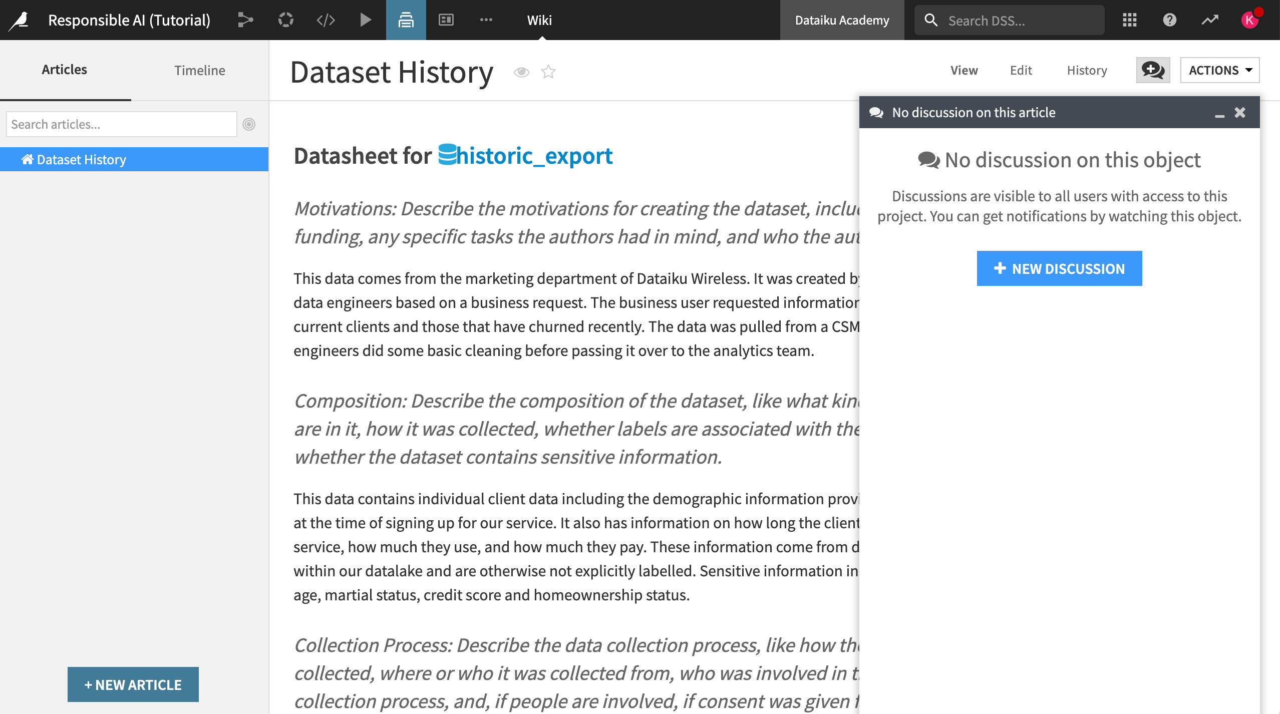
In this case, take a moment to read through the entire datasheet. Then, using the discussion feature:
Comment if the answers to the prompts give you confidence in the overall quality of the data.
List any issues you may have using the discussion feature of the article.
Observe the data#
This section will cover the observe step in the QOT framework, where we’ll take note of any interesting (or concerning) variables, qualities, or trends in the data.
Sensitive attributes#
Let’s begin by familiarizing ourselves with the term sensitive attribute.
A sensitive attribute is a demographic feature of a person’s profile that may reflect systemic, human, or statistical biases. The criteria for what constitutes a sensitive area will vary based on the context and use case.
Our goal is to ensure that our data isn’t biased against people based on some sensitive attribute.
Look for sensitive attributes in the data#
Within our Responsible AI project:
Open the historic_export dataset.
Select the quick column stats button on the top right part of the screen.
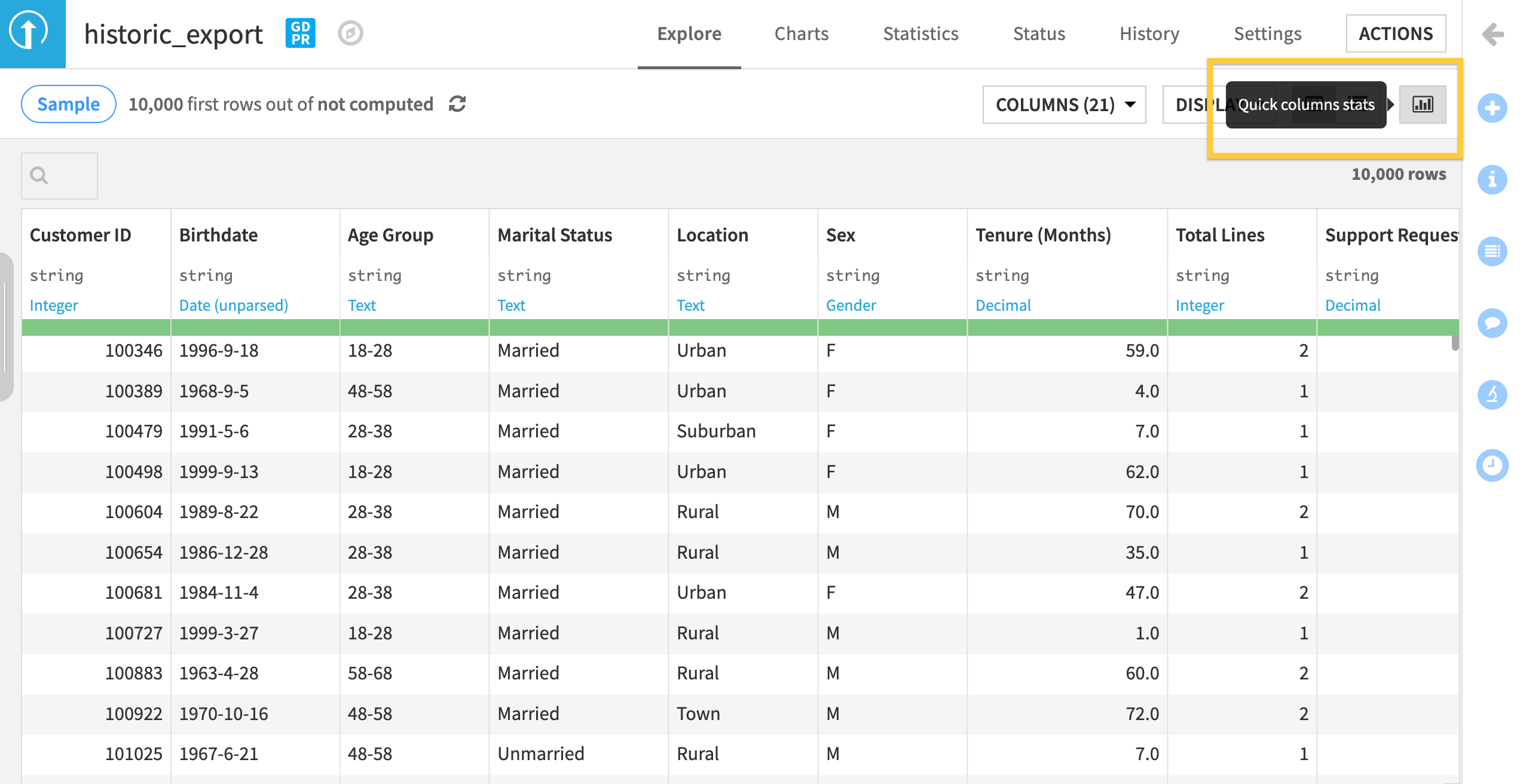
Based on the features in the quick column statistics, do you see any potential areas of bias in this dataset? We can record these observations in the wiki.
Navigate to the project wiki and click +New Article.
Name your new article
Initial Bias Checks. Here we will list potential sensitive attributes that need to be reviewed for bias before building a model.Write down any dataset columns that could represent a sensitive attribute or potential areas of bias.
Tip
You can use the formatting tools to structure and organize content. Select the View tab on the top right of the article page to see how your edits look.
In the historic_export dataset, Age, Sex, Marital Status, and Location could all be sensitive features subject to bias. Did you write anything similar in your observation?
Make sure to include these features in your document if you still need to. Additionally:
Brainstorm and note why these sensitive areas might be subject to bias, especially regarding the distribution of the target variable (that is, whether someone churned).
For example, you can note that churn might be a sensitive attribute because someone in a rural area may have fewer options when it comes to cell coverage. In this case, the data might show overall less churn among those clients, but the reason for the lack of churn could be the result of a systemic bias.
Exploratory Data Analysis#
Now that we’re familiar with sensitive attributes that might exist, we need to measure and observe any potential impact of those attributes on our data and eventual model.
In our use case, we want to make accurate predictions that determine whether a given client will churn in the future. To understand the impact of bias in this situation, we will need to assess how these sensitive attributes might skew or alter our target variable in the raw data.
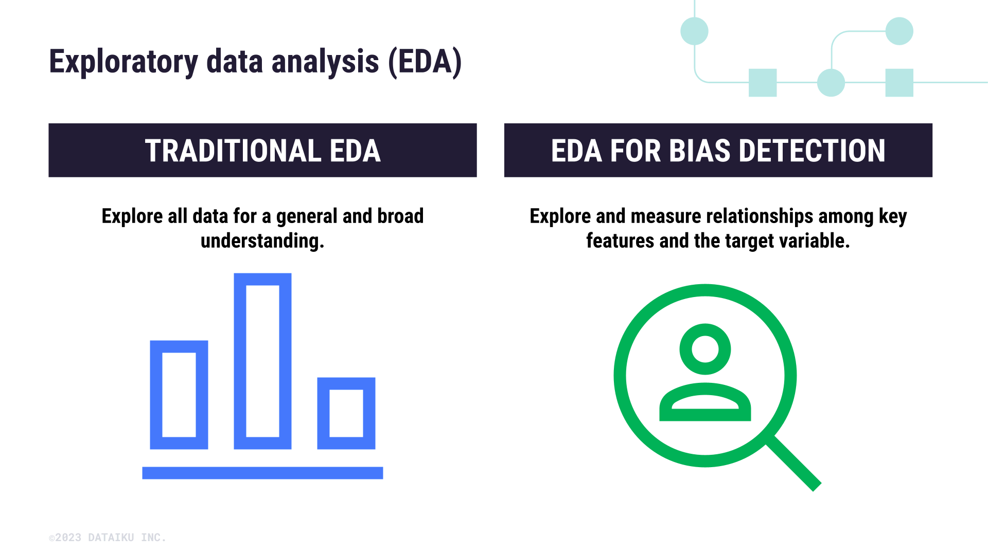
We usually start machine learning projects with exploratory data analysis (EDA) to make sense of the data before we begin modeling. Common EDA methods include:
Univariate analysis
Correlation matrices
Statistical tests
Visualizations
We’re going to do the same thing to understand if there are biases in our data, but with a focus on relationships between sensitive attributes and the target variable. This becomes an extension of the traditional EDA process that looks closely at specific kinds of relationships based on our understanding of what’s a sensitive attribute for our use case.
Begin the EDA process#
Open the historic_export dataset and go to the Statistics tab.
Select + Create Your First Worksheet.
Click Univariate Analysis and add the variables that we’ve flagged as sensitive attributes: Age Group, Sex, Marital Status, and Location.
Click Create Card to generate the univariate analysis.
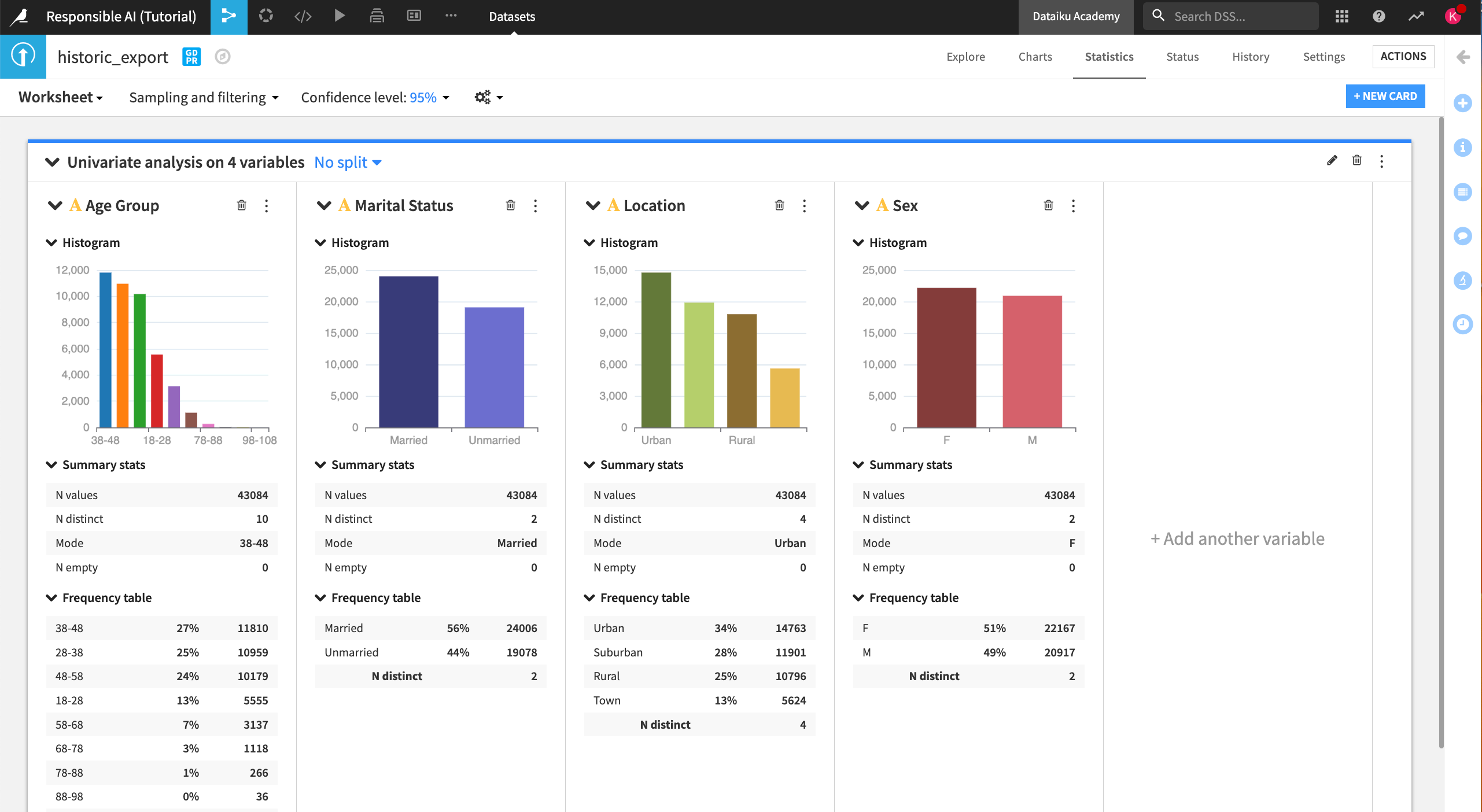
At the top of the analysis card, you can choose to see the distribution of data split by another variable. Let’s split by Status, our target variable indicating churn.
Click on No split.
Split by Status.
Disable the checkbox Show additional group for all values and Save.
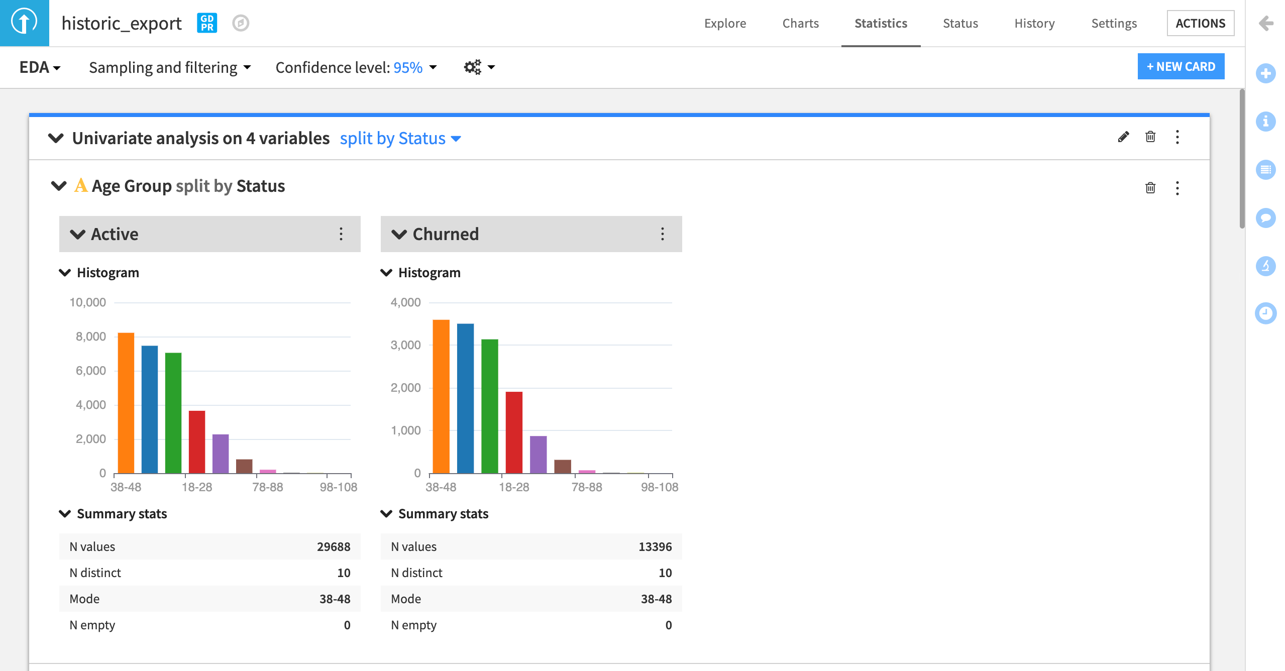
Does the univariate analysis indicate any potential biases in the data as it relates to historic churn? Are there any other interesting insights to find with the other variables in the dataset?
Document your answers in the Initial Bias Checks wiki article in a new section called
Exploratory Data Analysis.
Note
You can also include your statistics card in the article by publishing the card to the default project dashboard and adding the dashboard link to the article.
In addition to univariate analysis, Dataiku offers several methods for multivariate analysis, such as correlation matrices and distribution tests. However, these measures require continuous variables. Since our sensitive attributes are categorical features, we need to use alternative methods to assess their relationship with the target variable.
Test the data#
This section will cover the test stage of the QOT framework, where we will take some measurements to identify any data biases.
Testing for bias#
How do we take a concept like human or institutional bias and test if it’s present in our data?
This can be done in various ways, but here we will be using a chi-square test, or a test of independence. This test measures whether there is a statistically significant relationship between two categorical variables. Let’s look at an example to understand what this test is really measuring.
Understand the chi-square test#
Imagine you’ve been asked to review the last hiring numbers for a large department to be sure that there was no gender bias in the overall recruitment of new talent. Below, we have two contingency tables, or cross tabulations, that show two different scenarios of hiring outcomes for men and women who applied for jobs in the department.
Compare table A to table B. Assuming that all else is equal across candidates (such as performance or years of experience), does the data in either table indicate a biased distribution in hiring patterns?
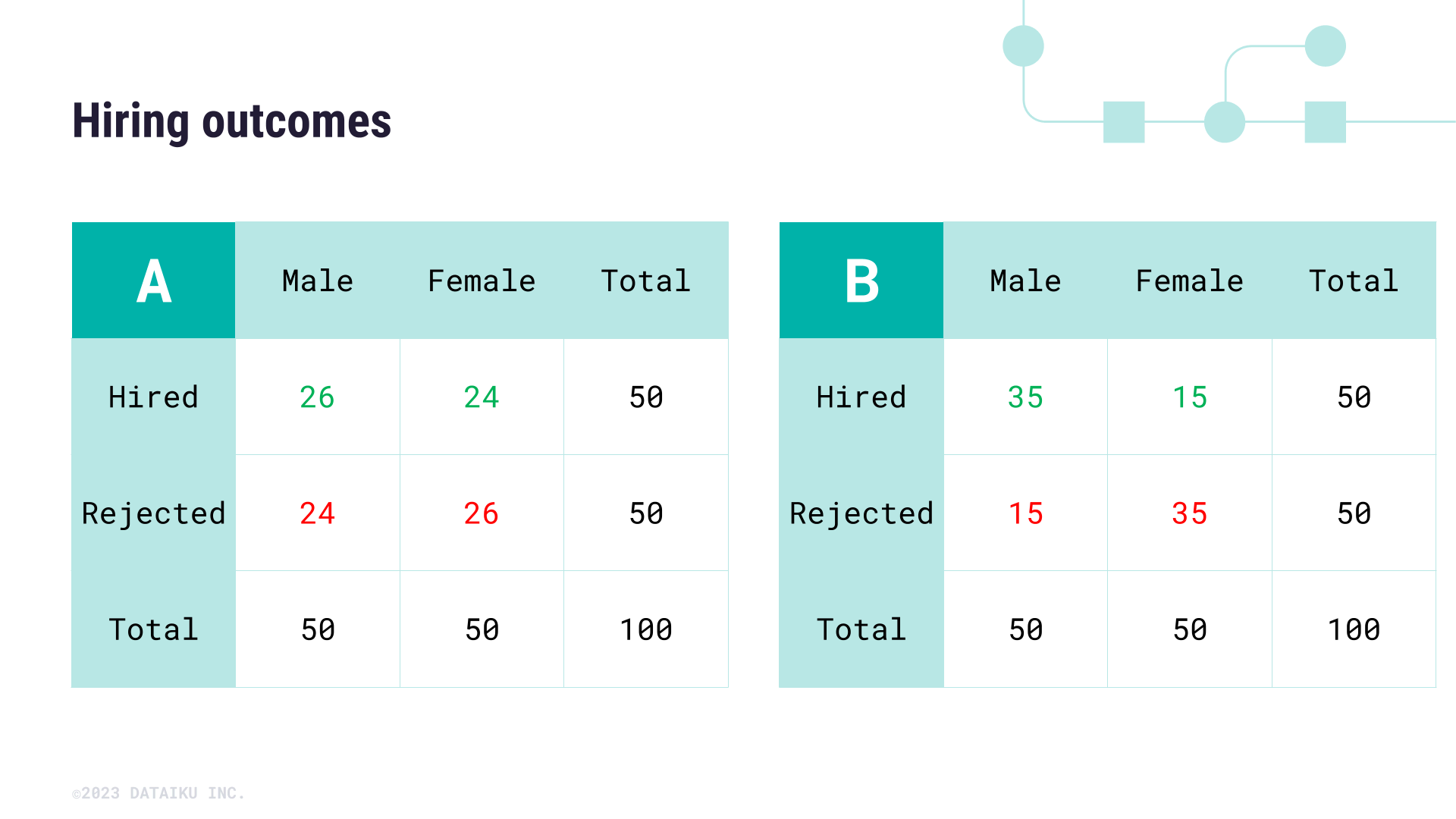
To answer this question more effectively, we can use a chi-square test to test the independence of the features Sex and Hired.
Using the contingency table, we can calculate and compare the expected value for a specific cell of the table against the actual value. To confirm whether the hiring outcomes of the second table are biased against female candidates, we need to check whether the number of hired female candidates (in this case 15) is statistically different from the expected value for this cell of the table. The expected value of a cell is calculated according to the following formula:
To calculate the expected value of being Hired and Female, we:
Take the Row Total (50 Hired candidates).
Multiply it by the Column Total (50 Female Applicants).
Divide by the Grand Total of the table (100 total applicants).
This gives us \(\lgroup50 \times 50\rgroup \div 100 = 25\)
Thus, the expected value of female applicants is 25. In the case of the second table, 25 seems very different from 15—but in the first hiring table, 25 isn’t far off from the actual value of 24 female applicants hired.
To determine where or not the difference between expected and actual values is statistically significant, we need to calculate a chi-square statistic. This is a lengthy calculation that can be frustrating to complete by hand, so let’s return to our use case and leverage Dataiku to help determine statistical significance.
Measure bias with interactive statistics#
For our original use case, we want to assess whether there is a pre-existing relationship between the target variable for churn (named Status) and each of the variables we’ve listed as potential sensitive attributes.
Luckily, we can use the What if? feature of Dataiku to measure whether these relationships exist and to what degree they’re statistically significant.
Let’s return to the Responsible AI project.
From the historic_export dataset, select the Statistics tab.
Click +New Card > Statistical tests > Categorical test > Chi-square independence test.
Try it out using the Status and Marital Status variables.
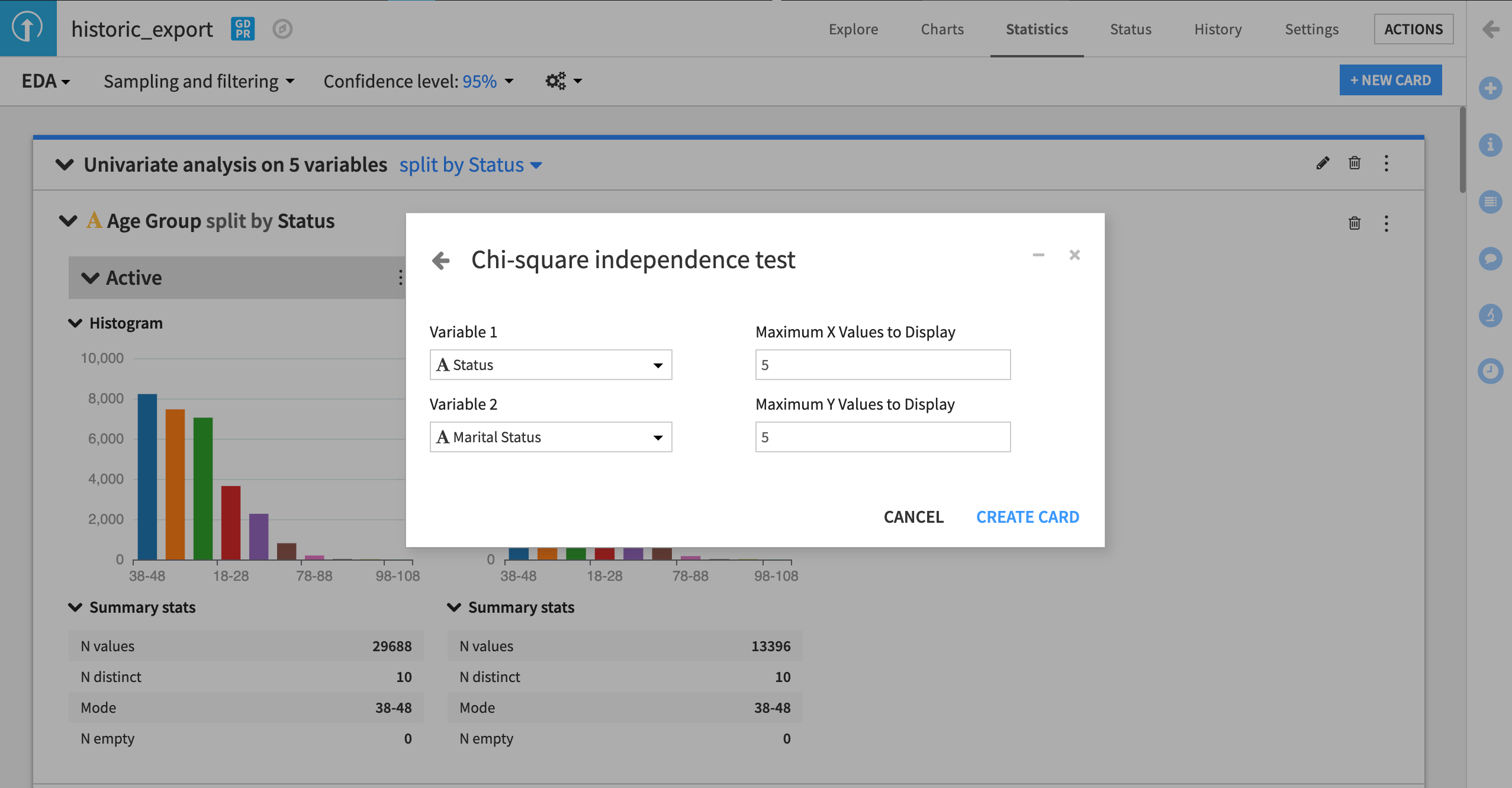
In the example below, we can see the chi-square test is inconclusive about whether there is a relationship between the target variable Status and Marital Status.
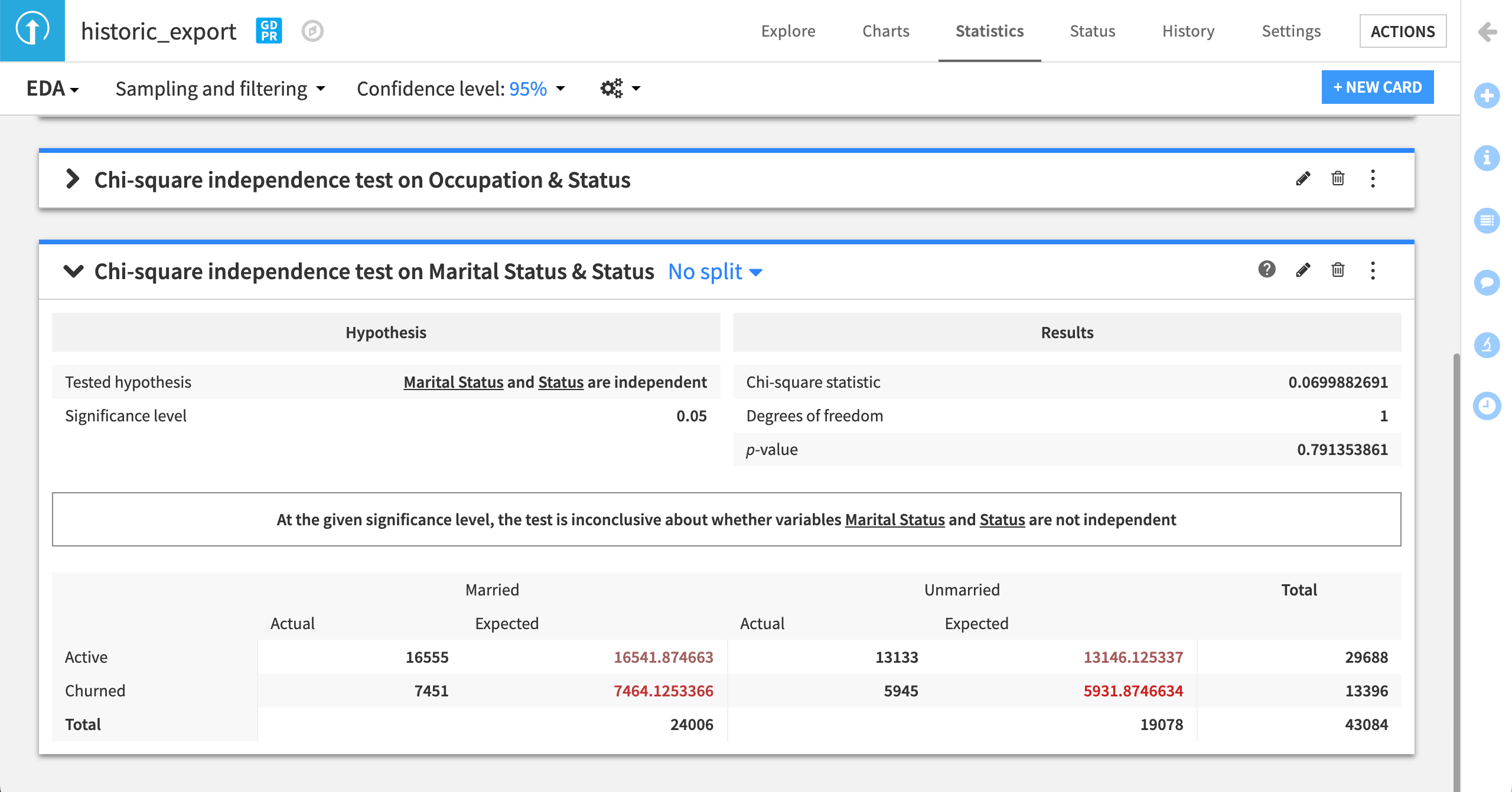
This gives us a degree of confidence that our training data doesn’t reflect any skews between churn and marital status.
Run the same chi-square test for the other variables of interest (Age Group, Sex, Marital Status, and Location), and add these results to the Initial Bias Checks wiki article. For each analysis, you can provide a few sentences on your interpretation of these results.
Note
An important caveat to the chi-square test is that statistical significance (or lack thereof) isn’t the same as practical significance. This difference depends entirely on the risk threshold set by your team (or broader analytics organization). Therefore, recording these results is essential to ensure clarity around what’s considered acceptable. We will return to this concept in other parts of our Responsible AI training series.
The chi-square test is just one check you can do to look for bias in datasets, specifically related to relationships between the target variable and sensitive attributes. In the case of continuous variables, you can also use Dataiku’s interactive statistics to assess differences in means, correlations, and distribution fits, which will help you find any areas of concern as related to potentially sensitive attributes.
Biased inputs#
Another form of bias we can assess is human input, including how certain features are engineered. The choices made during the collection, cleaning, and other processing of data will influence the data analysis and in some cases heighten the effect of potential biases.
In our use case, we can look at the distribution of age data from the Age Group column in our statistics worksheet.
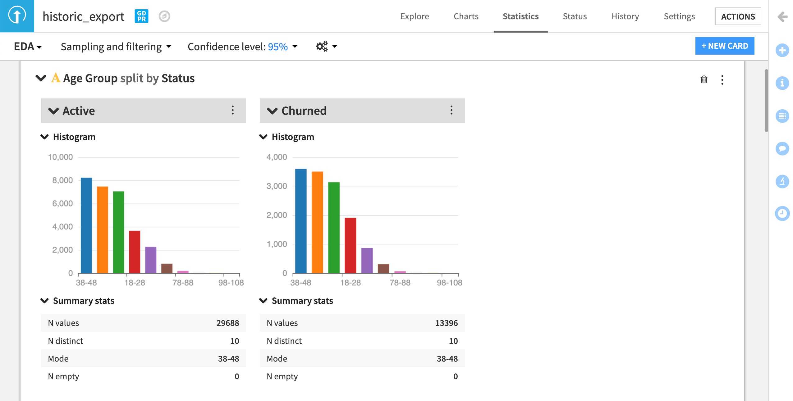
It’s not clear how these categories were decided. Further, the cutoff creates a skewed distribution. We could continue our analysis with this grouping, but since we don’t know why these bins were created this way, there could be a risk of bias based on how these groups were formed.
Note
Recall that, following the QOT method, we must always question the data. In a real-world use case, you might ask your marketing department if the original grouping in the dataset was based on their expectations and discuss whether a different grouping would make sense.
To better assess whether these groups are reasonable for our analysis, we can use the raw birthday data to calculate a customer’s age and, if needed, create new age groups. Before doing so:
Make a new article called
Feature Engineeringin the project wiki so you can document how you decide to implement the following steps.
From the historic_export table in your Dataiku Flow:
Create a Prepare recipe and name the output dataset
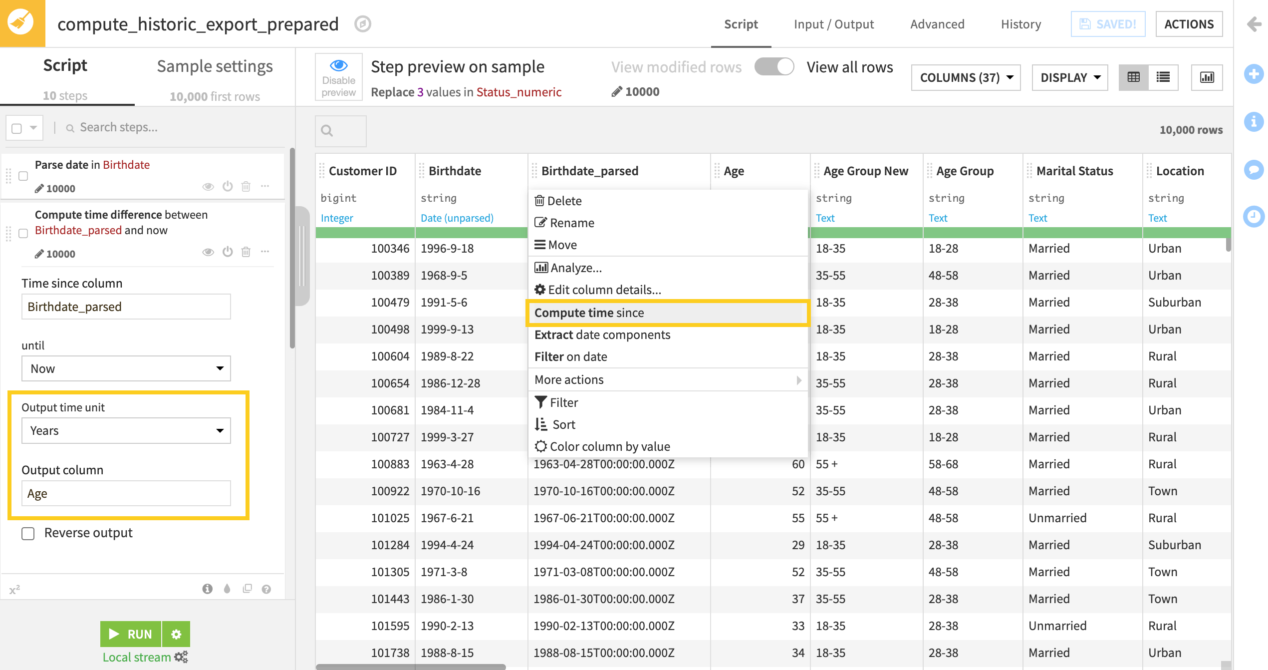
historic_export_prepared.From the Birthdate column dropdown, select Parse date and click Use Date Format.
From the new birthdate_parsed column dropdown, select Compute time since and change the Output time unit to Years.
Rename the Output column to
Age.
Analyze the distribution of the Age column. Is there a better way to categorize this information? Or should we leave it as a continuous variable? We previously noted that Age could be a sensitive attribute as older customers are often considered less likely to change their telecommunications providers, so it will be important to test this potential bias.
If we leave this variable as a continuous variable, we can measure the correlation between Age and the target variable, but by creating a categorical variable we can run the chi-square test which allows for a different type of analysis.
Let’s keep this variable continuous and create new age groupings. Our changes could help us analyze bias across generational groups — specifically the older age group.
From within the Prepare recipe, add a step using the Discretize processor.
Use Age as the Input column.
Set the Binning mode to Custom, use raw values.
Create three custom bins as shown here:
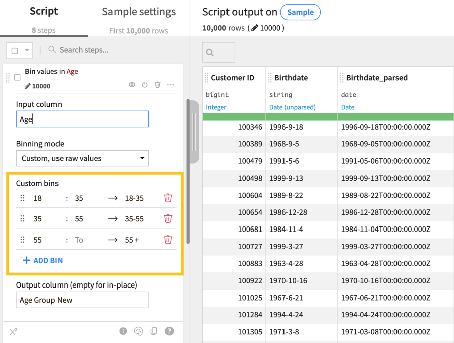
Name the output column
Age Group New.
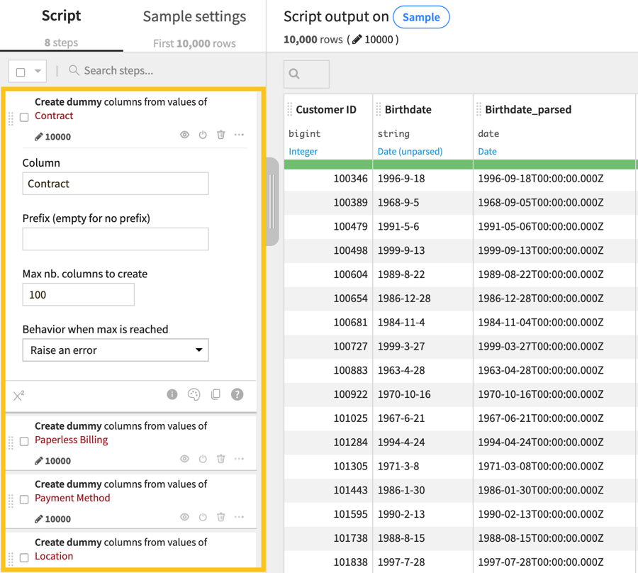
Next, let’s take a moment to encode some categorical data into numeric values. This will allow us to run a correlation test and bivariate analyses between our sensitive attributes and other features of the dataset. We’ll convert the categorical columns Contract, Paperless Billing, Payment Method, and Location into numerical data.
Add a new step to your Prepare recipe.
Select Unfold from the processor library.
Choose Contract in the Column field and keep the remaining default settings.
Repeat these steps for the remaining columns: Paperless Billing, Payment Method, and Location.
Note
Be sure to keep the original categorical variables in your dataset for future analyses.
Now we can add the final step to our Prepare recipe!
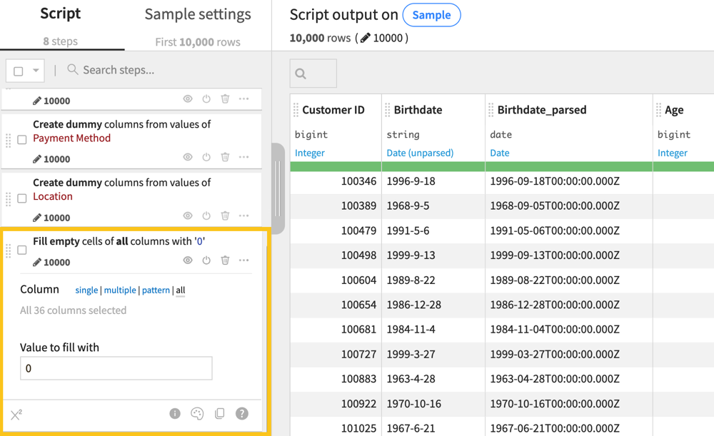
Add the Fill empty cells with a fixed value processor to your list of steps.
Choose all next to Column.
Set the Value to fill with to
0.
Remember to record all steps in your Feature Engineering wiki article.
Note
You may also notice a feature in the dataset labeled Credit Rating. While credit ratings are commonly used to understand a person’s financial capability, note that sometimes it’s unclear how credit ratings are assigned.
For example, in our dataset, the variable has qualitative values that are imprecise in terms of their value or meaning. Most of the categories could be ranked in an ordinal way (such as Low, Medium, High), but the addition of Good as a category doesn’t fit into this scale.
Moreover, the actual values themselves aren’t defined in the dataset documentation, so it’s impossible to assess what these categories relate to when it comes to a customer’s credit rating.
Based on these reasons, you may wish to remove the field from your dataset or make a note to not include this in the model during experimentation as it runs the risk of being highly biased and subjectively assigned according to an unclear metric.
After cleaning up your data and documenting any important feature engineering steps, run the recipe and look at the new output data.
From the output dataset historic_export_prepared, you can do statistical tests and univariate analyses to assess whether there is a meaningful difference between the average age of customers who churn versus those who don’t. In your analysis, think about whether the statistical significance is enough to qualify as a practical significance when it comes to measuring bias. If not, what else might you question to help you decide?
Proxy variables#
Another form of bias may appear in the form of a proxy variable, which is a feature that’s strongly correlated with one or many sensitive attributes.
For example, in the U.S. medical system, there is a strong correlation between overall healthcare spending and race, as years of abuse and mistrust dissuade non-white patients from engaging with medical institutions. This means that even if race isn’t present in a dataset, a feature like total healthcare expenditure could reflect inherent differences between white and Black patients — thus acting as a proxy for this sensitive attribute.
Building a model or analysis with a proxy variable creates a risk of perpetuating existing biases into downstream analytics, so it’s important to detect and remove these proxies early on. There are multiple ways to look for proxy variables in a dataset, including through:
Correlation matrices.
Proxy models.
Working with subject matter experts to apply pre-existing knowledge to analyses.
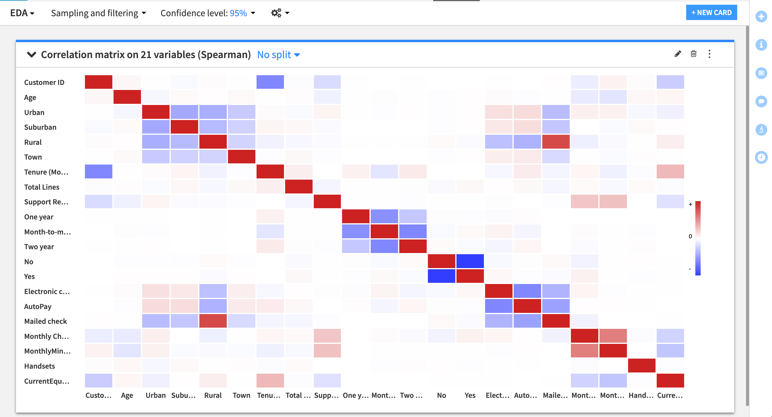
In our case, we need to test the dataset for potential proxy variables that relate to our sensitive attributes — especially any that may have been flagged in our earlier analysis as skewed in relation to the target variable. To create a correlation matrix:
Go to the Statistics tab of the historic_export_prepared dataset and click +Create Your First Worksheet.
Choose Multivariate analysis > Correlation matrix.
Select all numeric variables (prefixed by a #) and click Create Card.
Now, return to the wiki.
Create a new article called
Proxy Variables.Document the results of the correlation matrix.
Note if there are any strong relationships that indicate proxies with sensitive attributes.
Record any other interesting correlations that you see.
You can also send the results of this and other statistics cards to the Dashboard as a part of a data exploration visual.
Note that other alternatives to detect proxies can be informed by this initial approach. For instance, working with subject matter experts or applying existing knowledge can help pinpoint analyses. Additionally, you can create a model to test which variables are influential in predicting a sensitive feature. For example, the Children in HH, Occupation, and Marital Status features are considered the most important variables for a random forest model to predict Age Group. When we start model experimentation, we can assess whether these variables impact overall performance and fairness.
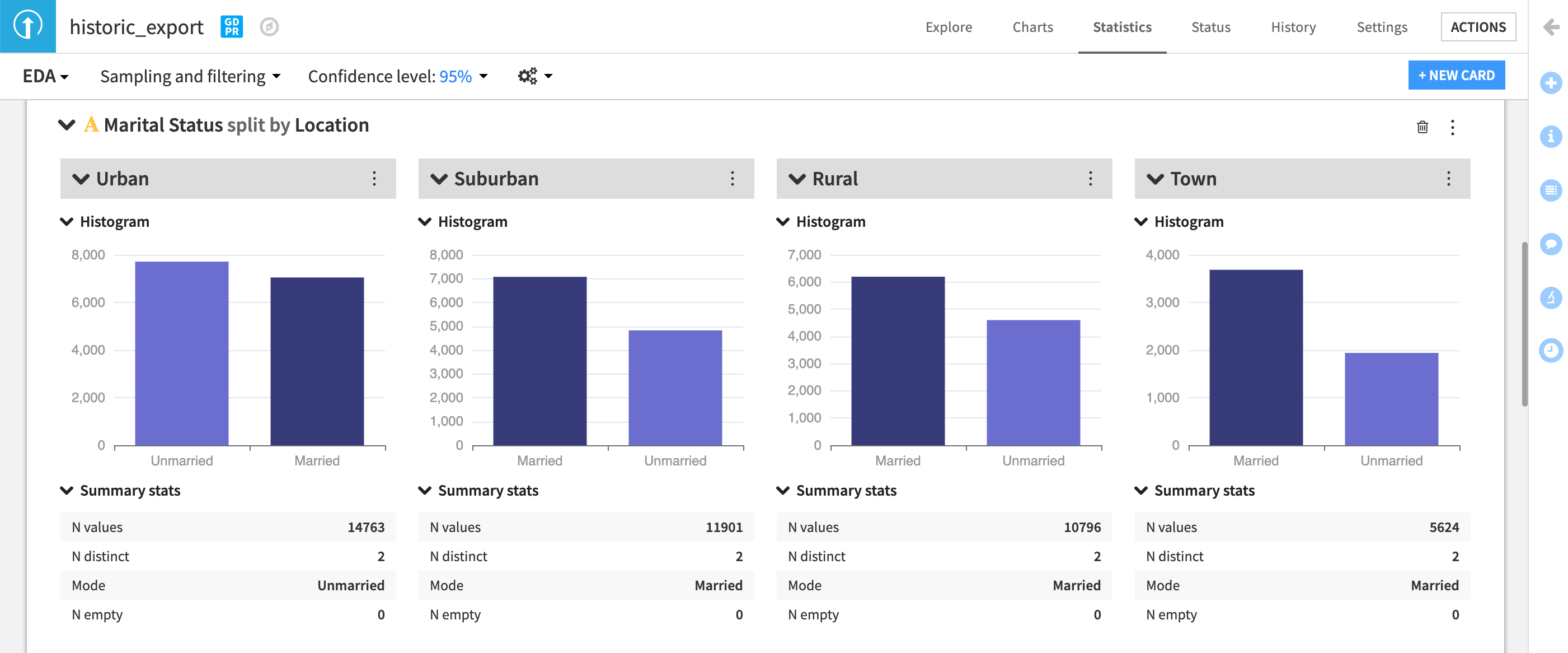
Intersections#
Finally, it’s important to recognize how biases and proxies for bias can reflect in intersecting ways in our data. For example, the effect of race can express itself differently across genders. You can choose to inspect and assess the data for our churn example using splits, as in the example below, to see how univariate analyses, chi-square tests, or other statistics vary across multiple sensitive attributes.
Model fairness metrics#
Let’s learn about RAI during the model building and predictive analytics stage. This section will teach you how to design a model with group fairness in mind.
Note
This tutorial specifically measures fairness of supervised classification models. Fairness testing differs for regression models or continuous outcomes.
Fairness metrics#
Let’s continue with our churn use case. When a churn prediction determines if a customer is eligible to receive some kind of promotional pricing, there is a potential to cause a harm of allocation. With this in mind, we have to decide which group fairness metric is best to optimize to avoid causing this harm.
Say we want to minimize errors and maximize performance across all subgroups of our sensitive attribute Age. We can compare this goal against a breakdown of the four main fairness metrics and what their measures mean in our specific context. If churn is a “positive” prediction, then:
Demographic Parity: The percentage of all predicted churn cases is the same across all age groups.
Predictive Rate Parity: The percentage of churn cases predicted accurately out of all predicted churn cases is close to 100 across age groups.
Equality of Opportunity: The percentage of churn cases predicted accurately (or true positives) is equal across age groups.
Equalized Odds: The percentage of churn cases predicted accurately (or true positives) and the churn cases predicted wrongly (false positives) is equal across age groups.
Each of these metrics promotes a different fairness and business goal. For instance, if we prioritize Demographic Parity, we might build a model that has a high churn prediction rate across all age groups, even if those predictions are inaccurate. In this case, we’ll have to be okay with recommending promotional pricing to customers who might not churn, resulting in a loss to the business.
Alternatively, prioritizing Equalized Odds would ensure that we build the model to do a good job predicting true churn and minimizing false positives evenly across the different age groups.
We could also optimize for Equality of Opportunity to focus on the recall of a model, making sure the model doesn’t miss true churn cases at a higher rate for the sensitive age group.
Think about which of these metrics would make the most sense from a business and fairness perspective. In your own organization, is it more important to minimize false positives (or negatives) or accurately capture as many true instances as possible? Before moving to the next section:
Determine which metric you think is best for this use case.
Go to the project wiki and make a new article called
Model Experimentation.Document your choice of metric and reasoning in this article.
Return to the Flow.
Model fairness report#
To understand how we can measure model fairness with Dataiku, we will first train a baseline model without changing any parameters. (This will be our control.)
Start by selecting the historic_export_prepared dataset.
Open the Actions tab and click on Lab.
Click on Auto ML Prediction and create prediction model on Status.
Choose Quick Prototypes, name your analysis
Quick modeling of Status, and click Create.
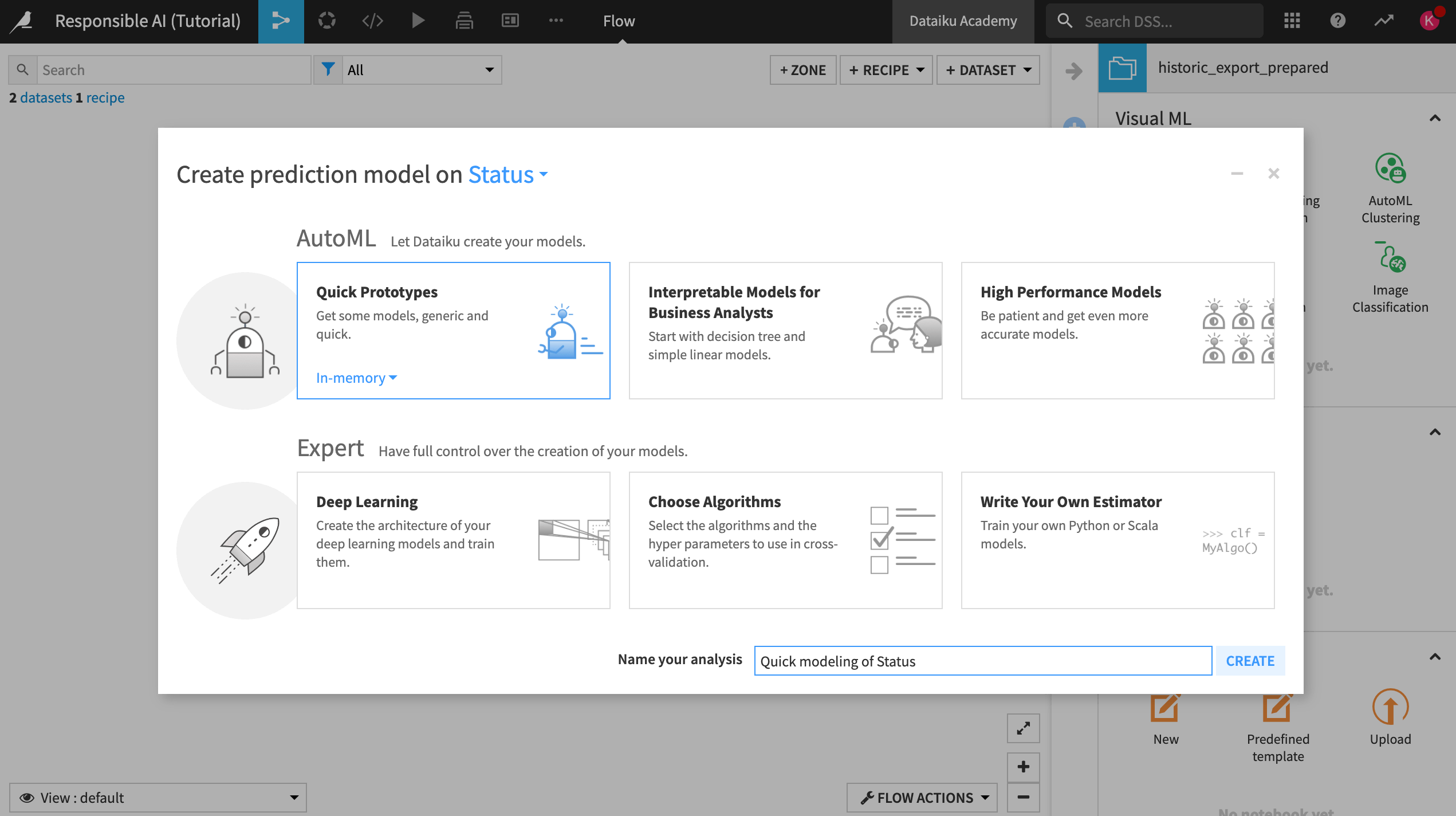
For our baseline model, we won’t adjust the design of the model at all, so:
Train the model without making any changes.
After training, open the Random forest model to see a summary and additional views on the model.
Important
Before continuing, take a moment to reflect on why training this model without making any adjustments to the design or feature selection could be a problem based on what we discovered during the data exploration phase of this project. Consider what you would tweak, knowing that the dataset has pre-existing biases.
Analyze metrics#
Within the Random Forest model summary:
On the left, select Explainability > Model fairness report.
Note
If you are working on an earlier version than Dataiku 12.5, go to Model Views > Model fairness report instead.
Set the sensitive attribute to Age Group New and the group to 55 +. This is our group of interest.
Make the positive outcome Churned and select Compute.
Select the Equality of Opportunity metric.
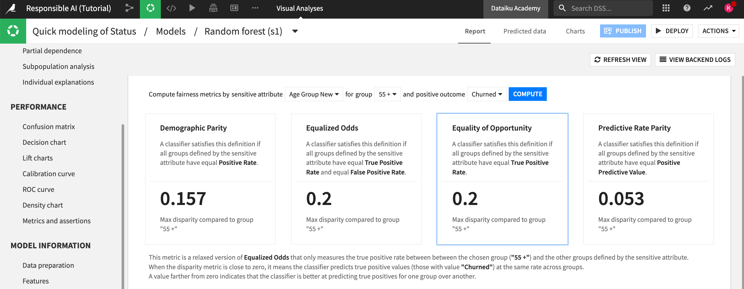
In this case, we chose the Equality of Opportunity metric to assess fairness because we want to ensure that the model finds true churn cases at an equal rate across the different age groups. This would support our end goal of making sure that older clients who are at risk of churn get the appropriate discounts and promotions.
Now, let’s review the results of the Model fairness report. Note that your metrics may not exactly match what we describe below, as your random forest model might differ slightly.
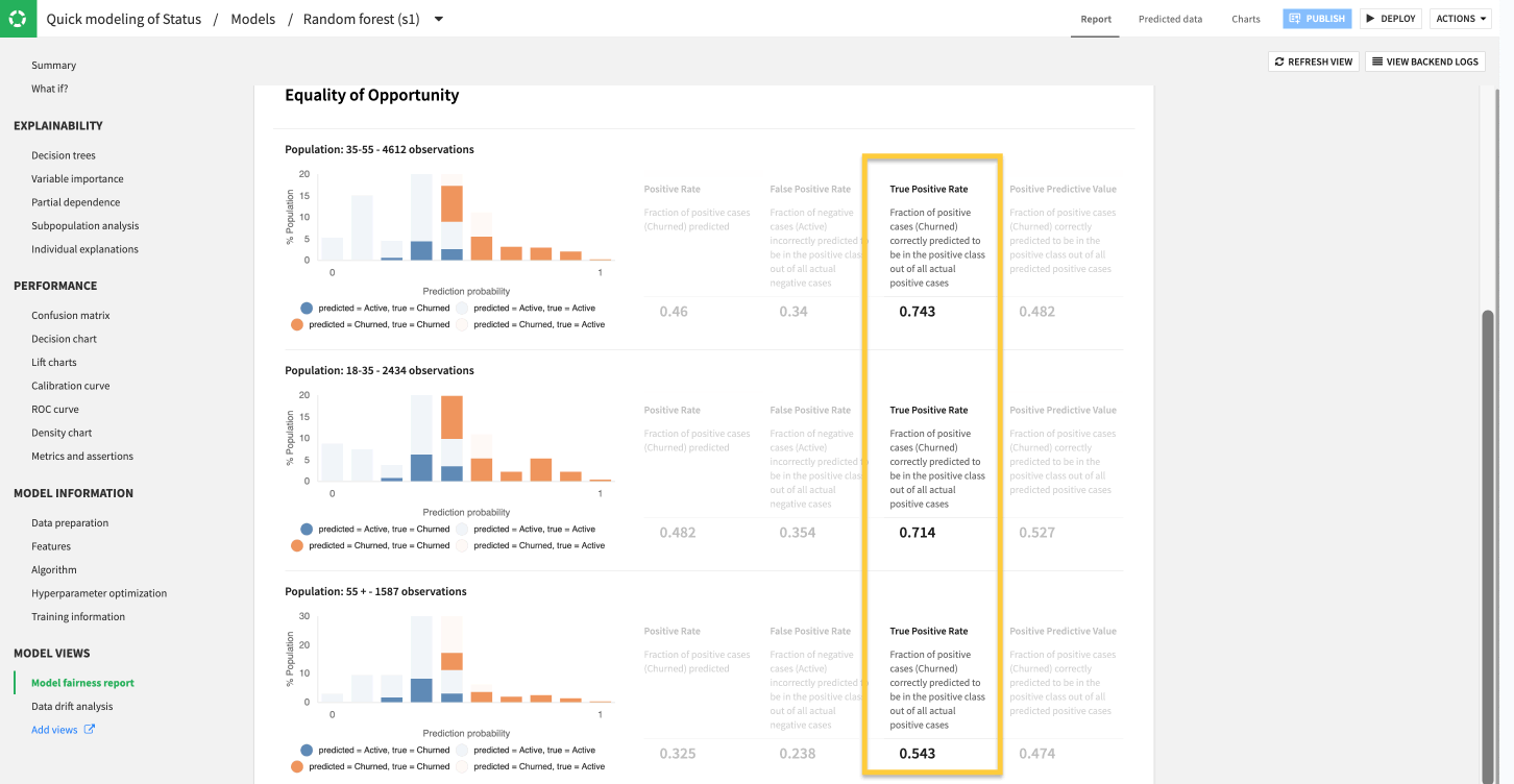
The results show a notable discrepancy in model performance among the different age groups in the dataset.
According to the model fairness report, the model finds far fewer true cases of churn (true positives) among older customers than younger age groups. To be more precise, the difference in performance between the 35 : 55 and 18 : 35 group is about 3%, but the max difference compared to the 55 + group is 20%.
The 0.543 True Positive Rate in our example indicates that even though the overall model might perform with a reasonable AUC, it misses around half of true churn cases for older customers who could actually benefit from promotional pricing or outreach to prevent potential churn.
Note
In this example, while 20% is a large discrepancy, should we pay attention to the 3% difference? The degree to which this difference is statistically or practically significant depends on each organization’s approach to measuring model risk. Currently, there are no overarching guidelines on what’s an acceptable threshold for model fairness, calling attention back to the importance of documenting these results and determining how well they align with your organization’s goals and visions for Responsible AI before the model is sent to production.
Document ideas#
Now we’re aware that our model may be biased in terms of age. Next, take some time to repeat these steps for some of the other sensitive attributes that were highlighted in part one of this series (gender, location, marital status).
Do you have similar concerns about the unfairness of this model relative to those features?
Return to your Model Experimentation article in the project wiki.
Document these concerns to establish traceability of ideas and thinking that went into building a more responsible AI pipeline.
Deploy the model#
Return to your random forest quick model.
Deploy this model to the Flow under the name
Baseline Modelso we can use it as our control model in the future.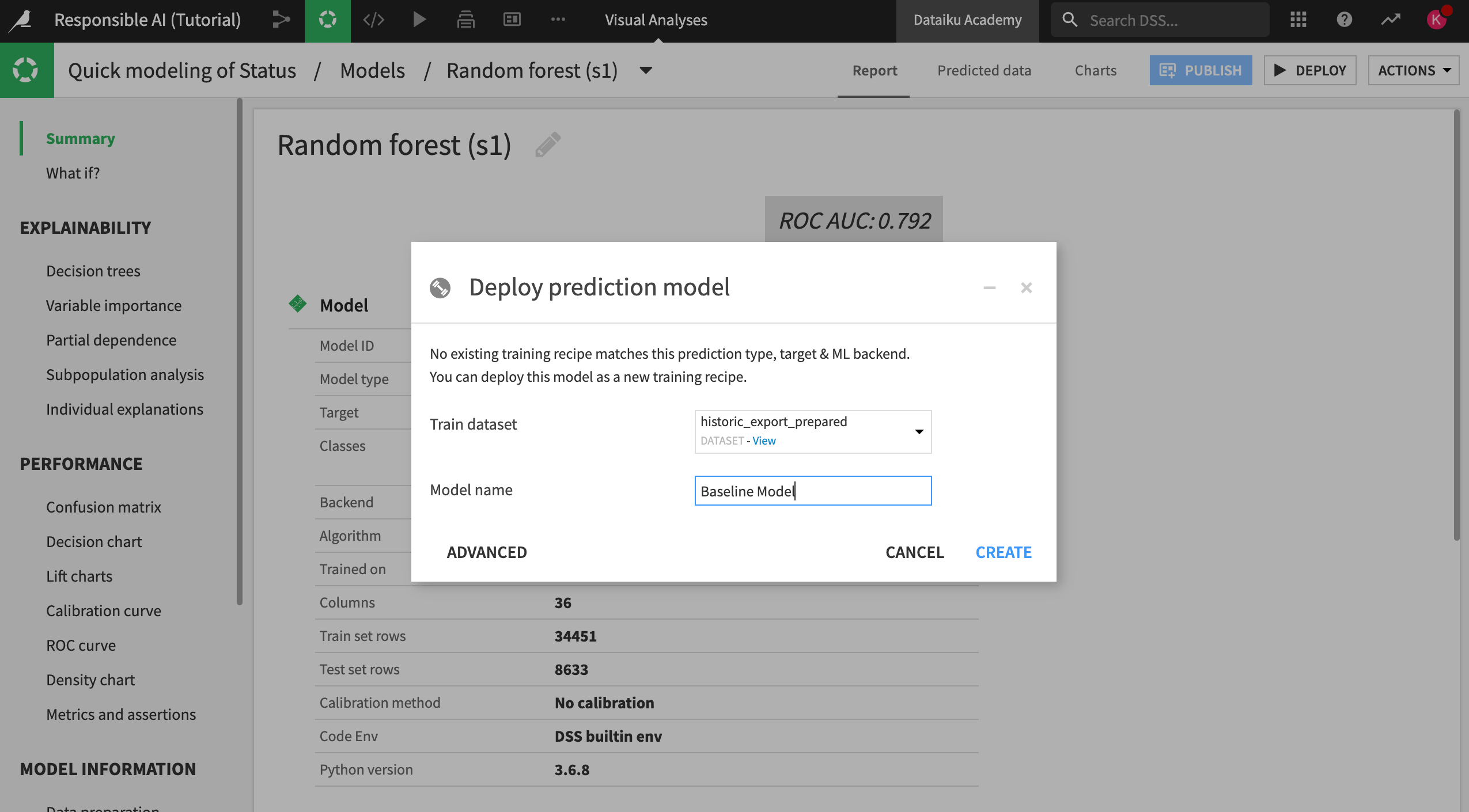
Design for group fairness#
Knowing that our baseline model might be biased against certain age groups, we can try to change our model design to combat that bias. Let’s do this by adjusting our model training decisions and feature selection.
Fair model design#
Let’s start tweaking our model design.
Open your Quick modeling of Status visual analysis and switch to the Design tab.
Navigate to the Debugging panel in the Basic section of the left panel. Here, you can see that ML diagnostics are already turned on.
These diagnostics support the overall reliability of models by checking input data and models for issues like overfitting, leakage, etc.
Along with these built-in checks, you can build custom assertions to integrate business or subject matter expertise into the model validation process. Assertions are rules or expectations for what the model should predict and can be used to confirm overall model performance in accordance with existing knowledge or business rules.
Build an assertion#
According to subject matter experts, only 30% of all customers over the age of 55 churn. If we believe this is a valid representation of our client base, we can build this ratio into the assumptions of our model through a new assertion. Therefore, when we run the model, Dataiku will check if it meets the criteria defined in the assertion and raise an alert if it doesn’t.
Build this assertion into your model using the following steps:
At the bottom of the Debugging panel, click +Add An Assertion.
Name the assertion
Over 55 Churn Rate.Fill in the condition where Age Group New Equals 55 +.
Make the expected class Churned.
Make the valid ratio >= 30%.
Click Save.
Document this assertion and reasoning in your Model Experimentation wiki article.
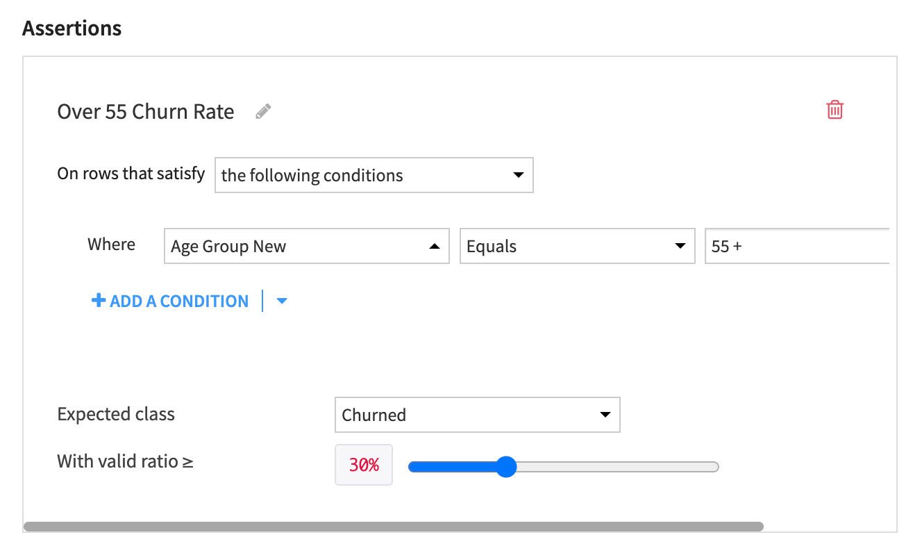
The assertion will:
Check if the model predicts that at least 30% of customers over 55 will churn.
Raise an alert if it doesn’t.
Important
This assertion doesn’t check if those predictions are true or false, or if they meet the fairness requirements for the model.
Create a custom metric#
Knowing that our baseline model doesn’t meet our requirements for Equality of Opportunity, we will need to keep experimenting to find a model that performs optimally and fairly across different groups of interest. To make model comparison easier, we can use a custom metric in the Design tab that can measure the disparity between different groups for our fairness metric.
To keep our model experimentation separate from our baseline model, we’ll create another visual analysis where we’ll make some changes before training.
From the Flow, select the historic_export_prepared dataset.
Open the Actions tab and click on Lab.
Click on Auto ML Prediction and create prediction model on Status.
Choose Quick Prototypes, name your analysis
Custom Metric Model, and click Create.Navigate to the Design tab and switch to the Metrics panel.
Here we can see options to optimize and evaluate the model on different metrics. For this example, we will create a custom metric to evaluate the model on, rather than optimize.
Click on +New custom metric to open the custom metric editor.
Name the metric
Equality of Opportunity for Age.Uncheck the Greater is better checkbox. We want the difference between the true positive rate for the groups to be as low as possible.
Insert the following Python code to call the model fairness outputs.
def score(y_valid,y_pred,X_valid):
 from sklearn.metrics import confusion_matrix
 import numpy as np
 import dataiku
 dataiku.use_plugin_libs(plugin_id="model-fairness-report")
 from dku_model_fairness_report import fairness_metric_report
 from dku_model_fairness_report import ModelFairnessMetric
 sensitive = X_valid['Age Group New']
 bunch = fairness_metric_report.group_summary(
     metric_function = ModelFairnessMetric.equality_of_opportunity,
     y_true = y_valid,y_pred = y_pred,sensitive_features = sensitive,
     label_list = y_valid.unique())
 ref = bunch['by_group']['55 +']
 disp = [abs(x - ref) for x in bunch['by_group'].values()]
 return(max(disp))
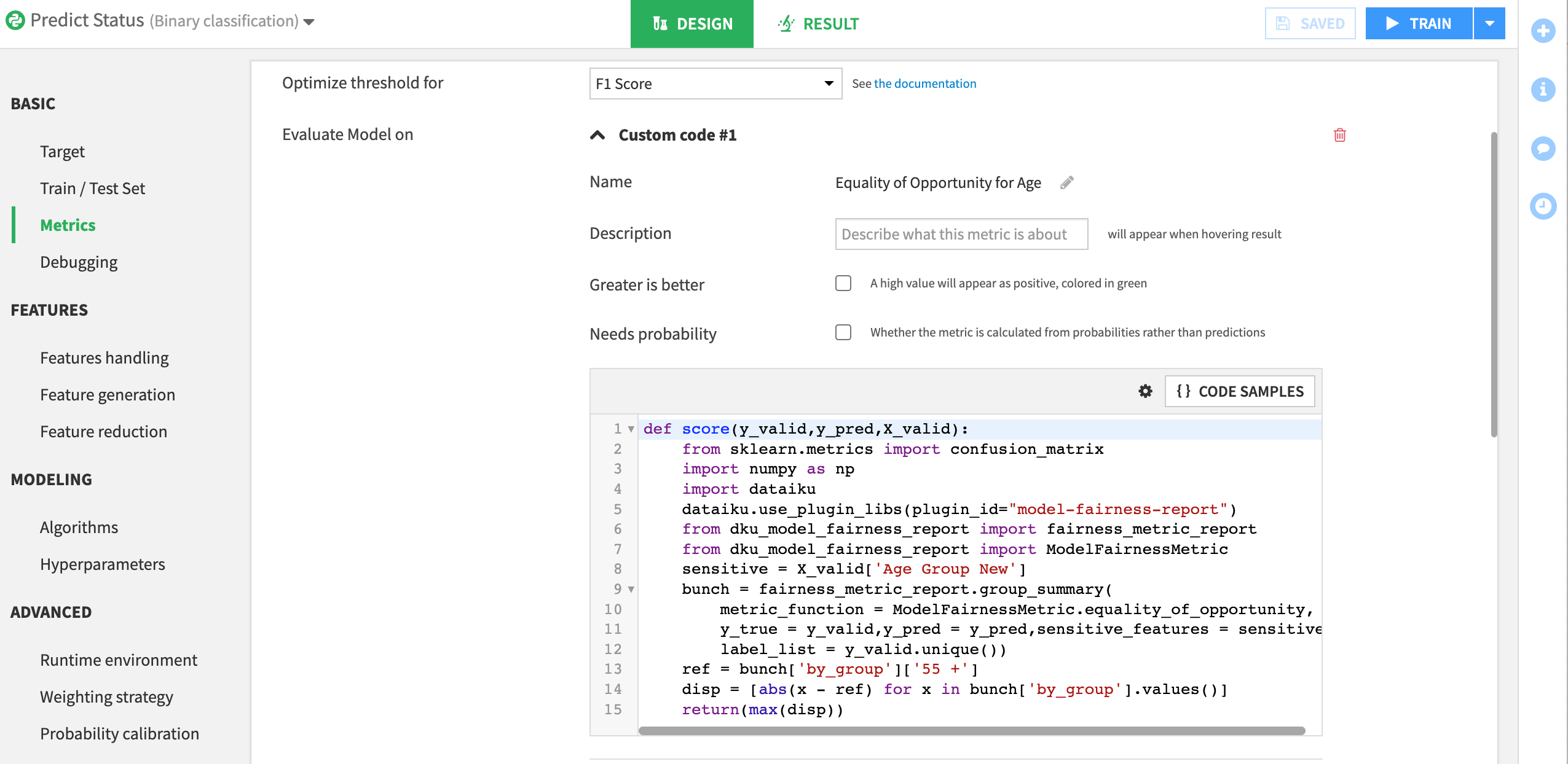
This code will measure maximum disparity between our reference group and the other groups in our age variable. When we run our model, this custom metric will be calculated and can be used to compare models using the model comparison feature.
Remove proxy features#
Last, we can ensure that certain features (and potential proxies for age) aren’t included in the model.
Open the Features handling panel in the Features section of the Design tab.
Disable all age related variables: Age, Age Group, Age Group New, Birthdate and Birthdate_parsed.
Train the model.
Recall that you can use a model to test for proxy variables. We’ve done this for you and have discovered that the features ChildreninHH and Occupation are most important in predicting someone’s age. You can experiment with different model sessions to determine if removing these variables improves the model and compare the results.
Once you have found a model that performs well on your criteria for fairness and overall performance:
Deploy it to the Flow as an updated or improved model, and name it
Improved Model.Document in your Model Experimentation wiki article why this model was ultimately chosen and what parameters were used to make that decision.
Note
These are only some of the steps you can take to build a fairer model. You can also use:
Preprocessing techniques to create sample weights on training data.
Specialized models that optimize for fairness during training.
Post-processing algorithms to balance performance.
It’s important to remember that a fair model isn’t the only requirement for a responsibly built AI pipeline — rather, it’s part of a more extensive approach. Let’s learn about interpretability next.
Interpretability techniques#
Model interpretability is how well we understand the general mechanics of association between model variables and outcomes. This concept is imperative for AI transparency so you can improve your model. Let’s explore how Dataiku enables interpretability through variable importance and What if analysis.
Feature importance#
Let’s see feature importance, or variable importance, in practice. We’ll investigate our baseline model to check for any areas of concern.
Open Quick modeling of Status from your visual analyses.
Open the Random forest model we have trained to predict churn.
Click on Explainability > Feature importance in the left menu.
Let’s only focus on the most important variables in this chart. Remember that your numbers may vary from ours.
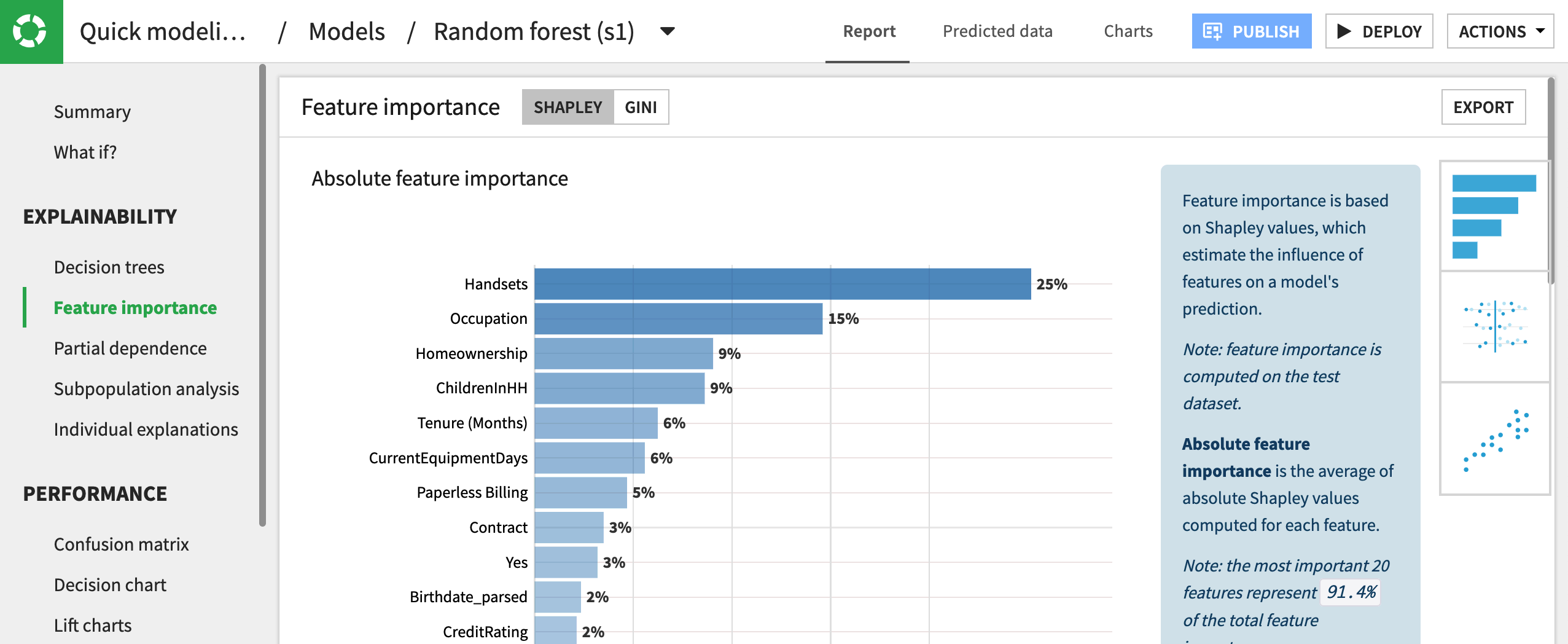
Using Shapley values, we can determine that Handsets is the most influential variable in determining a prediction for churn.
It’s important to note that this doesn’t mean more handsets lead to churn, but rather that for the full model, handsets are most useful in determining the final outcome. Moreover, we can see how much more influential this variable is relative to the others in the dataset. In this case, handsets are 11% more influential than customers’ tenure with the company.
What if a sensitive attribute such as gender appeared as the most influential variable in your model? Would this be cause to redesign the model? Questions such as these are important to ask whenever implementing Responsible AI and always depend on greater context.
Partial dependence plots#
Beyond variable importance, there are other ways to make sense of how different features affect the overall model predictions. Partial dependence plots are visualizations that show the dependence of predictions on a single feature. From an interpretability standpoint, these plots help us understand how different values of a single feature change the prediction probability for a specific outcome.
Let’s generate partial dependence plots for the Sex and Occupation features in our model. In doing so, we’ll be able to see how different values of the features affect churn predictions relative to the average probability of churning.
Navigate to Explainability > Partial dependence.
From the Select your variable dropdown, choose Sex.
Generate the partial dependence plot by clicking Compute.
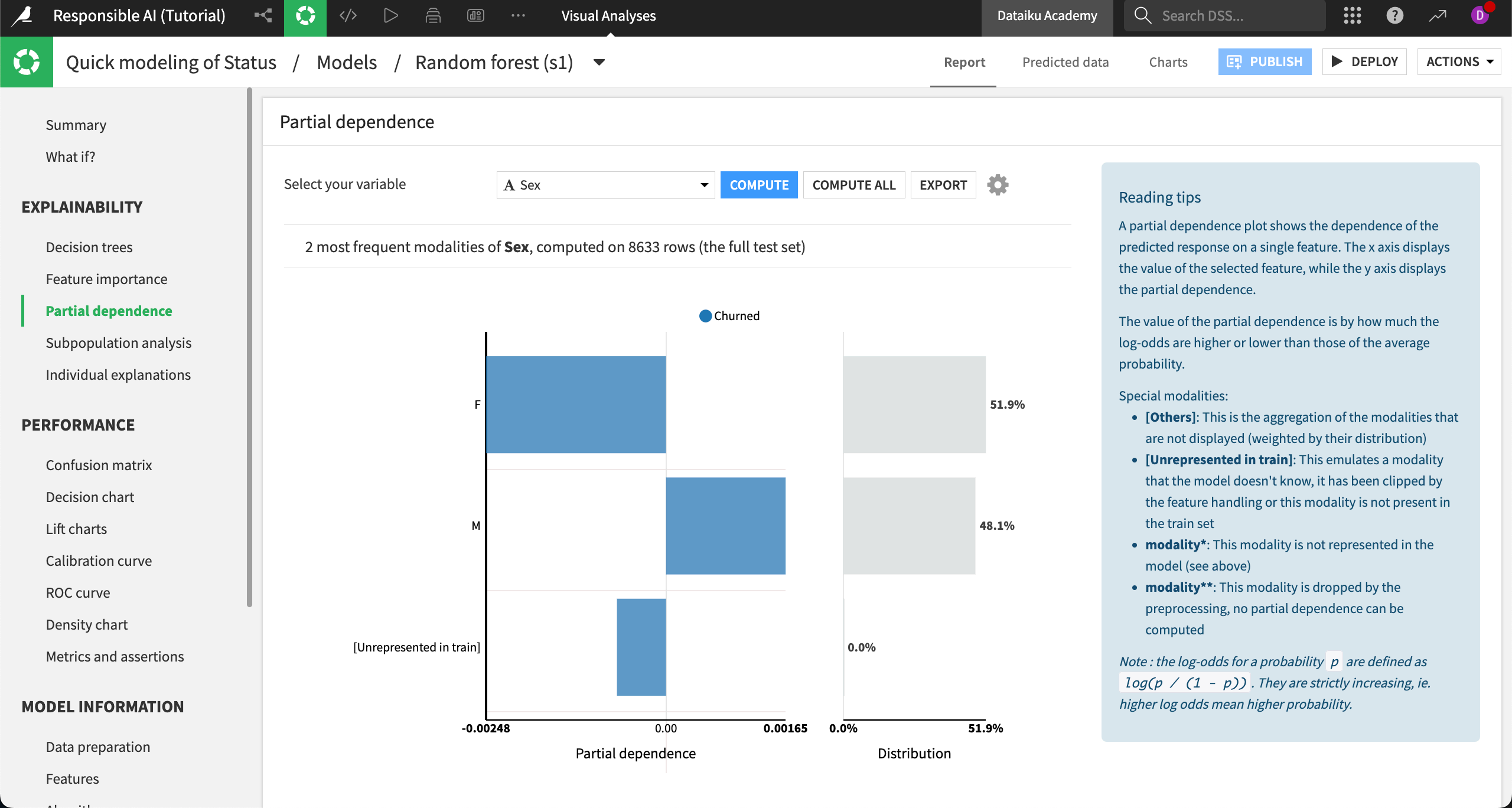
Here’s the partial dependence plot on occupation for comparison:
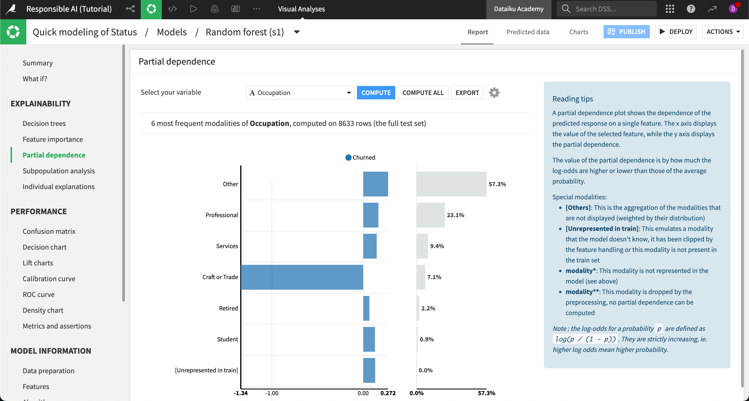
In the case of gender (assumed from the Sex variable), we see that the probability of churn is slightly lower than average for women and slightly higher than average for men. Still, the difference in probability is low in either direction.
By contrast, the customer’s occupation has a greater impact on the overall probability of churn, with those in Craft or Trade professions having a far lower than average probability to churn.
Does this mean the model is biased against craft or trade workers? Again, this question is subjective and depends on context. However, the question reveals how interpretability can help you audit your model for fairness.
What if analysis#
To deepen our interpretation of the model and understand it more holistically, we might want to understand how prediction probabilities change when multiple features are varied at the same time. To do this, we can use the What if analyses.
Navigate to What if? in the left menu.
By default, the What if simulator generates a baseline model prediction. In other words, it returns the probability of prediction for a hypothetical record in our dataset that takes the median value (for numeric) or most common value (for categorical) of each feature.
We can alter the values on this page to see how the prediction probabilities for the model would change. Let’s add some hypothetical models to a comparator to evaluate different hypotheticals side by side.
Hypothetical 1: Urban professional#
Scroll to the Location field and select Urban from the dropdown menu.
Scroll to Occupation and select Professional from the dropdown menu.
Click Add To Comparator.
Hypothetical 2: Rural craft or trade workers#
Scroll to the Location field and select Rural from the dropdown menu.
Scroll to Occupation and select Craft or Trade from the dropdown menu.
Click Add To Comparator.
Compare hypotheticals#
Select Compare (2) to see the scores side by side.
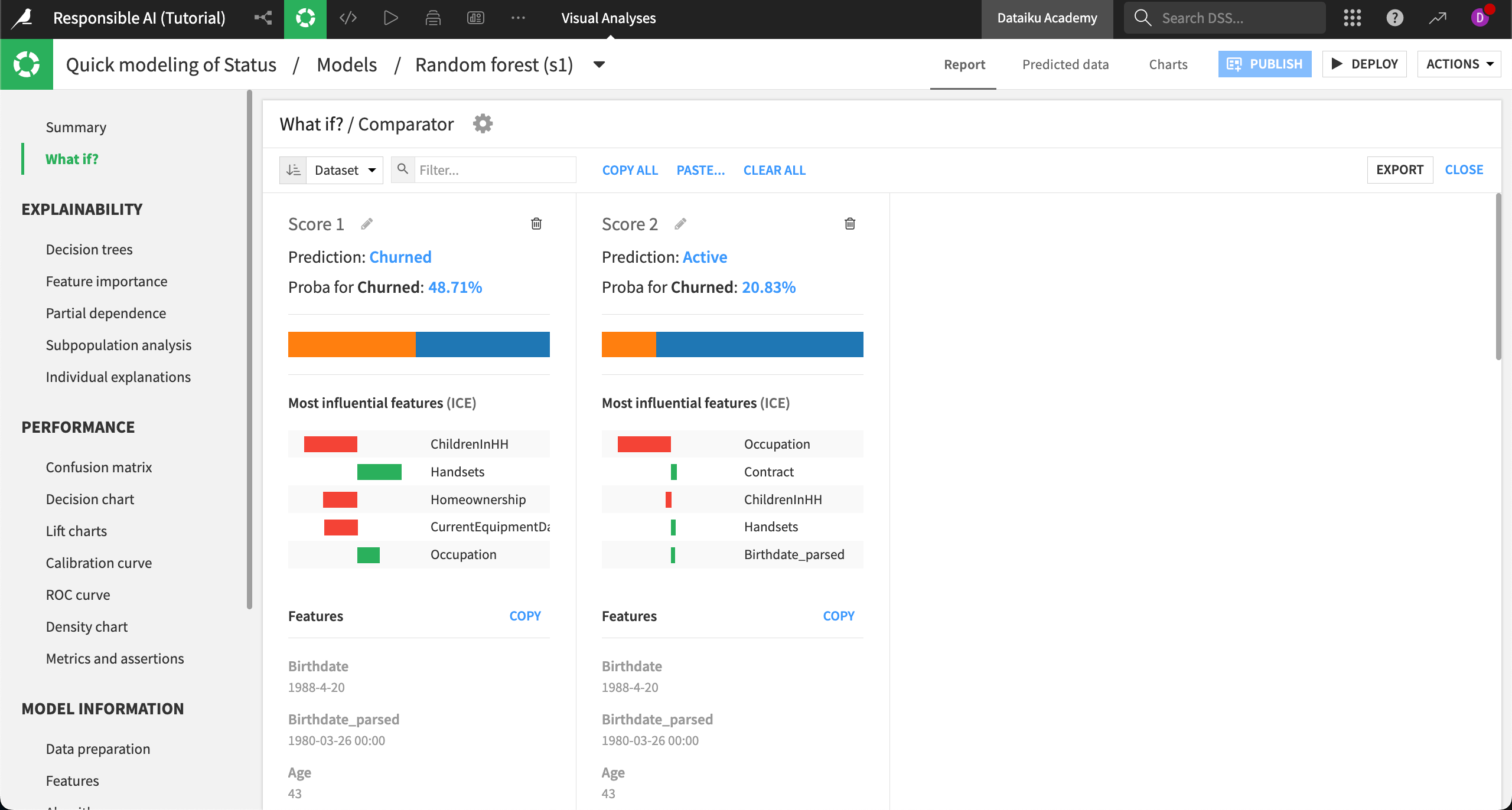
In this example, we can see how the model behaves differently for urban professionals (left) versus rural craft or trade workers (right). First, the average predicted probability to churn is far lower among the latter group of customers. Second, we can see which features are most influential in the overall predictions for these two models, with ChildreninHH being a stronger influence on the prediction for urban professionals.
This information could either confirm expert knowledge or indicate an issue in the model that needs to be addressed before deployment.
Additionally, this analysis could be used to assess the model’s overall counterfactual fairness and provide insight into other areas of concern.
Model explainability#
After learning about model transparency and deployment bias, let’s continue to the model reporting stage. We’ll move forward by learning how to calculate, interpret, and share explanations of individual predictions.
Individual explanations#
Let’s return to our use case to see what explainability looks like in practice.
Open your Responsible AI project and go to the Flow.
Select the Improved Model you have already deployed.
Navigate into the model Report.
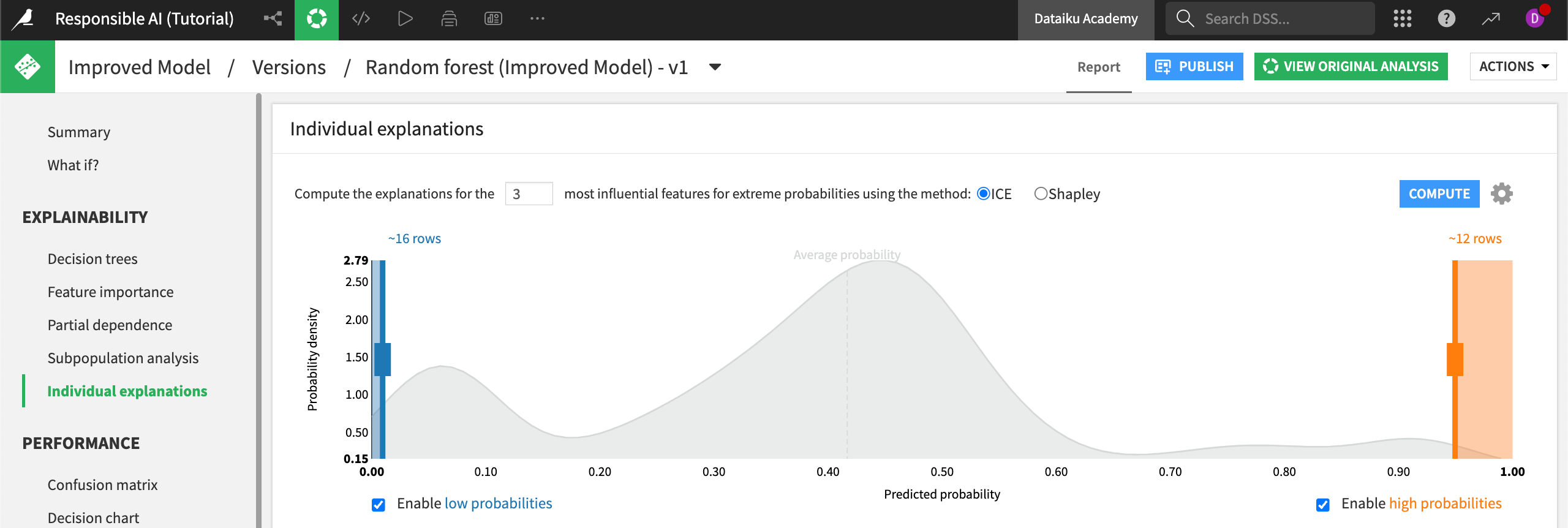
Open the Individual explanations panel under Explainability in the left menu.
Note
The Individual explanations panel lets you compute explanations for records using either ICE or Shapley computations. Results from Shapley calculations are generally considered more robust, though ICE takes less time to compute. For the purpose of our use case, we’ll use Shapley.
Switch the computation method to Shapley and Compute the explanations.
You can manually adjust how many records from high and low probability will be explained or choose to only look at high or low probabilities.
Note
Find more information on computation methods for individual explanations in the reference documentation.
Interpreting explanations#
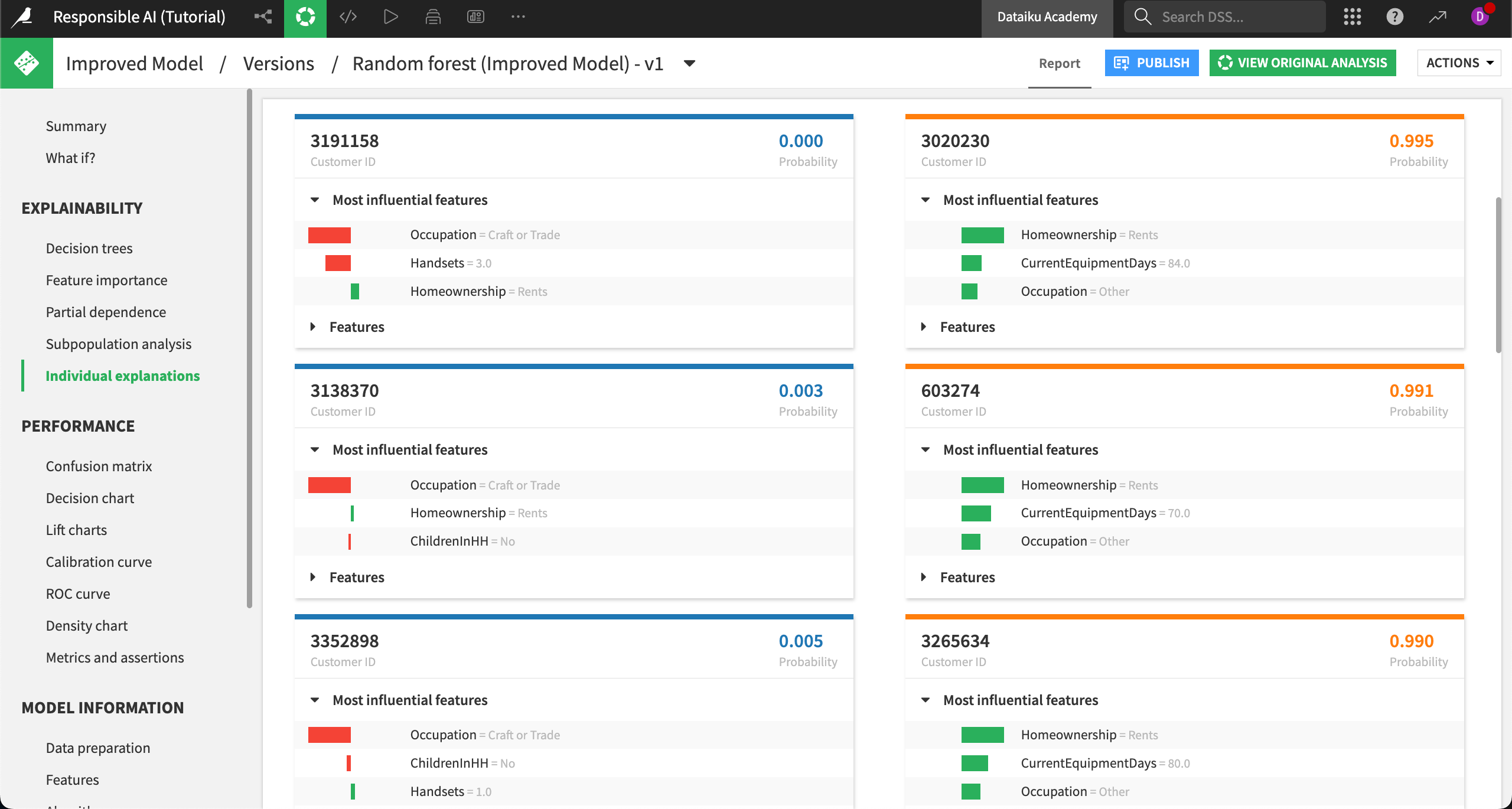
Now, we’ll compare the explanations of a low to high probability to churn side by side. As a reminder, the Status variable has two categories: Active or Churned. On the backend, the model has encoded Churned as a numeric 1 and Active as a numeric 0, where Churned is the desired outcome to predict.
The customer on the top left has a low probability of churning, as indicated by the probability in the top right of the tile. We can see that the most influential features on this record’s outcome are their occupation, how many handsets they use, and their homeownership status. Note that the red color is negative, indicating that the feature drives down the probability that the customer churns. In contrast, homeownership (green) slightly increases the probability of churn for this customer.
On the top right, a different customer has a high probability of churning. Their most influential feature is homeownership. Notice that different records (customers) have different influential features, showing that we can explain why individual records have a given probability.
Remember that explanations don’t have to be the same for every client. In fact, sometimes you’ll see that a variable is a driver in both negative and positive probabilities. Different combinations of features and model weights will produce varied results across individual records.
Reporting strategies#
We’ll conclude our series of tutorials on Responsible AI by learning how to create various reports in Dataiku to keep consumers and other stakeholders informed.
Add a check to a model#
Data quality rules and metrics can support data science and operations teams who want to make sure their data and models remain accurate, fair, and reliable over time.
As a reminder, we previously created and measured the Equality of Opportunity fairness metric across different age groups with our sensitive group of 55+ serving as the reference. Here is what that metric looks like:
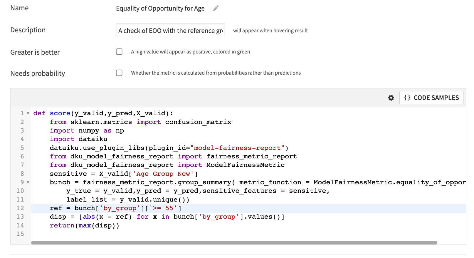
Now, we want to make sure that whoever maintains this model when deployed to production is aware of this metric and what it measures. You should have documented this metric choice in your project’s wiki already, which is a good start.
Next, we will set up a custom check on our model that will calculate this metric whenever the model is retrained. The check will alert us if the model metric falls outside an acceptable range.
From the Flow, open the Improved Model.
Select the Settings tab at the top of the page.
Navigate to Status checks on the left side of the page. This section allows you to build a custom check or verification on any metric in the model.
Select Metric value is in a numeric range to start building the check.
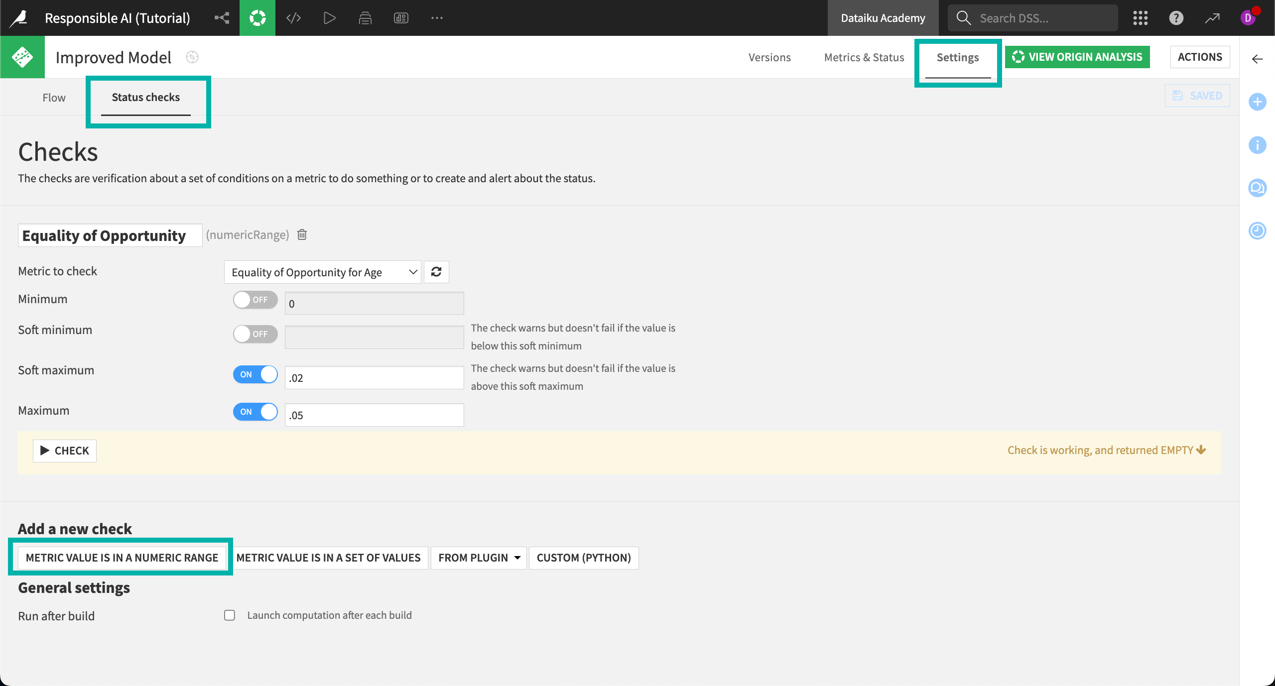
Name your check
Equality of Opportunity.Next to Metric to check, select Equality of Opportunity for Age.
Set the soft maximum to
.02.Set the maximum to
.05.Select Save in the top right corner, and then Check to run the check.
Remember that the Equality of Opportunity metric is set to measure the maximum disparity of the True Positive Rate (TPR) for the sensitive age group and all other age groups in the dataset. Therefore, our check:
Sends a warning if the TPR for the sensitive age group is between 2% and 5% lower than that of other age groups.
Fails and sends an error to the logs if the TPR is more than 5% lower than that of other age groups.
To ensure the best performance, you could also include minimums in the check, which would check that the TPR for the sensitive group isn’t higher than any other group in the data. This would be reflected as a minimum negative percentage (such as -.05).
As previously mentioned, the acceptable threshold for a fairness metric will vary for each use case and the overall risk guidelines set by the organization. These checks and warnings can also be used in scenarios, and/or in conjunction with the Govern node, so the right steps to correct a model in production can be taken quickly.
Build a dashboard report#
Next we will cover how to leverage dashboards in reporting to support the documentation provided in the wiki.
As we have worked through this tutorial project, we’ve created a number of insights and visuals that can be shared with stakeholders of the project. For example, the exploratory data analysis conducted on potential biases in our originating dataset can be published to a dashboard and linked within the wiki page. Additionally, all model summaries of both lab and saved models are publishable, including interactive aspects such as What if analyses.
Let’s add the What if analysis we conducted to this dashboard.
Navigate to Dashboards (
) in the top navigation bar and select the default dashboard that Dataiku has already created for us.

Switch to Edit mode to start building the dashboard.
Click on the + button to add a tile to the page.
In the info window, choose Saved model report and select the Improved Model as your source model, then Add.
In the right panel, under Saved model report options, choose What if?.
The What if analysis appears on your dashboard.
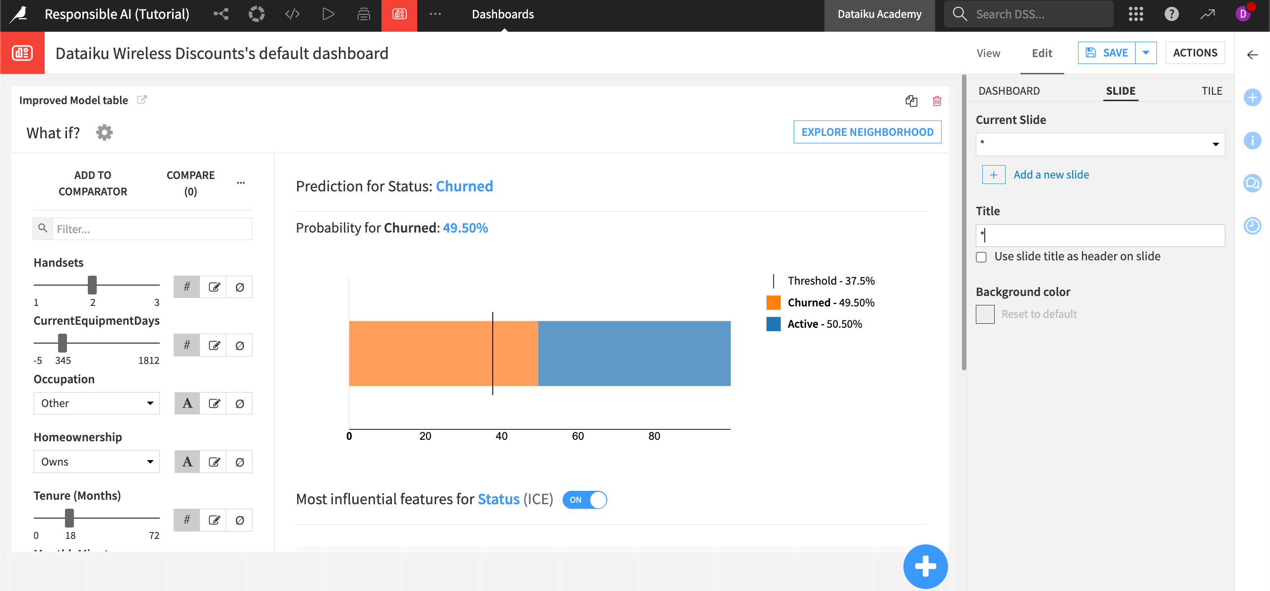
The dashboard is highly customizable and offers built-in access to insights from all parts of a project. Using the dashboard to save and share key insights during the development process and beyond is a core part of transparency in Responsible AI.
Document generation for Responsible AI#
When it comes to reporting to regulators, governance teams, or auditors, documentation is critical. The wiki is a fundamental starting point but doesn’t always provide sufficient information. For stakeholders that need specific step-by-step information about a project, you can use document generation within Dataiku.
The first kind of document that can be generated is the Flow Document. This document is a detailed report of all activity taken on the Flow, including the datasets and recipes used. To build this document:
From the Flow, select Flow Actions at the bottom of the screen.
Click on Export documentation.
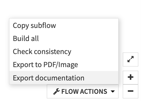
Choose Use the default template then Export.
This report will provide details on the datasets (including schemas and any metadata), recipes and their associated steps, saved models, managed folders, model evaluation stores, and any deployment or monitoring that has been set up on the project.
You can also customize and reorder the default template according to the specific needs of your stakeholders. See the reference documentation on custom templates for detailed guidance on how to customize this report.
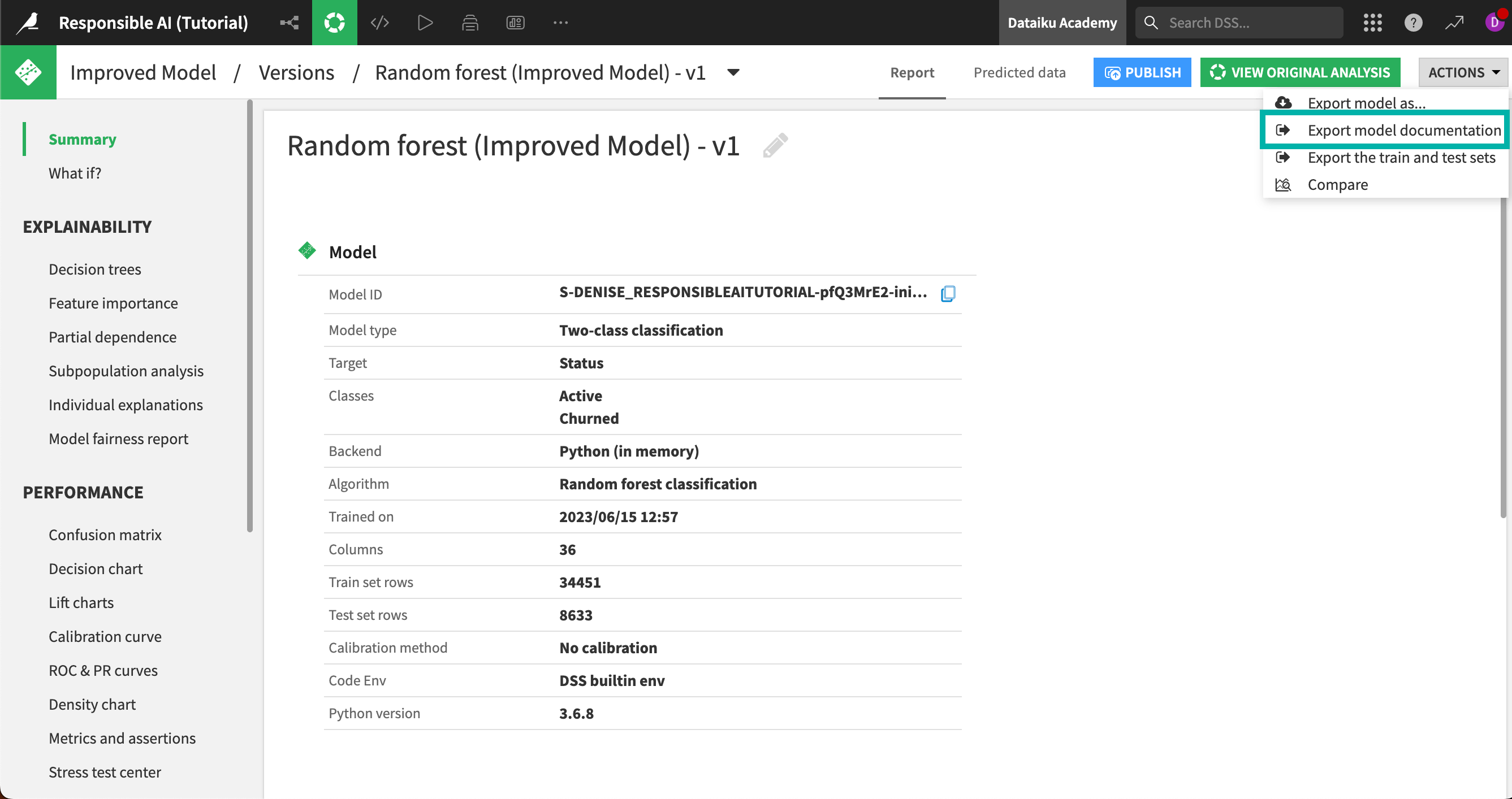
A second kind of report is the model documentation report, which can be produced for any model built in Dataiku (including those in the Lab but not deployed to the Flow). To generate one for our latest model:
From the Flow, select the deployed model Improved Model.
Click into the model version to enter the Report page.
From the Actions menu in the top right, select Export model documentation.
Note
To use the Model Document Generator, Dataiku must be set up to export images. For more information, visit Setting Up DSS Item Exports to PDF or Images.
The report covers the full design of the model, including any pre-processing steps, in-design feature engineering, and the full experimentation process of the different algorithms and hyperparameter tuning. Similar to the Flow documentation, the Model Document Generator can also accept a custom template, detailed in the reference documentation on custom model documents.
When it comes to reporting to regulatory and audit stakeholders, the document generators can provide detailed records of all actions and steps taken during a project build. Using your detailed wiki outlining the rationale for these choices and dashboards to provide key insights, you can provide a comprehensive and transparent report of how a data analytics project or ML workflow was built before it goes to deployment.
Next steps#
Nice job! You have reached the end of our Responsible AI training. As a reminder, you can download our example completed project to compare your work and results.


