
Tutorial | Image classification without code#
Get started#
Computer vision models can be powerful tools for image classification, but they’re difficult and expensive to create from scratch.
Dataiku provides several pre-trained deep learning models that you can use to classify images. You can also re-train a model to specialize it on a particular set of images.
Objectives#
In this tutorial, you will:
Classify images of healthy and diseased bean plant leaves using a pre-trained model.
Learn how to evaluate and fine-tune the model.
Use the model to classify new images.
Evaluate the model’s performance.
Prerequisites#
Dataiku 12.0 or later.
A Full Designer user profile.
A code environment for computer vision tasks:
Dataiku Cloud users should add the Deep Learning extension to their space.
Self-managed users should go to Administration > Code envs > Internal envs setup. If it doesn’t already exist, create the necessary code environment for your computer vision task (image classification or object detection) following Your first Computer vision model in the reference documentation.
Create the project#
From the Dataiku Design homepage, click + New Project.
Select Learning projects.
Search for and select Image Classification without Code.
If needed, change the folder into which the project will be installed, and click Create.
From the project homepage, click Go to Flow (or type
g+f).
Note
You can also download the starter project from this website and import it as a ZIP file.
Use case summary#
In the Flow, you’ll see two folders called bean_images_train and bean_images_test that contain the images on which you’ll train and test a classification model. The images are stored in managed folders, which is a requirement for running image classification models in Dataiku.
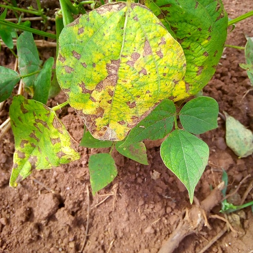
These images are from a project by the Artificial Intelligence Lab at Makerere University. This project identifies disease among bean crops in Uganda using image classification. Plants are classified into one of three possible categories:
Healthy
Infected with bean rust
Infected with angular leaf spot diseases
Begin by looking at the images themselves.
Open the bean_images_train folder.
Observe how the nearly 500 images are divided into three subfolders by class: healthy, bean_rust, and angular_leaf_spot.
Do the same for the bean_images_test folder, which you’ll use to test the model after training.

Fine-tune a pre-trained image classification model#
Now train a model to classify these images!
Extract image metadata into a dataset#
Before creating an image classifier, you need to build a tabular dataset including the file path for each image. The dataset also will include the class or target for each image.
You’ll do this using the List Folder Contents recipe, which lists all files in a folder, their file paths, and other information.
From the Flow, select the bean_images_train folder.
In the Actions panel, select the List Contents recipe from the menu of visual recipes.
Leaving the default output name, click Create Recipe.

In the recipe Settings tab, click + Add Level Mapping.
Set the Folder level to
1and the Column name totarget.This creates a column called target that contains the name of the folder where each image is located, which is the image’s category, or class.
Click Run to execute the recipe, and then open the output dataset when finished.

The resulting dataset bean_images_train_files contains 492 rows with the name and file path of each image, along with a column called target where each image is labeled as healthy, bean_rust, or angular_leaf_spot.

Create an image classification task#
In this section, you’ll create a model in the Lab (a fine-tuned version of a pre-trained model) before deploying it to the Flow.
In the Flow, select the bean_images_train_files dataset.
In the right panel, navigate to the Lab.
Among Visual ML tasks, select Image Classification.
Select target as the model’s target, or the column the model will try to predict.
Select bean_images_train as the image folder holding the training images.
Click Create.

Review the model’s target and test split#
Before training the model in the Lab, review the input and settings in the Design tab.
In the Basic > Target panel, confirm the selections for the target column, path column, and image location.
Under Target classes, filter the classes, and click on a few images to browse the training data.
Confirm the settings in the Train / Test Set panel.
Dataiku automatically split the images into training and validation sets so the model can continually test its performance during the training phase.

Tip
The Train / Test Set panel also contains sampling settings, which you might want to change when using larger datasets!
Choose a pre-trained model#
Dataiku provides three pre-trained neural networks that are widely used and considered industry standards. You can see these choices in the Design tab under Basic > Training > Model.
EfficientNet B0: Efficiency-oriented
EfficientNet B4: Balanced between efficiency and performance
EfficientNet B7: Performance-oriented
Balanced (EfficientNet B4) is the default model, and you’ll use it in this tutorial.
Navigate to the Training panel.
Confirm EfficientNet B4 is selected as the pre-trained model.
Confirm that
0fine-tuned layers will be used. See the note below for details.Confirm Early stopping is selected so that the training of the model finishes quicker.
Set Early stopping patience to
3so that the model will stop cycling through images if it doesn’t detect any performance improvement after three cycles, or epochs.

Important
Convolutional neural networks (CNN) have many different layers that are pre-trained on millions of images.
Retraining the final layer or final few layers helps the model learn on your specific images. Dataiku’s models always retrain the final layer, also called the classifier layer, to adapt it to the use case at hand.
The default setting of 0 under Number of fine-tuned layers means one layer will be fine-tuned. Inputting 1 here would mean that two layers will be fine-tuned, etc. Adding fine-tuned layers can increase performance, but also increases processing time.
Values for the Optimization and Fine-tuning sections are set to industry standards, and usually you won’t change these.
See also
Epochs and early stopping patience is discussed further in Concept | Optimization of image classification models.
Review the runtime environment#
Even with the relatively small set of images used for this tutorial, training an image classification or object detection model can take a long time. Without GPUs, the model training task here might take 30 to 90 minutes.
For real use cases, if your Dataiku instance is running on a server with a GPU, you can activate the GPU for training so the model can process much more quickly. Otherwise, the model will run on CPU, and the training will take longer. You may also execute the training in a container.
Navigate to the Advanced > Runtime environment panel.
Confirm a compatible code environment is selected, as described in the tutorial prerequisites.
If available, consider executing the model training in a container or activating GPUs.

Tip
If you are using Dataiku Cloud, for the purpose of this tutorial, you may want to select a container configuration, such as CPU-S-0.5-cpu-2Gb-Ram.
Train the model#
When you’re finished adjusting the model’s design, it’s time to train!
Click Train at the top right to begin training the model.
In the window, give your model a name or use the default, and select Train once more.

Note
Model training can take time depending on your computer’s memory capacity. During training, you can view the chart in the Result tab to track the performance of your model at the end of each epoch. The default metric to evaluate and maximize the model’s performance is ROC AUC, or area under the curve. Other metrics, such as Precision or Accuracy, are available in the Metric dropdown above the chart.
Interpret model metrics and explainability#
After training completes, you can assess the performance of a model before deploying it to the Flow.
Check model diagnostics#
When training a model, Dataiku automatically performs a series of model diagnostics, such as sanity checks for leakage detection or abnormal predictions.
These checks flagged two issues with the present model.
In the Results tab, hover over or click on the Diagnostics tag to see what issues have been raised.
Alternatively, click on the model on the left to open its report. Then navigate to the Training Information panel.

Tip
The sanity checks on the model suggest the training and testing sets are too small for robust performance. This was by design so that the model training would run faster for this tutorial. In most situations, you would want to provide more images!
View the model summary#
You can find an overview of the model in the Summary panel of the model report.
If you haven’t already done so, open the model report.
Navigate to the Summary tab.
Review the information, including the ROC AUC score.

Submit a new image#
You can upload new images directly into the model to classify them, view the probabilities of each class, and see how the algorithm is making a decision. This information can give you insight into how the algorithm works and potential ways to improve it.
Input a new image that the model hasn’t seen before.
Download the file
bean_disease_whatif.jpg, which is an image of plants infected with angular leaf spot.In the model report, navigate to the What if? panel.
Either drag the new image onto the screen, or click Browse For Images and find the image to upload.
The model should, hopefully, classify the image as having angular leaf spot disease, which is the correct classification.
Hover over each of the classes, and a heat map will appear to show which parts of the image the algorithm focused on to create the probabilities that the image falls into any of the three classes.

Tip
The panel reports that the probabilities of each class were close, suggesting that the model may be struggling to distinguish between classes. One way to fix this would be to add more images of angular leaf spot to help the model recognize that disease.
Important
If the prediction in What if is wrong, you might see that the algorithm is focusing on the wrong parts of an image. You can fine-tune an additional layer of your model or change the data augmentation to make the algorithm more robust, as you’ll explore in Concept | Optimization of image classification models.
Interpret the confusion matrix#
To further check the model’s performance, you can view a confusion matrix showing how many images were correctly and incorrectly classified during training. Your results may differ slightly from those shown here.
In the Explainability section, navigate to the Confusion matrix panel.
As one example, click on the portion of the matrix with a ground truth of angular_leaf_spot and predicted class of bean_rust.
Click on one of the images in this category to see how the similarity between bean rust and angular leaf spot may be leading to the model’s incorrect predictions.
Explore other results in the confusion matrix.

Review the density chart#
Another useful measure of performance is the density chart, which illustrates how the model succeeds in recognizing the classes.
In the Performance section, navigate to the Density chart panel.
View density functions for each class by choosing them from the dropdown menu in the top left of the chart.

Important
The two curves on the chart show the probability density of images that belong to the observed class vs. rows that don’t.
The blue density function shows the probability that an image wasn’t healthy.
The orange density function on the right shows the probability an image was healthy.
Ideally, the two density functions are fully separated: the farther apart the curves, the better a model performed.
Classify new images with the model#
Thus far, you’ve trained the model, viewed various metrics, and optionally fine-tuned and retrained the model. Now you can use the model to classify a batch of images it hasn’t seen before.
For purposes of this tutorial, you’ll use labeled images. This can help further test the performance of the model. However, you also could input unlabeled images with unknown targets to make useful predictions.
Deploy the model to the Flow#
Now that you’ve reviewed performance of the model, you can deploy it from the Lab to the Flow. That way you can use it to make predictions on new images (or further test the performance of the model, as is the case here).
From the model report, click Deploy in the top right corner.
Click Create, and find the training recipe and model added to the Flow.

Tip
You can find a model in the Lab at any time in two ways:
The ML (
 ) menu (
g+a) in the top navigation bar.The training dataset’s Lab (
 ) tab in the right panel in the Flow.
Extract test image metadata into a dataset#
Before you can make predictions, you need to create a tabular dataset with the file path and target information, similar to the one built for the training set.
Repeat those same steps here.
From the Flow, select the bean_images_test folder.
In the Actions panel, select the List Contents recipe from the menu of visual recipes.
Leaving the default output name, click Create Recipe.

In the recipe Settings tab, click + Add Level Mapping.
Set the Folder level to
1and the Column name totarget.Click Run to execute the recipe, and then open the output dataset when finished.
Tip
You should have a dataset in the Flow called bean_images_test_files with information on each of the 82 test images.
Apply the model to new images#
Now you can apply the model to the new images in bean_images_test.
From the Flow, select the saved model and the bean_images_test_files dataset.
In the right panel, select Score.
Under Inputs, select bean_images_test as the managed folder containing the images.
Click Create Recipe.

On the recipe’s Settings tab, leave the default batch size of 2, and click Run to execute the recipe.
When the recipe finishes running, open the dataset bean_disease_test_scored.
Note
The Score recipe’s Settings tab lets you change the batch size and edit how many images to score at a time. If available to you, you can also activate GPU to score faster.
Explore the scored image output#
When exploring the bean_disease_test_scored dataset, you’ll notice that in addition to the usual table and columns view, there is also a view for images.
While in the Images view of the Explore tab, browse through some images to see the prediction labels compared to their true target values.
Switch to the Table view.
Observe the four new columns (the probabilities for each class and the model’s prediction).

Tip
A quick scan of the probabilities reveals again that the model determined similar probabilities for each of the three classes on many images.
Create a confusion matrix#
In this case, you scored a dataset that included the ground truth for each image. Having the correct labels for each image, you can create a confusion matrix to get an overall picture of how the model performed on these new images. Note that you couldn’t do this without ground truth labels.
To create the matrix:
Navigate to the Charts tab.
From the chart type dropdown, choose Pivot table.
Drag the target column to the Rows field.
Drag the prediction column to the Columns field.
Drag Count of records to the Value field.
Click on the chart title, and name it
Confusion matrix.

Tip
Your results may vary, but the chart above shows the model did a good job of predicting the healthy and diseased plants!
Next steps#
Congratulations on building your first image classification model in Dataiku! You’re ready to create a new model on your own images.
See also
The reference documentation has more information on working with images.
To learn how to build object detection models in Dataiku, see Tutorial | Object detection without code.