
Concept | Individual prediction explanations#
Watch the video

Alongside partial dependence plots and subpopulation analysis, one of the most powerful features in the explainable AI toolkit is individual prediction explanations.
Note
The Individual explanations panel in Dataiku allows us to quickly get feature contributions for the most extreme cases.
In addition, we can also calculate individual explanations for every record in a dataset using the Score recipe.
These explanations make it easier to communicate the reasons for a specific prediction to business users and allow us to check for any potential biases in the model.
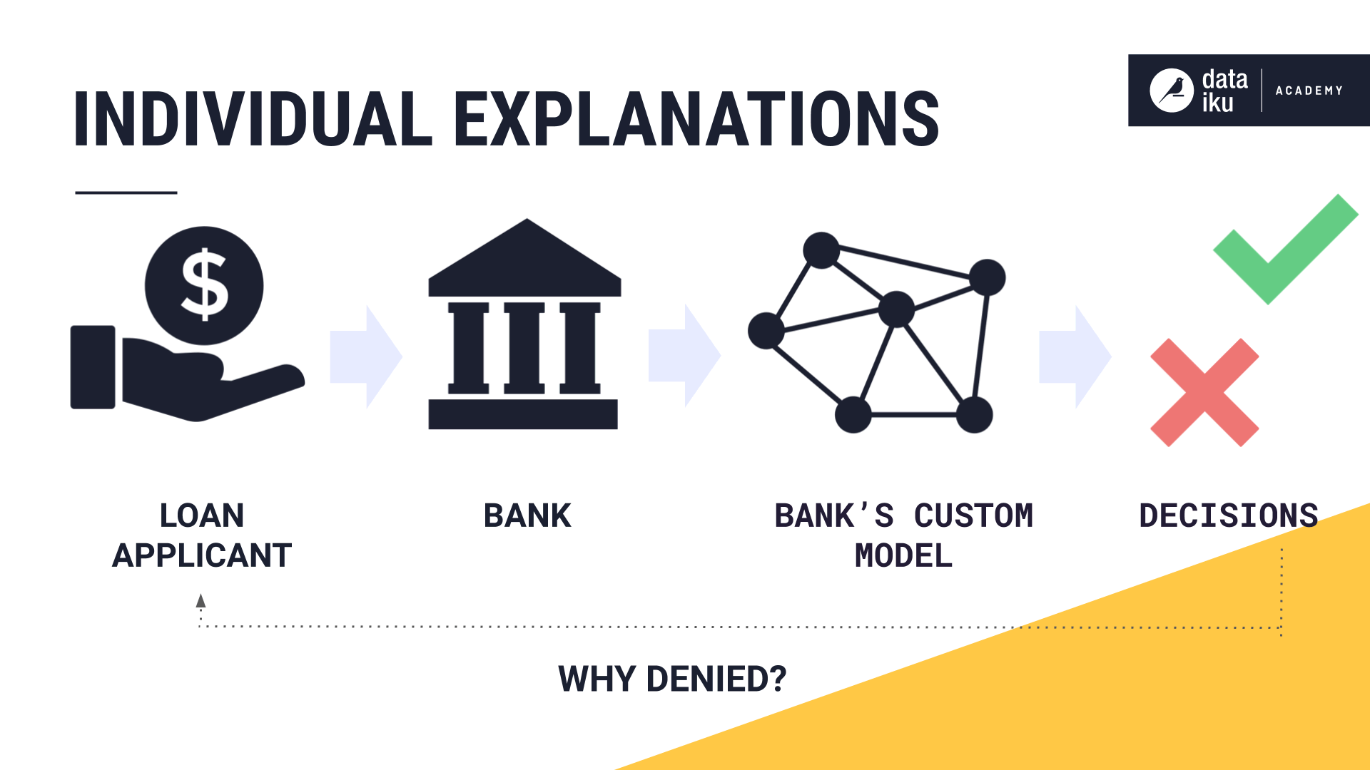
For example, banks often use custom algorithms to determine whether a client will default on a new loan. In the interest of transparency and fairness, banks are required to report the reasons why the client was denied a loan. To provide these answers, banks can use individual explanations to show what features were most important in the prediction for a specific client.
Let’s look closer at how to arrive at these explanations in Dataiku.
After training a prediction model, we can see the panel for Individual Explanations within the model report.
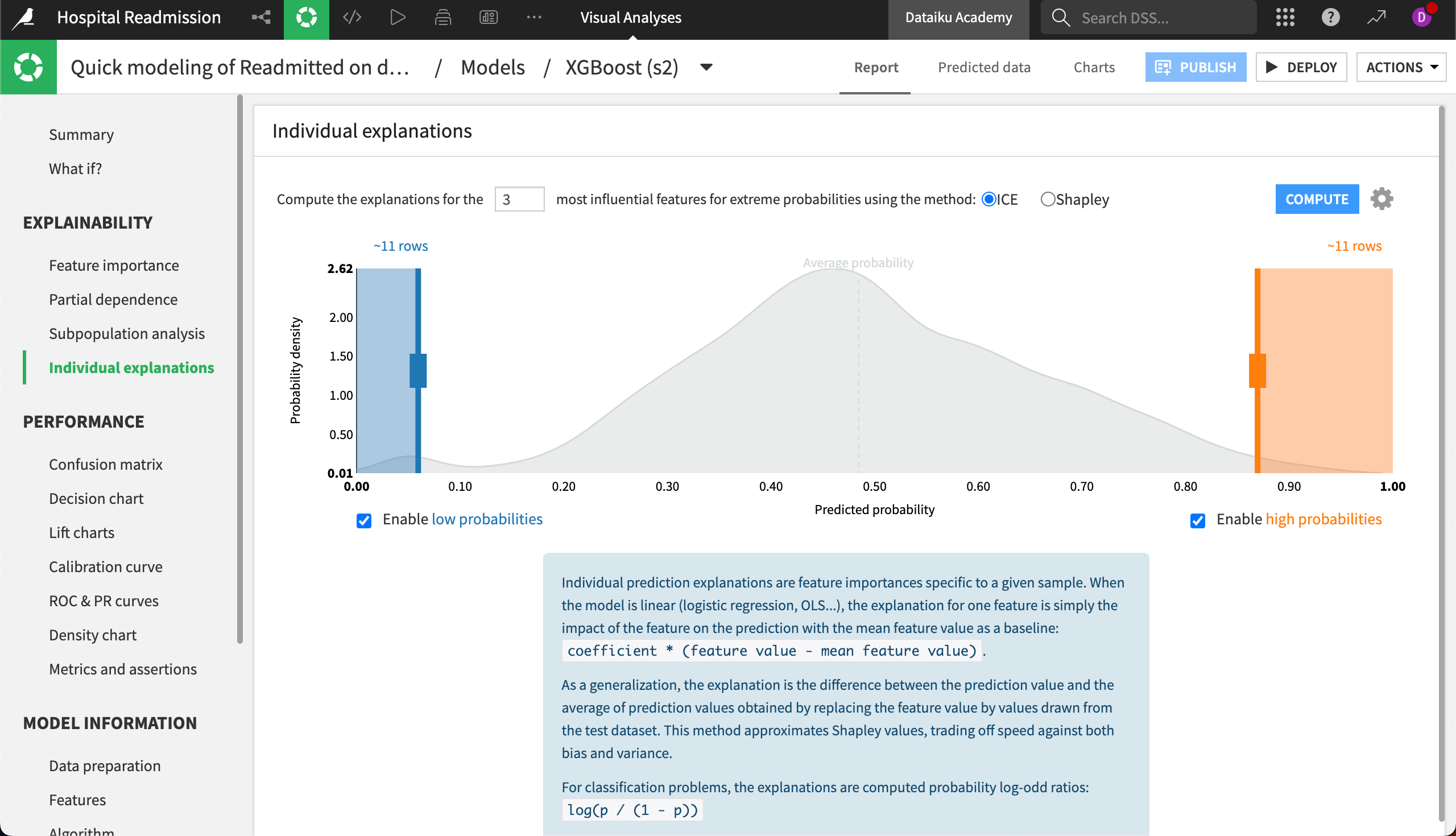
Here, we will see the probability distribution of all predictions in the test set. On the left side are those records that have the lowest predicted probabilities, and on the right are those with the highest. Moving the sliders will change the number of records for which explanations are calculated on each end of the probability distribution.
Above the probability distribution, we can choose the number of most influential features to generate in the explanation, and the computation method Dataiku should use. ICE will produce faster computations, while Shapley values may be more accurate. For more information, see the Computation methods section of the reference documentation.
By selecting Compute, Dataiku will generate explanations for our chosen records. Now we see a list of records underneath the probability distribution.
From the dropdown on the right-hand side, we can select which column of data is the individual record identifier, such as Encounter ID or Race. On the left side, we will see the record with the lowest predicted probability.
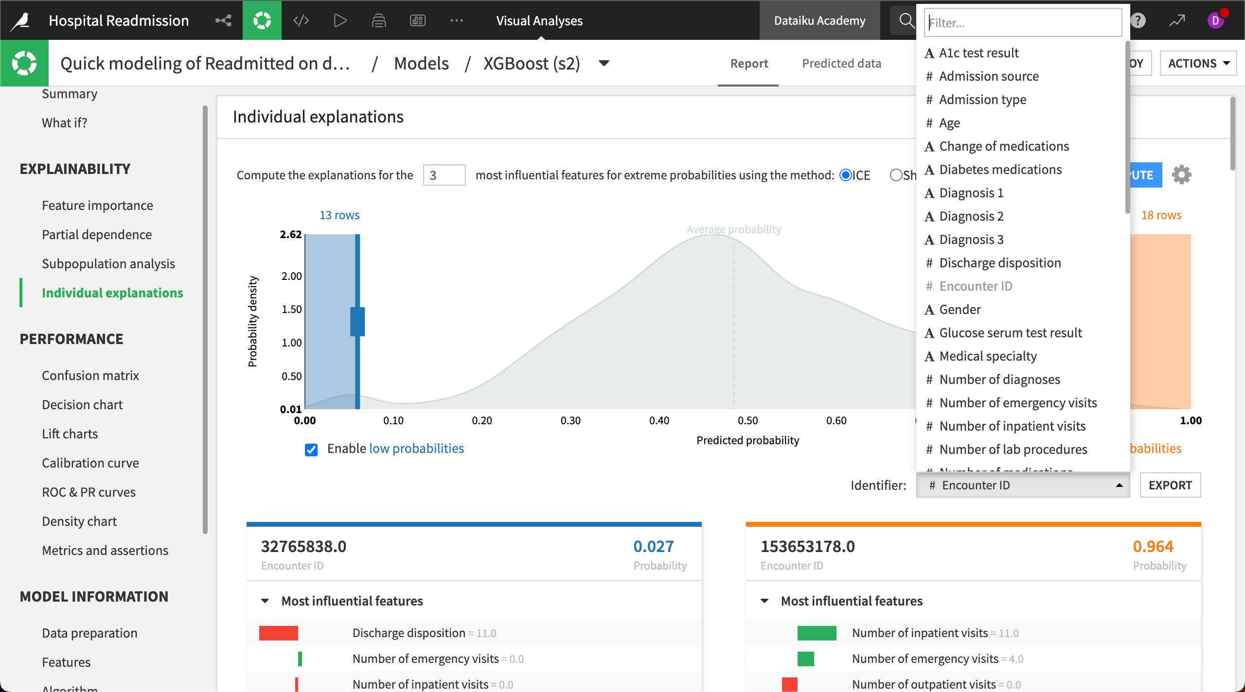
The three most influential features behind the model’s prediction for the first record in this example are Discharge disposition, Number of emergency visits, and Number of inpatient visits.
Each feature has a bar showing the direction and magnitude of influence. In this case, all three features have a negative influence on the prediction.
In scanning the results, it may become clear that the most influential features aren’t identical across all records. Seeing these differences across the data gives us an opportunity to investigate potential biases in the model.