
How-to | Animate charts#
Animating a chart in Dataiku lets you explore how your data changes as you move across the values of a selected variable, making it easier to identify trends, cycles, or anomalies in your dataset. Most chart types support animation.
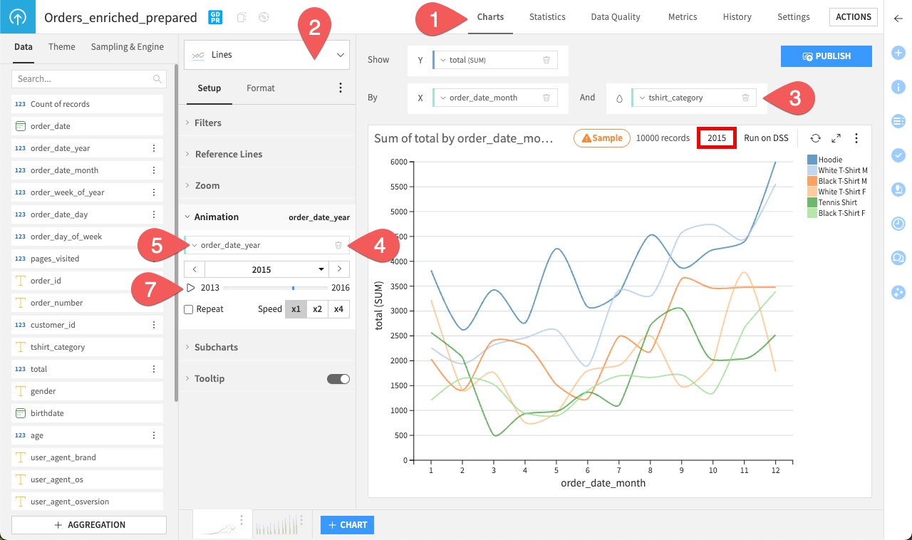
To animate a chart:
Open a dataset and navigate to the Charts tab (or type
g+v).Select a chart type such as Lines or Vertical bars.
Configure the chart axes with your variables of interest.
Enable animation by dragging a variable into the Animation field. For best results, use a variable with a meaningful progression, such as dates or categories.
If you want to adjust how the animation groups values, open the dropdown next to the animated variable and choose the Grouping that best suits your needs.
Use the animation controls to set the range of values, adjust speed, or enable looping.
Click the play button to preview your animated chart.
Tip
When publishing an animated chart to Dashboards, you can turn off autoplay so that viewers can control the animation themselves.