
Tutorial | Charts#
Charts are key tools for visualizing data. Let’s explore how to use these native tools in Dataiku!
Get started#
Objectives#
In this tutorial, you will:
Create charts, including editing display labels and formatting axes.
Filter your chart.
Prerequisites#
Dataiku 12.0 or later.
A basic level of knowledge about Dataiku is helpful. If you’ve never used Dataiku before, try the Core Designer learning path or a Quick Start tutorial!
Create the project#
From the Dataiku Design homepage, click + New Project.
Select Learning projects.
Search for and select Charts.
If needed, change the folder into which the project will be installed, and click Create.
From the project homepage, click Go to Flow (or type
g+f).
Note
You can also download the starter project from this website and import it as a ZIP file.
Use case summary#
This project focuses on a simplified credit card fraud detection use case. Using data about transactions, merchants, and cardholders, the Flow prepares datasets for further analysis. It involves preparing the data, just before applying a machine learning model to predict which transactions are likely to be authorized or fraudulent.
For the target variable, authorized_flag, a score of:
1 represents an authorized transaction.
0 is a transaction that failed authorization.
Create a chart#
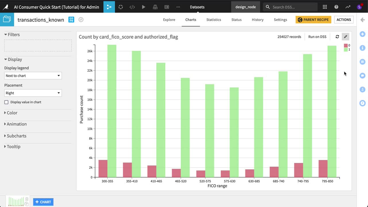
Let’s imagine that we’re interested in the relationship between FICO score (a measure of creditworthiness in the US) and whether a purchase is authorized or not. To explore this relationship, we’ll investigate using the transactions_known dataset, which would be the training data of possible Machine Learning models.
This video walks through all the steps described in this section. Play and pause the video as you read the instructions and build your chart.
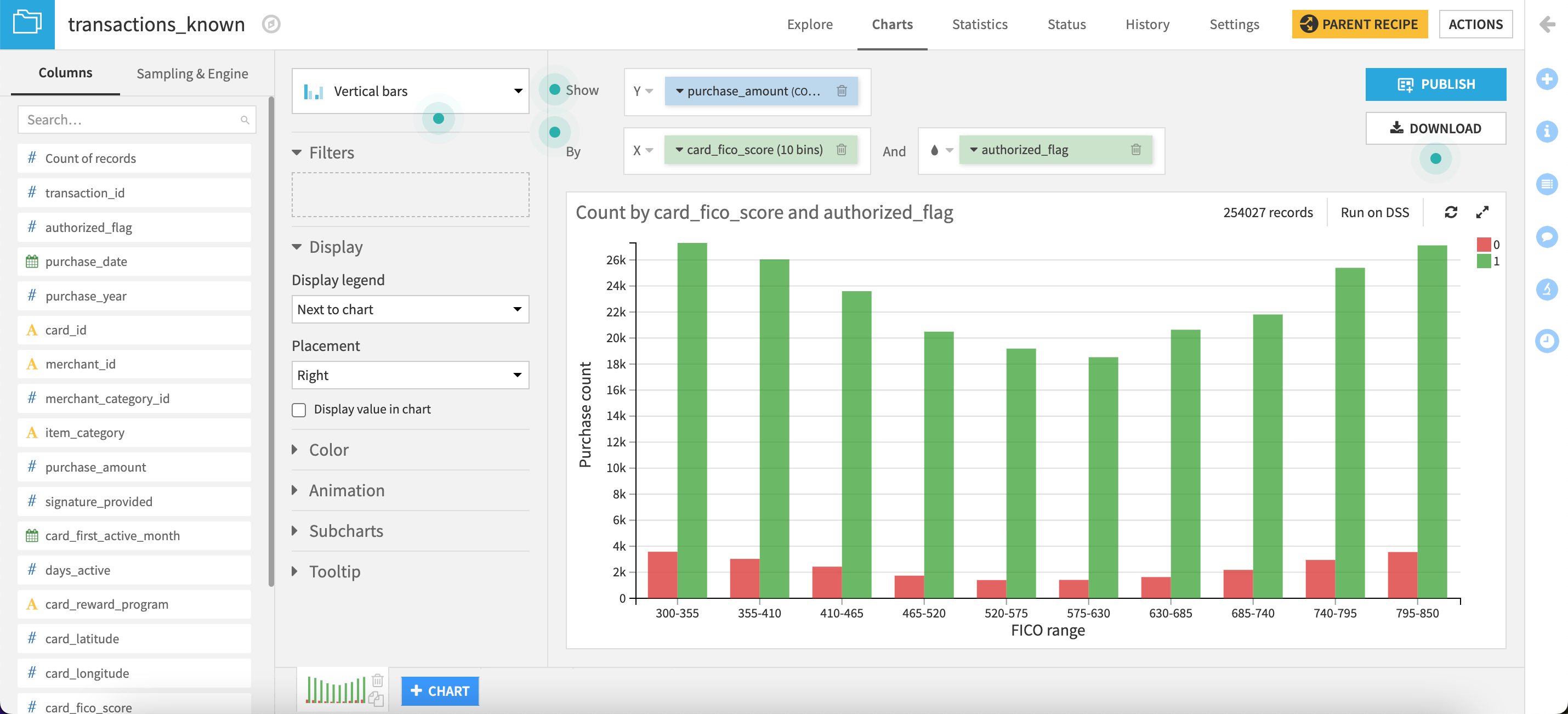
Create a vertical bar chart#
First, let’s create a vertical bar chart to explore the relationship between FICO score and purchase authorization.
Open the transactions_known dataset, and navigate to the Charts tab.
Drag purchase_amount to the Y axis field.
Drag card_fico_score to the X axis field.
Drag authorized_flag to the Color field.
Note
You can display the values on the charts and format them as you wish.
Refine axis labels#
The average purchase amount for an unauthorized purchase already seems much higher across all FICO scores, but let’s start refining the plot.
Click the authorized_flag dropdown to change the Binning mode to None, use raw values. Before investigating average purchases, let’s start with counts first.
Click the purchase_amount dropdown to change the Aggregation function to Count non-null.
Click to open the card_fico_score dropdown. Set the Generate one tick per bin dropdown to Yes.
We now have a basic chart plotting counts of authorized and unauthorized purchases by FICO range. Of course, though, this is just a sample.
Select the data sample#
Since the dataset is relatively small, let’s view the whole dataset instead of a sample.
In the Sampling & Engine tab on the left, uncheck Use same sample as explore.
Change the Sampling method to No sampling (whole data).
Save and refresh the sample.
We now have the full data in the chart.
Customize axis labels#
Let’s make the chart more presentable.
In the left panel, go to the Format tab.
Click the Y axis section, expand the Title panel, and provide the cleaner axis title
Purchase count.Expand the Values panel, and change Multiplier to Thousands.
Click the X axis section, and provide a more presentable axis title:
FICO range.
Edit the chart palette#
Do you remember what the values 0 and 1 represent? Let’s change the colors to make it easier to recall.
Click the color droplet (
 ) to the left of the authorized_flag dimension to adjust the palette.
Click on the colored circle to the left of the number, and change the 0 to red (for transactions that failed authorization).
Change the 1 to green (those that passed).
Not bad! As expected, we have relatively few unauthorized transactions compared to those authorized, and this holds true for every level of FICO range.
Note
You’ll notice that this chart uses the Theme default palette. As of Dataiku 14.0, you can configure reusable themes to ensure consistent colors, fonts, and layouts across all charts.
For more information about theming, refer to Visualization themes.
Filter the chart#
Dataiku allows you to filter your charts on the data from one or several columns from the source dataset.
Add a filter to your chart#
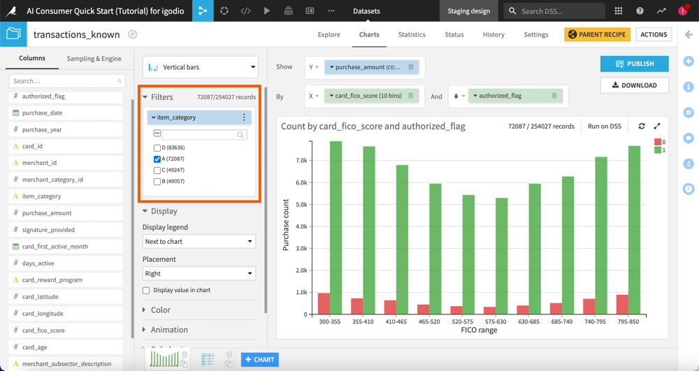
Let’s say you want to explore the relationship between FICO score and whether a purchase is authorized or not, only for specific item categories.
This means that you need to add a filter on the item_category column.
To do so, follow the steps below:
In the left panel, go to the Setup tab.
Under Filters, drag and drop the item_category column. By default, all four categories (A, B, C and D) are listed and selected.
Deselect categories B, C and D.
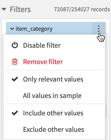
Use filter options#
All filters have an option menu in their headers that provides options based on the filter type:
For alphanumeric and date part types:
For numeric types:
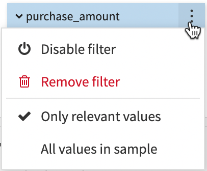
To edit, disable or remove a filter:
Click the More options menu in the filter header.
Try out any options.
The list below describes the different options:
Disable filter: Disables the filter so that it doesn’t impact the chart.
Rename filter: Renames the filter to an appropriate name.
Remove filter: Removes the filter from the Filters section.
Sort by: Sorts the filter values based on predefined rules.
Range of values / Single value / Multiple values / Custom: Allows you to restrict the filter value selection based on the chosen mode.
Only relevant values / All values in sample: These options are relevant when you have several filters in the Filters section. So, when you have 2 or more filters defined:
each filter with the All values in sample option enabled will display all values,
each filter with the Only relevant values option enabled will only display the values that are relevant based on other filters selection. By default, Dataiku enables the Only relevant values option.
Include other values: When you change the sampling method or update the dataset, if you select this option, the filter adds the new values and checks them to enable them.
Exclude other values: When you change the sampling method or update the dataset, if you select this option, the filter adds the new values but uncheck them to disable them.
Next steps#
Congratulations! You’ve just built and customized your first chart. Now, feel free to explore other chart types and see what works best for your data!
You can learn more about charts in the following spaces: