
Visualize data#
In this section, we’ll create a few charts on the facies_with_labels_prepared dataset to understand the data a little better.
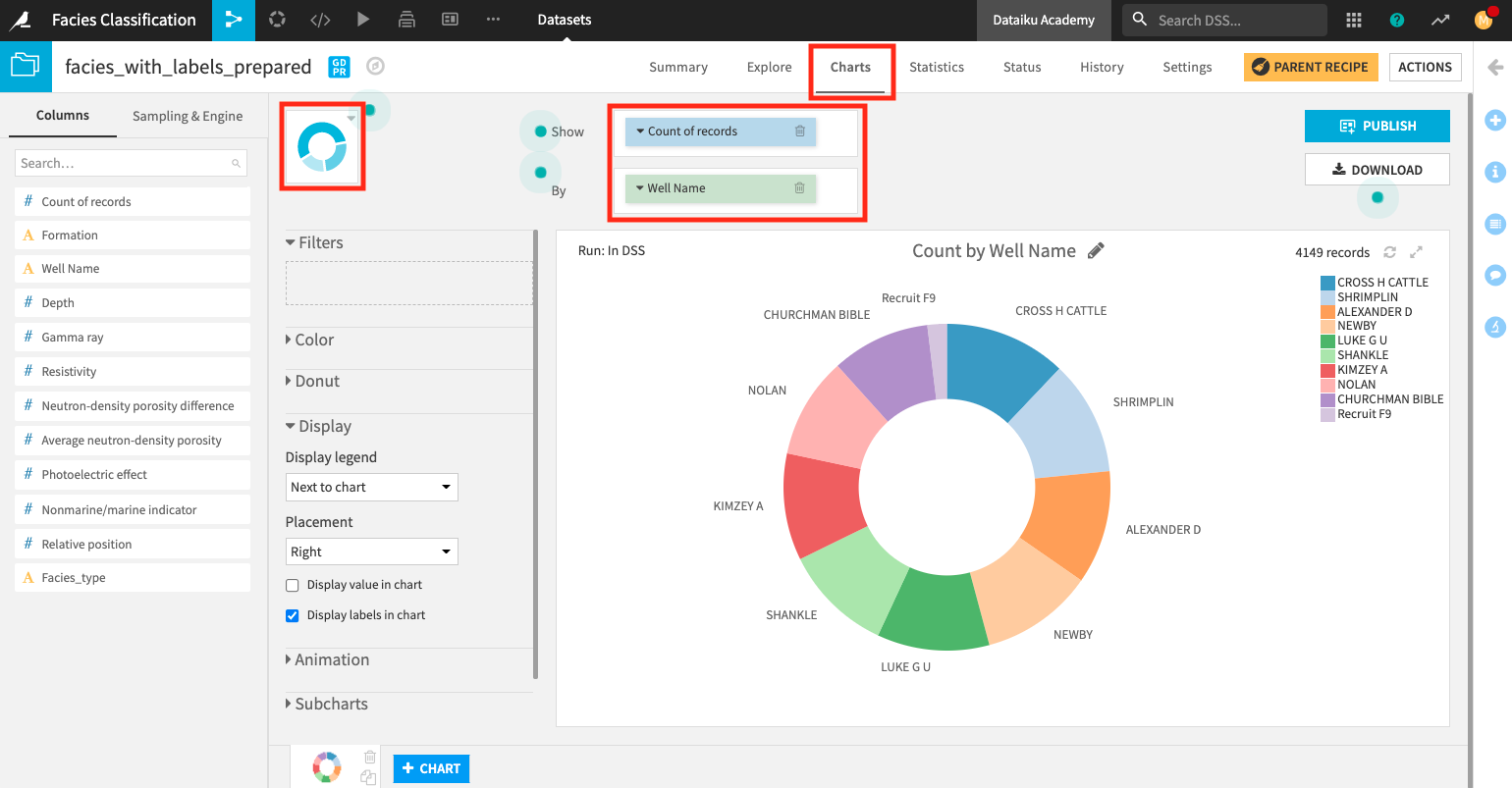
Create a donut chart#
We’ll use a donut chart to visualize the number of records for each well in the dataset.
From the Flow, open the facies_with_labels_prepared dataset and go to the Charts tab.
Change the chart type selection to a Donut chart.
Create a donut chart that shows Count of records by Well Name.
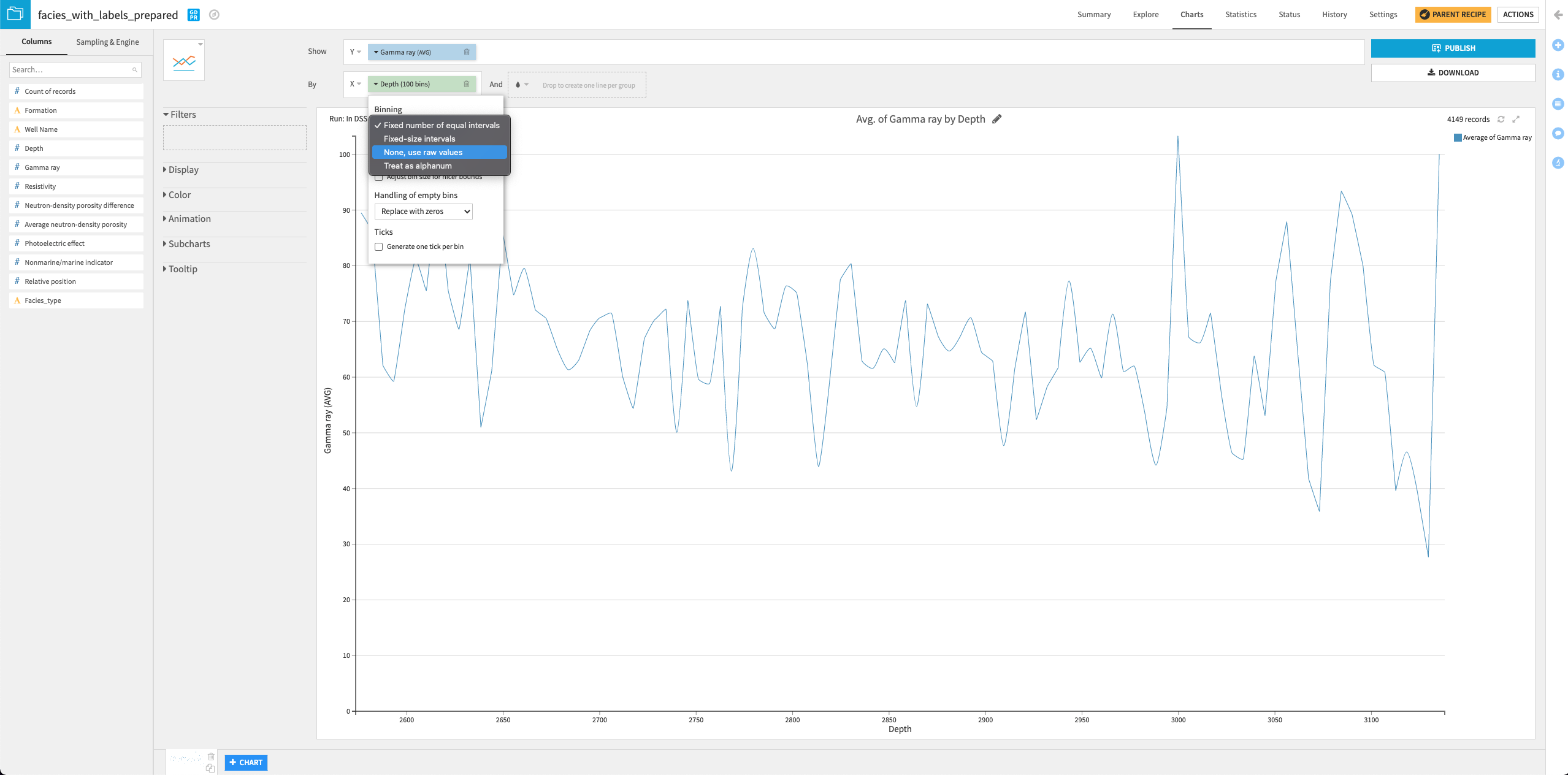
Create a line chart#
Let’s now create a second chart, a line chart, to examine how the gamma ray values vary with a well’s depth.
Click the + Chart button at the bottom of the screen to create a second chart.
Change the chart type selection to a Lines chart.
Assign the column Depth to the “X-axis” and the column Gamma ray to the “Y-axis”.
Click the arrow next to “Depth” in the X field to change the “Binning” to None, use raw values.
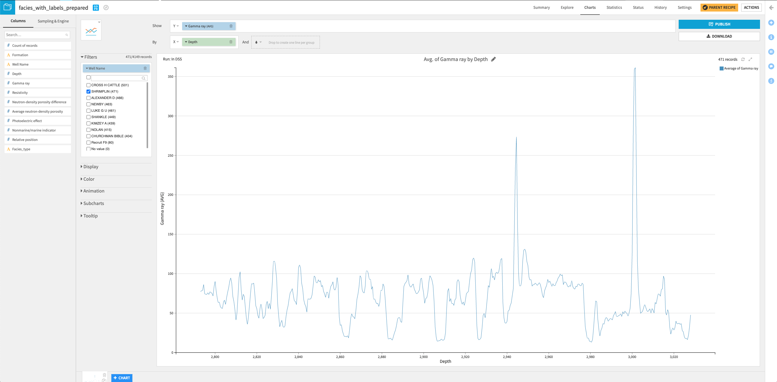
Drag the column Well Name into the “Filters” box and select only the “SHRIMPLIN” well.
You can try your hands at creating some other interesting charts to visualize the data!