
Tutorial | No-code maps#
Get started#
Dataiku has a drag and drop interface for creating a wide range of data visualizations — including maps. Let’s walk through how to create these maps without any code.
Objectives#
In this tutorial, you will:
Create a variety of maps from geographic data.
Prerequisites#
Dataiku 12.0 or later.
Reverse geocoding / Admin maps plugin (included by default on Dataiku Cloud).
Basic knowledge of Dataiku (Core Designer level or equivalent).
Create the project#
From the Dataiku Design homepage, click + New Project.
Select Learning projects.
Search for and select No-code Maps.
If needed, change the folder into which the project will be installed, and click Install.
From the project homepage, click Go to Flow (or type
g+f).
From the Dataiku Design homepage, click + New Project.
Select DSS tutorials.
Filter by Core Designer.
Select No-code Maps.
From the project homepage, click Go to Flow (or type
g+f).
Note
You can also download the starter project from this website and import it as a zip file.
You’ll next want to build the Flow.
Click Flow Actions at the bottom right of the Flow.
Click Build all.
Keep the default settings and click Build.
Use case summary#
The project has three data sources:
tx |
Each row is a unique credit card transaction that has been either been authorized (a score of 1 in the authorized_flag column) or flagged for potential fraud (a score of 0). |
cardholders |
Each row is the latitude and longitude coordinates of a unique credit card holder. |
merchants |
Each row is the latitude and longitude coordinates of a unique merchant, all of which are gas stations. |
The Flow joins a small random sample of these three datasets together so that every record in tx_joined is a unique transaction, enriched with data about the location of credit card holders and merchants for that transaction.
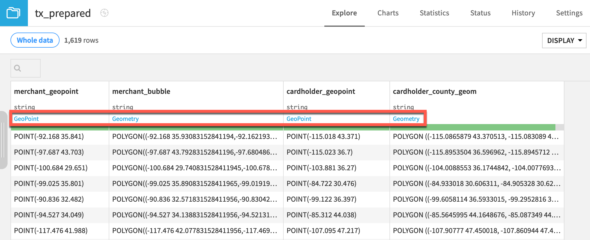
Confirm geographic data types#
The tx_prepared dataset contains four columns of geographic data. Although all columns are stored as strings in this case, Dataiku has auto-detected the meanings to be either GeoPoint or geometry. This designation enables us to use the map chart types in the Charts tab.
Open the tx_prepared dataset, and observe the meanings detected for the geographic data columns: merchant_geopoint, merchant_bubble, cardholder_geopoint, and cardholder_county_geom.
Tip
If interested in how to create these kinds of geographic columns, see Tutorial | Geographic processors.
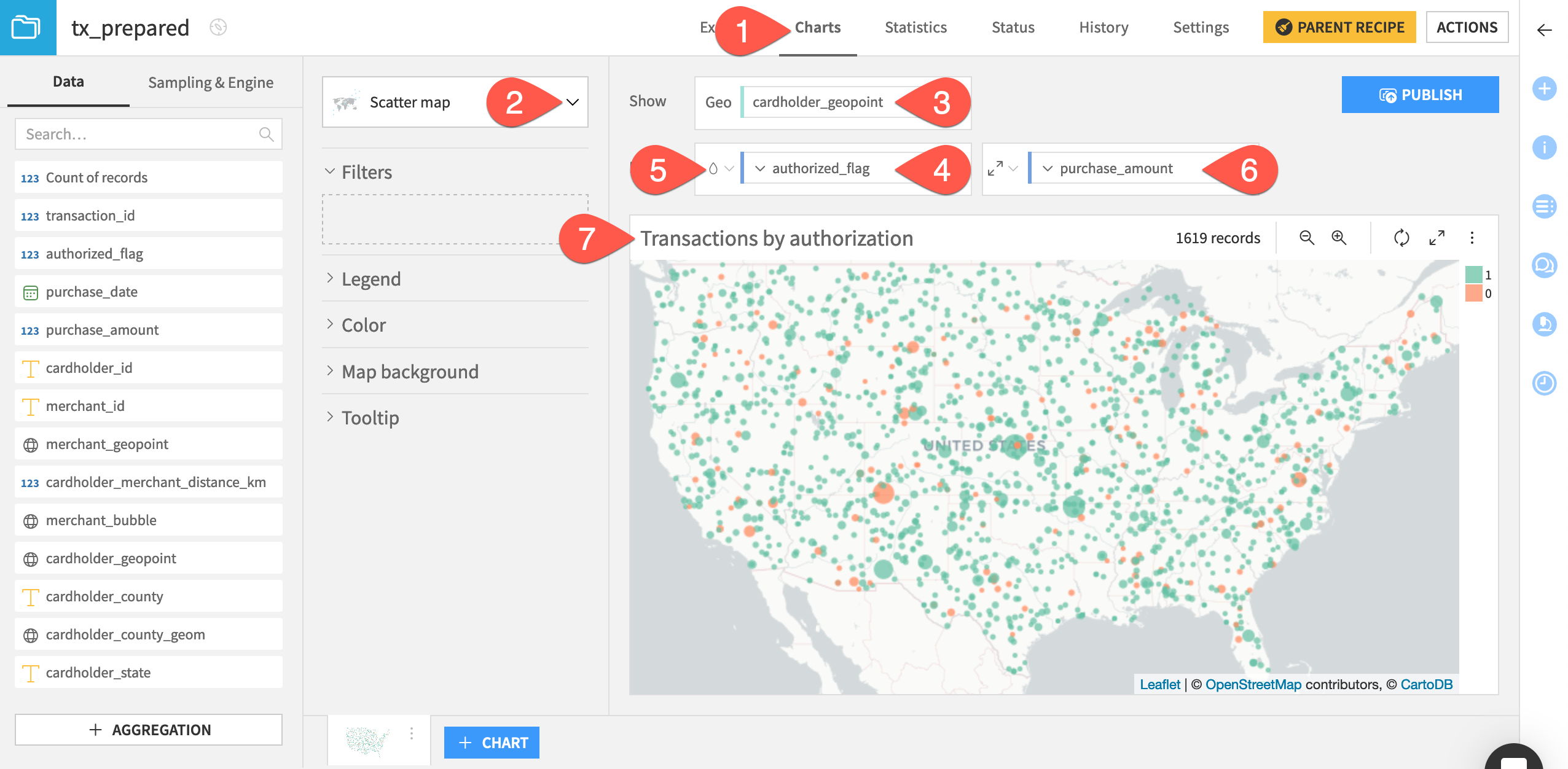
Create a scatter map#
The scatter map is one of the best options to get started visualizing geographic data because it’s a straightforward way to plot points on a map.
Let’s try to visualize the locations of credit card holders, and whether the model authorized the transactions.
Navigate to the Charts tab of the tx_prepared dataset.
Open the chart picker on the left, and select the Scatter map.
Drag cardholder_geopoint from the left to the Geo field.
Drag authorized_flag to the color droplet (
 ) field. Open the authorized_flag dropdown, and check the box Treat as alphanum.
Click the color droplet, and change the palette to Set 2.
Drag purchase_amount to the radius field (
 ) to the right of the color field to scale the size of the bubbles. Click the radius setting at the left of the field, and reduce the base to
 2.Rename the chart
Transactions by authorization.
Tip
This is a small dataset. To visualize patterns among a larger number of points, you may want to try a density map.
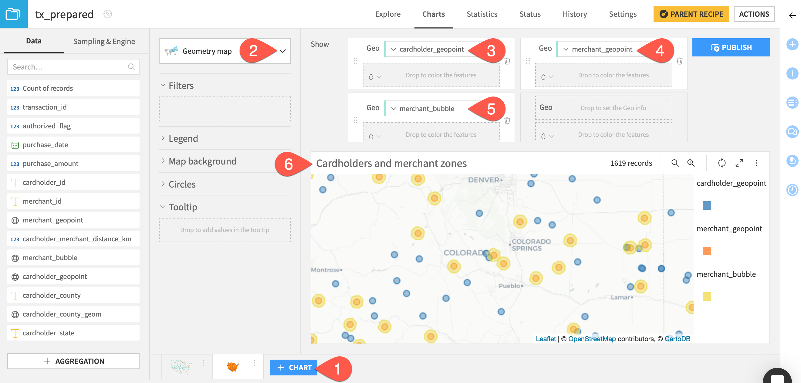
Create a geometry map#
To simultaneously visualize multiple sets of geographic columns, you can use a geometry map. This time, let’s try to visualize not just the cardholders, but also the merchants (and the buffer area drawn around them).
Click + Chart at the bottom.
From the chart picker, select Geometry map.
As above, drag cardholder_geopoint to the Geo field.
Drag merchant_geopoint to the second Geo field. Open its corresponding color droplet, and change the merchant points to orange.
Drag merchant_bubble to the third Geo field. Change its color to yellow.
Rename the chart
Cardholders and merchant zones.Zoom in to explore which customers lie within a 10 kilometer radius of a merchant.
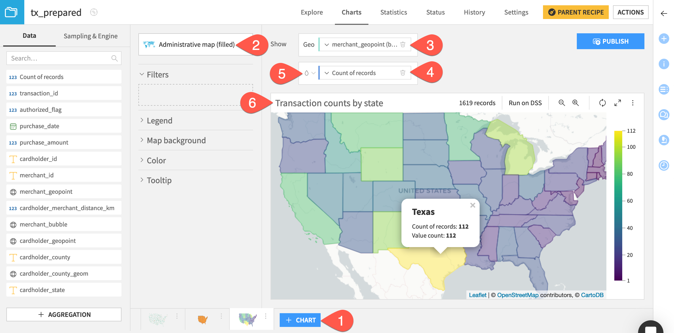
Create an administrative map#
Although this dataset has a column of county geometries, it’s not requires for the purpose of mapping. You can use administrative maps to visualize data within administrative boundaries — also known as a choropleth.
Filled administrative maps#
Let’s visualize the counts of transactions at the state level, assuming the merchant location as the place of the transaction.
Click + Chart at the bottom.
From the chart picker, select Administrative map (filled).
Drag merchant_geopoint to the Geo field. Open the field dropdown, and set the admin level to Region/State.
Drag Count of records to the Details field.
Open the color droplet (
), and change the palette to Viridis.Rename the chart
Transaction counts by state.
Tip
Instead of official administrative boundaries, you could also use a grid map to define an area of an arbitrary size and visualize counts within those boxes.
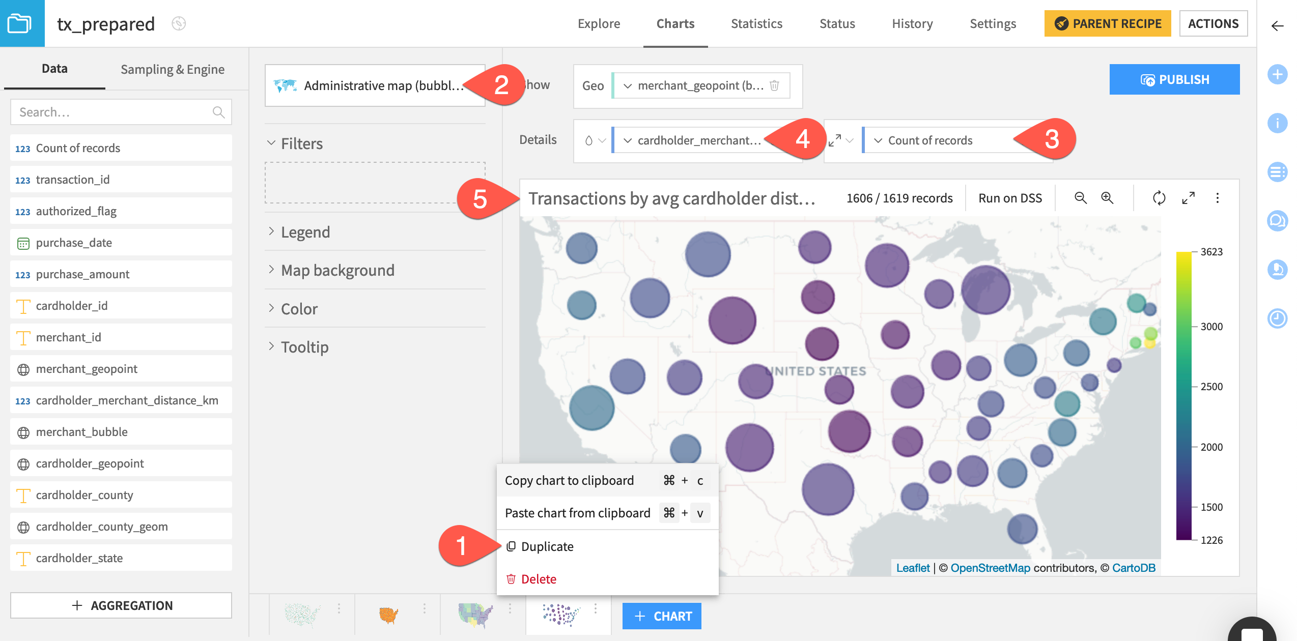
Bubble administrative maps#
By their nature, administrative boundaries can be squiggly and vary widely in area. Sometimes, you may want to aggregate by administrative boundaries, but visualize results in a more uniform way.
Let’s again visualize the counts of transactions in each state, but also plot the average distance between card holders and merchants for transactions within an administrative boundary.
At the bottom, click the vertical three dots (
 ) to open the options menu for the filled admin chart. Select Duplicate.
Change the chart picker to Administrative map (bubbles).
Shift the Count of records tile to the radius setting (
).Drag cardholder_merchant_distance_km to the vacant color droplet field.
Rename the chart
Transactions by avg cardholder distance.
Next steps#
Congratulations! You’ve built a range of maps for quick insights into a range of geographic data questions. You can polish these existing maps using filters, tooltips, and many other options. You can also try the density and grid maps not demonstrated here.
See also
For more information, see the reference documentation on Map Charts. For more resources on other types of charts, see the Knowledge Base.
Once you have prepared and visualized geographic data structures, you can move on to more advanced geographic operations. Try that next in Tutorial | Geo join recipe!
Tip
You can find this content (and more) by registering for the Dataiku Academy course, Geospatial Analytics. When ready, challenge yourself to earn a certification!