Create a dashboard#
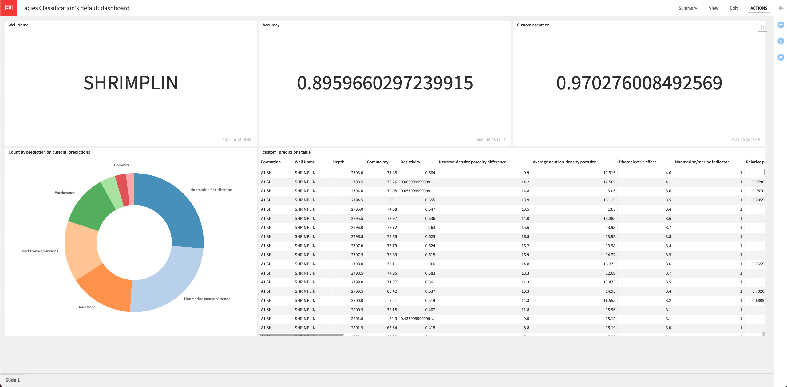
In this section, we’ll create a dashboard to expose our results. The dashboard will contain the following information:
Name of the well (“Shrimplin”) that we selected to use in the test dataset.
The accuracy of the latest deployed model.
The custom accuracy (using our custom scoring) of the latest deployed model.
The custom_predictions dataset that contains the predictions data and indicates whether the prediction is correct, based on information about the adjacent facies.
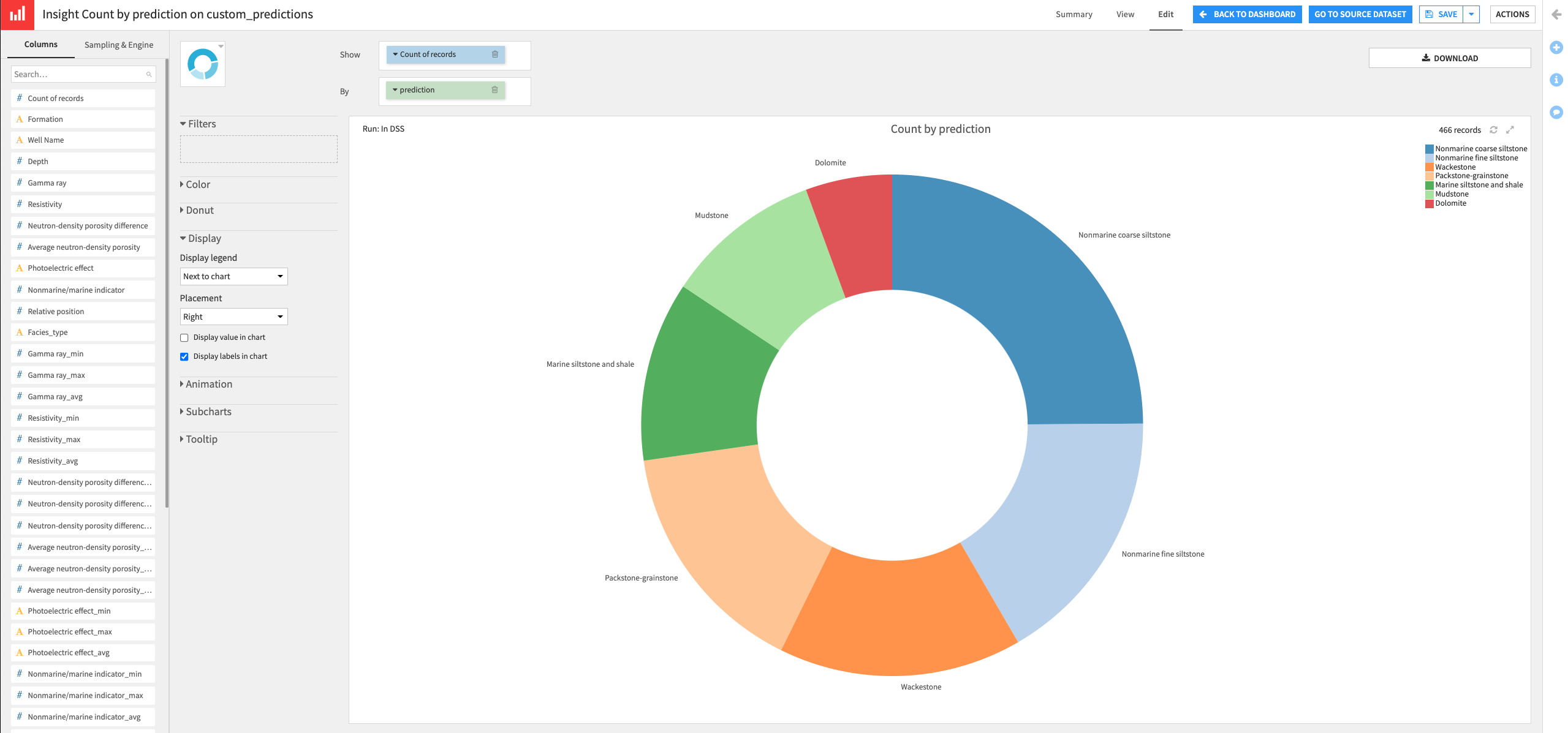
A donut chart of the proportion of each class predicted by the model
Create metrics#
Let’s start by creating three metrics to display the name of the well in the test dataset, the accuracy, and the custom accuracy of the deployed model.
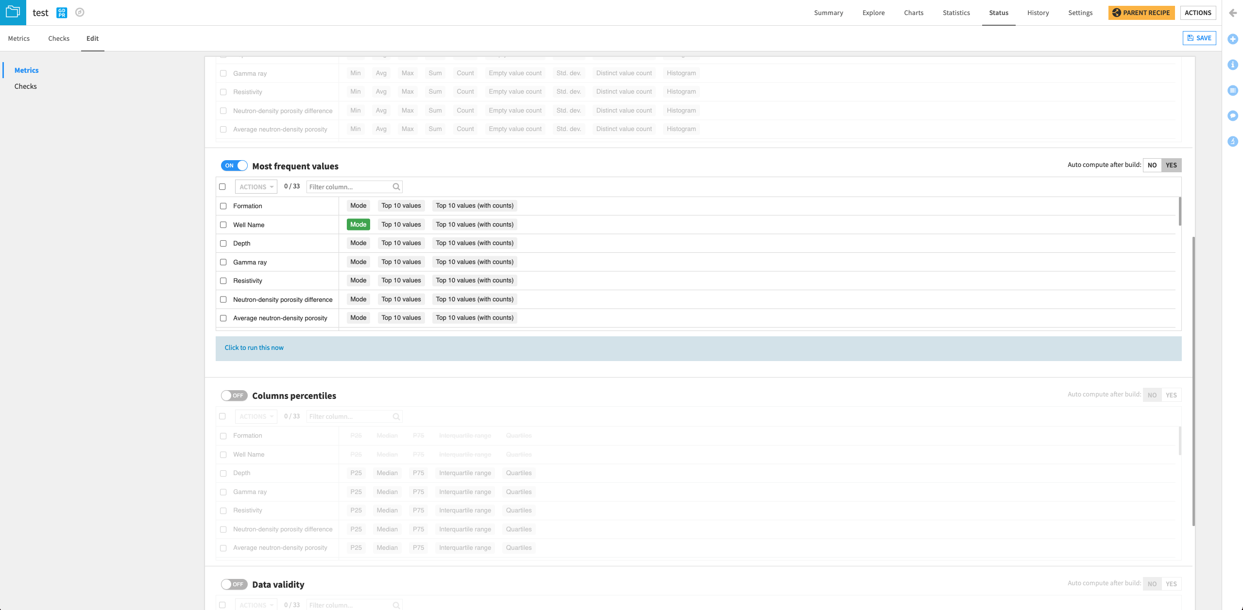
Display the well in the test dataset#
From the Flow, open the test dataset and go to its Status page.
Click the Edit tab.
Scroll to the “Most frequent values” section on the page and click the slider to enable the section.
Select Mode next to “Well Name”.
Click Yes next to the option to “Auto compute after build”.
Save your changes.
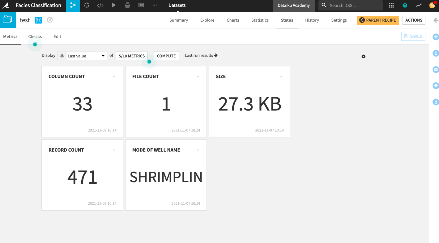
Go back to the Metrics tab.
Click the box that displays 4/10 Metrics.
In the “Metrics Display Settings”, click Mode of Well Name in the left column to move it into the right column (Metrics to display).
Click Save to display the new metric on the home screen.
Click Compute.
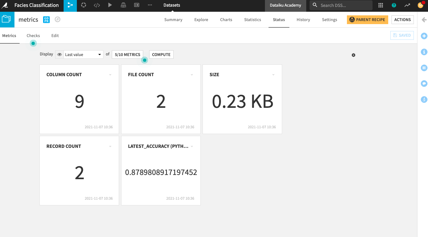
Display the latest accuracy of the deployed model#
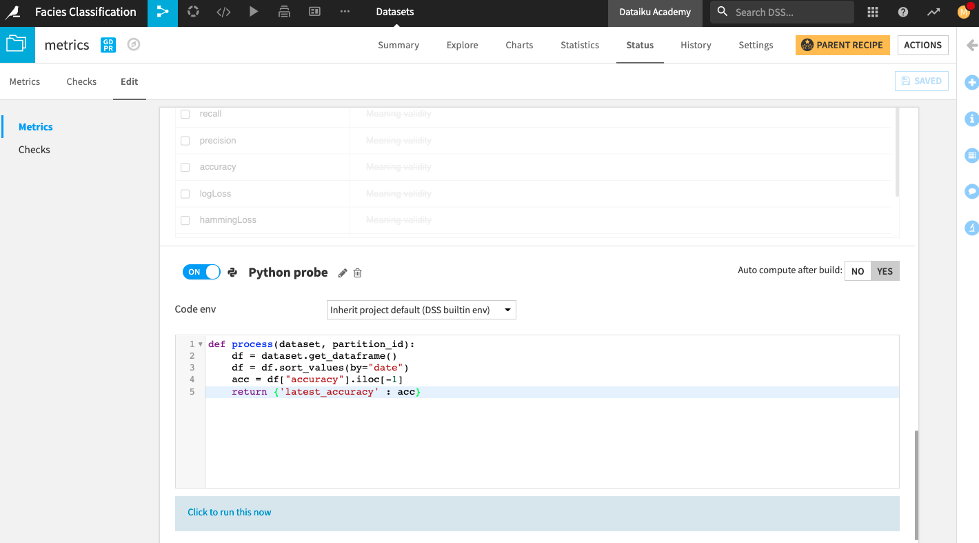
Go to the metrics dataset and go to its Status page.
Click the Edit tab.
We will create a custom Python probe that will return the latest value of the accuracy.
At the bottom of the page, click New Python Probe.
Click the slider next to the Python probe to enable it.
Replace the default code in the editor with:
def process(dataset, partition_id):
        df = dataset.get_dataframe()
        df = df.sort_values(by="date")
        acc = df["accuracy"].iloc[-1]
        return {'latest_accuracy' : acc}
Click Yes next to the option to “Auto compute after build”.
Save your changes.
Click the text below the editor: Click to run this now.
Click Run.
Add the new metric to the Metrics home screen.
Go back to the Metrics tab.
Click the box that displays 4/10 Metrics.
In the “Metrics Display Settings”, click latest_accuracy (Python probe) in the left column to move it into the right column (Metrics to display).
Click Save to display the new metric on the Status home screen.
Click Compute.
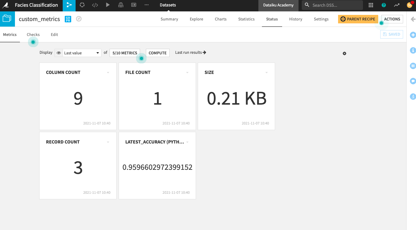
Display the custom accuracy of the deployed model#
Go to the custom_metrics dataset and repeat the same steps we just performed on the metrics dataset to create and display metrics on the Status home screen.
Create dashboard#
From the project’s top navigation bar, go to Dashboards (
 ).
).Open the existing default dashboard for the project.
Click the Edit tab to access the dashboard’s Edit mode.
Click the “plus” button in the bottom right of the page to add a new tile displaying the Well name to the dashboard.
Select the Metrics tile.
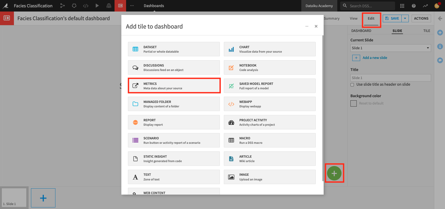
In the Metrics window, specify:
Type: Dataset
Source: test
Metric: Mode of Well Name
Insight name:
Well Name
Click Add.
Similarly, add a tile to display the latest_accuracy (Python probe) from the metrics dataset.
Name the insight
Accuracy.And add a tile to display the latest_accuracy (Python probe) from the custom_metrics dataset.
Name the insight
Custom Accuracy.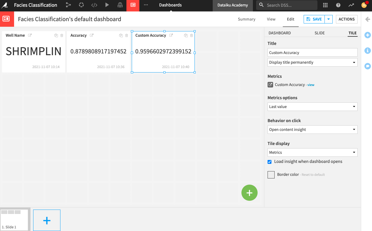
Add the custom_predictions dataset to the current page and name the insight
custom_predictions table.Finally, add a chart to the dashboard.
Specify custom_predictions as the “Source dataset”.
The Chart interface opens up.
Create a donut chart that shows the Count of records by prediction.
Click Save, then click Back to Dashboard.
You can rearrange your tiles to your liking. Then click Save.
Click the View tab to explore your dashboard.