
Tutorial | Facies classification#
Note
This content was last updated using Dataiku 11.
Overview#
Business case#
Facies are uniform sedimentary bodies of rock that are distinguishable enough from each other based on physical characteristics like sedimentary structure and grain sizes.
The ability to classify facies based on their physical characteristics is of great importance in the oil & gas industry. For example, identifying a succession of facies with sandstone units might be indicative of a good reservoir, as these sandstone units tend to have high permeability and porosity which are ideal conditions to store hydrocarbons.
Our goal is to increase knowledge of the subsurface and estimate reservoir capacity. To this end, our data team will estimate the quantity of hydrocarbons in a reservoir by observing the lateral extent and geometries of the facies containing the reservoir units.
Input data#
This use case requires the following two input data sources, available as downloadable archives at the links below:
The facies_vector_screen.csv file contains information about the facies characteristics.
The facies_labels.csv file contains a lookup table mapping the name of each facies type to a number.
These datasets come from the paper Comparison of four approaches to a rock facies classification problem by Dubois et.al.
Prerequisites#
To understand the workflow of this use case, you should be familiar with:
The concepts covered in the recommended courses of the Core Designer learning path
The Windows recipe
Technical requirements#
Have access to a Dataiku instance — that’s it!
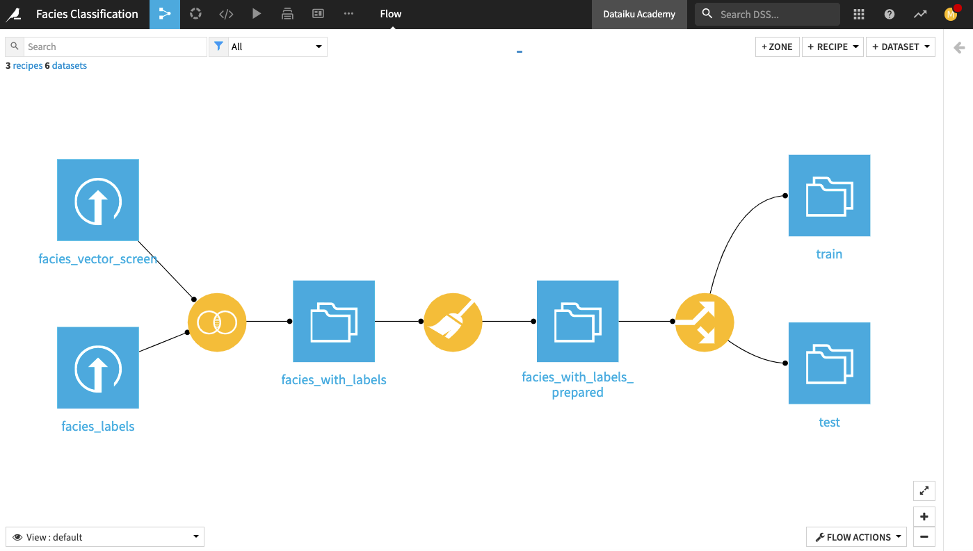
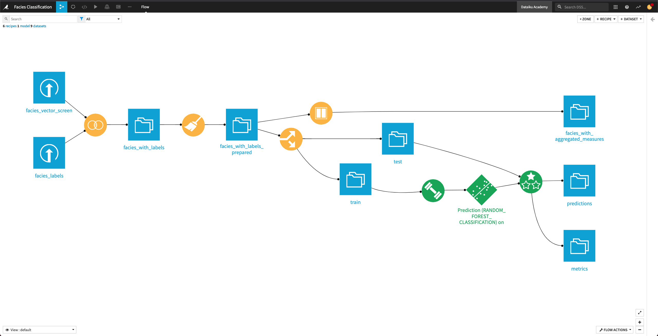
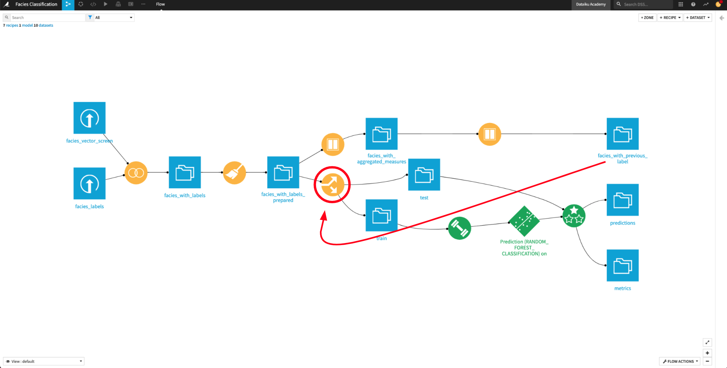
Workflow overview#
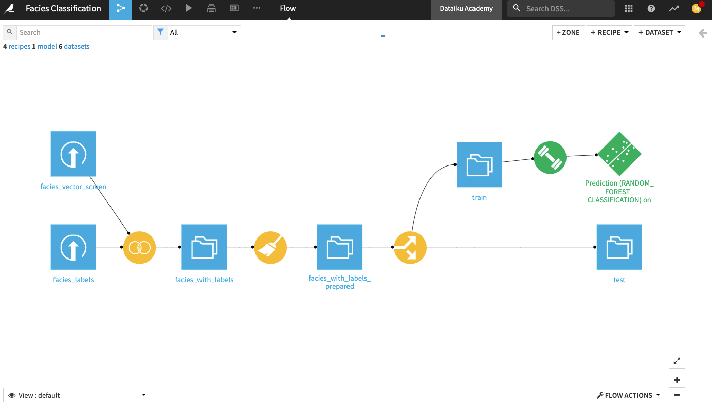
The final Dataiku pipeline is shown below. You can also follow along with the completed project in the Dataiku gallery.
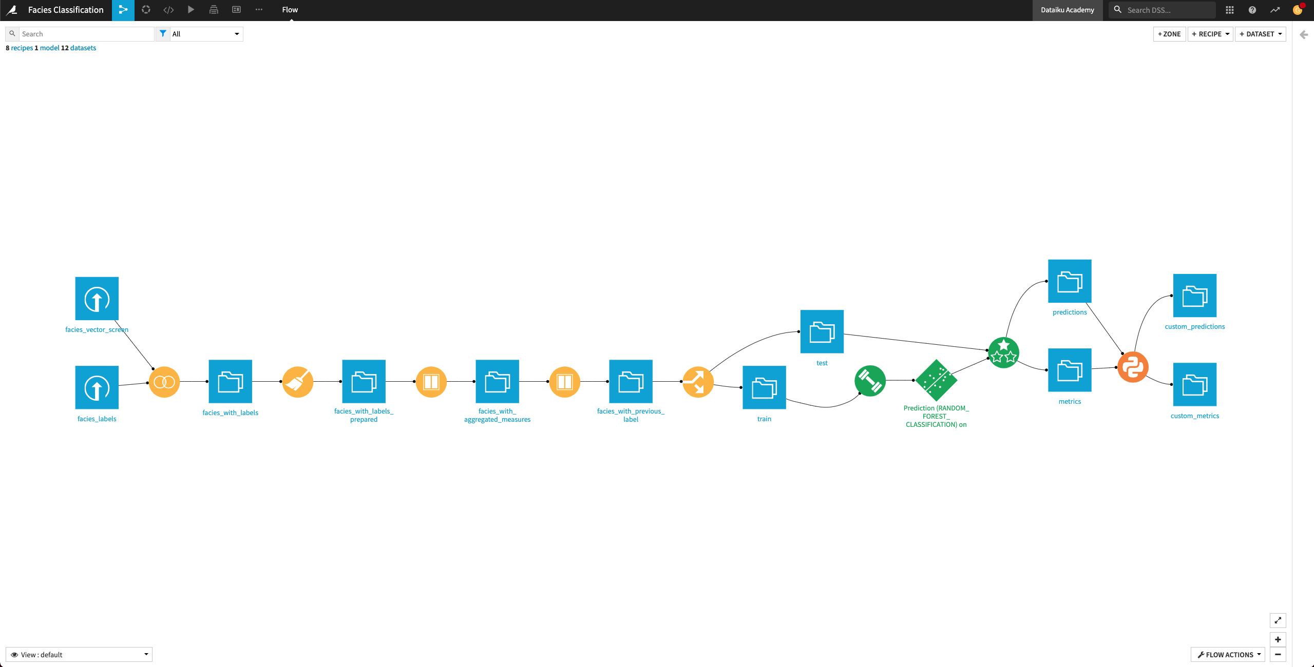
The Flow has the following high-level steps:
Upload, join, and clean the datasets.
Train and evaluate a machine learning model.
Generate features and use them to retrain the model.
Perform custom model scoring.
Publish insights to a dashboard.
Create a Dataiku app.
Prepare input data#
Create a new blank Dataiku project and name it
Facies classification.
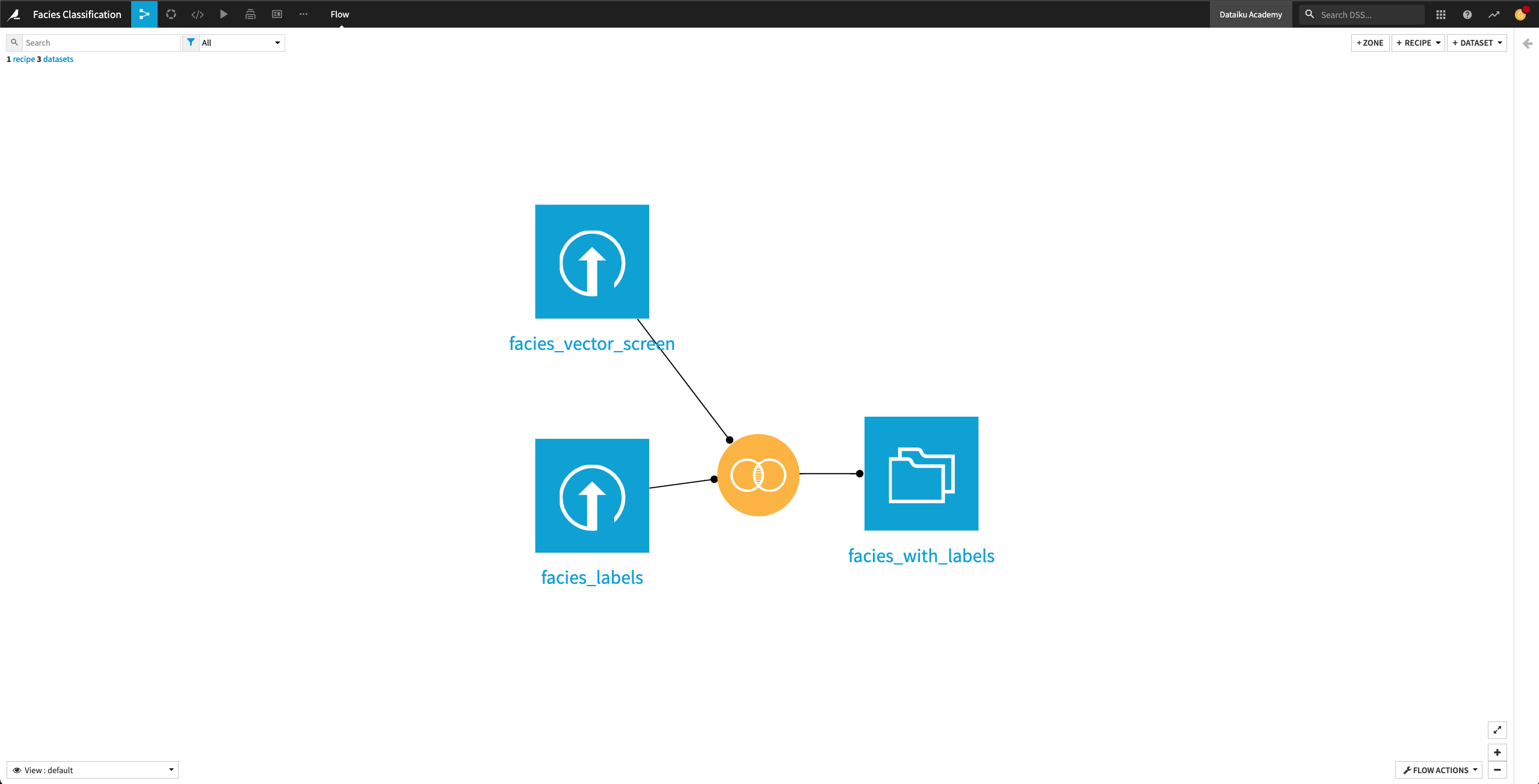
Upload and join input datasets#
In this section, we’ll upload the two input datasets and join them into a dataset that contains the facies characteristics and their corresponding labels.
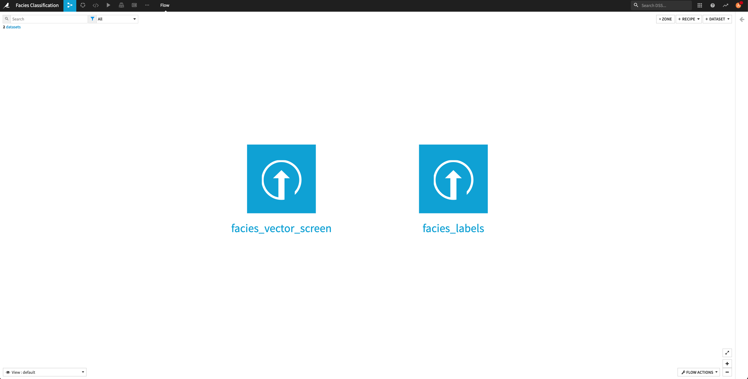
First, let’s create the facies_vector_screen and the facies_labels datasets in the project. From the project’s homepage,
Click Import Your First Dataset.
Click Upload your files.
Add the facies_vector_screen.csv file.
Click Create to create the facies_vector_screen dataset.
Return to the Flow.
Create the facies_labels dataset in a similar manner.
Return to the Flow.
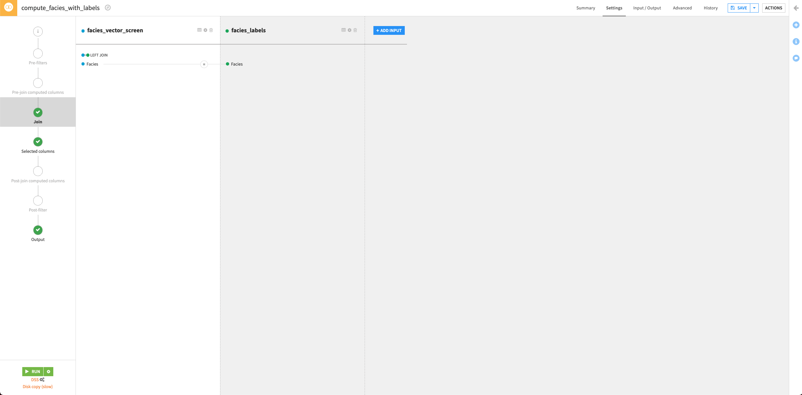
The facies_labels dataset contains a lookup table mapping each facies name to a number. We’ll join this dataset with facies_vector_screen.
From the Flow, click the facies_vector_screen dataset to select it. This dataset will serve as the “left” dataset in the Join recipe.
Open the right panel and select the Join recipe.
Select the facies_label dataset as the additional input dataset.
Name the output dataset
facies_with_labels.Click Create Recipe.
By default, Dataiku selects the column Facies as the join key.
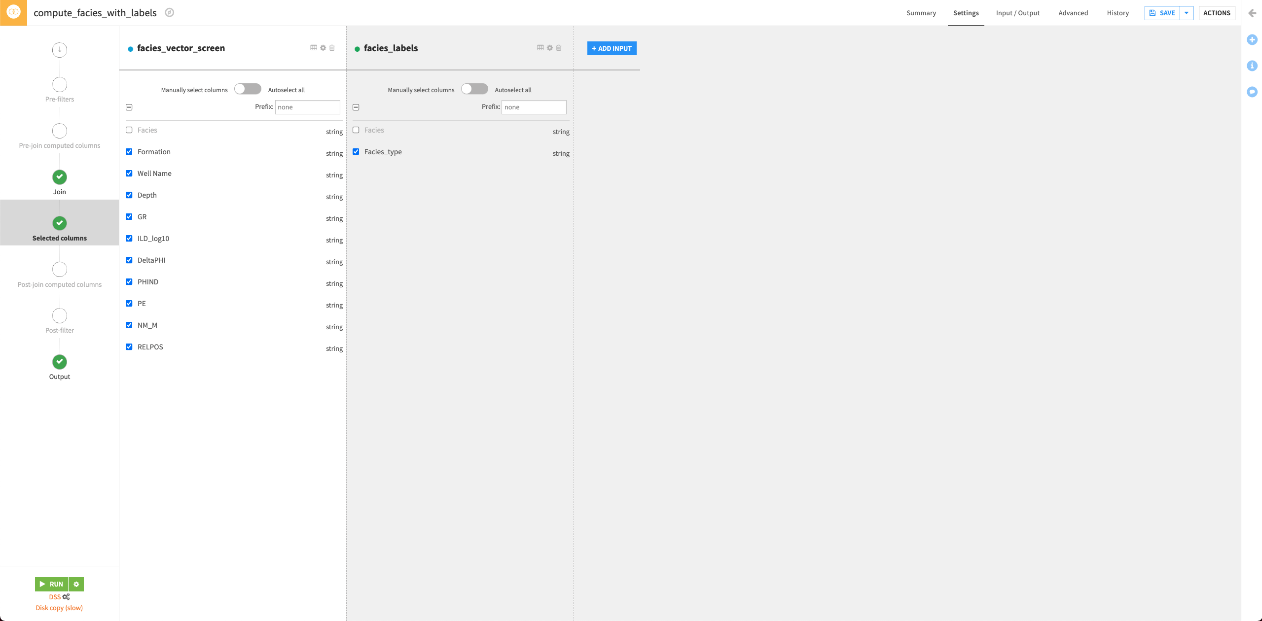
Click the Selected columns tab and uncheck the Facies column from the facies_vector_screen dataset. This column was useful to ensure the mapping between each facies characteristics vector and the explicit facies label. We don’t need it anymore.
Click Run to run the recipe.
Click Update Schema to accept the schema change for the output dataset.
Return to the Flow.
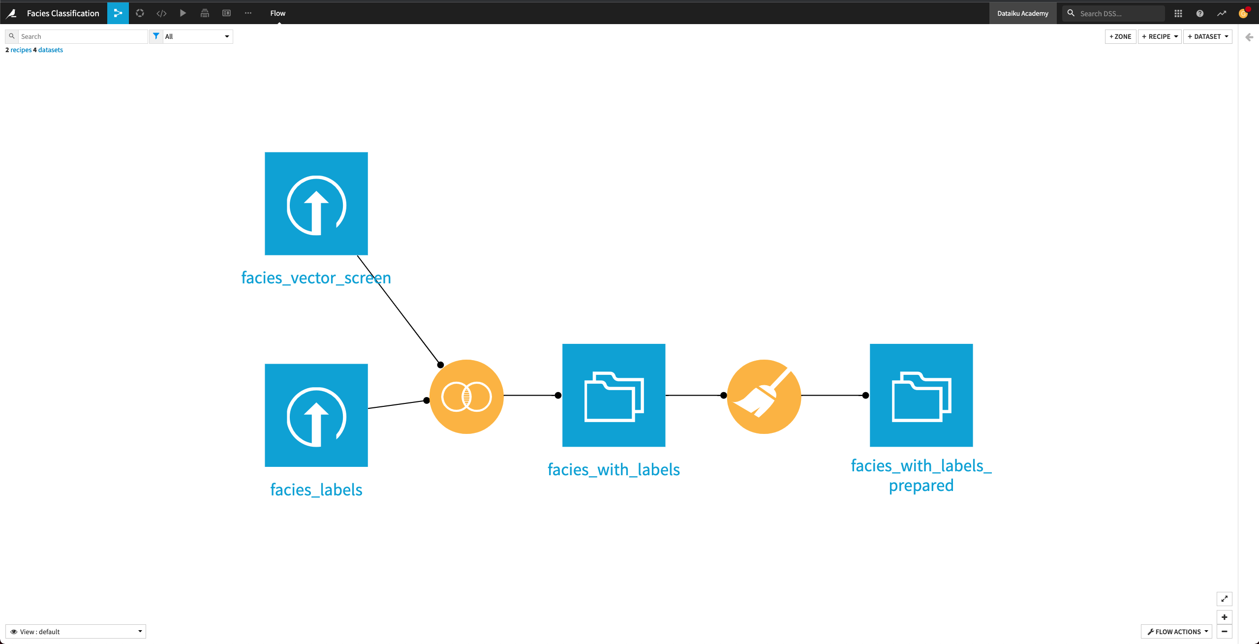
Prepare the dataset#
Explore the facies_with_labels dataset. The column names aren’t intuitive. For example, the column NM_M represents “nonmarine/marine indicator” and PE represents “Photoelectric effect”. We’ll rename the columns by using a Prepare recipe.
Return to the Flow and click the facies_with_labels dataset to select it.
From the right panel, select the Prepare recipe.
Keep the default output name
facies_with_labels_prepared, and click Create Recipe.Click + Add a New Step.
Search for the Rename columns processor and select it.
Click +Add Renaming.
Rename the following seven columns:
GR —>
Gamma rayILD_log10 —>
ResistivityPE —>
Photoelectric effectDeltaPHI —>
Neutron-density porosity differencePHIND —>
Average neutron-density porosityNM_M —>
Nonmarine/marine indicatorRELPOS —>
Relative position
Click Run to run the recipe and click Update Schema when prompted.
Visualize data#
In this section, we’ll create a few charts on the facies_with_labels_prepared dataset to understand the data a little better.
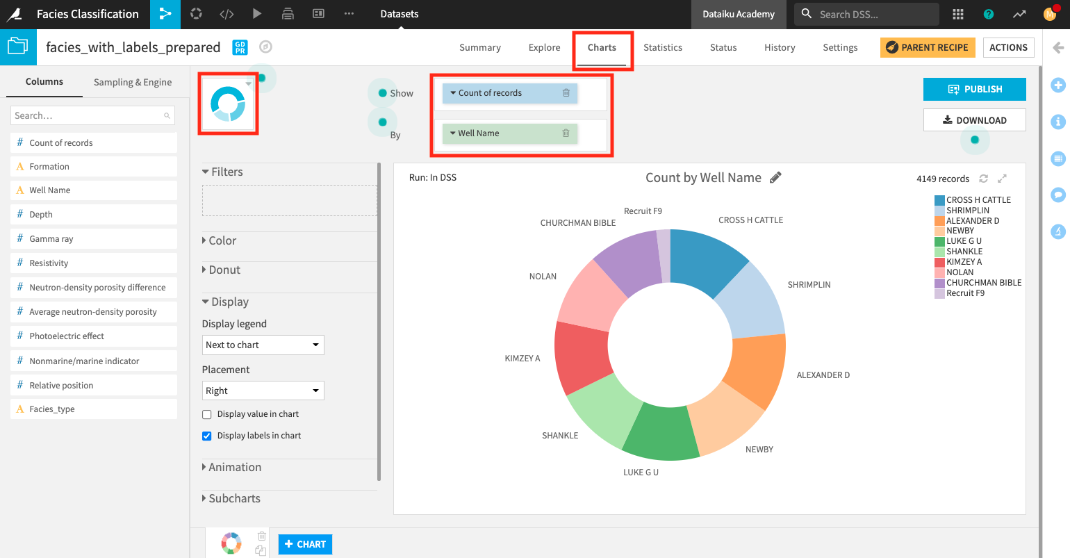
Create a donut chart#
We’ll use a donut chart to visualize the number of records for each well in the dataset.
From the Flow, open the facies_with_labels_prepared dataset and go to the Charts tab.
Change the chart type selection to a Donut chart.
Create a donut chart that shows Count of records by Well Name.
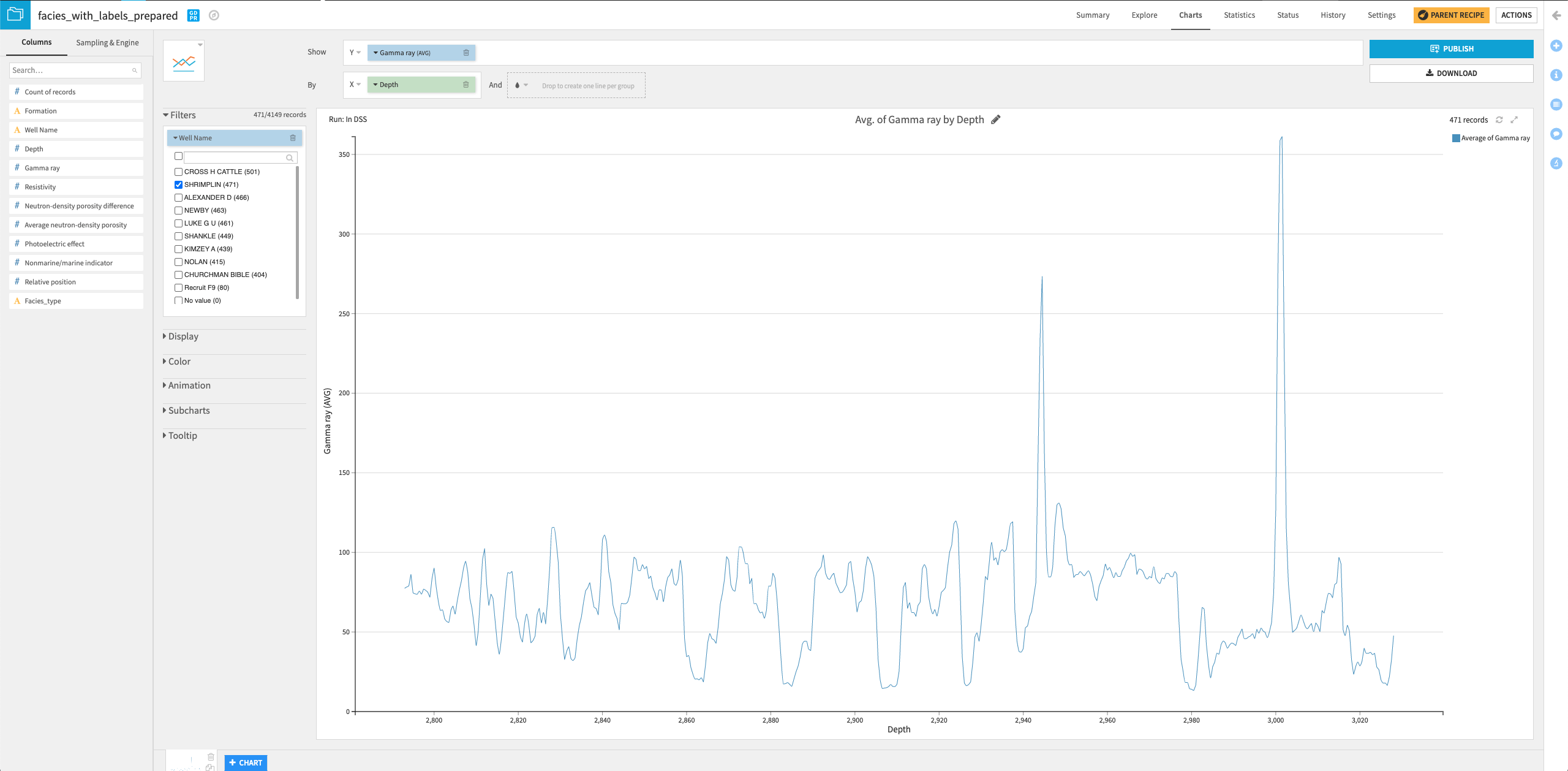
Create a line chart#
Let’s now create a second chart, a line chart, to examine how the gamma ray values vary with a well’s depth.
Click the + Chart button at the bottom of the screen to create a second chart.
Change the chart type selection to a Lines chart.
Assign the column Depth to the “X-axis” and the column Gamma ray to the “Y-axis”.
Click the arrow next to “Depth” in the X field to change the “Binning” to None, use raw values.
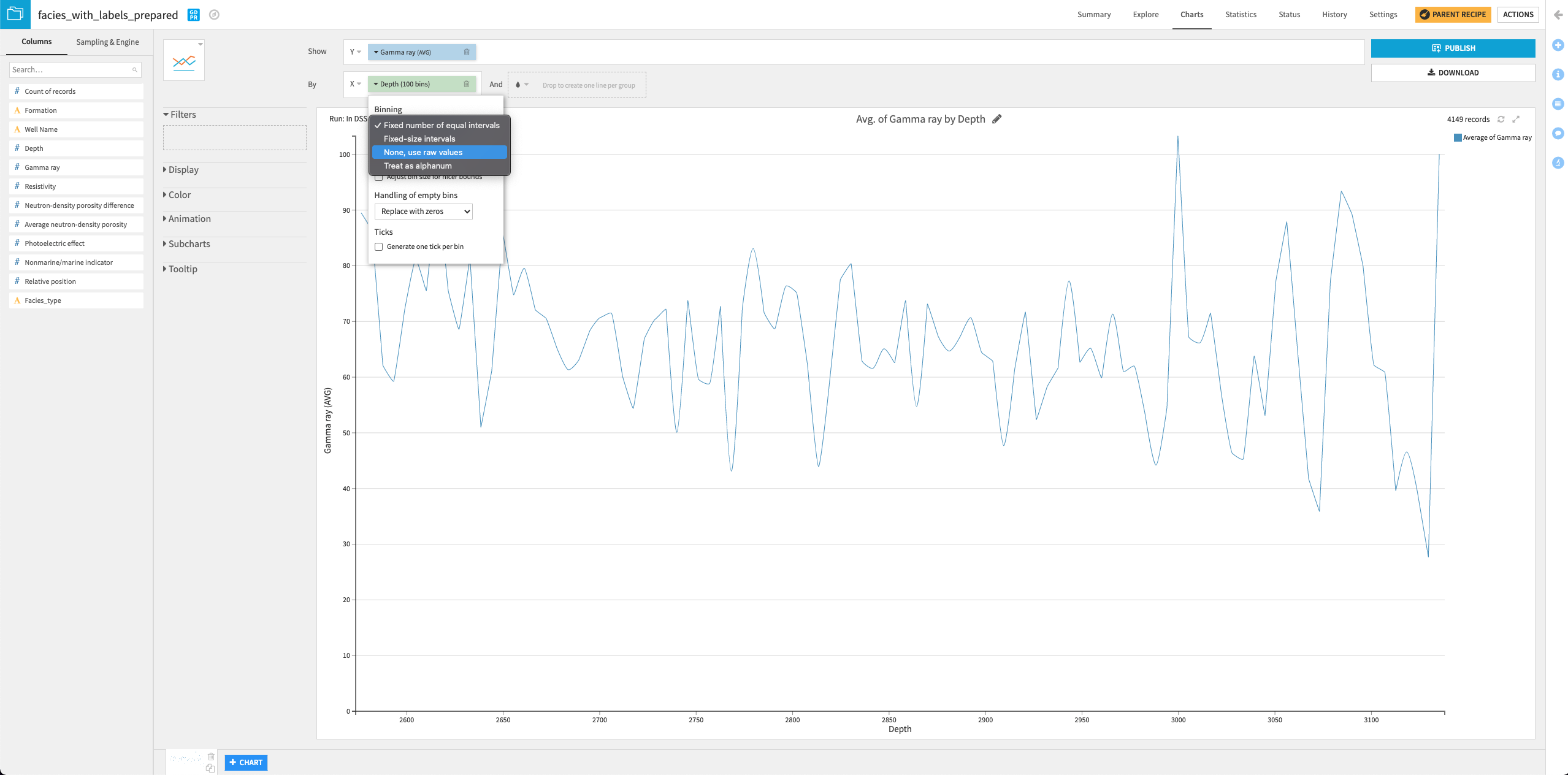
Drag the column Well Name into the “Filters” box and select only the “SHRIMPLIN” well.
You can try your hands at creating some other interesting charts to visualize the data!
Train and evaluate a machine learning model#
In this section, we’ll build machine learning models on the data, using the features as-is. We’ll then deploy the best-performing model to the Flow and evaluate the model’s performance. In a later section, we will generate features to use in the Machine learning model.
Split data#
Before implementing the machine learning part, we first need to split the data in facies_with_labels_prepared into training and testing datasets. For this, we’ll apply the Split recipe to the dataset and create two output datasets train and test.
From the Flow, click the facies_with_labels_prepared dataset.
Select the Split recipe from the right panel.
Add two output datasets
trainandtest.Create the recipe.
Select the Define filters splitting method.
We will use this method to move all rows that correspond to a specific well (Shrimplin) into the test dataset and move other rows into the train dataset.
At the “Splitting” step of the recipe, define the filter: “Match rows that satisfy a formula:
val('Well Name') == "SHRIMPLIN"for the test dataset.Specify “All other values” go into the train dataset.
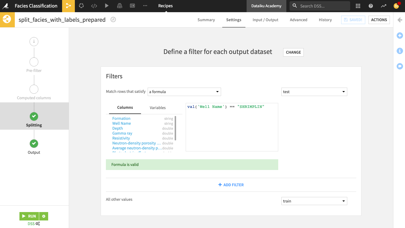
Run the recipe. Your output test dataset should contain 471 rows.
Train models and deploy a model to the Flow#
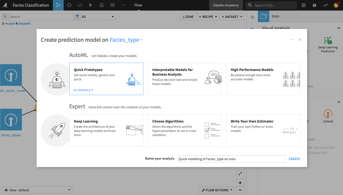
Now that we’ve split the dataset into a train and a test dataset let’s train a machine learning model. For this, we’ll use the visual machine learning interface.
From the Flow, click the train dataset to select it.
Open the right panel and click Lab.
Select AutoML Prediction from the “Visual analysis” options.
In the window that pops up, select Facies_type as the target feature on which to create the model.
Click the box for Quick Prototypes.
Keep the default analysis name and click Create.
In the Lab, go to the Design tab.
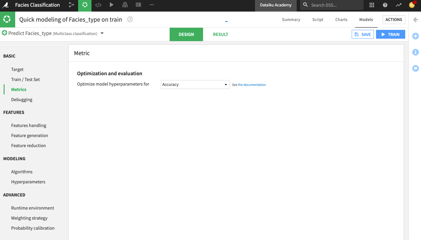
Go to the Metrics panel and change the optimization metric to Accuracy.
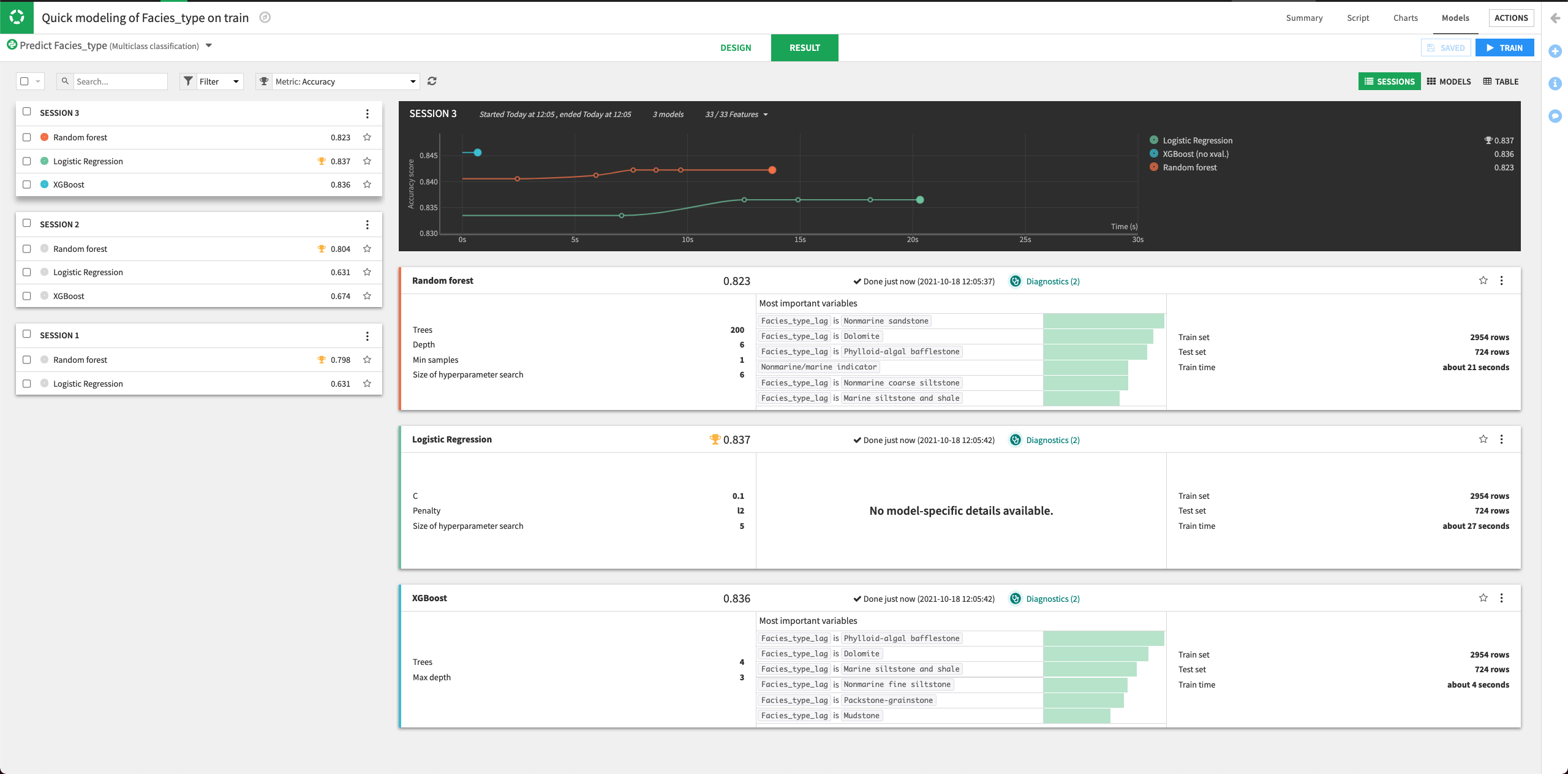
Click Train to train the model.
The Result page for the sessions opens up. Here, you can monitor the optimization results of the models.

The Result page shows the Accuracy score for each trained model in this training session, allowing you to compare performance side-by-side.
Let’s try to improve the performance of the machine learning models by tuning some parameters. We’ll also add some other algorithms to the design.
Return to the Design tab, and go to the Algorithms panel.
For the Random Forest model, specify three different values for the “Number of trees” parameter:
100,200,400.Keep the default values for the other parameters.
Click the slider next to the “XGBoost” model to turn it on.
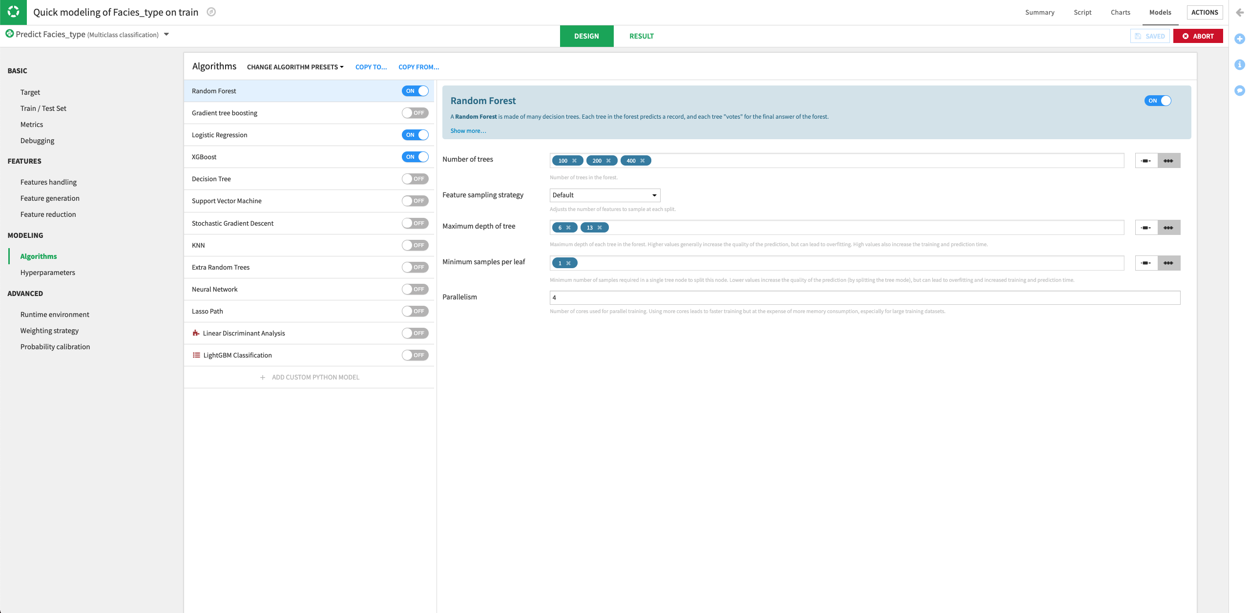
Train the models.
Dataiku will try all the parameter combinations and return the model with the parameter combination that gives the best performance.
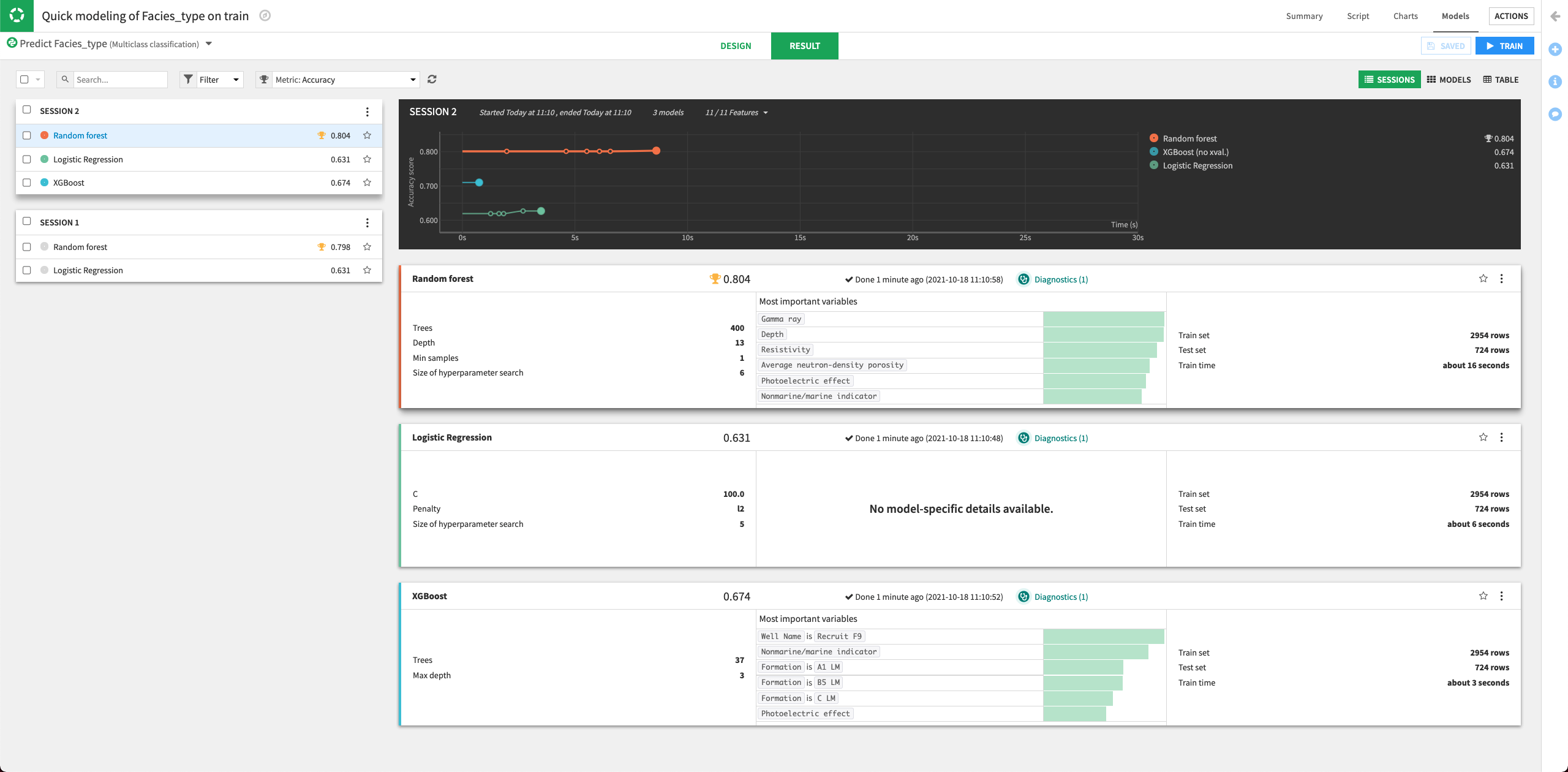
The performance of the Random Forest model improved in the second training session.
Click the Random Forest model to open its Report page.
Click the Deploy button to deploy the model to the Flow.
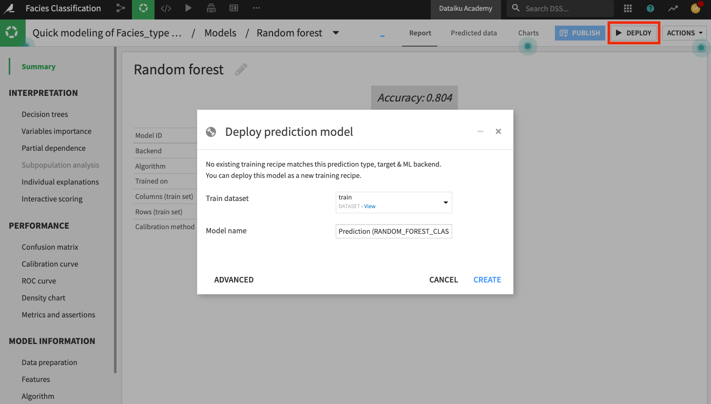
Keep the default model name and click Create.
The Flow now contains the deployed model.
Evaluate model performance#
Our test dataset contains information about the classes of the facies in the Facies_type column. Since we know the classes, we will use the test dataset to evaluate the true performance of the deployed model.
We’ll perform the model evaluation by using the Evaluate recipe. This recipe will take the deployed model and the test dataset as input and generate a predictions and a metrics dataset as outputs.
Click the test dataset and open the right panel to select the Evaluate recipe from the “Other recipes” section.
Select the model we just deployed as the “Prediction model”.
Click Set in the “Outputs” column to create the first output dataset of the recipe.
Name the dataset
predictionsand store it in CSV format.Click Create Dataset.
Click Set to create the metrics dataset in a similar manner.
Click Create Recipe.
Keep the default settings of the Evaluate recipe.
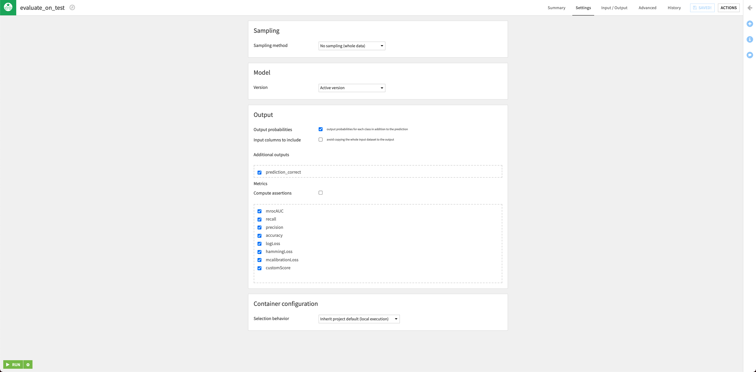
Run the recipe and then return to the Flow.
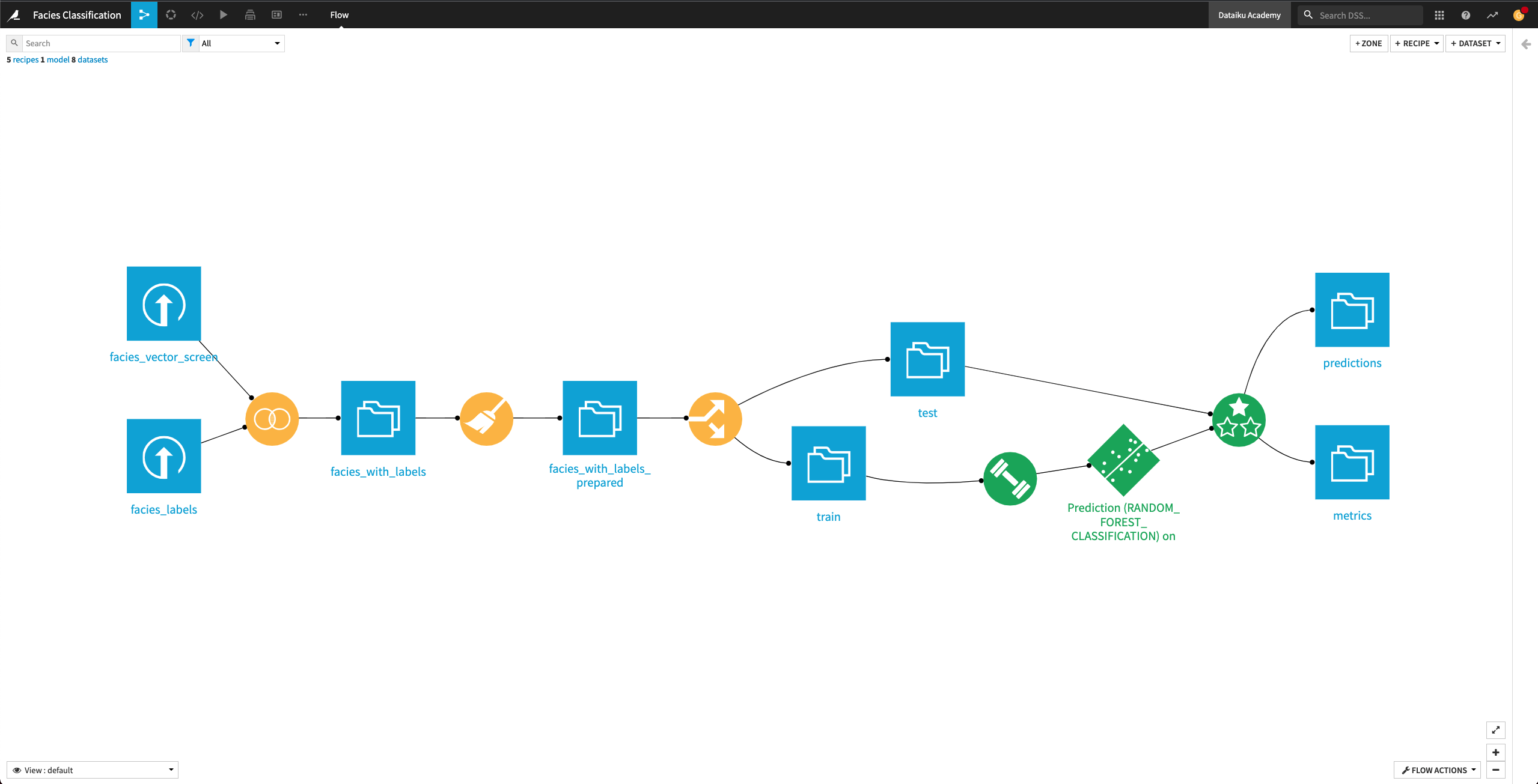
The Flow now contains the Evaluate recipe and its outputs predictions and metrics.
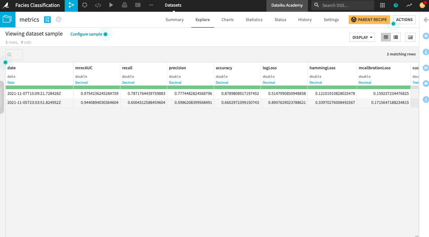
Open up the metrics dataset to see a row of computed metrics that include Accuracy. The model’s accuracy is now 0.66 (the training accuracy was 0.804).
Tip
Each time you run the Evaluate recipe, Dataiku appends a new row of metrics to the metrics dataset.
You can also return to the Flow and open the predictions dataset to see the last 11 columns, which contain the model’s prediction on the test dataset.
Return to the Flow.
Generate features#
In the previous lesson, the Evaluate recipe returned the metrics dataset where we saw the model’s accuracy on the test dataset. The model accuracy can be improved. To improve it, we will now generate new features that will be used to train a new machine learning model.
Generate features with the Window recipe#
The facies_with_labels_prepared dataset has 11 columns. Let’s say that for a facies sample at depth “D”, we have access to the physical data and the facies label at previous depths (D-1, D-2, …). We’ll now use the data from the previous depths to generate additional features for our machine learning model. For this, we’ll use a Window recipe.
Create aggregated features#
For each sample, in the facies_with_labels_prepared dataset, let’s calculate the average, minimum, and maximum of the measurements over the previous four samples (that is, the samples that occur at depths D-1, D-2, D-3, and D-4)by using a Window recipe.
From the Flow, click the facies_with_labels_prepared dataset to select it.
Select the Window recipe from the right panel.
Name the output facies_with_aggregated_measures and create the recipe.
Upon creating the recipe, you land on its “Settings” page.
In the “Windows definitions” step, click the slider next to “Partitioning Columns” to enable it.
Select Well Name as the partitioning column.
Enable the “Order Columns” option and specify Depth as the column to use.
Enable the “Window Frame” option.
Limit the preceding rows to
4and the following rows to0.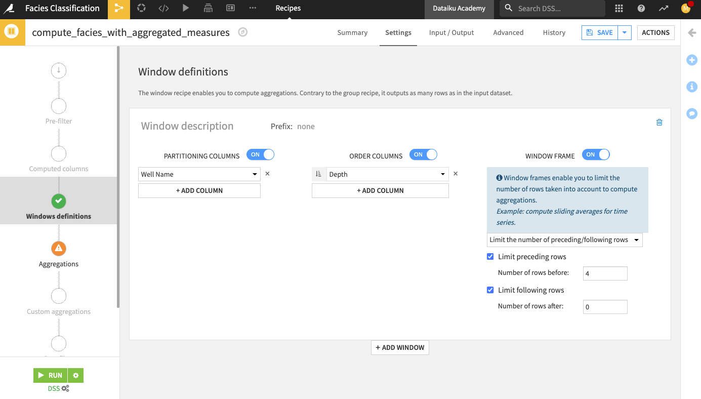
In the “Aggregations” step, select the Min, Max, and Avg for all the measurements columns (that is, all columns except Formation, Well Name, Depth, and Facies_type).
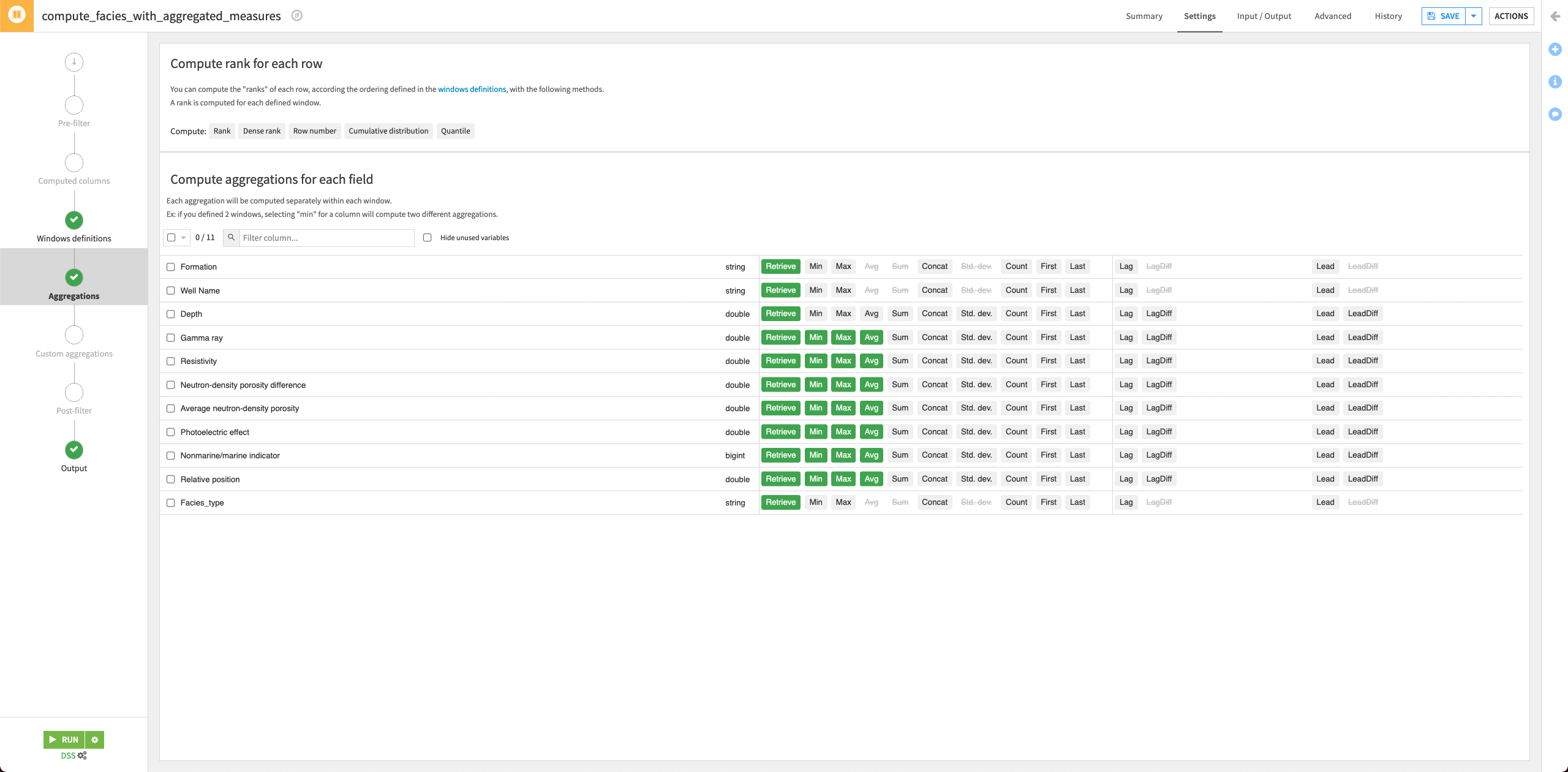
Run the recipe and update the schema when prompted.
Return to the Flow.
Create features with previous sample#
Let’s also add one more interesting feature. We’ll assume that for each sample at depth “D”, we know the facies label at depth “D-1”. This is a strong assumption, and in reality, you might not have this level of information when collecting the data out in the field. However, for the purpose of this exercise, we’ll assume this to be true.
Click the facies_with_aggregated_measures dataset and select a new Window recipe from the right panel of the Flow.
Name the output
facies_with_previous_labeland create the recipe.In the “Windows definitions” step, click the slider next to “Partitioning Columns” to enable it.
Select Well Name as the partitioning column.
Enable the “Order Columns” option and specify Depth as the column to use.
Enable the “Window Frame” option.
Limit the preceding rows to
1and the following rows to0.In the “Aggregations” step, search for
faciesto bring up the Facies_type column.Select the aggregation Lag for the column and specify a lag value of
1.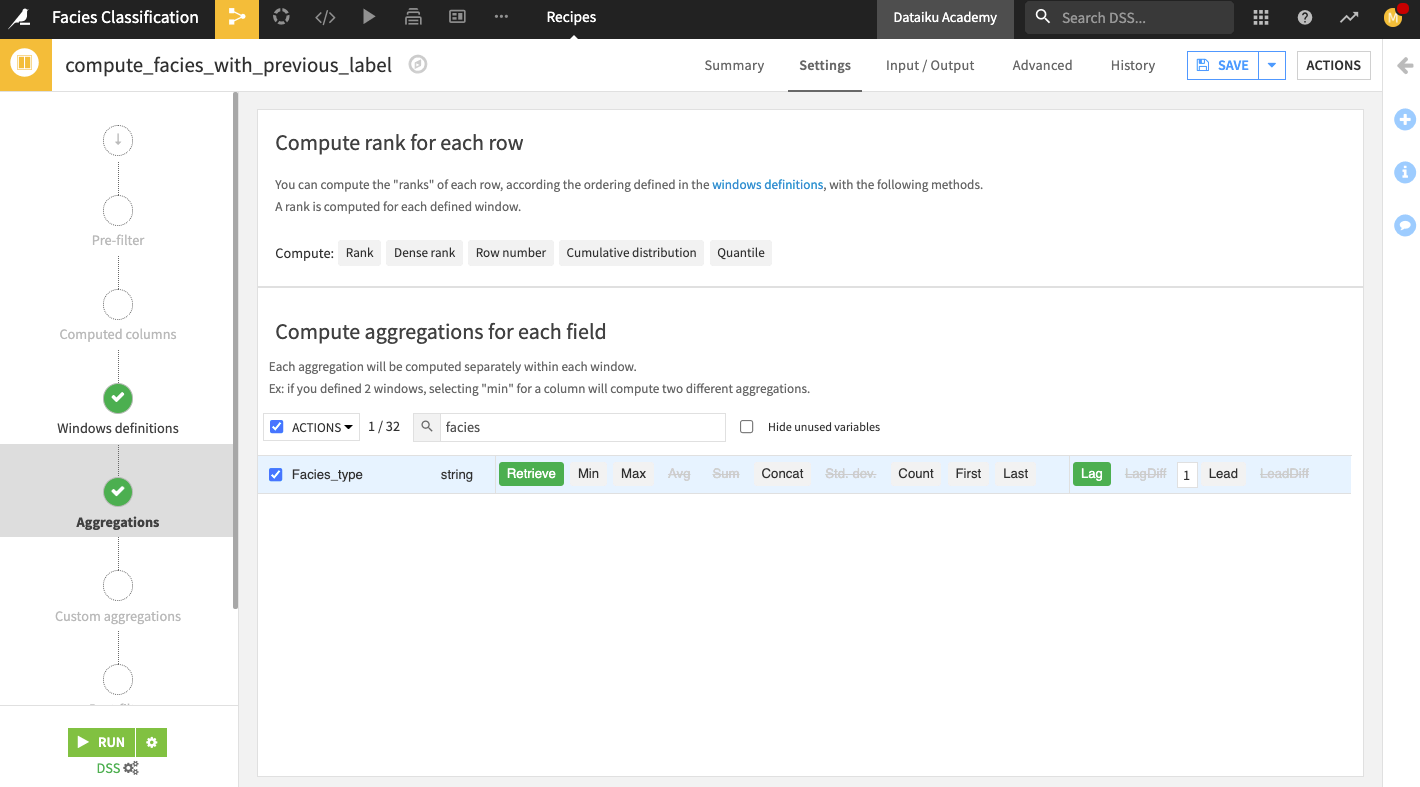
Run the recipe and update the schema when prompted.
Open the Output dataset facies_with_prvious_label to see that the dataset contains 33 columns. We’ve now added a total of 22 new features to the data from the facies_with_labels_prepared dataset.
Return to the Flow.
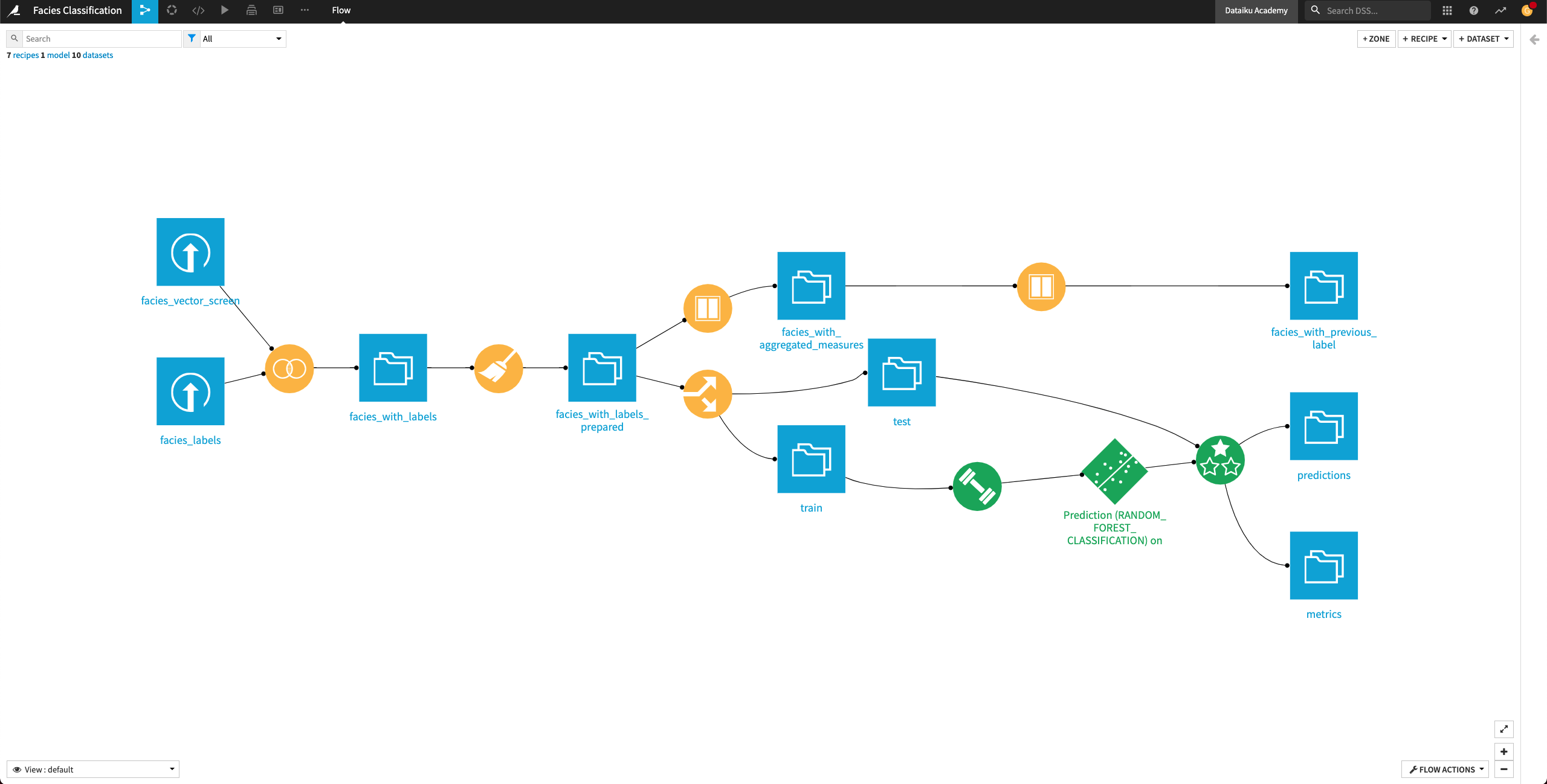
Update recipe input and propagate schema#
In the previous lesson, we generated new features to use for retraining our machine learning model. In this section, we’ll prepare to retrain the model by updating its input (that is, the train dataset) to include the newly generated features from the facies_with_previous_label dataset.
Remap input of the Split recipe#
To update the data in the train and test datasets so that they include the newly generated features, we’ll remap the input of the Split recipe to the facies_with_previous_label dataset.
Double-click the Split recipe to open it.
Click the Input/Output tab of the recipe.
Change the input dataset to facies_with_previous_label.
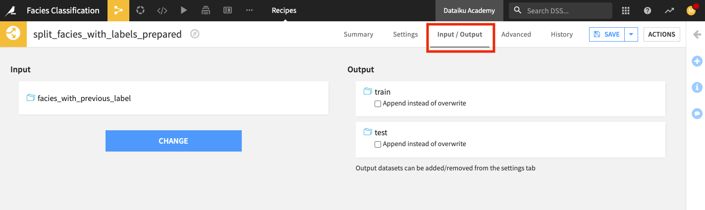
Return to the Settings tab, and run the recipe.
Update the schema when prompted. Wait for Dataiku to finish building the train and test datasets.
Return to the Flow.
Check schema consistency#
A dataset in Dataiku has a schema that describes its structure. The schema of a dataset includes the list of columns with their names and storage types. Often, the schemas of our datasets will change when designing the Flow. This is exactly what happened when we remapped the input of the Split recipe. We changed the schema of the dataset used as input to the Split recipe.
Furthermore, when we ran the Split recipe to update the data in the output datasets (train and test), we also chose to update the schema of these datasets. However, we must not forget the downstream dataset (predictions). We still need to propagate the schema changes (from train and test) to this dataset.
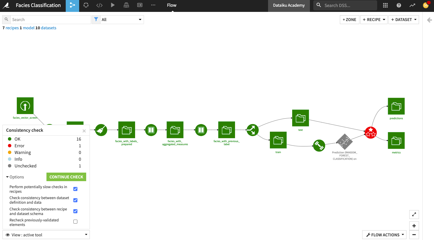
Dataiku has a tool to check the consistency of all schemas in your project. To access this tool:
Click the Flow Actions button in the bottom right corner of the Flow.
Select Check consistency.
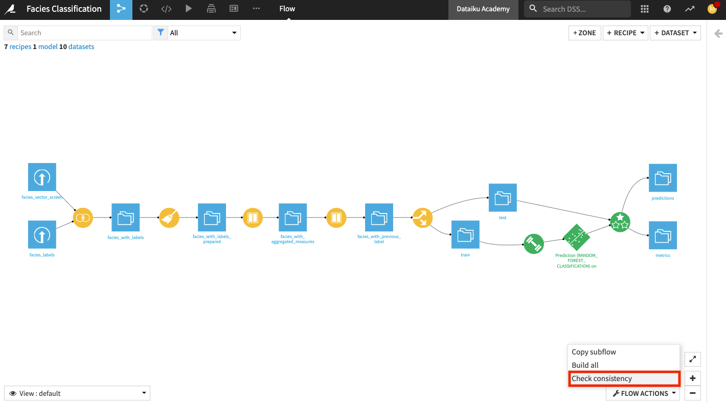
In the “Consistency check” options, click Start Check
The tool detects an error on the Evaluate recipe because the schema is incompatible between the input and the output of the recipe.
Propagate Schema#
To fix the error detected by the Consistency Check tool, we’ll propagate the schema from the facies_with_previous_label dataset downstream across the Flow.
Right click the facies_with_previous_label dataset, and select Propagate schema across Flow from here.
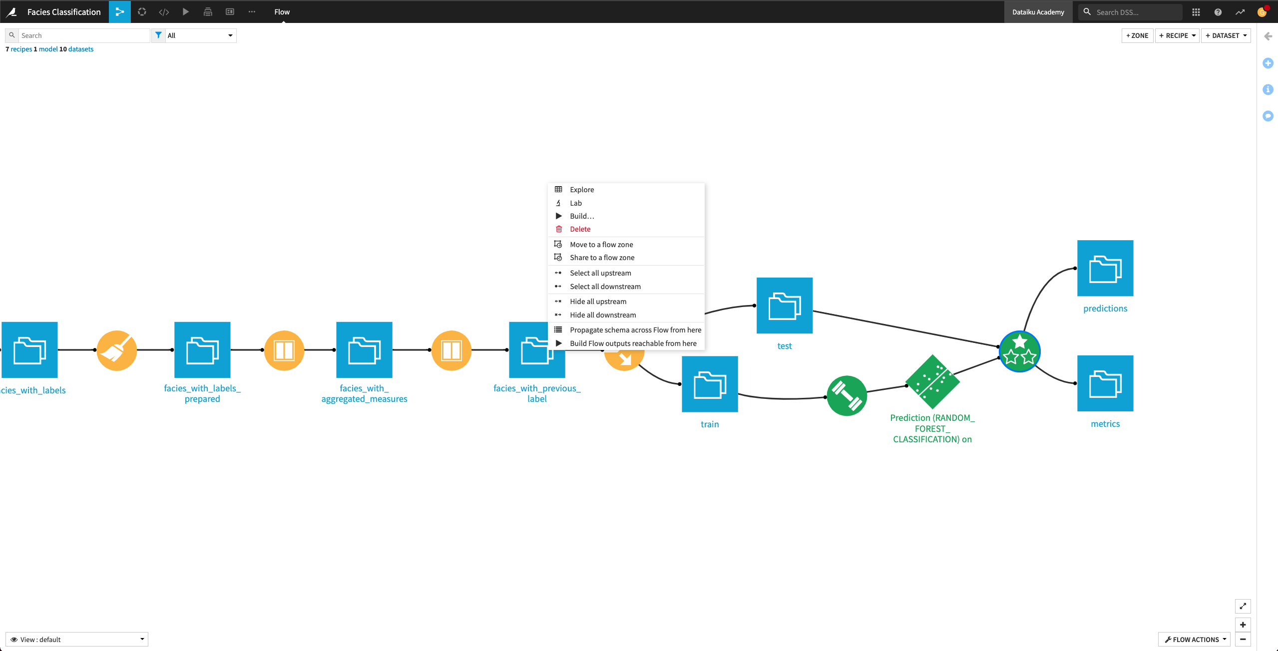
In the “Schema propagation” box, click Start.
The schema propagation tool informs us that the Train recipe needs a manual check.
Right-click the Train recipe and click Mark as OK.
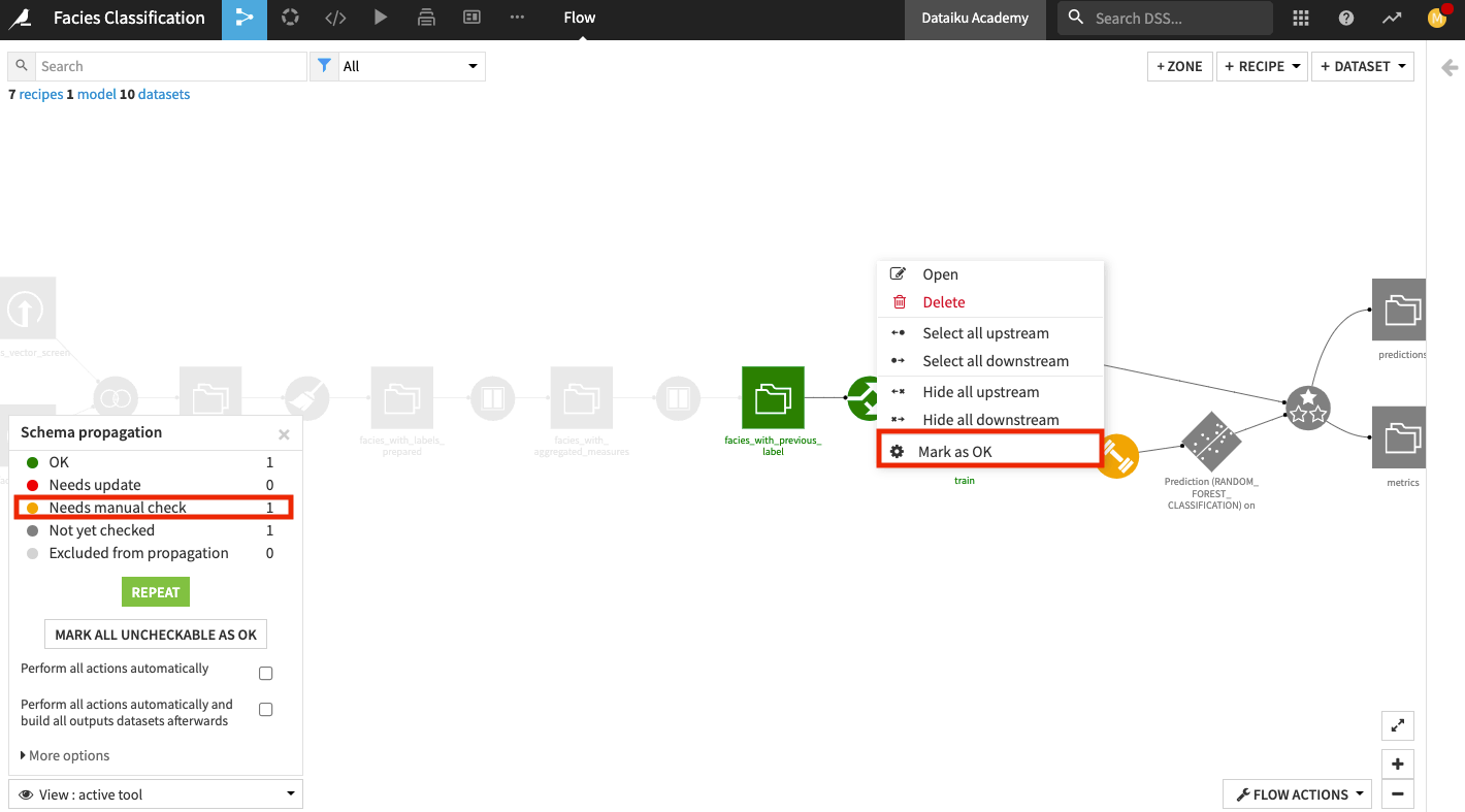
Click Repeat in the schema propagation tool.
Click the Evaluate recipe to review the schema changes.
Accept the schema changes by clicking Update Schema.
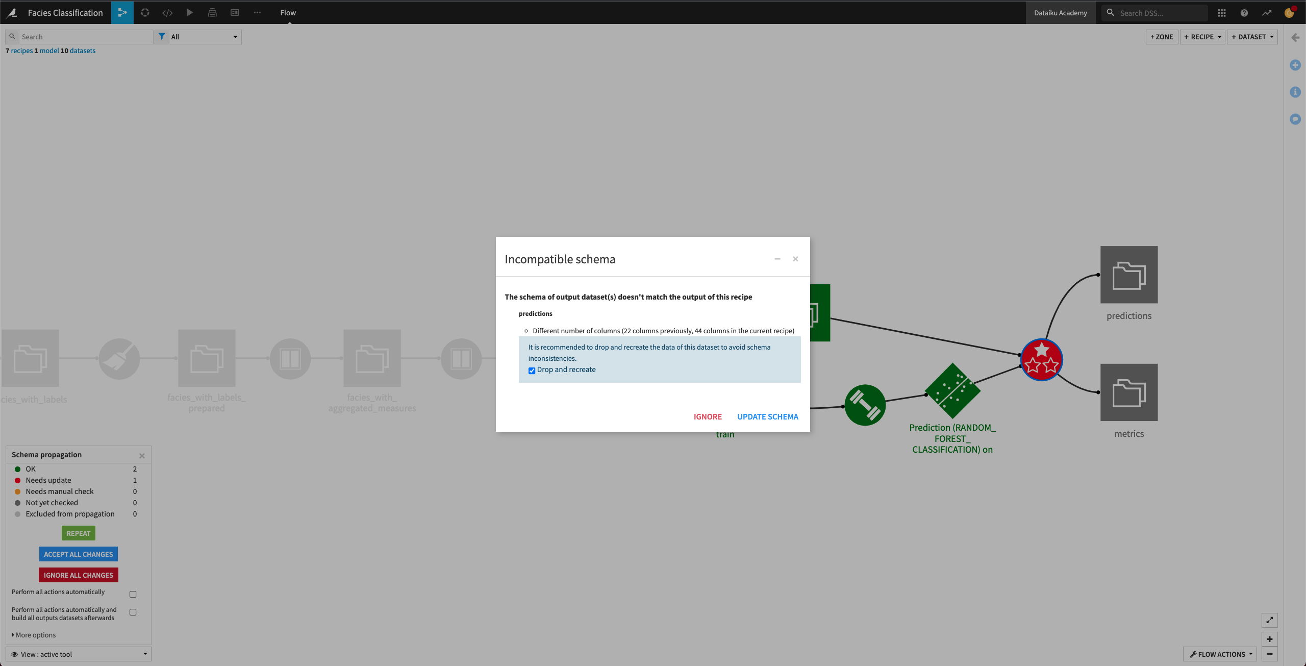
Now, all the downstream Flow items from the facies_with_previous_label dataset are colored green, indicating that we’ve resolved all the schema incompatibilities. We can now move on to retrain the machine learning algorithm.
Retrain machine learning model#
In the previous section, we resolved schema inconsistencies in the Flow and updated the input (train dataset) to our machine learning model. The train dataset now includes the new features that we generated. In this section, we will retrain the model’s algorithm using the new features.
Let’s return to the Lab to see the new features for training.
From the Flow, open the deployed model (the green diamond object).
Click View Origin Analysis.
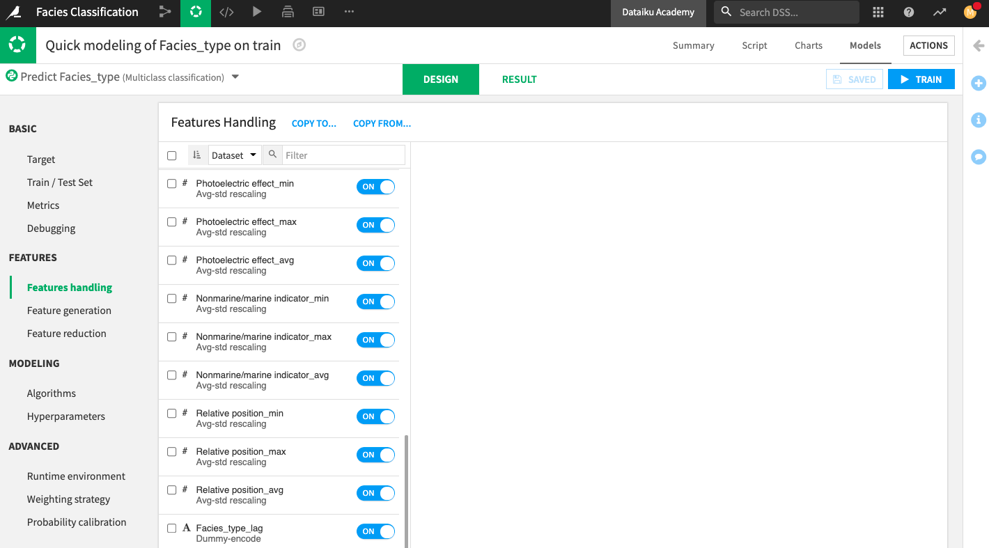
Go to the Design tab and open the Features handling panel.
In the “Features Handling” panel, you can see the list of features that Dataiku has selected. This list includes the new features. We will keep this selection.
Click Train to launch a new training session.
The result of the training session suggests that the new features improved the performance of all the trained models, with the Logistic Regression model having the highest training accuracy.
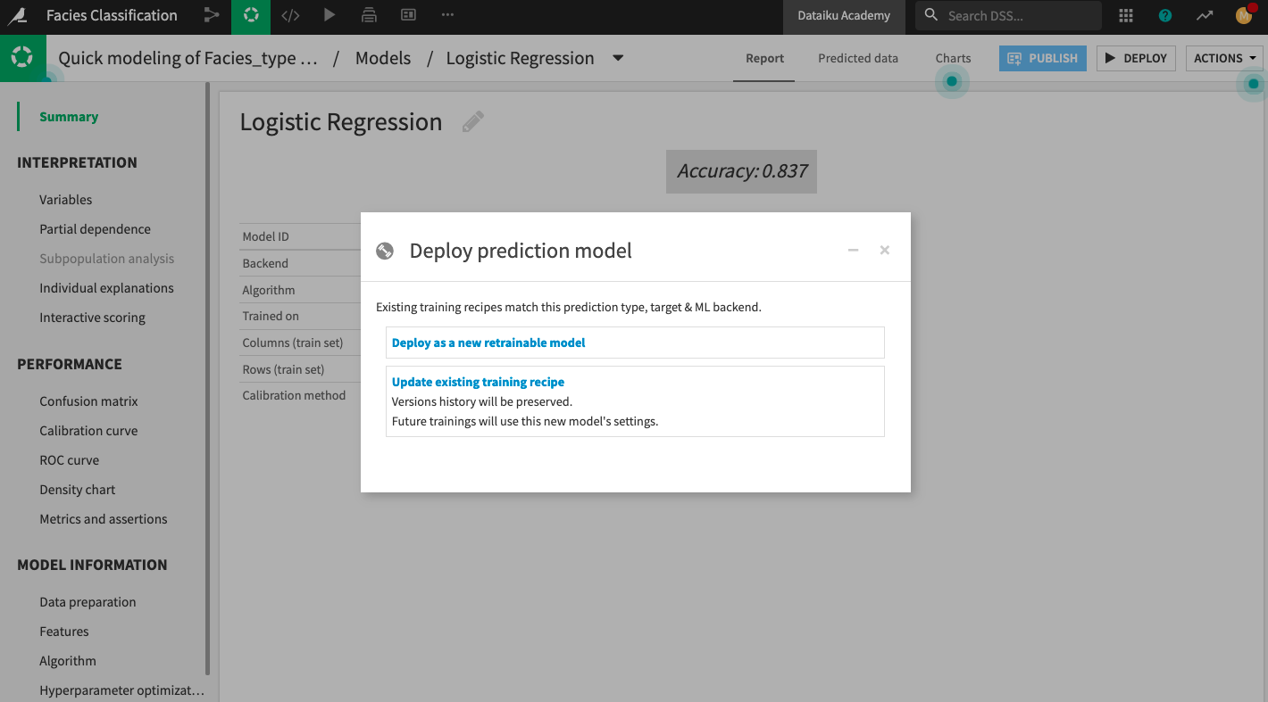
Click the Logistic Regression model to open its Report page.
Deploy the model to the Flow, selecting the Update Existing Training Recipe option when prompted.
Keep the default selection to activate the new model version, then click Update.
In the Flow, open the Evaluate recipe and run it once more.
Explore the metrics dataset.
The metrics dataset now has a second row of metrics. Here, you can see that the accuracy of the new model is higher than the first model we trained.
Perform custom scoring#
In this section, we’ll perform custom scoring based on domain knowledge that we have about facies classification.
Suppose we know that the facies type of adjacent (or neighboring) facies are good indicators of the type of a given facies. We can use this information to extend the ground truth (about the type of a given facies) to the type of its neighboring facies. Using this new ground truth information, we can compute new accuracy values on the predictions of the machine learning algorithm.
To perform the custom scoring, we will use a Python recipe in the Flow.
Create a Python recipe#
Our Python recipe will include custom code to implement these tasks:
Determine that a prediction in the predictions dataset is correct if the predicted facies type (in the prediction column) is the same as the Facies_type of one of the adjacent rows.
Compute new accuracy values based on this determination.
To create the Python recipe:
Select the predictions and metrics datasets in the Flow.
From the right panel, select a Python recipe.
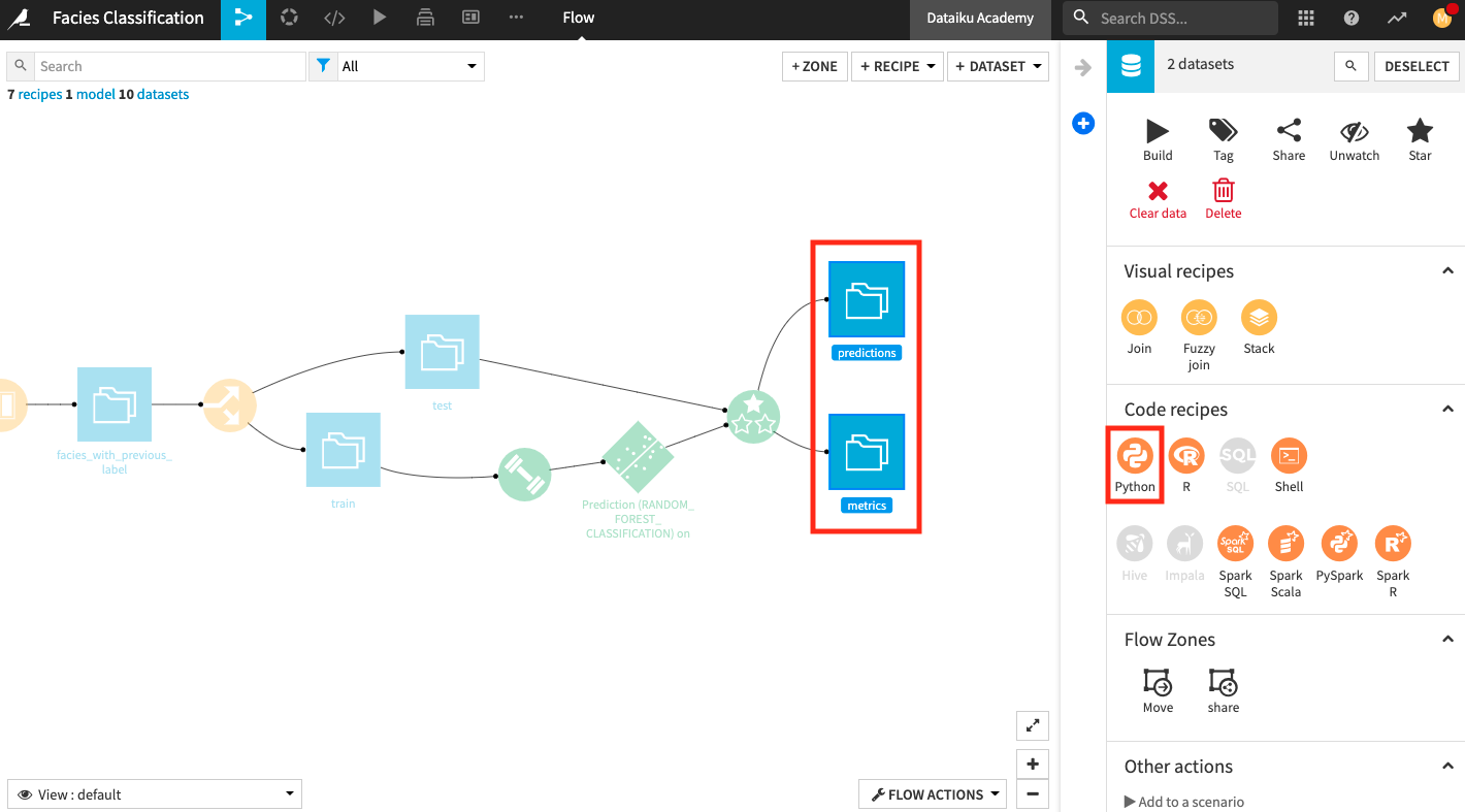
In the “New Python recipe” window, add two new output datasets custom_predictions and custom_metrics.
Create the recipe.
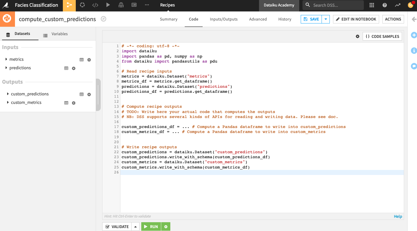
The Python recipe contains some starter code. You can modify the code as follows:
# -*- coding: utf-8 -*-
import dataiku
import pandas as pd, numpy as np
from dataiku import pandasutils as pdu
import datetime

# Read recipe inputs
test_Dataset_Prediction = dataiku.Dataset("predictions")
test_Dataset_Prediction_df = test_Dataset_Prediction.get_dataframe()

# Read recipe inputs
test_Dataset_Metrics = dataiku.Dataset("metrics")
test_Dataset_Metrics_df = test_Dataset_Metrics.get_dataframe()

dico_adjacent_facies = {}
dico_adjacent_facies['Nonmarine fine siltstone'] = ['Nonmarine coarse siltstone']#1
dico_adjacent_facies['Nonmarine sandstone'] = ['Nonmarine coarse siltstone']#2
dico_adjacent_facies['Nonmarine coarse siltstone'] = ['Nonmarine sandstone', 'Nonmarine fine siltstone']#3
dico_adjacent_facies['Marine siltstone and shale'] = ['Mudstone']#4
dico_adjacent_facies['Mudstone'] = ['Marine siltstone and shale', 'Wackestone']#5
dico_adjacent_facies['Wackestone'] = ['Mudstone', 'Dolomite', 'Packstone-grainstone']#6
dico_adjacent_facies['Dolomite'] = ['Wackestone', 'Packstone-grainstone']#7
dico_adjacent_facies['Packstone-grainstone'] = ['Wackestone', 'Dolomite', 'Phylloid-algal bafflestone']#8
dico_adjacent_facies['Phylloid-algal bafflestone'] = ['Packstone-grainstone', 'Dolomite']#9

def custom_score(pred, label):
        return pred==label or pred in dico_adjacent_facies[label]

# Compute recipe outputs from inputs
# TODO: Replace this part by your actual code that computes the output, as a Pandas DataFrame
# NB: DSS also supports other kinds of APIs for reading and writing data. Please see doc.

test_Dataset_Custom_Metrics_df = test_Dataset_Prediction_df.copy()
test_Dataset_Custom_Metrics_df['Adjacent prediction'] = test_Dataset_Prediction_df.apply(lambda x: custom_score(x['prediction'], x['Facies_type']), axis=1)

acc = float(test_Dataset_Custom_Metrics_df['Adjacent prediction'].sum())/test_Dataset_Custom_Metrics_df['Adjacent prediction'].size
test_metrics_test_df = test_Dataset_Metrics_df.copy()
test_metrics_test_df = test_metrics_test_df.append({'accuracy':acc, 'date':datetime.datetime.now()}, ignore_index=True)

# Write recipe outputs
test_Dataset_Custom_Metrics = dataiku.Dataset("custom_predictions")
test_Dataset_Custom_Metrics.write_with_schema(test_Dataset_Custom_Metrics_df)

# Write recipe outputs
test_metrics_test = dataiku.Dataset("custom_metrics")
test_metrics_test.write_with_schema(test_metrics_test_df)
Click Validate then Run the Python recipe.
Return to the Flow and explore the dataset custom_metrics.
Sort the dataset in ascending order by the date column to see the changes in the metrics from the earliest to the current computation.
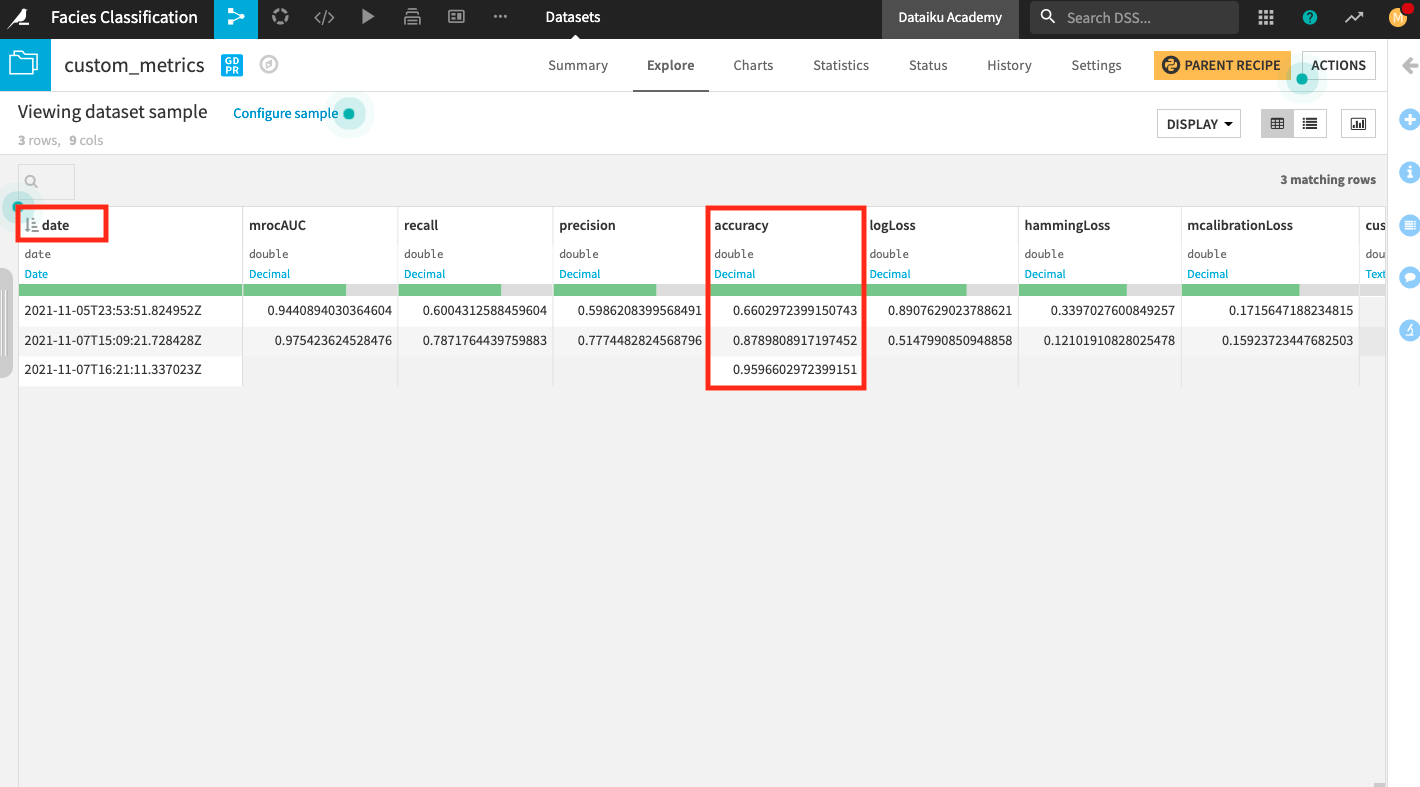
Notice that the custom accuracy obtained by using our custom scoring method is much higher (0.96) compared to the accuracy we obtained previously (0.88) using the default scoring method. We were able to improve the accuracy by leveraging the given domain knowledge about facies type.
Return to the Flow.
Create a dashboard#
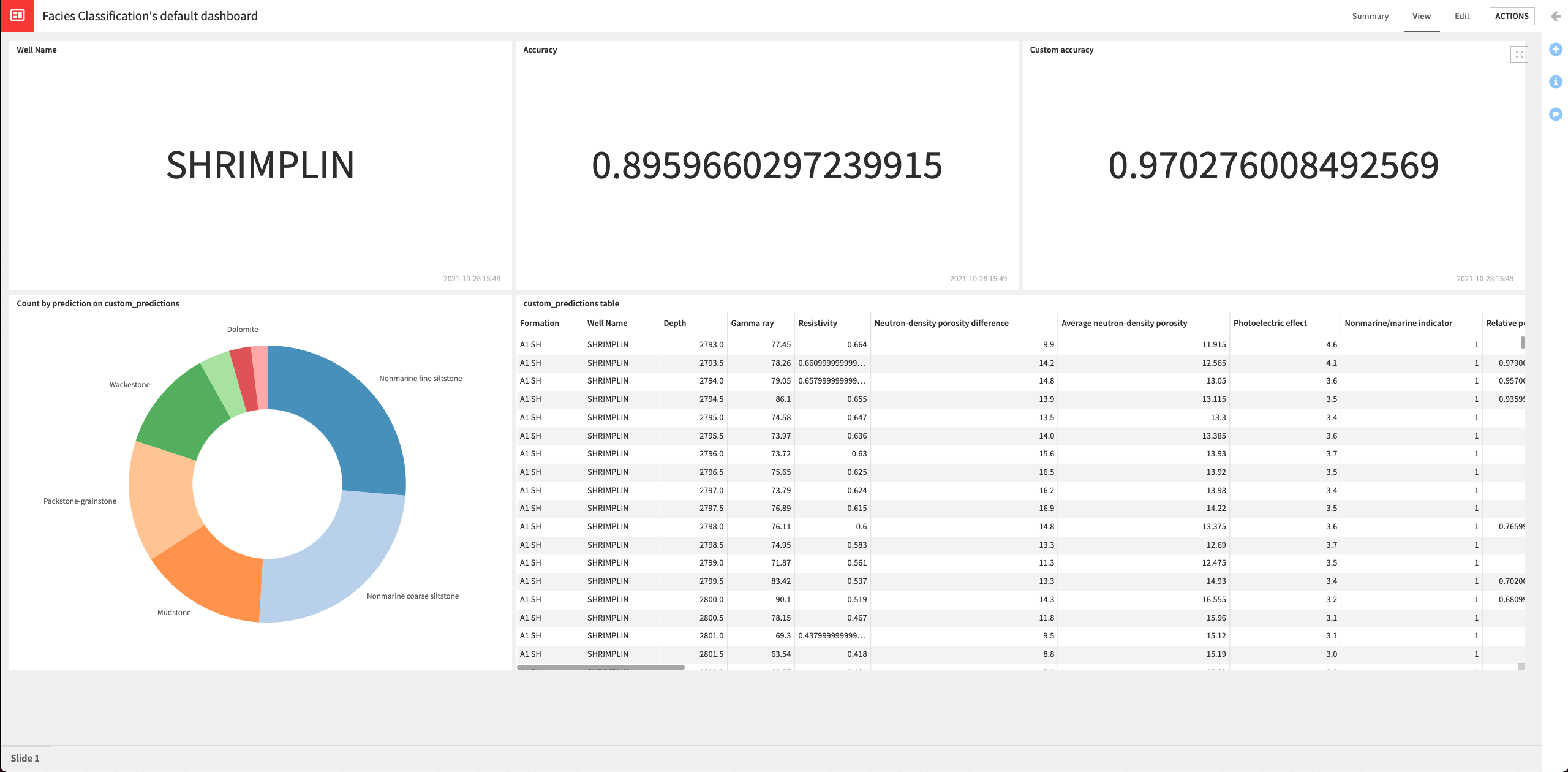
In this section, we’ll create a dashboard to expose our results. The dashboard will contain the following information:
Name of the well (“Shrimplin”) that we selected to use in the test dataset.
The accuracy of the latest deployed model.
The custom accuracy (using our custom scoring) of the latest deployed model.
The custom_predictions dataset that contains the predictions data and indicates whether the prediction is correct, based on information about the adjacent facies.
A donut chart of the proportion of each class predicted by the model
Create metrics#
Let’s start by creating three metrics to display the name of the well in the test dataset, the accuracy, and the custom accuracy of the deployed model.
Display the well in the test dataset#
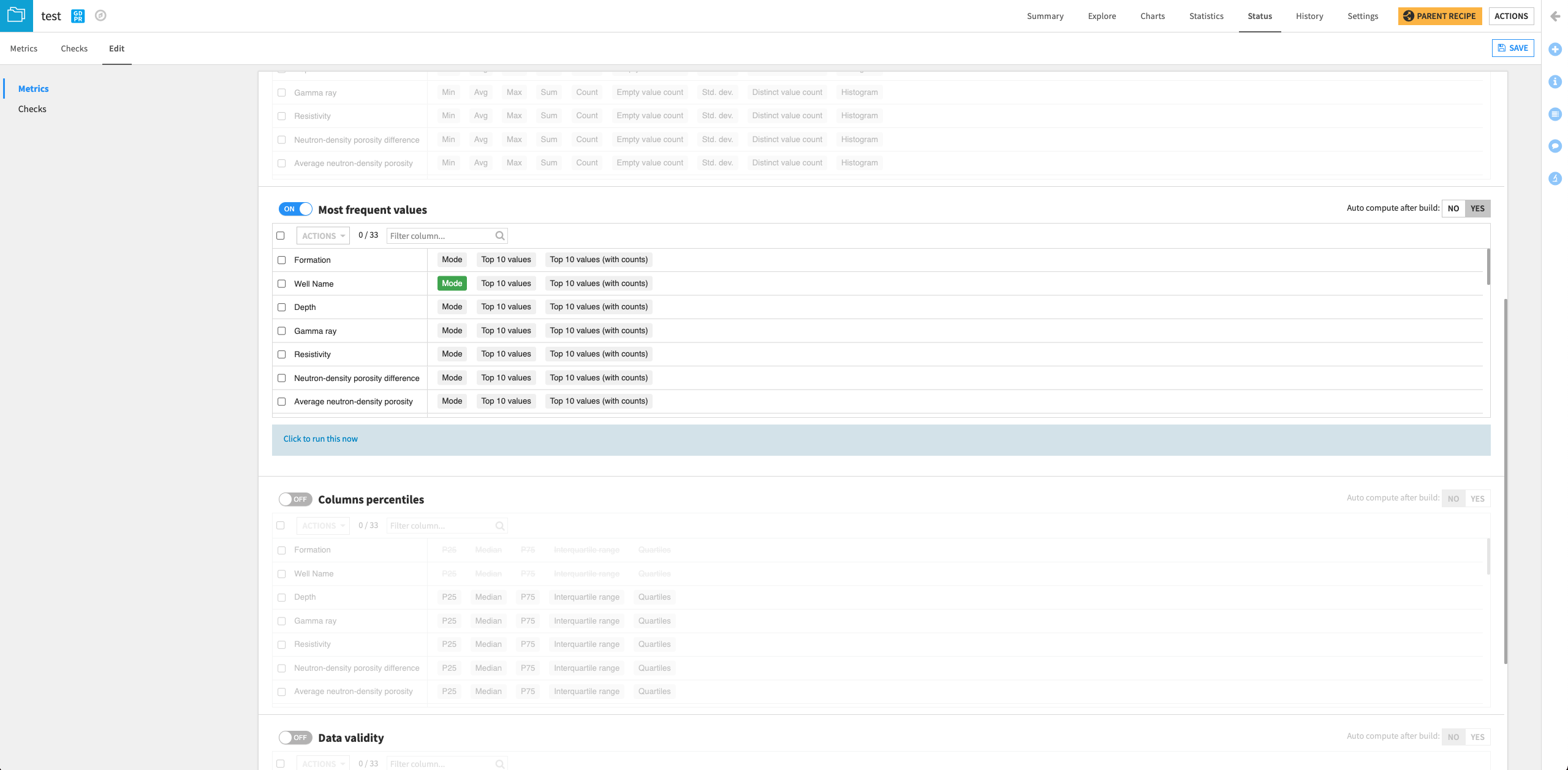
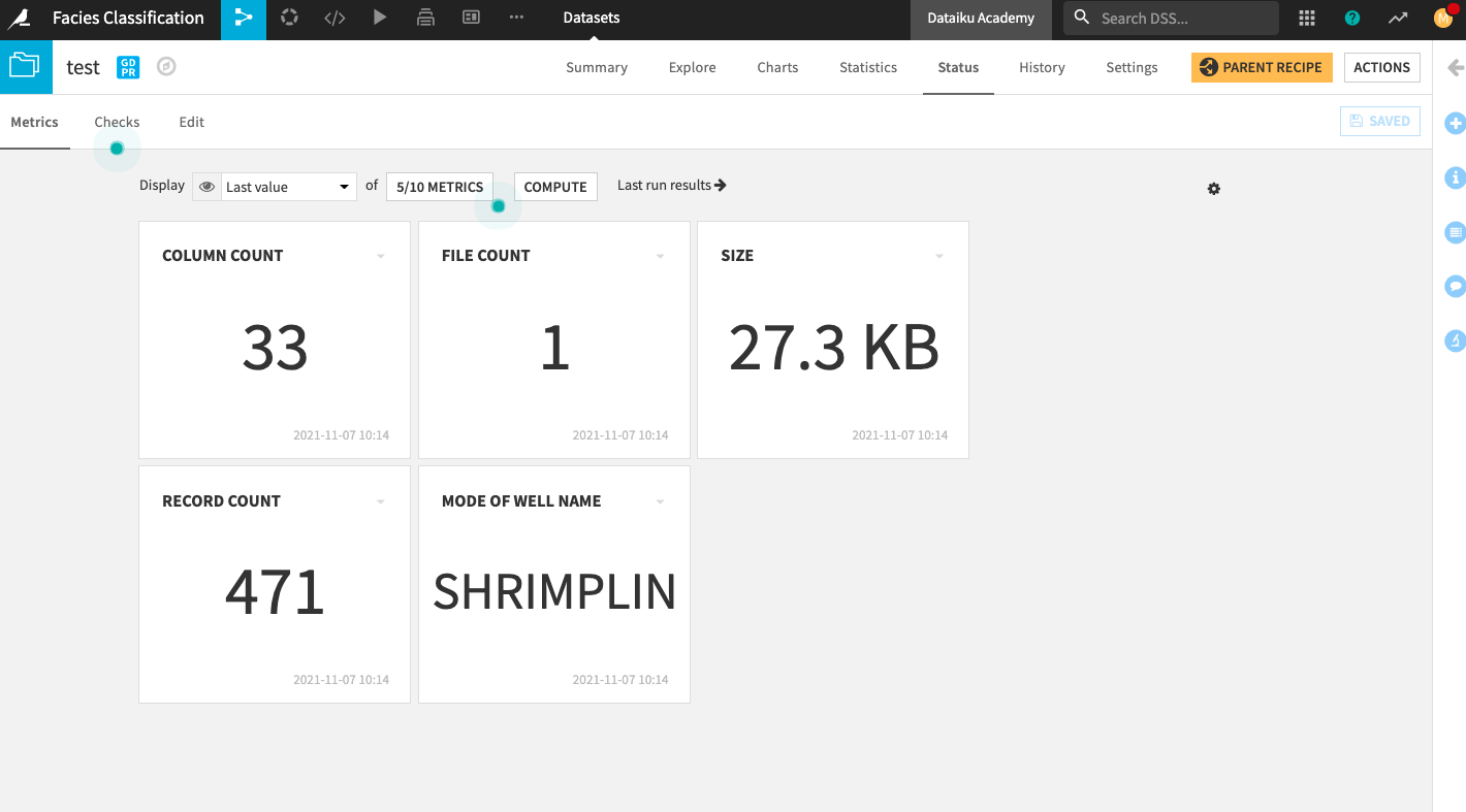
From the Flow, open the test dataset and go to its Status page.
Click the Edit tab.
Scroll to the “Most frequent values” section on the page and click the slider to enable the section.
Select Mode next to “Well Name”.
Click Yes next to the option to “Auto compute after build”.
Save your changes.
Go back to the Metrics tab.
Click the box that displays 4/10 Metrics.
In the “Metrics Display Settings”, click Mode of Well Name in the left column to move it into the right column (Metrics to display).
Click Save to display the new metric on the home screen.
Click Compute.
Display the latest accuracy of the deployed model#
Go to the metrics dataset and go to its Status page.
Click the Edit tab.
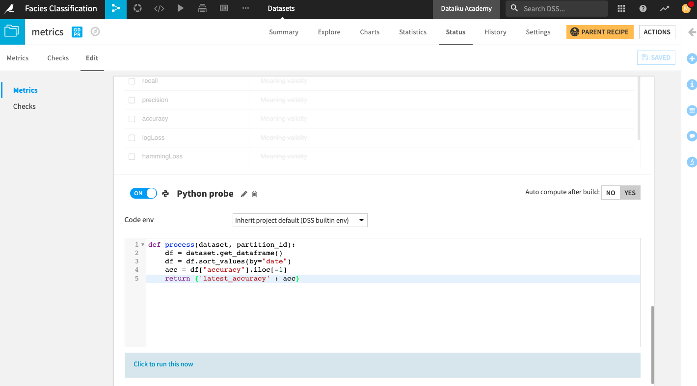
We will create a custom Python probe that will return the latest value of the accuracy.
At the bottom of the page, click New Python Probe.
Click the slider next to the Python probe to enable it.
Replace the default code in the editor with:
def process(dataset, partition_id):
        df = dataset.get_dataframe()
        df = df.sort_values(by="date")
        acc = df["accuracy"].iloc[-1]
        return {'latest_accuracy' : acc}
Click Yes next to the option to “Auto compute after build”.
Save your changes.
Click the text below the editor: Click to run this now.
Click Run.
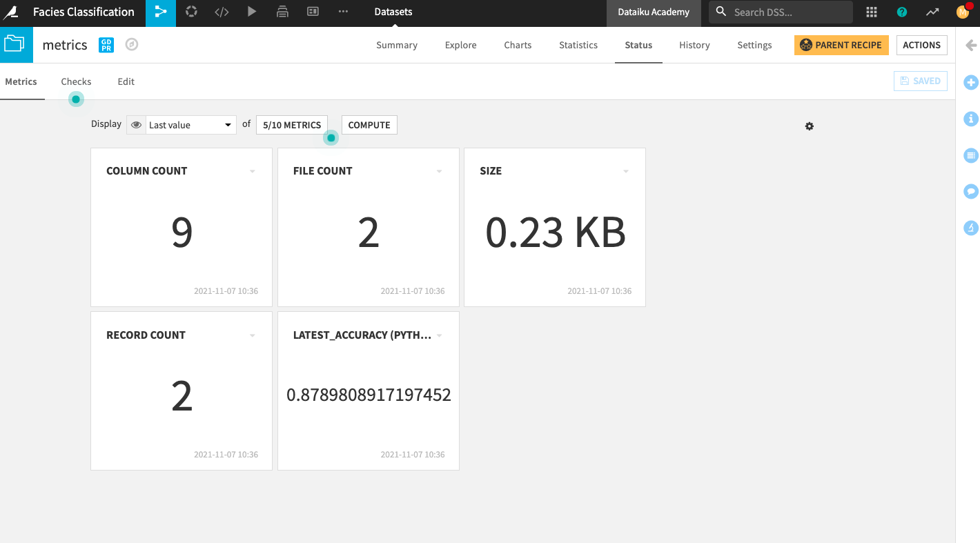
Add the new metric to the Metrics home screen.
Go back to the Metrics tab.
Click the box that displays 4/10 Metrics.
In the “Metrics Display Settings”, click latest_accuracy (Python probe) in the left column to move it into the right column (Metrics to display).
Click Save to display the new metric on the Status home screen.
Click Compute.
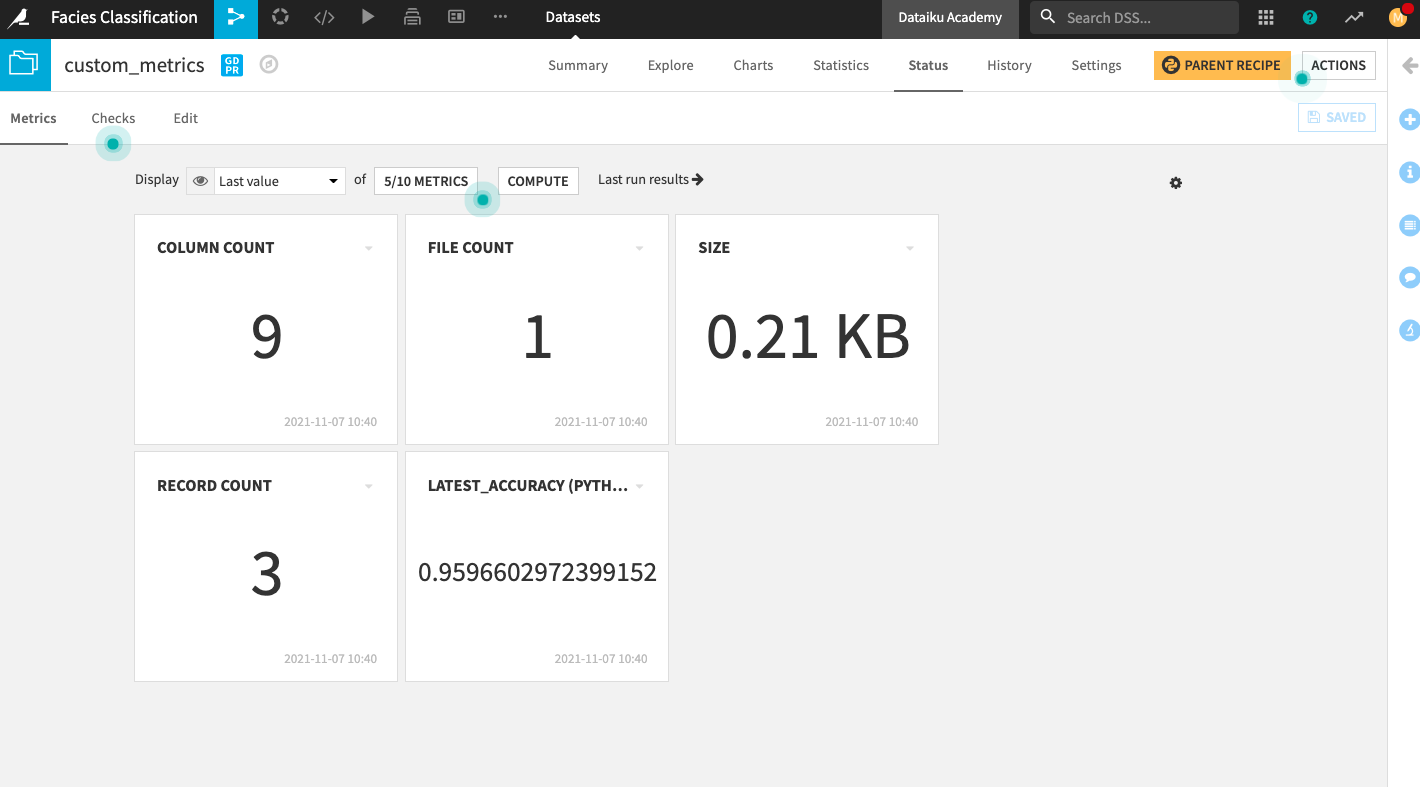
Display the custom accuracy of the deployed model#
Go to the custom_metrics dataset and repeat the same steps we just performed on the metrics dataset to create and display metrics on the Status home screen.
Create dashboard#
From the project’s top navigation bar, go to Dashboards (
 ).
).Open the existing default dashboard for the project.
Click the Edit tab to access the dashboard’s Edit mode.
Click the “plus” button in the bottom right of the page to add a new tile displaying the Well name to the dashboard.
Select the Metrics tile.
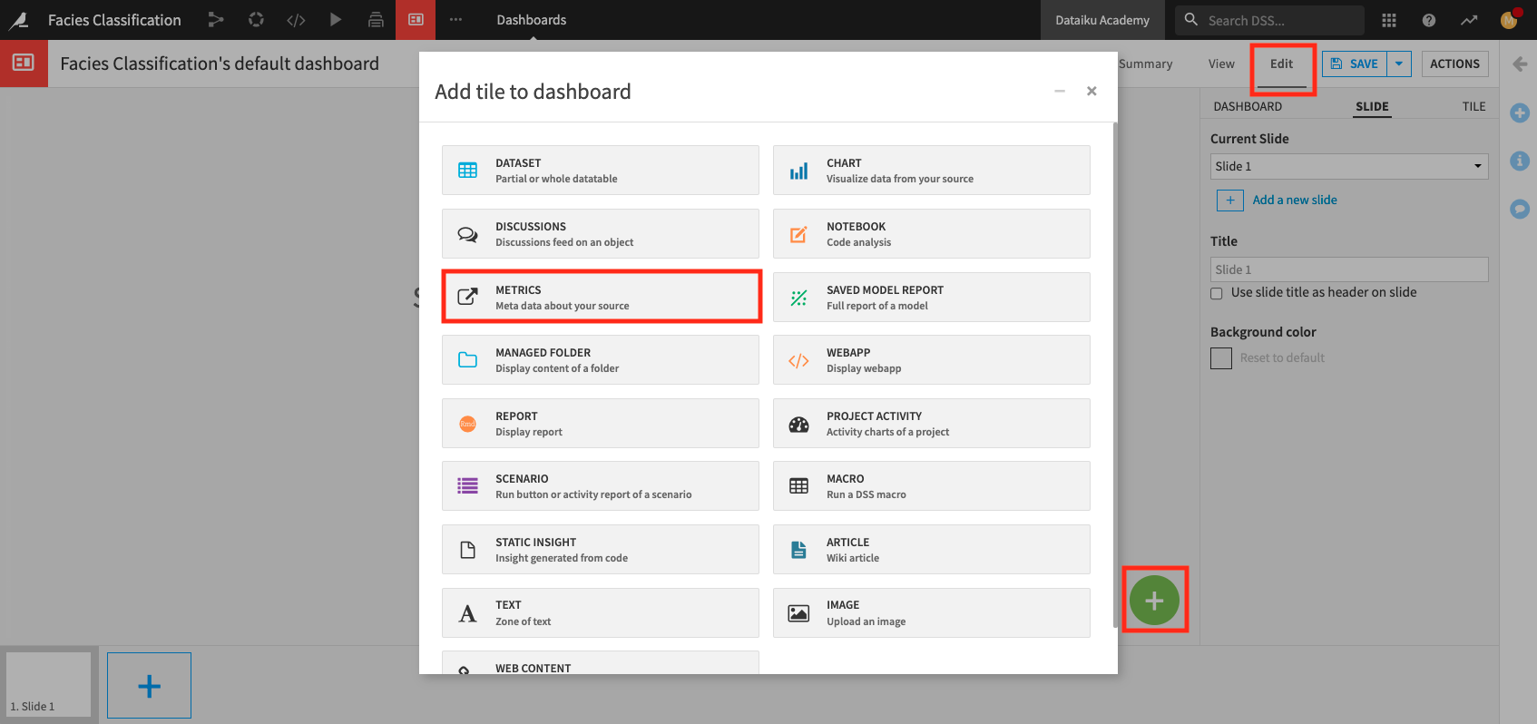
In the Metrics window, specify:
Type: Dataset
Source: test
Metric: Mode of Well Name
Insight name:
Well Name
Click Add.
Similarly, add a tile to display the latest_accuracy (Python probe) from the metrics dataset.
Name the insight
Accuracy.And add a tile to display the latest_accuracy (Python probe) from the custom_metrics dataset.
Name the insight
Custom Accuracy.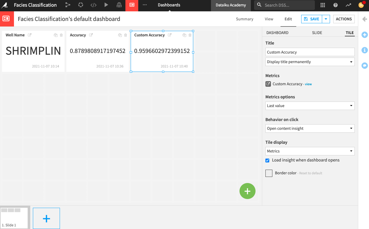
Add the custom_predictions dataset to the current page and name the insight
custom_predictions table.Finally, add a chart to the dashboard.
Specify custom_predictions as the “Source dataset”.
The Chart interface opens up.
Create a donut chart that shows the Count of records by prediction.
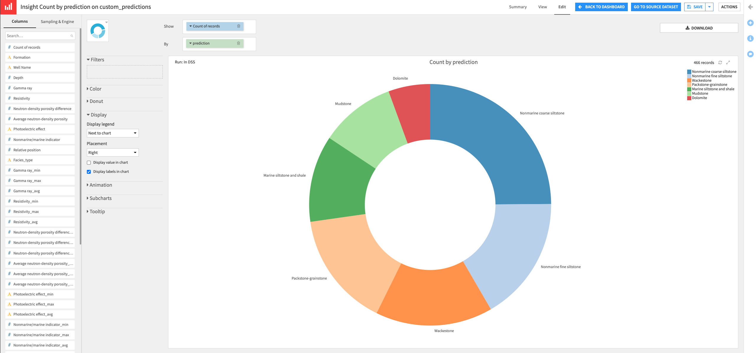
Click Save, then click Back to Dashboard.
You can rearrange your tiles to your liking. Then click Save.
Click the View tab to explore your dashboard.
Create a Dataiku app#
At this point, our project is mostly done, and we may want to share it with others so that they can reuse it with any well (not limited to Shrimplin). However, if we were to give users access to the whole project, they would certainly make many changes that might not be ideal. One way to solve this problem while allowing others to use the project is to package it as a reusable Dataiku app.
Before we create the Dataiku app, we will need to make a few modifications to the project. These include: automating the retraining of the model when the input train dataset changes and creating a variable that can take on the value of any desired Well name.
Automate model retraining#
Let’s start by creating a scenario to automate model retraining. Every time that a different “Well Name” is selected in the Split recipe, we will need to rebuild the Flow, re-train the machine learning model, and rerun the Evaluate recipe. We would also want to update the dashboard to view our results.
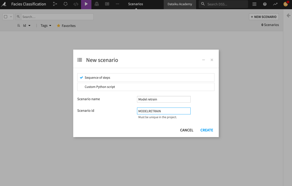
Let’s create the Scenario.
From the project’s top navigation bar, go to Scenarios.
Click Create Your First Scenario and name it
Model retrain.Click Create.
Go to the Steps tab.
Add a Build/Train step.
Click Add a Model to Build and select the deployed model (there should be only one).
Click Add.
Change the build mode to Force-rebuild dataset and dependencies.
Add a second Build/Train step.
Add two datasets to build: custom_predictions and custom_metrics.
Keep the default settings.
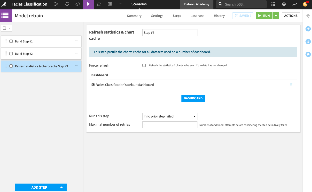
Add a last step to Refresh statistics and chart cache, and add your dashboard to that step. This last step will refresh the dashboard with the new computations.
Save the scenario.
Now we have a scenario to retrain our machine learning model, rebuild our Flow, and refresh the dashboard. However, we’re still missing an important step. We need to assign the Well Name to a variable so that its value can be changed as needed.
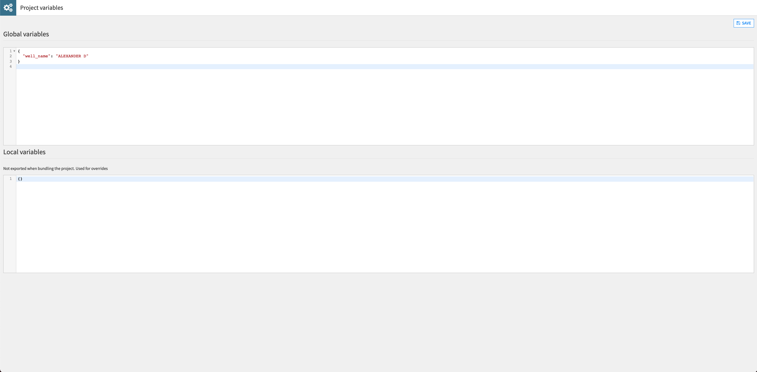
Define a project variable#
Let’s use a project variable to change the Well Name used in the Split recipe.
From the project’s top navigation bar, go to the More Options (
 ) menu and select Variables.
Define a project variable as follows:
{
"well_name": "ALEXANDER D"
}
Click Save.
Return to the Flow and open the Split recipe.
Update the formula in the “Splitting” step to replace “SHRIMPLIN” with the reference to the project variable as shown:
val('Well Name') == "${well_name}".Click Save.
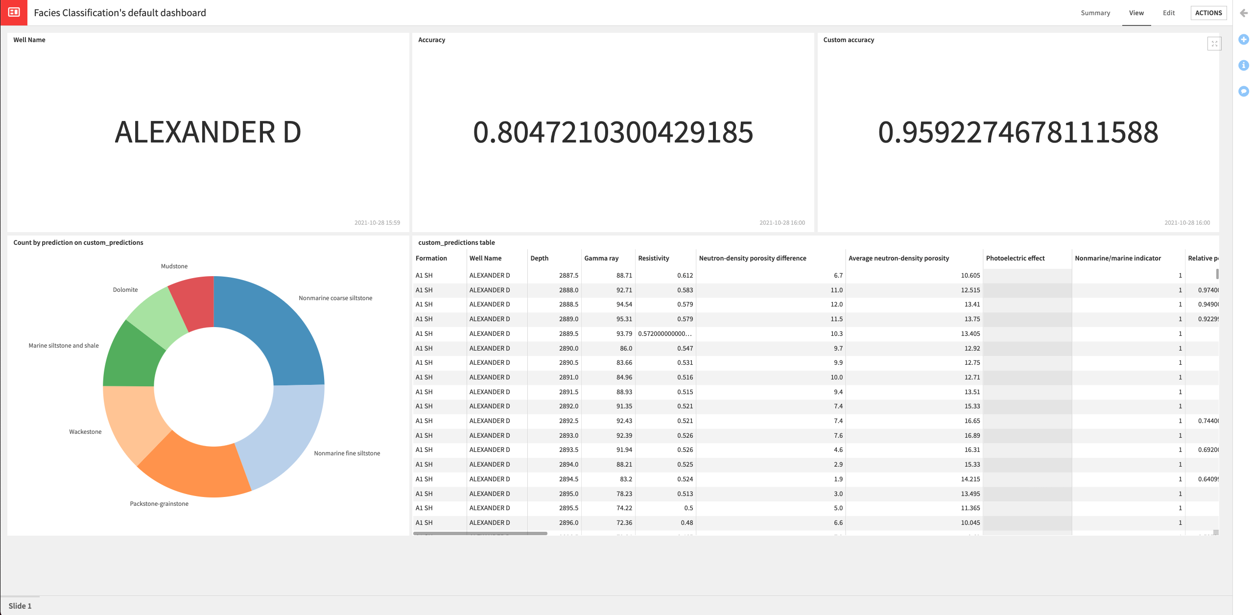
Return to the “Model retrain” scenario and run it. Wait for the run to complete (it might take a few minutes).
Open the dashboard to see that the tiles have been updated with information for the well “Alexander D”.
Create a Dataiku app#
Finally, we can package our project as a Dataiku app.
From the project’s top navigation bar, go to the More Options (
) menu and select Application Designer.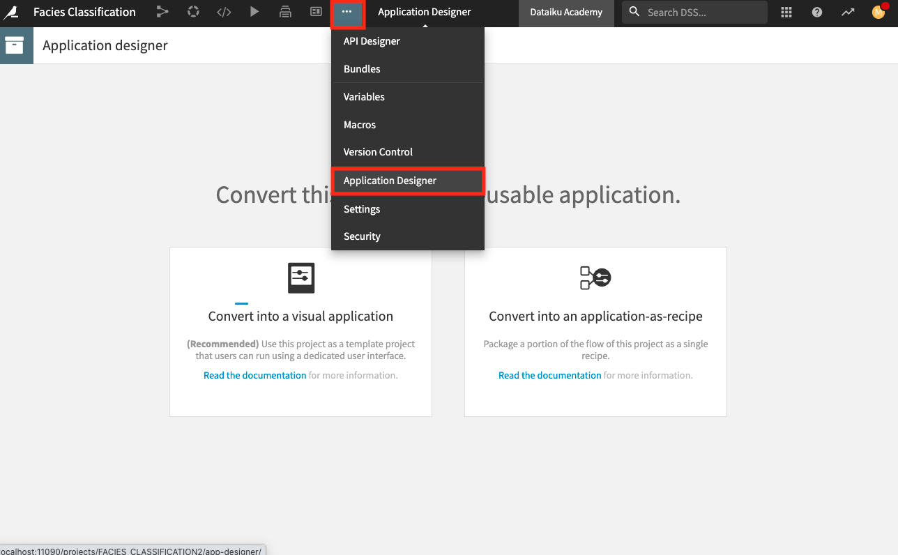
Select the option to Convert into a visual application.
In the “Content” tab, tick the option to “Export all ‘uploaded’ datasets”.
Keep the other default settings.
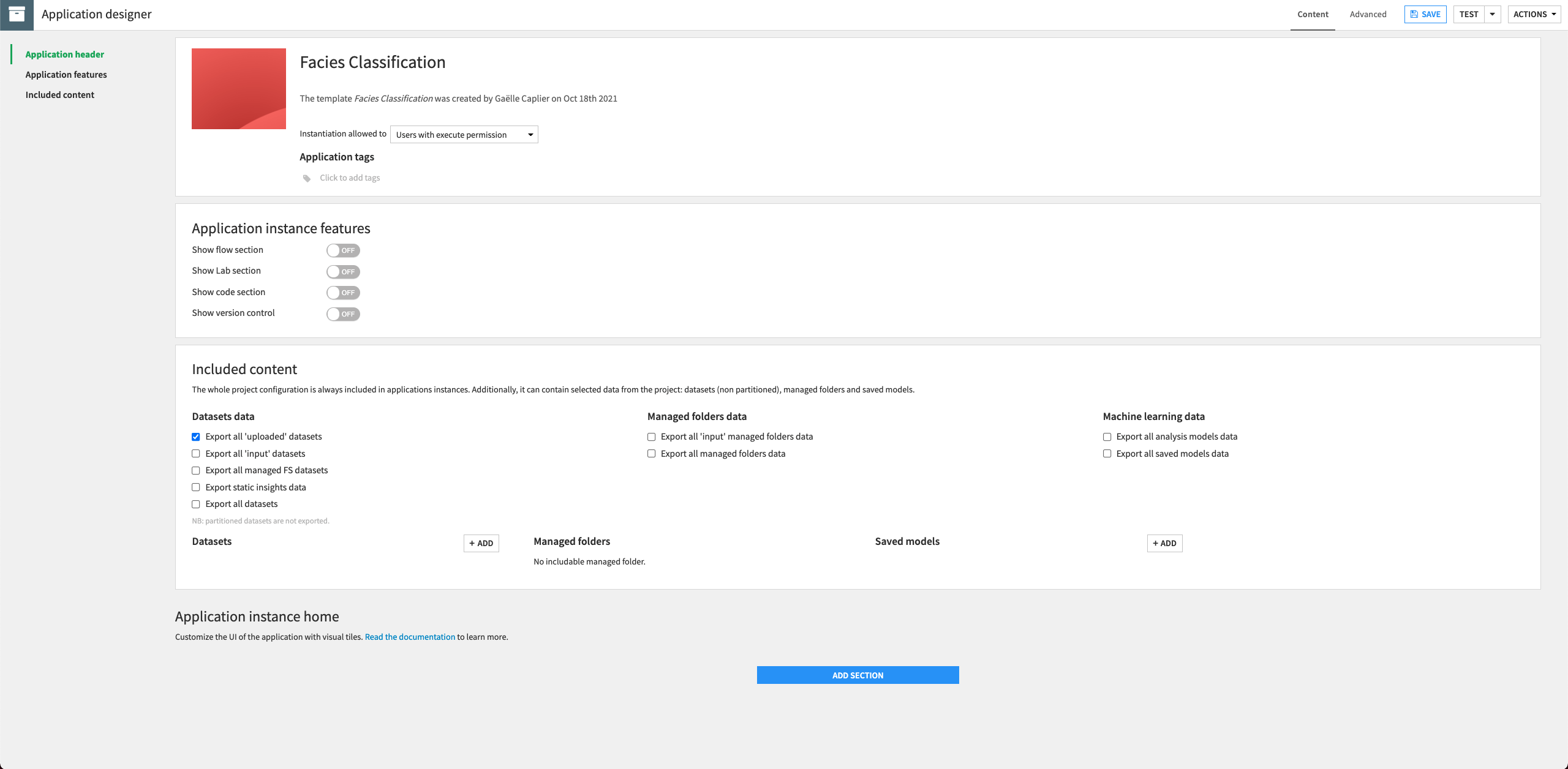
Click Add Section to a new section to the application.
Provide the Title:
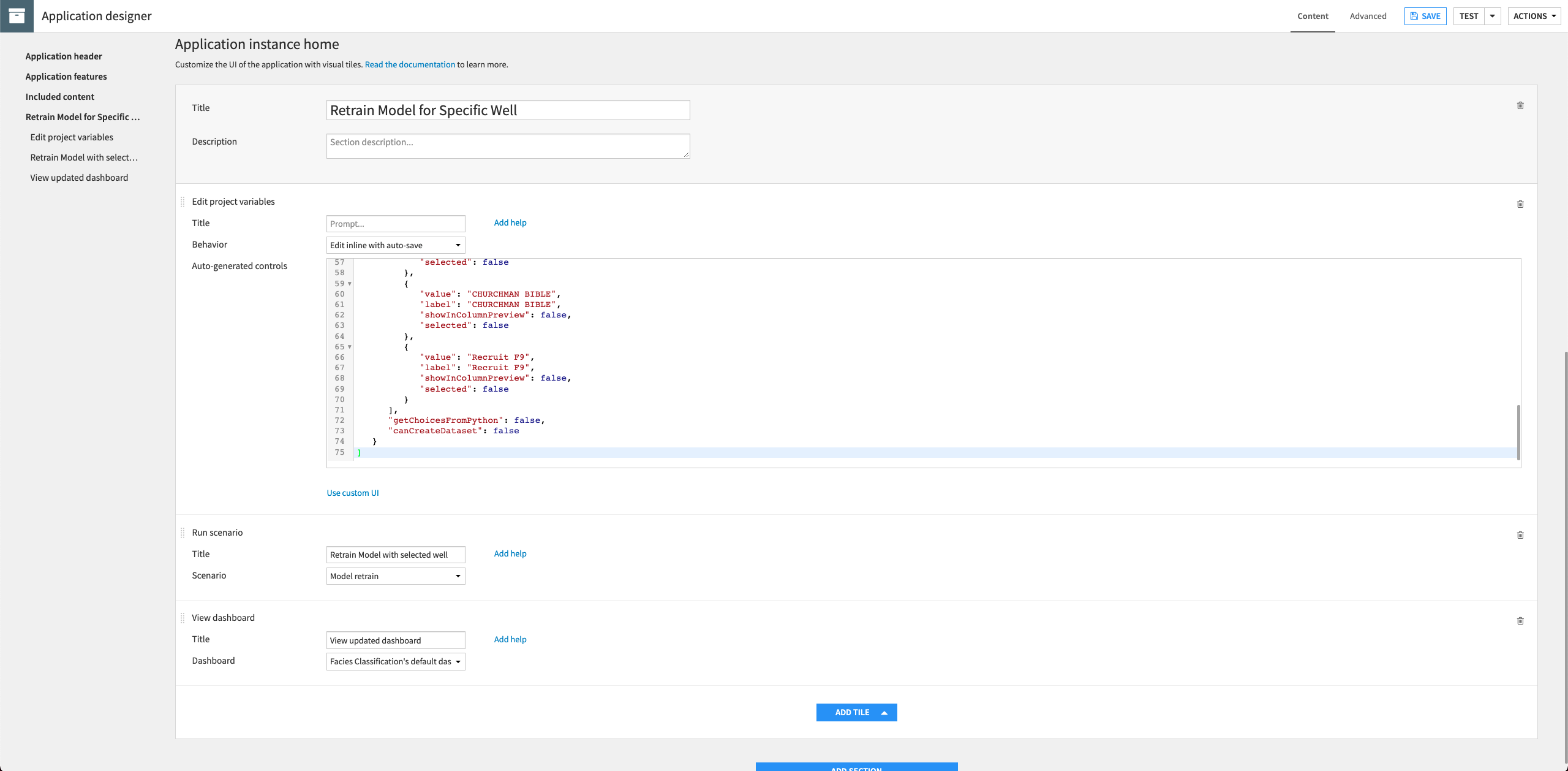
Retrain Model for Specific Well.In this section, click Add Tile to add a new tile and select Edit project variables.
Provide the “Title”:
Select Well Name.Select the “Behavior”: Edit inline with auto-save.
In the “Auto-generated controls” code editor, provide the following JSON:
[
   {
      "name": "well_name",
      "type": "SELECT",
      "label": "Well Name",
      "mandatory": true,
      "canSelectForeign": false,
      "markCreatedAsBuilt": false,
      "allowDuplicates": true,
      "selectChoices": [
         {
            "value": "CROSS H CATTLE",
            "label": "CROSS H CATTLE",
            "showInColumnPreview": false,
            "selected": false
         },
         {
            "value": "SHRIMPLIN",
            "label": "SHRIMPLIN",
            "showInColumnPreview": false,
            "selected": false
         },
         {
            "value": "ALEXANDER D",
            "label": "ALEXANDER D",
            "showInColumnPreview": false,
            "selected": false
         },
         {
            "value": "NEWBY",
            "label": "NEWBY",
            "showInColumnPreview": false,
            "selected": false
         },
         {
            "value": "LUKE G U",
            "label": "LUKE G U",
            "showInColumnPreview": false,
            "selected": false
         },
         {
            "value": "SHANKLE",
            "label": "SHANKLE",
            "showInColumnPreview": false,
            "selected": false
         },
         {
            "value": "KIMZEY A",
            "label": "KIMZEY A",
            "showInColumnPreview": false,
            "selected": false
         },
         {
            "value": "NOLAN",
            "label": "NOLAN",
            "showInColumnPreview": false,
            "selected": false
         },
         {
            "value": "CHURCHMAN BIBLE",
            "label": "CHURCHMAN BIBLE",
            "showInColumnPreview": false,
            "selected": false
         },
         {
            "value": "Recruit F9",
            "label": "Recruit F9",
            "showInColumnPreview": false,
            "selected": false
         }
      ],
      "getChoicesFromPython": false,
      "canCreateDataset": false
   }
]
In the same section, click Add Tile to add a new tile and select Run scenario.
Provide the “Title”:
Retrain Model with selected well.Select the “Scenario”: Model retrain.
Add a last tile to the section, selecting the type View dashboard.
Provide the “Title”:
View updated dashboard.Select the default dashboard for the project.
Save the application and then Test it. Creating a test instance might take a few minutes.
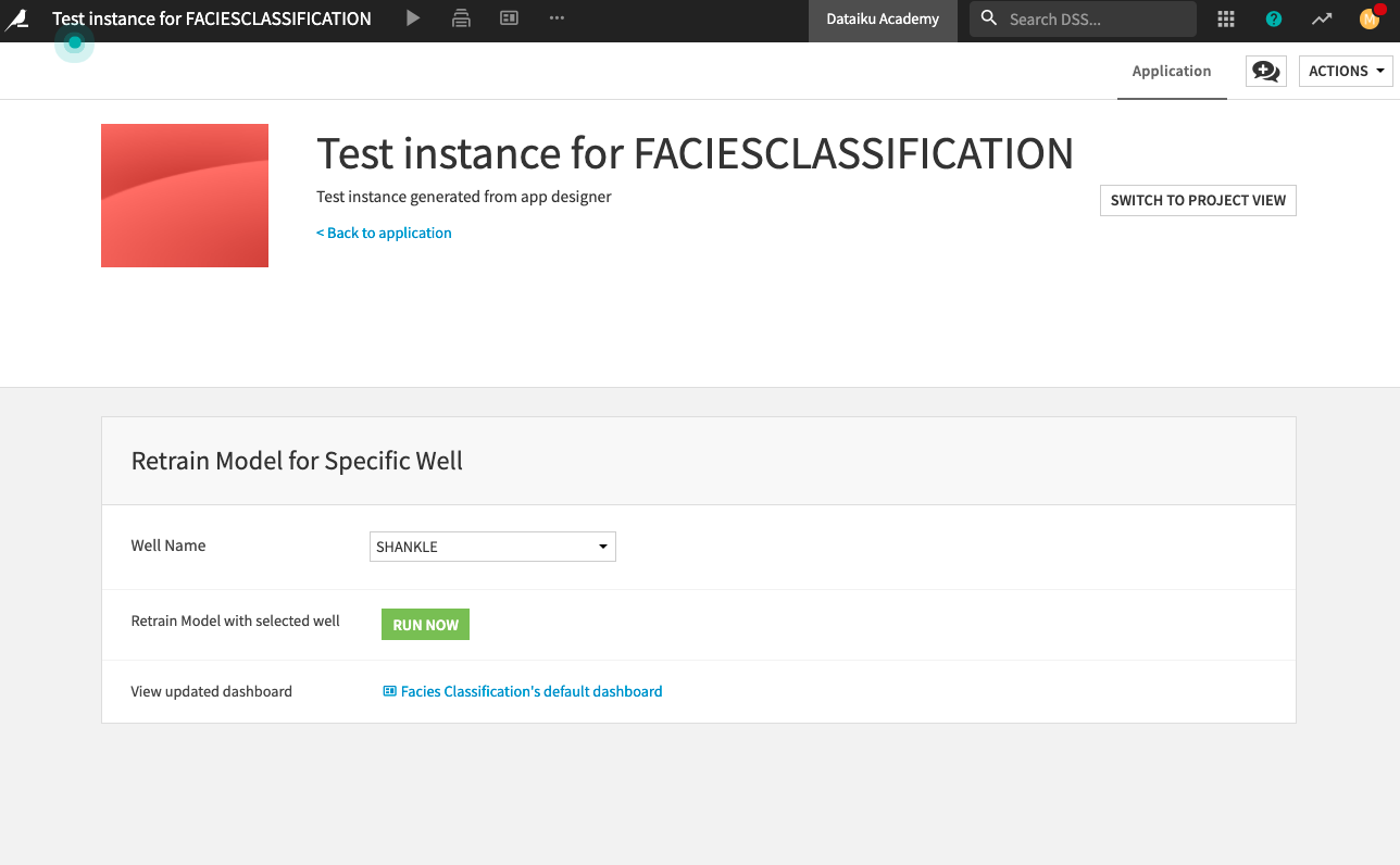
Once the test instance is ready, you can test the application with different well names (for example, “Shankle”) by selecting a name from the dropdown menu of the “Well Name” section.
You can then retrain the model for the chosen well by clicking the Run Now button to run the project’s scenario.
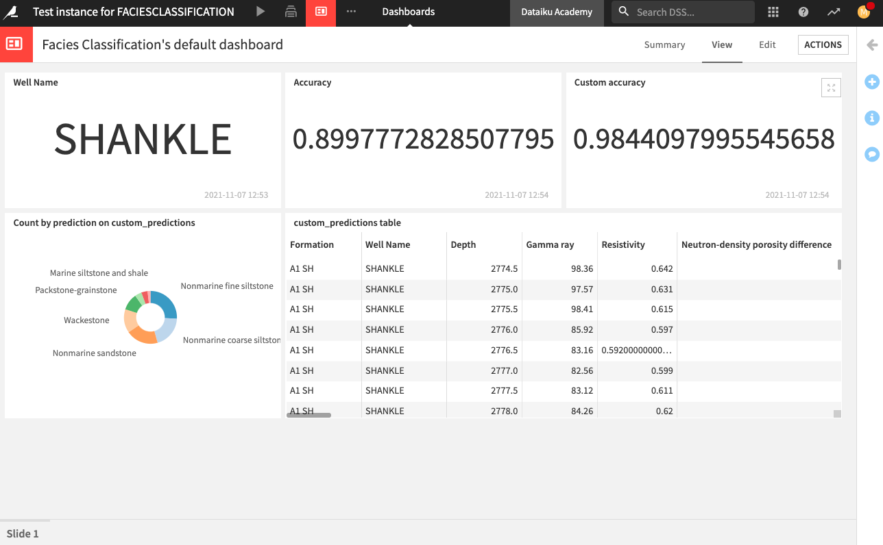
After running the scenario, you can explore the dashboard that has been updated to reflect information for the selected well.
Wrap-up#
Congratulations! We created an end-to-end workflow resulting in a dashboard for non-technical experts and a Dataiku app for others to reuse our project. Compare your own work to that of the project posted in the Dataiku gallery.