Tutorial | Network optimization#
Note
This content was last updated using Dataiku 11.
Overview#
Business case#
The car rental company from the Predictive Maintenance use case wants to expand their network to satisfy new demand from a partnership with an insurance company. To get maximum value from this expansion, they have approached our data team once again. Their goals include being able to:
Understand how the current network fits with the observed and anticipated demand.
Optimize the vehicle rotation schedule by predicting the demand at each agency location.
Evaluate partnerships and/or acquisition locations to expand the network efficiently.
Supporting data#
This use case requires the following three input data sources, available as downloadable archives at the links below:
Demand: A record of all road accidents handled by the insurance company spanning four years. The four yearly files total approximately 250k observations. This dataset is a modified version of a French open dataset.
Network: A simulated dataset that records information on the current locations of nearly 350 car rental agencies.
Partners: A simulated dataset that contains information on potential partners; that is, new locations (garages) to expand the network. The data must be parsed from raw HTML to extract the relevant information.
Workflow overview#
The final Dataiku pipeline is pictured below.

The Flow has the following high-level steps:
Upload the datasets.
Clean the datasets.
Join the datasets based on geographic proximity.
Aggregate the data by geography and station.
Additionally, we will create visualizations using charts and a webapp, to be shared on a dashboard.
Prerequisites#
You should be familiar with:
Core Designer learning path
The Window recipe
Technical requirements#
The Reverse Geocoding / Admin Maps plugin is required to create the filled administrative map chart.
The Geocoder plugin is required to enrich the demand dataset and identify the geographic coordinates of rental agencies from addresses.
[Optional] A MapQuest developer or Bing Maps API key is required if you use one of those providers in the Forward geocoding recipe of the Geocoder plugin.
Note
For general notes on plugins to Dataiku, please see the reference documentation.
Data preparation#
The end goal of our data preparation is to take the three input datasets and produce a single dataset of unique car accidents and the geographic locations of the nearest rental agency and garage.
To get started, within Dataiku, create a new project and name it Network Optimization.
Demand dataset#
Create a new dataset from the yearly demand files (that is, accidents.zip). Since all files have the same structure, we can drag and drop the ZIP file in a single upload, and Dataiku will stack the four CSV files automatically. Name the output accidents_database.
The accidents_database first needs cleaning in order to be suitable for analysis. The main preparation steps we will undertake include:
Cleaning and parsing the date for each observation.
Cleaning longitudes and latitudes and creating GeoPoints.
Enriching GeoPoints with administrative information.
From the accidents_database, create a Prepare recipe and store the output in the default name, accidents_database_prepared.
Cleaning dates and times#
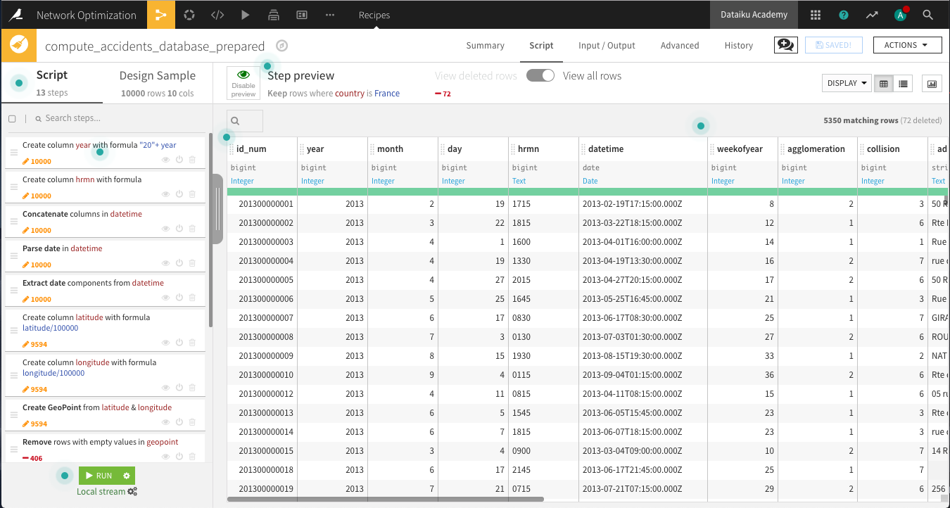
To get a recognizable datetime object, we will need to clean and concatenate the year, month, day and hrmn columns by adding the following steps to the Prepare script.
The year column has two-digit years instead of four. Add a new step using the Formula processor. Name the output column year, and use the expression
"20" + year.There are inconsistencies in the number of digits in the hrmn column, which represents the hours and minutes. Convert it to a 24-hour (military time) format using the Formula processor. Name the output column hrmn. Copy and paste the expression below, so that 12:30 AM will be written as “0030”, 6:45 AM as “0645”, 10:00 PM as “2200”, and so on. In other words, the output of each row in the column should contain four digits according to a 24-hour clock format.
if(length(hrmn) == 3,"0"+hrmn,
if(length(hrmn) == 2,"00"+hrmn,
if(length(hrmn) == 1,"000"+hrmn,hrmn)))
Use a Concatenate columns processor to merge the year, month, day, and hrmn columns into an output column
datetime, using-as the delimiter.Because the new datetime column is stored as a string, use the Parse date processor in-place on datetime as the input column. Depending on your sample configuration, the likely format will be
yyyy-MM-dd-HHmmoryyyy-MM-ddZ. Be sure the new storage type is date.Use another processor to Extract date components from the datetime column. Only create one new additional column,
weekofyear, to mark the particular week in a year (1-52).
Cleaning geographic columns#
The latitude and longitude columns aren’t yet in the right format. We want to use the WGS 84 coordinates system, so these columns should be decimal values. Add a Formula processor that divides latitude by
100000.Repeat the same for longitude.
Use the Create GeoPoint from lat/lon processor with the input columns latitude and longitude. Name the output
geopoint.Click on the geopoint column header and select Analyze. Note that about 45% of the column values are “POINT(0 0)” or empty. Discard these observations in the next two steps.
Use the Remove rows where cell is empty processor on geopoint. You can also find it in the More actions menu after selecting the column header.
Use the Filter rows/cells on value processor on geopoint to remove matching rows where geopoint has the value
POINT(0 0).Use the Reverse-geocode location processor on the geopoint column, producing the output columns named city (level 8), department (level 6), region (level 4) and country (level 2).
Note
If you have successfully installed the Reverse Geocoding plugin, but run into difficulty using it the first time, note that the Reverse Geocoding plugin is one of the few plugins that requires restarting Dataiku before using it.
Delete the four columns with the “_enName” suffix. Switching to the Columns view makes this especially easy.
Keep only the rows for which country is
France. Using the Filter rows/cells on value processor, select country as the column, and addFranceas the value to match.
Run the recipe, updating the schema to 18 columns. We now have a clean dataset of the dates, times, and geographic locations of car accidents in France over a four year period.
Network dataset#
Upload the downloaded rental_agencies.csv.zip. Name the dataset rental_agencies. Here, the data is almost completely clean, and the main task is to geolocate the agencies. That is, for each row, retrieve the longitude and latitude corresponding to the address and ZIP code.
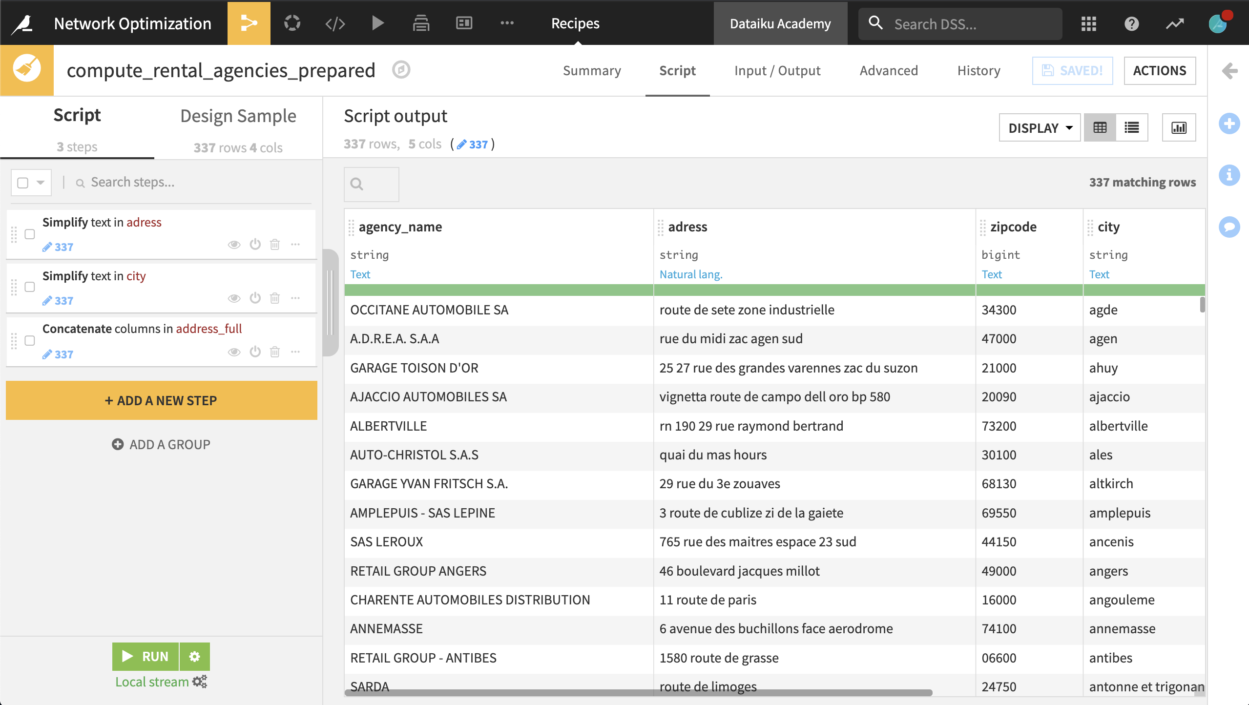
To do this, create a Prepare recipe with the default output name rental_agencies_prepared and the following steps:
Use the Simplify text processor on the address column. This normalizes the text.
Use the same processor with city as the input column.
Using the Concatenate columns processor, concatenate the columns address, zipcode, and city into the output column address_full, using a single space as a delimiter.
Run the recipe, updating the schema.
Now we want to use the Geocoder plugin to compute the latitude and longitude of each station’s address.
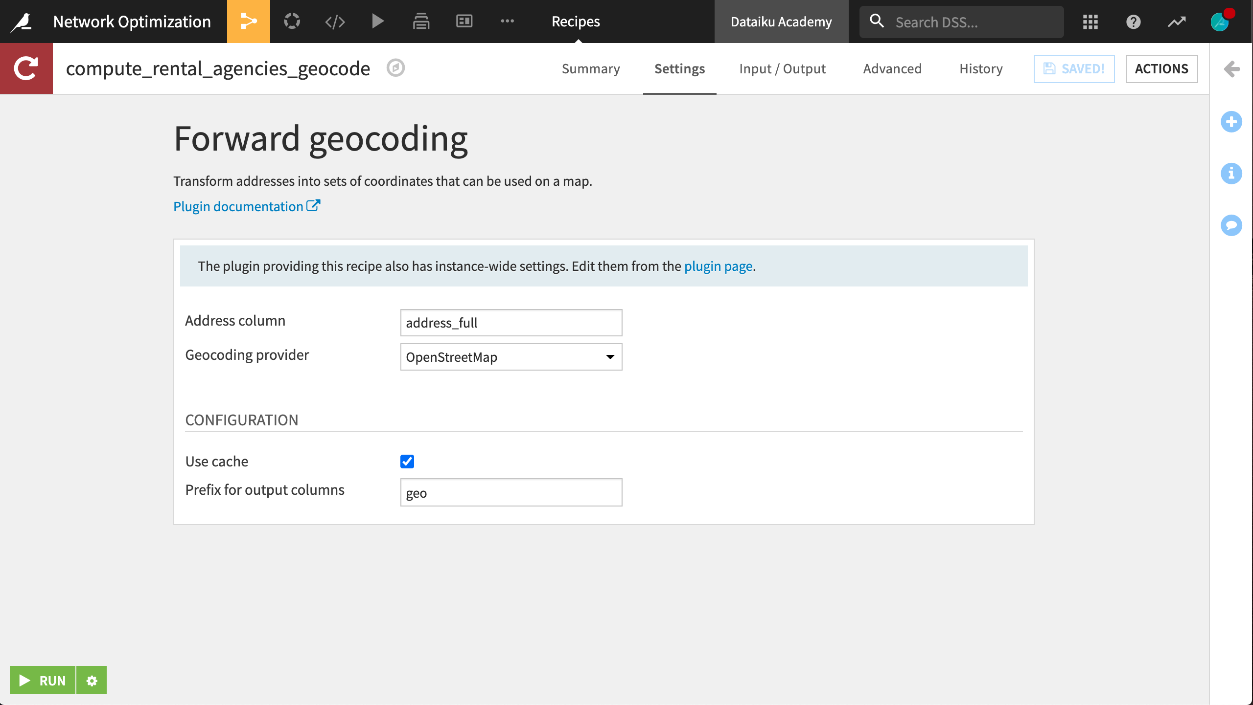
From the + Add Item > Recipe dropdown in the Flow, select Geocoder > Forward geocoding.
Set rental_agencies_prepared as the input dataset and create
rental_agencies_geocodeas the output.Select address_full as the address column and select your choice of provider to retrieve the latitude and longitude of each rental agency. Specify
geoas the prefix for the generated columns.
Garage dataset#
The last dataset is found in garage_locations.csv.zip. In order for Dataiku to recognize the data, go into the Format/Preview tab and select One record per line from the Type dropdown. The resulting dataset, garage_locations, should have a single column.
We now need to parse the HTML code in each cell to extract the relevant information (the name and latitude/longitude of each garage). For that, we will use a combination of string transformations. The trick is to find unique string combinations to split the column as efficiently as possible and avoid mistakes.
Note
For longer recipes, as shown in the one here, organizing steps into Groups can be a useful tool, particularly if you need to duplicate a series of steps elsewhere.
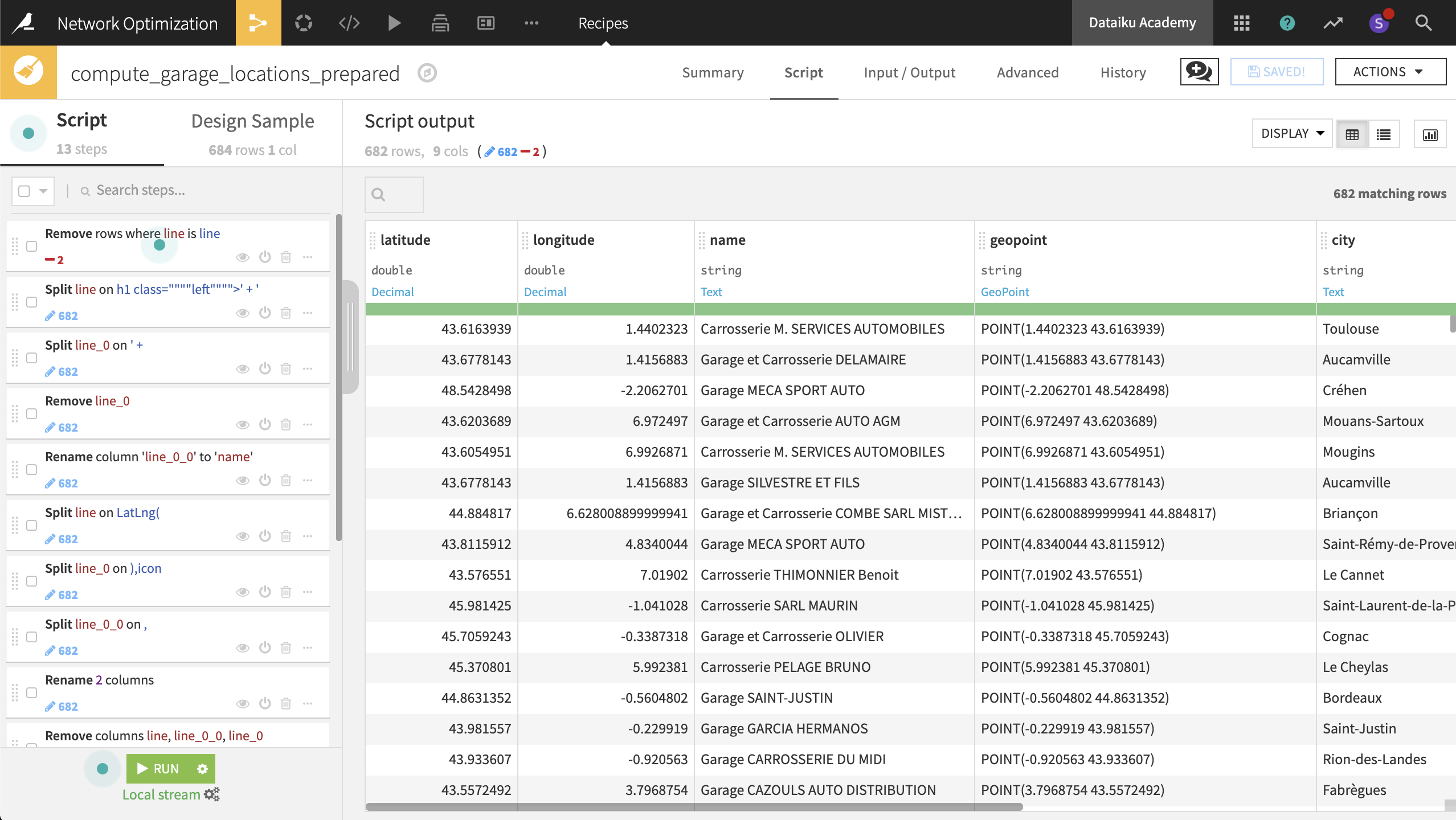
From the garage_locations dataset, create a new Prepare recipe, keeping the default output name, and adding the following steps to the script:
Use the Filter rows/cells on value processor to remove rows where the column line has the value
line.The values in the dataset are too long to view in their entirety in the table. Right-click on the first cell and select Show complete value. Looking at the complete value of the first cell, the garage name (“Carrosserie M. SERVICES AUTOMOBILES”) is wrapped within
h1tags. This seems to be the case for each observation, so let’s try splitting the first column on theh1tag.Use the Split column processor on the line column, taking
h1as the delimiter. This gets us part of the way there, but there is still a common prefix before the garage name.In the same Split step, try adding the whole prefix
h1 class=""""left"""">' + 'as the delimiter. Select Truncate in the Split processor, making sure that “Starting from” is set to End to keep only the last column.
In a new step, use the Split columns processor on the line_0 column, with
' + 'as the delimiter. Select Truncate to keep only the first column from the beginning.Delete the column line_0.
Rename the column line_0_0 to
name.Select the last four steps. After right clicking, select Group and name it
Parse garage name.
Now parse the latitude and longitude coordinates using a similar process:
Split the column line on the delimiter
LatLng(. Select Truncate, keeping1column starting from the End.Split the new column line_0 on the delimiter
),icon. Here Truncate, keeping1column starting from the Beginning.Split the new column line_0_0 on the delimiter
,.Rename the column line_0_0_0 to
latitudeand line_0_0_1 tolongitude.Delete the columns line, line_0 and line_0_0, leaving only three remaining columns.
Organize the last five steps into a group called Parse lat/lon coordinates.
Use the Create GeoPoint from lat/lon processor to create a new column named geopoint from the existing latitude and longitude columns.
Use the Reverse-geocode location processor on the geopoint column to extract the same geographic information as for rental_agencies_prepared: city (level 8), department, region and country
Delete all the four new columns with the “_enName” suffix.
Run the recipe, updating the schema to nine columns.
We now have three geo-coded datasets: accidents, rental agencies, and garages.
Geo-Joining Datasets#
In this step, the objective is to enrich each accident observation with the nearest rental agency and the nearest garage so as to simulate our operating model and plan capacity at the station or geographic level.
With the Geo-join processor, we’ll be able to calculate the distance between an accident and the nearest rental agency, or an accident and the nearest garage.
From the accidents_database_prepared dataset, create a new Prepare recipe with accidents_joined as the output and the following steps in the script.
Add a new step with the Geo-join processor:
Specify the
latitudeandlongitudecolumns from “this” dataset.Select rental_agencies_geocode as the “Dataset to Join with”.
geolatitudeandgeolongitudeidentify the latitude and longitude coordinates in the “other” dataset.The “Columns to copy from the other dataset” are
agency_name,geolatitude, andgeolongitude.Specify
station_as the output column prefix.
Add another Geo-join processor step:
latitudeandlongituderemain the columns from “this” dataset.garage_locations_prepared is the dataset to join with.
latitudeandlongitudeidentify the needed columns in the “other” dataset.Copy the
nameandgeopointcolumns from the garage dataset.Specify
garage_as the output column prefix.
Run the recipe, updating the schema to 25 columns.
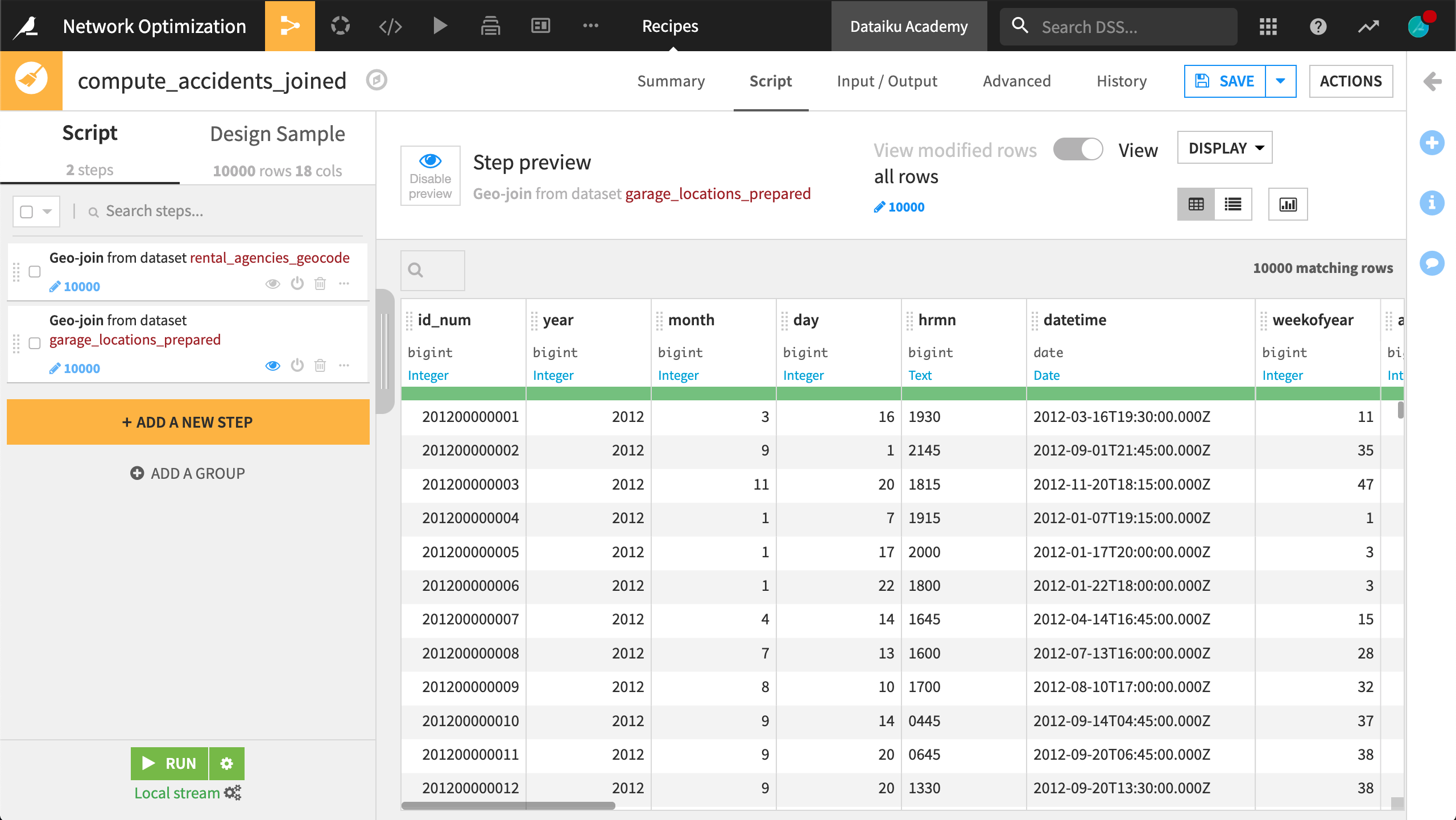
Data preparation is done! We now have one dataset that includes not only the date, time, and location of every car accident, but also the names and locations of the nearest rental agency (or station) and garage for each accident.
Analysis & visualization#
The end goal of this project is to provide analyses that our colleagues outside the data team can understand and use. We can create a number of visualizations and organize them within a dashboard to get an idea of our network and the structure of the demand.
Charts#
Without any further data transformation steps, the accidents_joined dataset has information we can use to create visualizations of the current network. Within the Charts tab of the accidents_joined dataset, create the following charts:
Note
Recall that the Explore tab only displays a sample of the data. For the Charts to display the entire dataset, see the Sampling & Engine tab on the left panel. Unchecking the box “Use same sample as explore” allows the user to change the sampling method here.
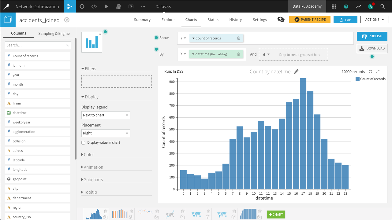
Distribution of accidents by hour of the day
In a histogram, drag Count of records to the Y-axis and datetime to the X-axis, with “Hour of day” selected as the date range.
Distribution of accidents by day of week and year
In a histogram, drag Count of records to the Y-axis, datetime to the X-axis, with “Day of week” selected as the date range, and subgroups defined by year.
For binning, year should use raw values.
Weekly comparison of accidents count on the past 4 years
In a line chart, drag Count of records to the Y-axis, weekofyear to the X-axis, and subgroups defined by year.
For binning, weekofyear and year should use raw values.
Geographic distribution of accidents, filtering out for low collision scores
In a scatter map, drag geopoint to define the points and collision to define the color of each point, with more collisions creating a darker color.
Add the collision column as a filter, limiting points to where collision is greater than 3.
Choropleth of number of accidents
In a filled administrative map, drag geopoint to define the tile shapes; select Department/County as the Admin level. Count of records defines the color of each polygon.
The resulting map shows the highest number of accidents occur in Bouches-du-Rhône on the southeastern coast.
Choropleth of average distance between accidents and agencies
In a Filled Administrative map, let geopoint at the Department/County admin level define the polygon shapes. Let station_join_distance define the color of each polygon.
The resulting map shows the greatest average distance to stations occurs in Corsica.
Cumulative distribution of accidents based on distance to agencies (5 km bins)
In a stacked bar chart, drag Count of records to the Y-axis and station_join_distance to the X-axis.
The Compute setting for Count of records should be set to Cumulative values, and binning for station_join_distance should be set to “Fixed-size intervals” of bin size 5.
This last chart is a first step towards capacity planning. We can see a significant number of accidents that are more than 15km from the closest rental station. To account for the effect of partner garages, we need to create some new columns.
In the Lab, create a new Visual analysis for accidents_joined, named Analyze_accidents_joined, and add the following steps to the script.
Use the Formula processor to create the column effective_network with the expression below. It creates a rule where if the distance between the collision and the nearest rental station is over 15km, and the nearest garage is closer, the garage will handle the request; otherwise the station will.
if(station_join_distance > 15 && garage_join_distance < station_join_distance,
    "garage","station")
Use the Formula processor to create the column effective_distance with the expression below. Given the rule above for determining where the request is handled, this computes the actual distance between the collision and the location that will handle the request.
if(effective_network=="garage",garage_join_distance,station_join_distance)
Now in the Charts tab of the same Visual Analysis, create the following chart.
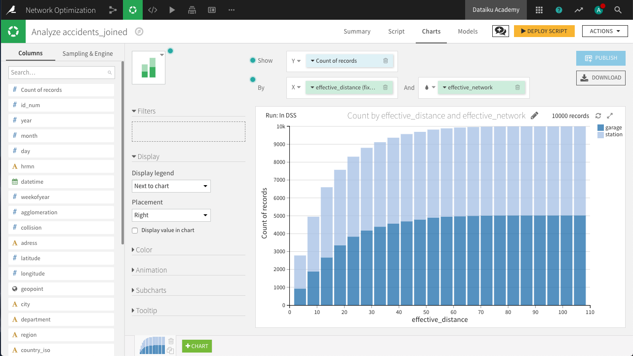
Cumulative distribution of effective distance
In a stacked bar chart, drag Count of records to the Y-axis, effective_distance to the X-axis, and subgroups defined by effective_network.
The Compute setting for Count of records should be set to Cumulative values, and binning for effective_distance should be set to fixed-size intervals of size 5.
Notice that partnering with the garage network would allow us to effectively cover many more collisions than we otherwise would be able to without the garages.
From the yellow icon at the top right, Deploy the script as a Prepare recipe, making sure to check both the options Create graphs on the new dataset and Build the dataset now. Accept the default output name, accidents_joined_prepared.
This first set of charts is ready!
Webapp#
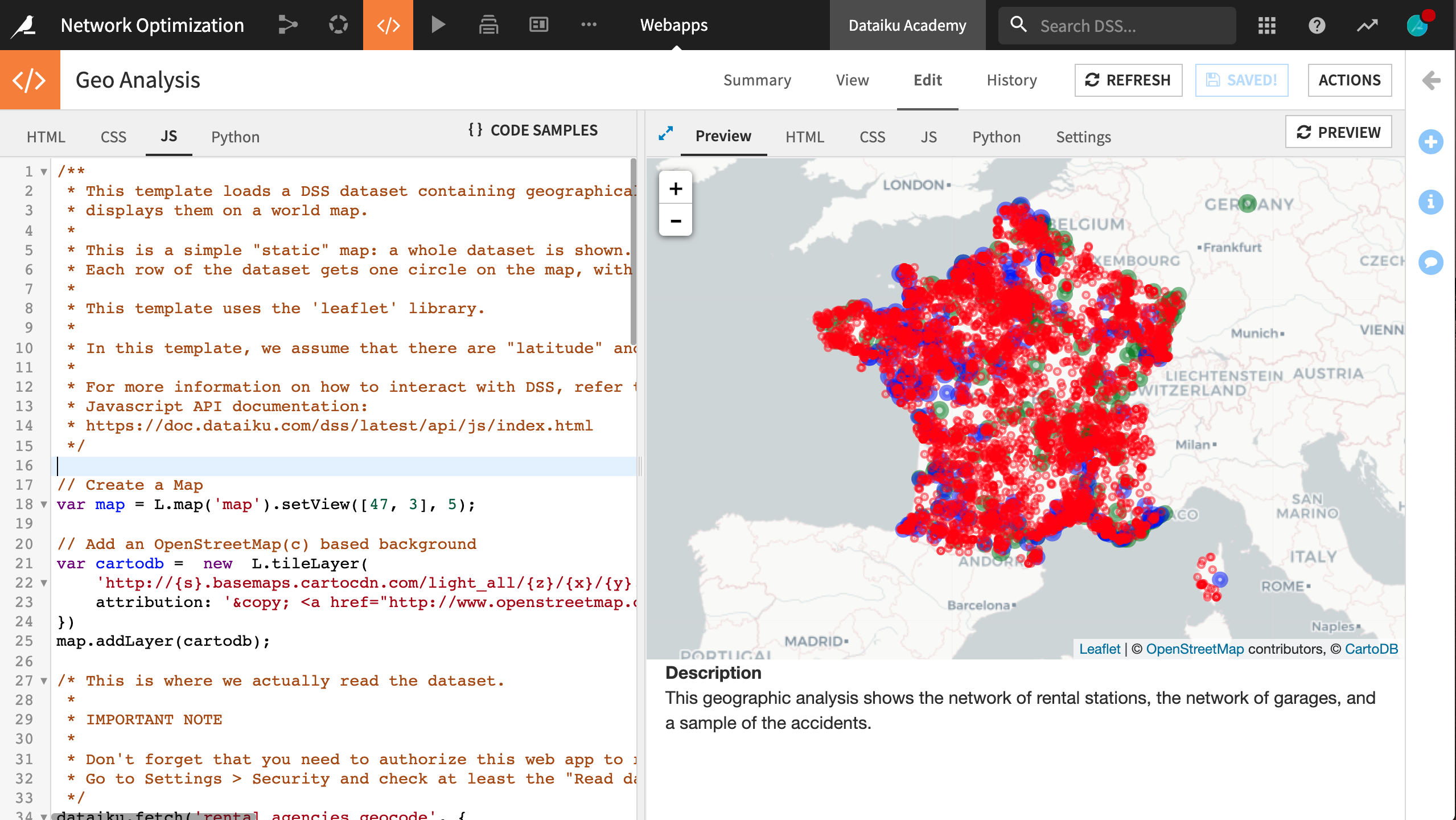
The geo-join processor allowed us to calculate the distances between accidents and rental agencies or garages. Now let’s map this network with the help of a webapp.
The advantages of using a webapp for this visualization are its flexibility in creating advanced or dynamic charts and the ability to visualize data from several datasets in the Flow.
Note
For more resources on creating webapps in Dataiku, such as Python Bokeh or R Shiny, please visit the reference documentation.
From the Code (“</>”) menu in the top navigation bar, create a new Webapp.
This will be a Code Webapp so we can fully customize it. Moreover, make it a Standard HTML webapp. Lastly, choose Starter code for creating map visualizations, and name it
Geo Analysis.The starter code includes a preloaded tile map (from Leaflet) and a template for the JavaScript code.
Within the Edit object tab, navigate to the Settings tab in the main panel.
Under Security, click Configure.
Grant the webapp “Read data” permission for the prepared accidents, rental agencies, and garage datasets.
In the HTML tab, remove the default
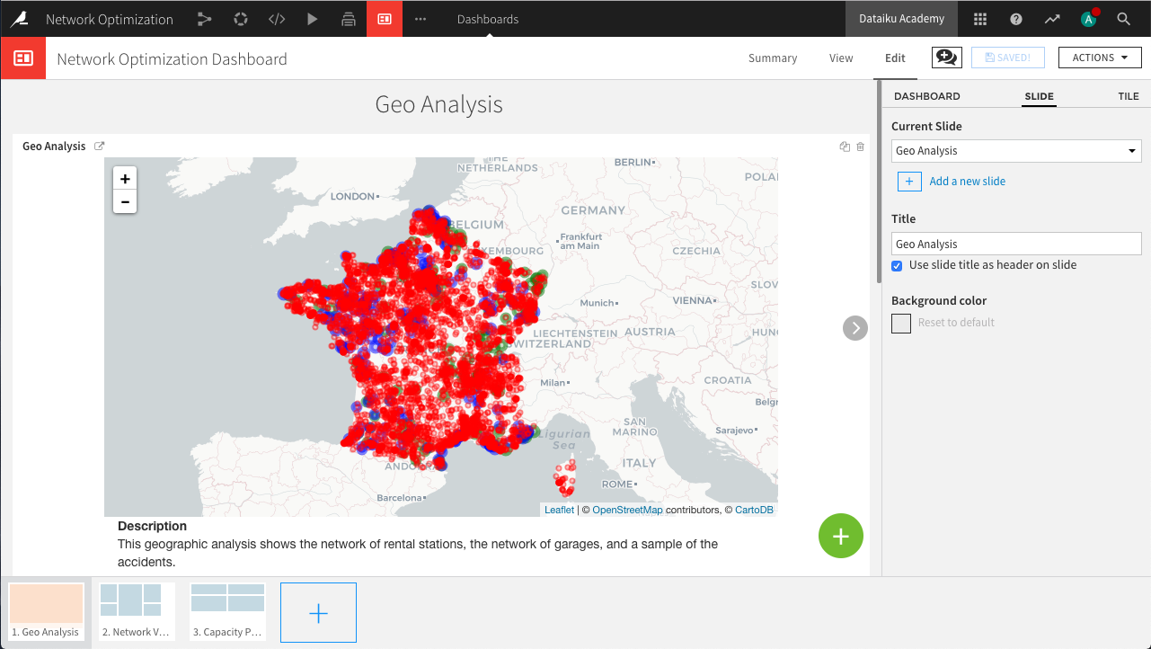
<h1>heading and the following paragraph containingA short legend. Replace the description so that the HTML code appears as the following:<!-- Body of your app --> <div class="container"> <div class="row"> <div class="col-md-9" id="map"></div> <div class="col-md-3"> <strong>Description</strong> <p> This geographic analysis shows the network of rental stations, the network of garages, and a sample of the accidents. </p> </div> </div> </div>
In the JS tab, alter the block starting with
dataiku.fetch()to the following. This block adds the rental agencies to the map as green points.dataiku.fetch('rental_agencies_geocode', { sampling : "head", limit : 20000 }, function (df) { // Add a map marker for each row on the dataset // Each marker is a circle. The size of the circle varies with the 'size' column values var nbRows = df.getNbRows(); for (var i = 0; i < nbRows; i++) { var record = df.getRecord(i); // Replace by your own column names here var lat = parseFloat(record["geolatitude"]); var lon = parseFloat(record["geolongitude"]); var name = record["agency_name"]; var city = record["city"]; if(isNaN(lat) || isNaN(lon)) continue; // Radius of the marker is in meters var radius = 15000; var marker = new L.circle([lat, lon], radius, { color: 'green', fillColor: 'green', fillOpacity: 0.2 }).bindPopup("Name: <strong>" + name + "</strong>"); marker.addTo(map); }; });
Now make a copy of the above block of code and alter it to the following. Or alternatively, paste the block below to add the garages to the map as blue markers. For the sake of clarity, a random sample of 200 garages is displayed.
dataiku.fetch('garage_locations_prepared', {
    sampling : "random",
    limit : 200
  }, function (df) {

    // Add a map marker for each row on the dataset
    // Each marker is a circle. The size of the circle varies with the 'size' column values
    var nbRows = df.getNbRows();
    for (var i = 0; i < nbRows; i++) {
      var record = df.getRecord(i);

      // Replace by your own column names here
      var lat = parseFloat(record["latitude"]);
      var lon = parseFloat(record["longitude"]);
      var name = record["name"];

      // Radius of the marker is in meters
      var radius = 15000;

      var marker = new L.circle([lat, lon], radius, {
          color: 'blue',
          fillColor: 'blue',
          fillOpacity: 0.2
        }).bindPopup("Name: <strong>" + name + "</strong>");

        marker.addTo(map);
      };
});
Finally, copy the previous block with the following alterations or paste the new block below. This section adds the accidents to the map with red markers. For clarity, a random sample of 10,000 accidents is displayed.
dataiku.fetch('accidents_database_prepared', {
    sampling : "random",
    limit : 10000
  }, function (df) {

    // Add a map marker for each row on the dataset
    // Each marker is a circle. The size of the circle varies with the 'size' column values
    var nbRows = df.getNbRows();
    for (var i = 0; i < nbRows; i++) {
      var record = df.getRecord(i);

      // Replace by your own column names here
      var lat = parseFloat(record["latitude"]);
      var lon = parseFloat(record["longitude"]);
      var collision = record["collision"];

      // Radius of the marker is in meters
      var radius = 1;

      var marker = new L.circle([lat, lon], radius, {
          color: 'red',
          fillColor: 'red',
          fillOpacity: 0.2
        }).bindPopup("Number of collisions: <strong>" + collision + "</strong>");

        marker.addTo(map);
      };
});
With three separate dataiku.fetch() calls, save the changes and the preview should update accordingly with the new custom visualization we just created. Our simple webapp is done!
Group and Window recipes#
In this section, we use the Group and Window recipes to create visualizations for capacity planning at the station and regional level.
Regional level analysis#
Which regions have the greatest need for expansion? To answer this, we have to identify the regions with the highest number of accidents per rental agency. Additionally, we want to see the extent to which these figures vary seasonally.
Starting from the accidents_joined_prepared dataset, initiate a Group recipe. Choose to group by month and keep the default output name. In the recipe settings:
In the Pre-filter step, create a filter to keep only rows where the value of year is greater than
2012.In the Group step, add region as a second group key, keep “Compute the count for each group” selected, and add the following aggregations:
For collision: Avg
For station_agency_name: Distinct
For station_join_distance: Avg
For garage_name: Distinct
For garage_join_distance: Avg
In the Post-filter step, keep only the rows where region is defined.
Run the recipe, updating the schema to eight columns.
From here, we can draw the monthly load curves by region, so as to identify areas where we need to increase our capacity, and possibly identify seasonal effects that can help us optimize the rotation of our vehicles.
In the Lab, create a new Visual analysis with the default name. On the Script tab, use the Formula processor to create a new column, capacity_ratio, from the expression count/station_agency_name_distinct.
On the Charts tab, create a new Lines chart with capacity_ratio on the Y-axis, month on the X-axis, and subgroups defined by region. Set the aggregation for capacity_ratio to “MAX”, the binning for month to use raw values, and the sorting for region to display the 7 regions with the highest monthly ratios.
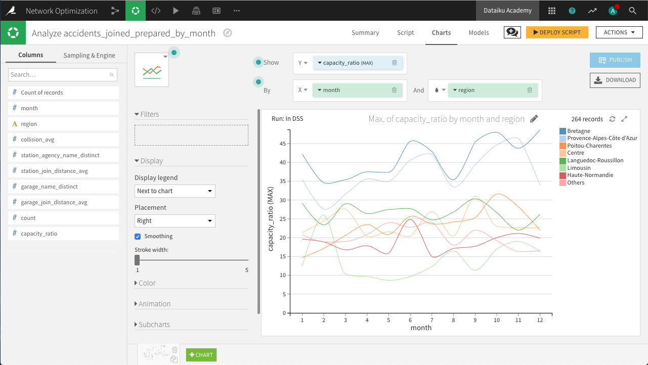
The resulting chart above shows that Bretagne and Provence-Alpes-Côte d’Azur are most in need of extra resources. Among the regions, there are suggestions of seasonal spikes, but further analysis would be needed to determine whether these are significant or spurious variations.
Deploy the script as a Prepare recipe, making sure to check both options Create graphs on the new dataset and Build the dataset now. Keep the default output name.
Station level analysis#
The goal here is to create a dataset with one record per station, and columns showing the monthly load values as well as a 3-month sliding average. We can do this with a Group recipe followed by a Window recipe.
Note
For a more detailed explanation of the Window recipe, please see the reference documentation or the Visual Recipes course.
Starting again from the accidents_joined_prepared dataset, create a Group recipe. Choose to group by month and name the output accidents_by_station.
In the Group step, add station_agency_name as a second group key, keep “Compute the count for each group” selected, and choose the following aggregations:
For station_join_distance: Avg
Run the recipe, updating the schema to four columns.
From the resulting dataset, create a Window recipe. Keep the default output name.
In the Windows definitions step, identify station_agency_name as the partitioning column and month (ascending) as the ordering column. To create a 3-month sliding window, set the window frame to limit the number of preceding rows to
3and the number of following rows to0.In the Aggregations step, select the following aggregations:
For month: Retrieve
For station_agency_name: Retrieve
For station_join_distance_avg: Retrieve, Max
For count: Retrieve, Avg, LagDiff: 1
The LagDiff 1 aggregation gives, for each agency, the difference between the number of accidents nearest the agency in the current month and the number of accidents in the previous month.
Run the recipe, updating the schema to seven columns.
In the Charts tab of the output dataset, create a new Lines chart with count_lag_diff on the Y-axis, month on the X-axis, and subgroups defined by station_agency_name. Set the aggregation for count_lag_diff to AVG, the binning for month to use raw values, and the sorting for station_agency_name to display the 5 agencies with the highest average lag-difference.
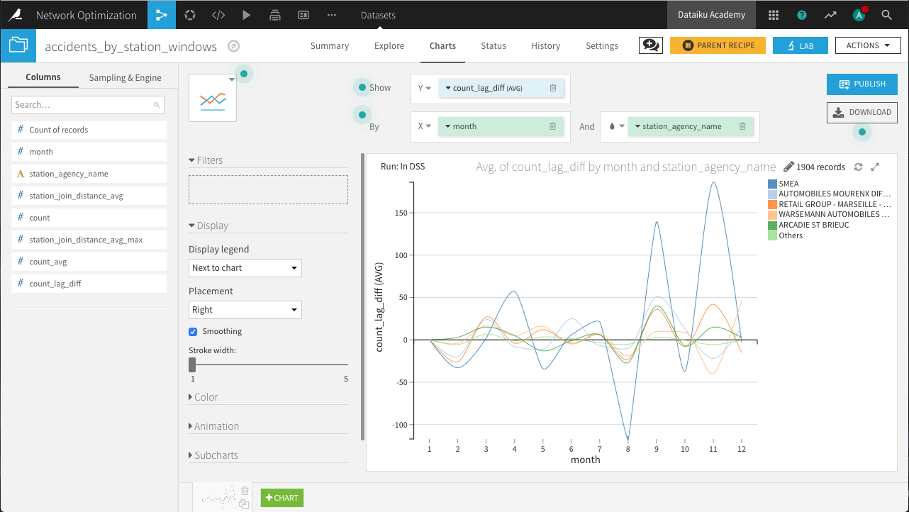
The resulting chart above shows us the rental stations with the most volatile demand, with SMEA experiencing the largest changes month-to-month.
Dashboards#
Every Dataiku project starts with a default dashboard. Rename it to Network Optimization Dashboard by navigating to the Summary tab and clicking the pencil icon next to the project title. Then, follow the steps below to publish your work to the dashboard:
In the Edit tab, create three pages called
Geo Analysis,Network Visualization, andCapacity Planning. Check the box to use the page title as the header on each page.On the “Geo Analysis” page, click the green plus icon to add a tile. Choose Webapp and select the previously created Geo Analysis webapp.
Publish the charts from accidents_joined (except for the cumulative distribution chart) to the “Network Visualization” page. You can do this by returning to the dataset’s Charts tab, clicking the blue Publish button, and selecting the desired charts and the corresponding dashboard and pages to which they belong.
Publish the remaining charts to the “Capacity Planning” page.
Hint
Feel free to adjust, resize, and reorganize the individual charts within the dashboard to improve the layout and display of each page.
Wrap-up#
Congratulations! We created an end-to-end workflow resulting in a dashboard for non-technical experts.
Key steps in this process included:
Reversing geo-coding geographic coordinates and geo-joining datasets.
Creating a wide variety of visualizations, including choropleths.
Building an HTML webapp with Dataiku starter code.
Using Group and Window recipes for new insights into the data.
Thank you for your time working through this use case.

