Webapp#
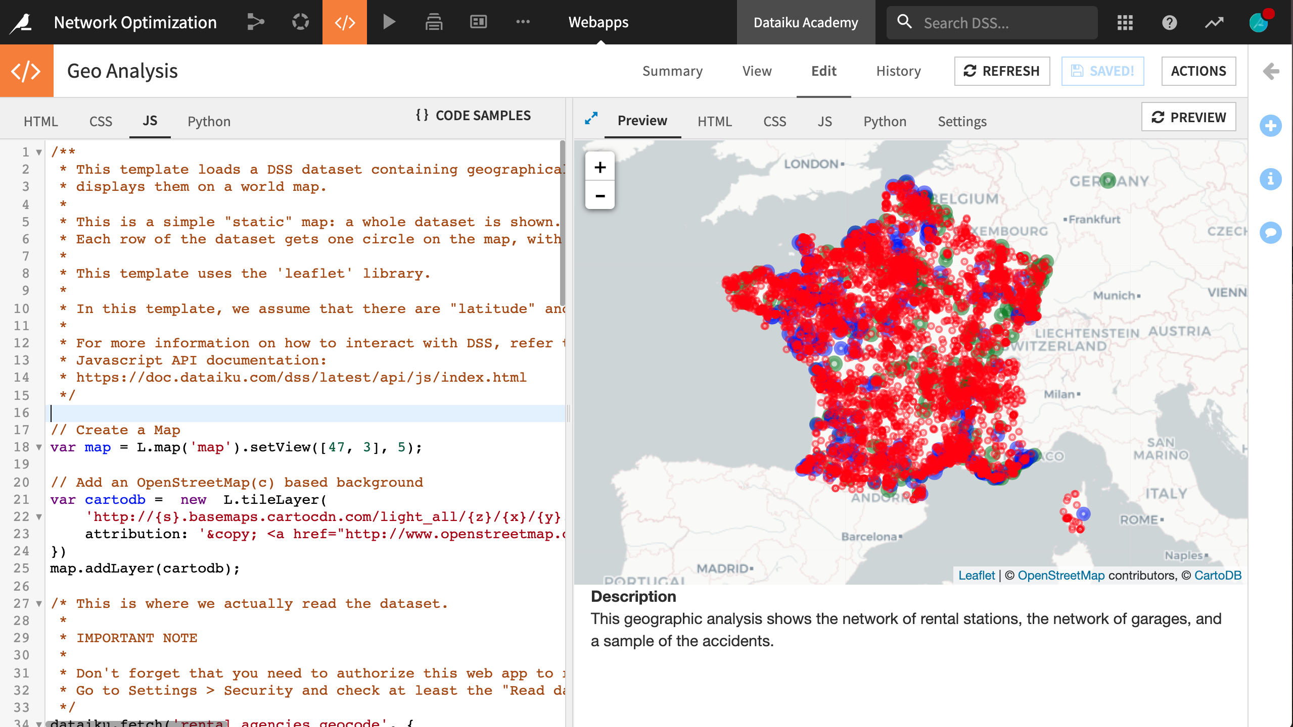
The geo-join processor allowed us to calculate the distances between accidents and rental agencies or garages. Now let’s map this network with the help of a webapp.
The advantages of using a webapp for this visualization are its flexibility in creating advanced or dynamic charts and the ability to visualize data from several datasets in the Flow.
Note
For more resources on creating webapps in Dataiku, such as Python Bokeh or R Shiny, please visit the reference documentation.
From the Code (“</>”) menu in the top navigation bar, create a new Webapp.
This will be a Code Webapp so we can fully customize it. Moreover, make it a Standard HTML webapp. Lastly, choose Starter code for creating map visualizations, and name it
Geo Analysis.The starter code includes a preloaded tile map (from Leaflet) and a template for the JavaScript code.
Within the Edit object tab, navigate to the Settings tab in the main panel.
Under Security, click Configure.
Grant the webapp “Read data” permission for the prepared accidents, rental agencies, and garage datasets.
In the HTML tab, remove the default
<h1>heading and the following paragraph containingA short legend. Replace the description so that the HTML code appears as the following:<!-- Body of your app --> <div class="container"> <div class="row"> <div class="col-md-9" id="map"></div> <div class="col-md-3"> <strong>Description</strong> <p> This geographic analysis shows the network of rental stations, the network of garages, and a sample of the accidents. </p> </div> </div> </div>
In the JS tab, alter the block starting with
dataiku.fetch()to the following. This block adds the rental agencies to the map as green points.dataiku.fetch('rental_agencies_geocode', { sampling : "head", limit : 20000 }, function (df) { // Add a map marker for each row on the dataset // Each marker is a circle. The size of the circle varies with the 'size' column values var nbRows = df.getNbRows(); for (var i = 0; i < nbRows; i++) { var record = df.getRecord(i); // Replace by your own column names here var lat = parseFloat(record["geolatitude"]); var lon = parseFloat(record["geolongitude"]); var name = record["agency_name"]; var city = record["city"]; if(isNaN(lat) || isNaN(lon)) continue; // Radius of the marker is in meters var radius = 15000; var marker = new L.circle([lat, lon], radius, { color: 'green', fillColor: 'green', fillOpacity: 0.2 }).bindPopup("Name: <strong>" + name + "</strong>"); marker.addTo(map); }; });
Now make a copy of the above block of code and alter it to the following. Or alternatively, paste the block below to add the garages to the map as blue markers. For the sake of clarity, a random sample of 200 garages is displayed.
dataiku.fetch('garage_locations_prepared', {
    sampling : "random",
    limit : 200
  }, function (df) {

    // Add a map marker for each row on the dataset
    // Each marker is a circle. The size of the circle varies with the 'size' column values
    var nbRows = df.getNbRows();
    for (var i = 0; i < nbRows; i++) {
      var record = df.getRecord(i);

      // Replace by your own column names here
      var lat = parseFloat(record["latitude"]);
      var lon = parseFloat(record["longitude"]);
      var name = record["name"];

      // Radius of the marker is in meters
      var radius = 15000;

      var marker = new L.circle([lat, lon], radius, {
          color: 'blue',
          fillColor: 'blue',
          fillOpacity: 0.2
        }).bindPopup("Name: <strong>" + name + "</strong>");

        marker.addTo(map);
      };
});
Finally, copy the previous block with the following alterations or paste the new block below. This section adds the accidents to the map with red markers. For clarity, a random sample of 10,000 accidents is displayed.
dataiku.fetch('accidents_database_prepared', {
    sampling : "random",
    limit : 10000
  }, function (df) {

    // Add a map marker for each row on the dataset
    // Each marker is a circle. The size of the circle varies with the 'size' column values
    var nbRows = df.getNbRows();
    for (var i = 0; i < nbRows; i++) {
      var record = df.getRecord(i);

      // Replace by your own column names here
      var lat = parseFloat(record["latitude"]);
      var lon = parseFloat(record["longitude"]);
      var collision = record["collision"];

      // Radius of the marker is in meters
      var radius = 1;

      var marker = new L.circle([lat, lon], radius, {
          color: 'red',
          fillColor: 'red',
          fillOpacity: 0.2
        }).bindPopup("Number of collisions: <strong>" + collision + "</strong>");

        marker.addTo(map);
      };
});
With three separate dataiku.fetch() calls, save the changes and the preview should update accordingly with the new custom visualization we just created. Our simple webapp is done!


