
Tutorial | Visual analyses in the Lab#
Get started#
Having all your work in the Flow can lead to overcrowding. On the other hand, the Lab is the place for experimentation and preliminary work.
For data preparation, you can create a visual analysis in the Lab, and then deploy this work as a Prepare recipe in the Flow.
Objectives#
In this tutorial, you will:
Prepare data in a visual analysis from the Lab.
Deploy a visual analysis from the Lab to the Flow as a Prepare recipe.
Prerequisites#
To reproduce the steps in this tutorial, you’ll need:
Dataiku 13.4 or later.
Basic knowledge of Dataiku (Core Designer level or equivalent).
Create the project#
From the Dataiku Design homepage, click + New Project.
Select Learning projects.
Search for and select Visual Analyses.
If needed, change the folder into which the project will be installed, and click Create.
From the project homepage, click Go to Flow (or type
g+f).
Note
You can also download the starter project from this website and import it as a ZIP file.
You’ll next want to build the Flow.
Click Flow Actions at the bottom right of the Flow.
Click Build all.
Keep the default settings and click Build.
Use case summary#
The project has three data sources:
Dataset |
Description |
|---|---|
tx |
Each row is a unique credit card transaction with information such as the card that was used and the merchant where the transaction was made. It also indicates whether the transaction has either been:
|
merchants |
Each row is a unique merchant with information such as the merchant’s location and category. |
cards |
Each row is a unique credit card ID with information such as the card’s activation month or the cardholder’s FICO score (a common measure of creditworthiness in the US). |
Create a visual analysis#
The tx_joined dataset joining the transaction, credit card, and merchant data requires further preparation. Although you could do this directly in a Prepare recipe, imagine that you’re still in an exploratory stage.
To avoid cluttering the production Flow with outputs you may not use, take an alternative approach: a visual analysis in the Lab.
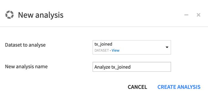
From the Flow, select tx_joined.
In the Actions tab on the right, click on the Lab button. Alternatively, navigate to the Lab (
 ) tab of the right panel.
In the Visual analyses section, click New Analysis.
Click Create Analysis, accepting the default name.
Add preparation steps to a script#
You now see an interface that appears similar to a Prepare recipe. You can add steps to it in exactly the same way.
Parse a date column#
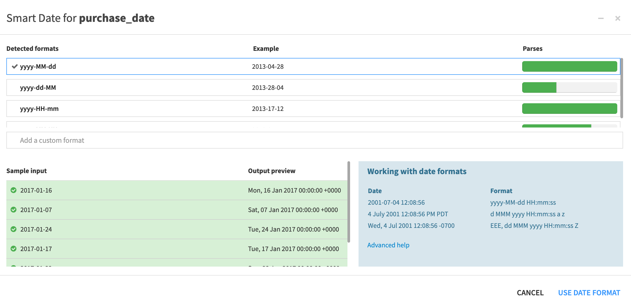
Start by parsing dates.
In the bottom left, click + Add a New Step.
Search for and select the processor Parse to standard date format.
- In the Script panel on the left, add the following:
Column:
purchase_dateOutput column:
purchase_date_parsedInput date format(s) of
yyyy-MM-dd
Observe the results in the preview to the right.
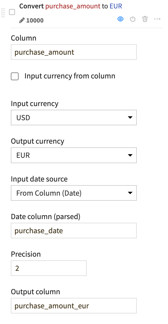
Convert currencies#
One handy processor provides the ability to convert currencies based on a date column.
Near the bottom left, click + Add a New Step.
Search for and select Convert currencies.
- In the Script, add the following:
Column:
purchase_amountInput currency: USD
Output currency: EUR
Input date source: Select From Column (Date), and give
purchase_dateas the Date column (parsed)Output column:
purchase_amount_eur
Observe results in the preview.
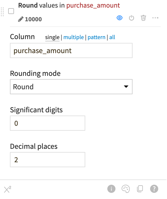
Round numbers#
You can also round the original purchase_amount values for simplicity.
Click on the column header for purchase_amount.
Click on Round to integer.
In the Script, increase the decimal places to
2.
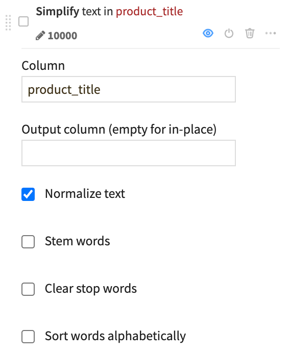
Simplify text#
If you want to work with a text or natural language column, a good starting point is often to normalize the text.
Click on the column header for product_title.
Click Simplify text.
Leave the default option to normalize the text.
Extract with a regular expression#
You can manipulate string data with regular expressions in many places throughout Dataiku, including in data preparation. As an example, let’s use a regular expression to extract into a new column the name of the first match of common Apple products.
Near the bottom left, click + Add a New Step.
Search for and select Extract with regular expression.
- In the Script, add the following:
Input column:
product_titlePrefix for output column(s):
appleRegular expression:
\b(apple|macbook|ipad|iphone|ipod)\b
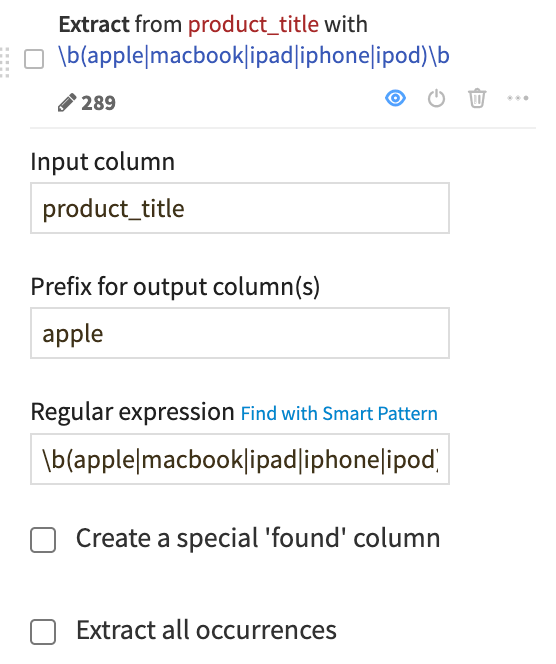
Note
Here we’ve provided the regular expression for you, but you can explore how to use the smart pattern builder on your own.
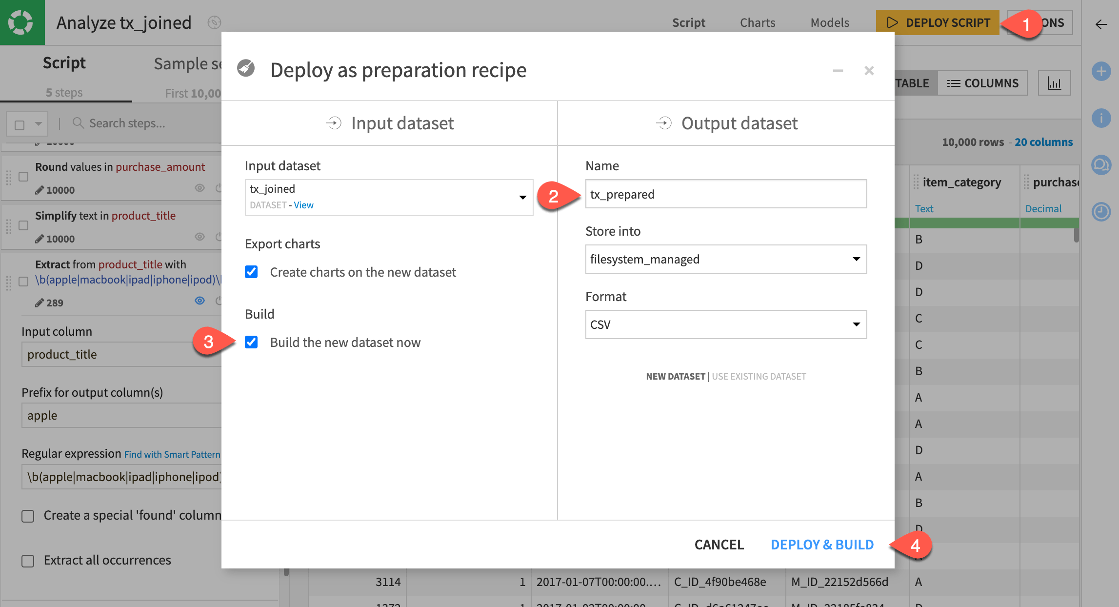
Deploy a visual analysis script#
Of course, you could continue preparing this data in a number of ways, but let’s stop here. Assuming you’re satisfied, you can now transfer these experimental steps into an actual Prepare recipe where it can transform data in the Flow.
Near the top right, click Deploy Script.
Name the output dataset
tx_prepared.Check the box to build the new dataset now.
Click Deploy & Build.
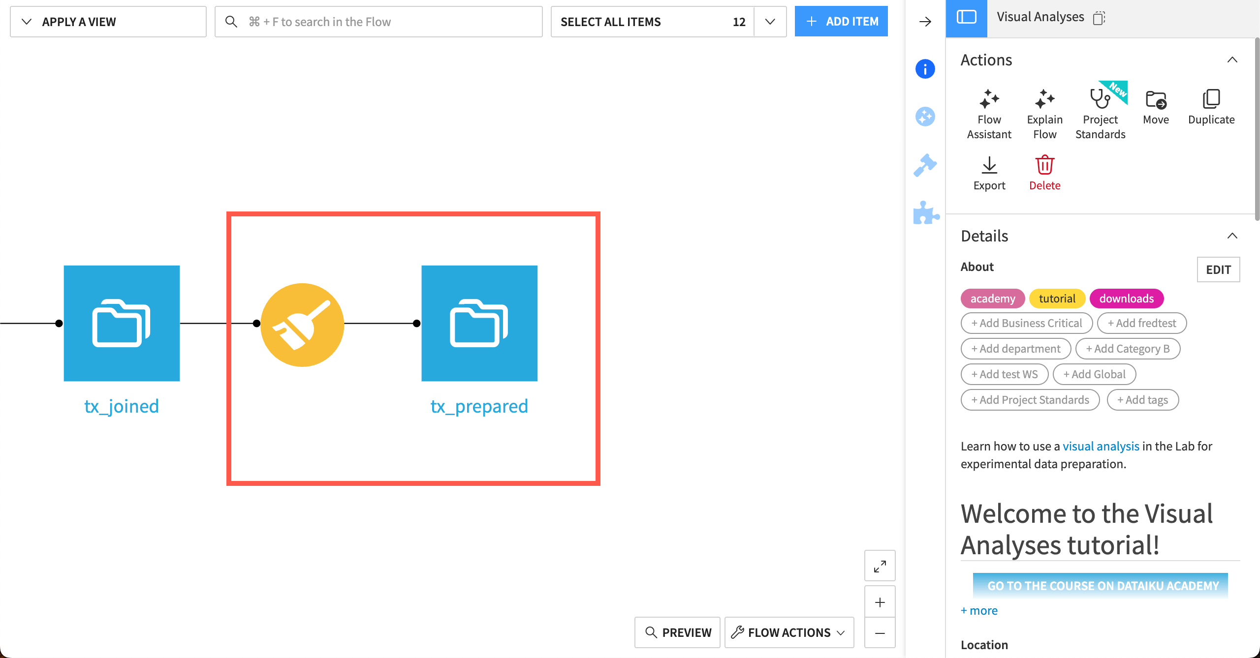
You can see the new Prepare recipe and tx_prepared output dataset in the Flow.
Next steps#
Your Flow should include a Prepare recipe with the same script of steps you’ve added, as well as the output dataset!
Now that you have a prepared dataset, the next step is to dive further into the toolkit of other visual recipes. Try the Pivot recipe next!