
Tutorial | Advanced What if simulators#
Getting started#
The What if tool for Dataiku visual models enables anyone to compare multiple test cases from real or hypothetical situations. This tutorial will teach you how to use What if analyses to explore counterfactual data points and optimize a target in a regression model.
Objectives#
In this tutorial, you will learn how to:
Create reference records.
Explore counterfactuals.
Optimize an outcome based on model predictions.
Create a dashboard based on What if analysis.
Prerequisites#
Dataiku version 12.0 or above.
Basic knowledge of Dataiku (Core Designer level or equivalent).
Create the project#
From the Dataiku Design homepage, click + New Project.
Select Learning projects.
Search for and select Advanced What if Simulators.
If needed, change the folder into which the project will be installed, and click Install.
From the project homepage, click Go to Flow (or type
g+f).
From the Dataiku Design homepage, click + New Project.
Select DSS tutorials.
Filter by ML Practitioner.
Select Advanced What if Simulators.
From the project homepage, click Go to Flow (or type
g+f).
Note
You can also download the starter project from this website and import it as a zip file.
Use case summary#
The Advanced What if simulators project includes two datasets — hospital_readmissions and million_song_subset — along with some models that have already been trained on each. We’ll use those models to learn how What if can help us learn more about the models’ predictions and infer some actionable business insights.
Explore neighborhood#
The hospital_readmissions dataset contains diabetes patients along with medical information such as how long they spent in the hospital, the number of hospital visits, and the number and type of medications they’re on.
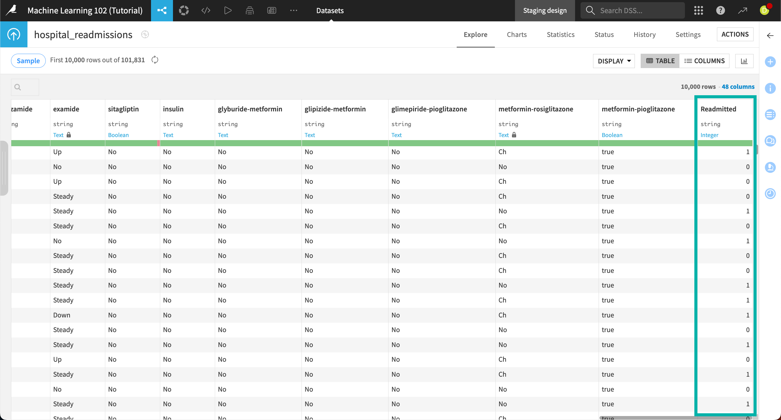
The previously trained models predict whether each patient will be readmitted to the hospital — a binary classification. For classification models, Dataiku’s What if analysis helps you explore similar records of a reference point to find out how small changes in inputs could return an alternate class.
In this case, we’ll explore how the model predicts readmission, then use What if to find simulated counterfactual records in which patients aren’t predicted to be admitted. In other words, we’re looking for the small changes in the patients’ medical records that can help keep them out of the hospital.
Open the model#
To access the models:
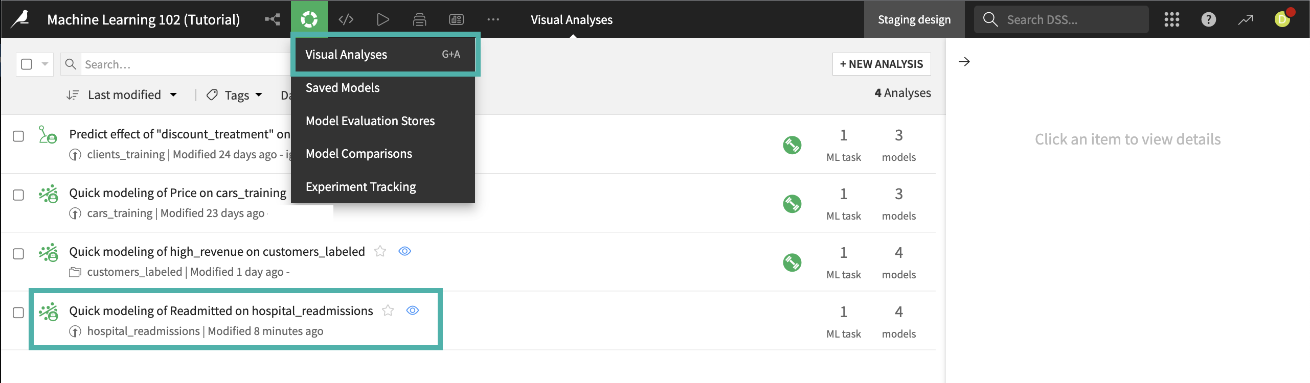
From the Machine Learning menu of the top navigation bar, click on Visual ML.
Select the model Quick modeling of Readmitted on hospital_readmissions.
You’ll see four previously trained models on the Result tab. Of these models, the LightGBM model performed the best, so we will use that one for further analysis.
Click on the LightGBM model under Session 1 on the left.
Create a reference record#
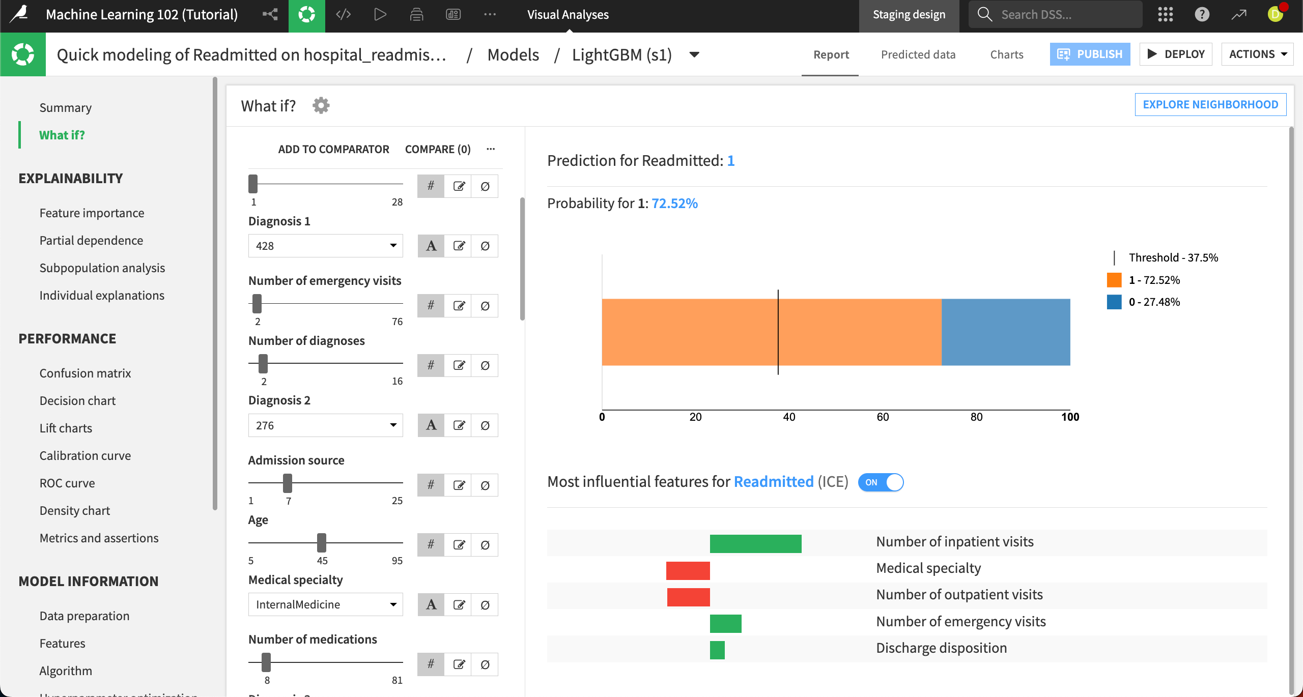
Now we’re ready to use the What if analysis. We’ll start by creating a reference record, which is a simulated patient record that shows us what the model would predict given different inputs. We’re asking the model to show us What if a patient existed with these certain medical data points? What would the model predict, and with what probability?
Navigate to the What if? panel at the top left.
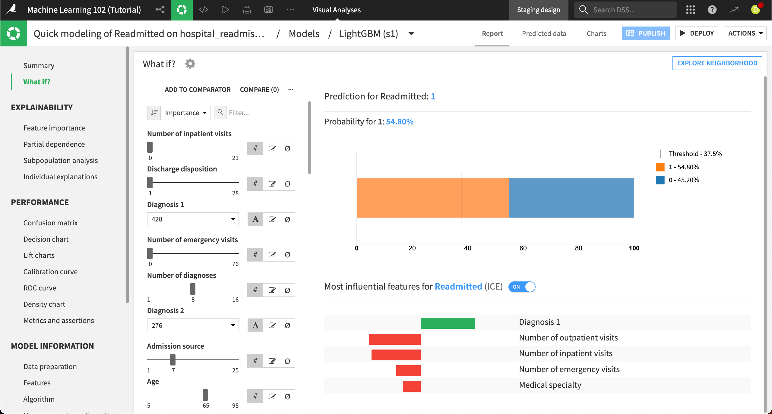
The left side of the panel displays the interactive simulator where you can configure all the input features values. The right side displays the result of the prediction, along with explanations of which features contribute most strongly to this prediction. The probability of this default prediction is almost 55%.
Features in the interactive simulator are listed in order of importance in the model’s predictions by default. You can also sort the features by name, dataset, or type.
The default values are based on the training set for the model, and use the medians for numerical features and the most common values for categorical features.
To create your own custom scenario, simply change the values:
The Number of inpatient visits is the most important feature in this model. Use the slider to increase this number to
2. This alone changes the probability for a readmitted prediction to more than 64 percent.Change the Number of diagnoses to
2.Lower the Age to
45.
We can see that this changes the predicted probability of the patient being readmitted from about 55% to 72.5%.
Explore counterfactuals#
After setting the reference record, we’ll now explore the neighborhood of simulated records that are similar to this one but would result in a different prediction (i.e. not being readmitted to the hospital). This allows us to explore a number of different simulated records without tediously changing the feature inputs ourselves.
Select Explore neighborhood in the top right.
This brings you to the Counterfactual explanations tab. On the left, you can choose which features to make actionable, or which ones you want the algorithm to change when making new simulated records. By default, all the features are frozen at the value from the reference record.
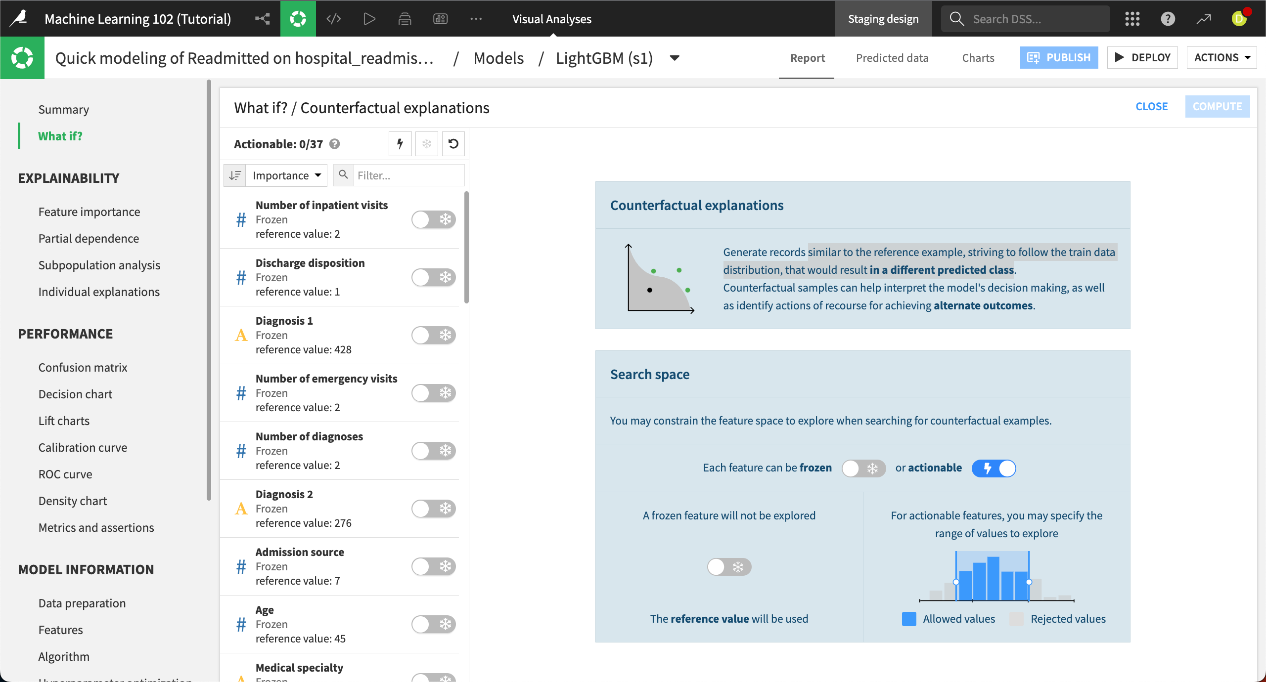
Let’s unfreeze several features. Click on the toggle switches to make the following features actionable (the snowflake will change to a lightning bolt):
Number of inpatient visits
Discharge disposition
Diagnosis 1
Number of emergency visits
Number of diagnoses
Diagnosis 2
Age
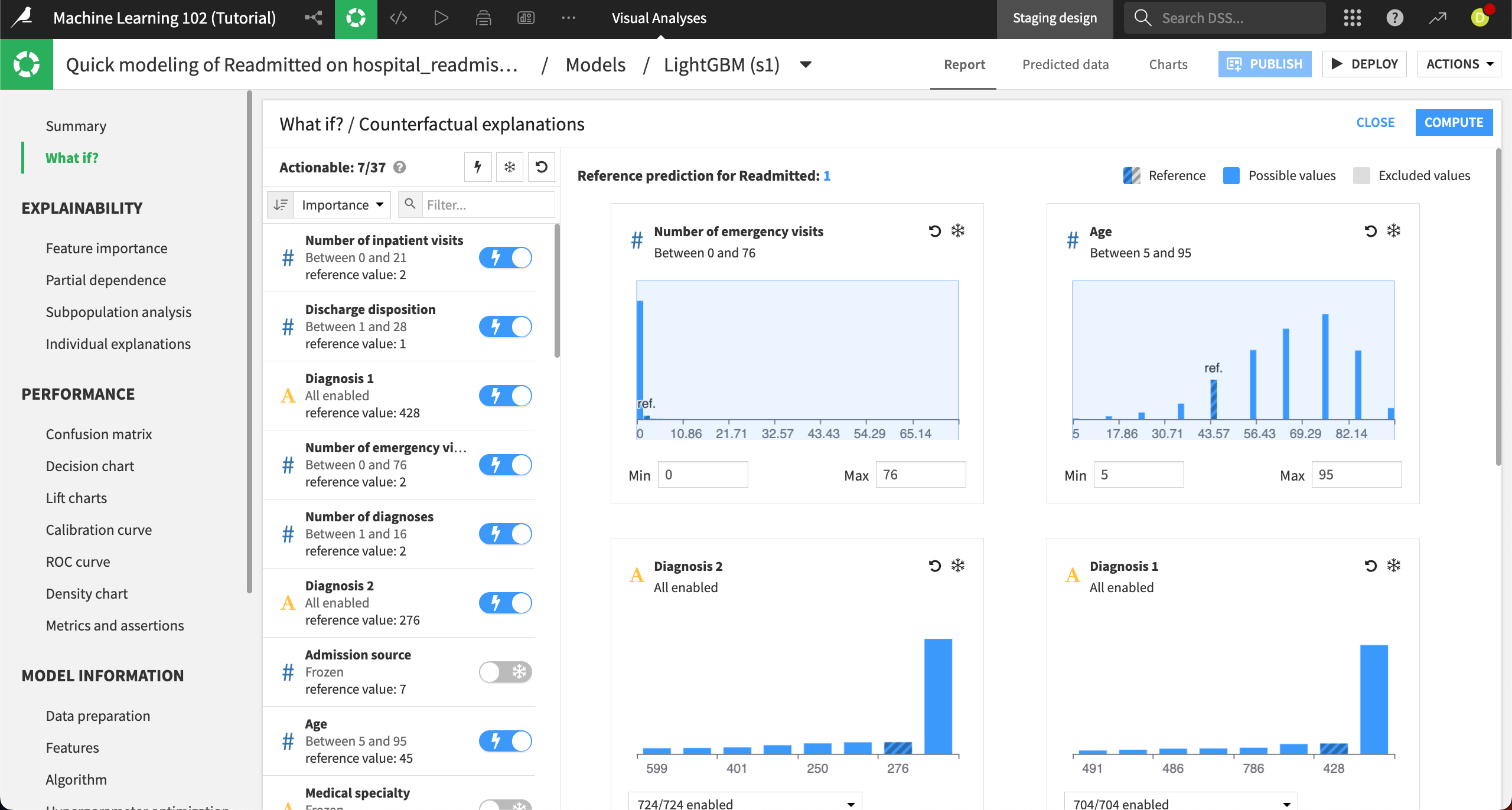
Each actionable feature appears on the right, along with corresponding distribution charts. In these charts, you can choose to exclude certain values from the counterfactual analysis. For example, the Number of emergency visits has a wide range, from 0 to 76, but we can see that there are few patients higher than just a few visits. Let’s exclude the higher values.
In the Number of emergency visits chart, leave the Min at
0and change the Max to5.Tip
You can also set a range by sliding the light blue shaded box on the chart.
Click Compute in the top right to complete the counterfactual analysis.
The Result panel has two main components, a plot and a table, to help you explore the simulated records.
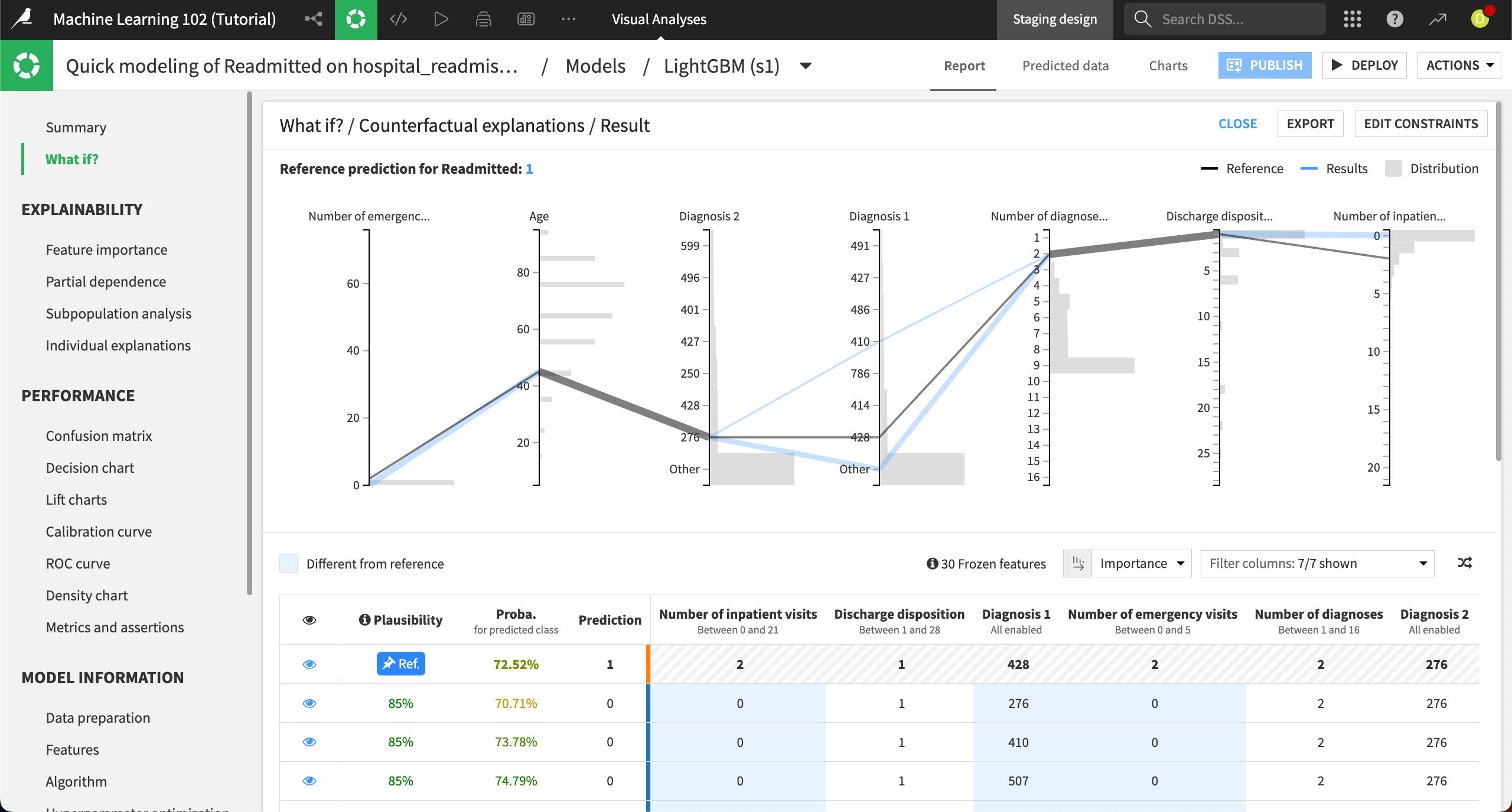
The parallel coordinates chart at the top shows each actionable feature, with the reference record plotted in gray and some of the top counterfactual simulated records plotted in blue. The histograms on each feature represent the distribution of the original data so you can gauge where values from the simulated records would fall in the distribution.
From the resulting chart, we can see that the simulated records where the patient isn’t predicted to be readmitted (a prediction of 0), seem to vary the most in the Diagnosis 1 and Number of inpatient visits features. This means that patients with different initial diagnoses and fewer inpatient visits are expected to be readmitted less often.
You can explore the details of each simulated record using the table at the bottom of the Result panel. The reference record is pinned to the first row and denoted by Ref. All other records have the opposite prediction.
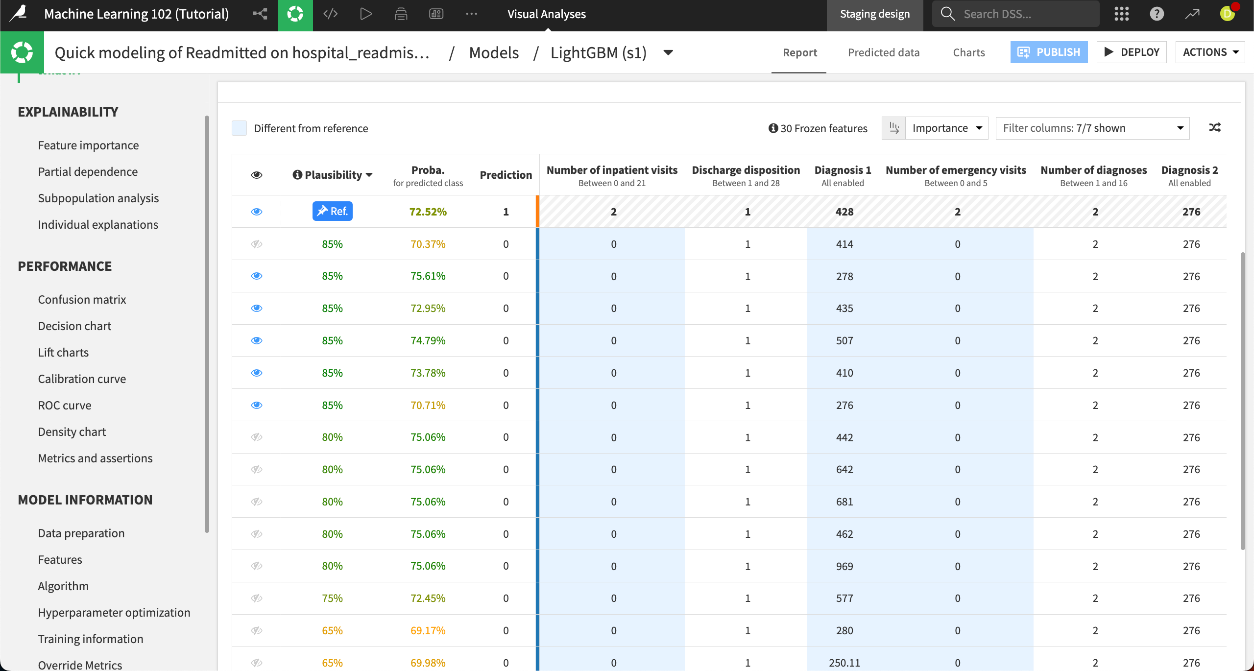
The Plausibility column shows the likelihood of finding each record in the dataset, and the Proba. column shows the probability for the predicted class. All columns after the bright blue line are features from the dataset.
You can sort the table by each column or filter the columns. For example, sorting by the Plausibility column, descending, shows us that more than 10 records have an 80% or higher probability.
The records with the blue eye icon are shown in the chart at the top of the Result panel. You can toggle visibility for each record using the eye icon.
Outcome optimization#
Next we’ll look at how Dataiku’s What if simulation works for a regression model. For regression models, the What if analysis helps you simulate records to reach a minimal, maximal, or specific prediction.
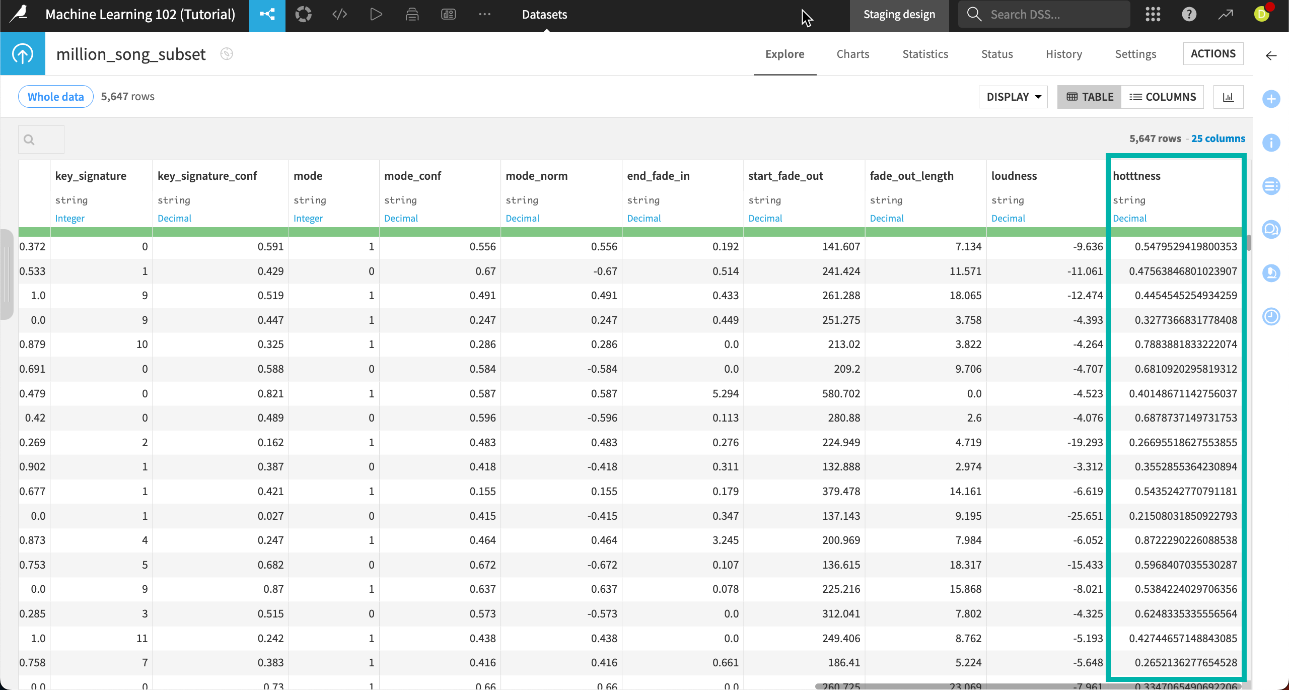
We’ll use the dataset million_song_subset, which is from the Million Song Dataset, a collection of audio features and metadata for one million contemporary popular songs. After some preparation, the subset contains only about 5,600 rows so that the models and simulations run more quickly.
The features include the song title, artist, artist popularity, year, duration, tempo, and other information. Our model will predict a song’s hotttness, or measure of its popularity on a scale of 0 (cold) to 1 (hottt). We’ll use the What if analysis to find combinations of song characteristics that lead to maximal song popularity.
Open the model#
To access the models:
From the Machine Learning menu of the top navigation bar, click on Visual ML.
Select the model Quick modeling of hotttness on million_song_subset.
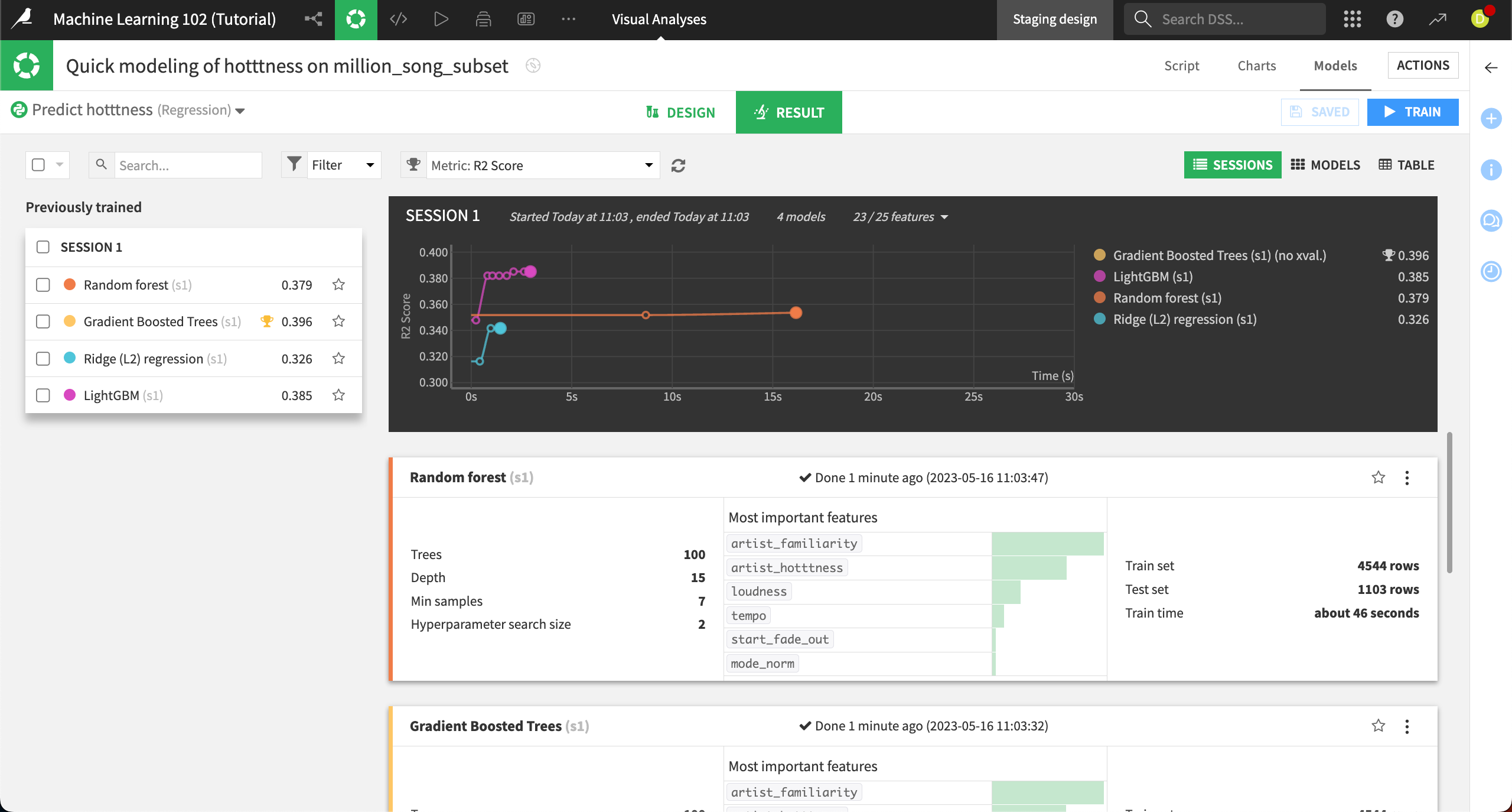
You’ll see four previously trained models on the Result tab. None of the models performed well. It can be hard to predict what makes a song popular! We’ll use the gradient boosted trees model because it performed the best.
Click on the Gradient Boosted Trees model under Session 1 on the left.
Create a reference record#
The process for starting a What if analysis for a regression model is the same as with classification. We’ll start with a reference record, then explore more deeply around it. This time, though, instead of counterfactual records showing a different outcome, we’ll be asking the model to show us simulated records that optimize a song’s popularity.
Navigate to the What if? panel at the top left.
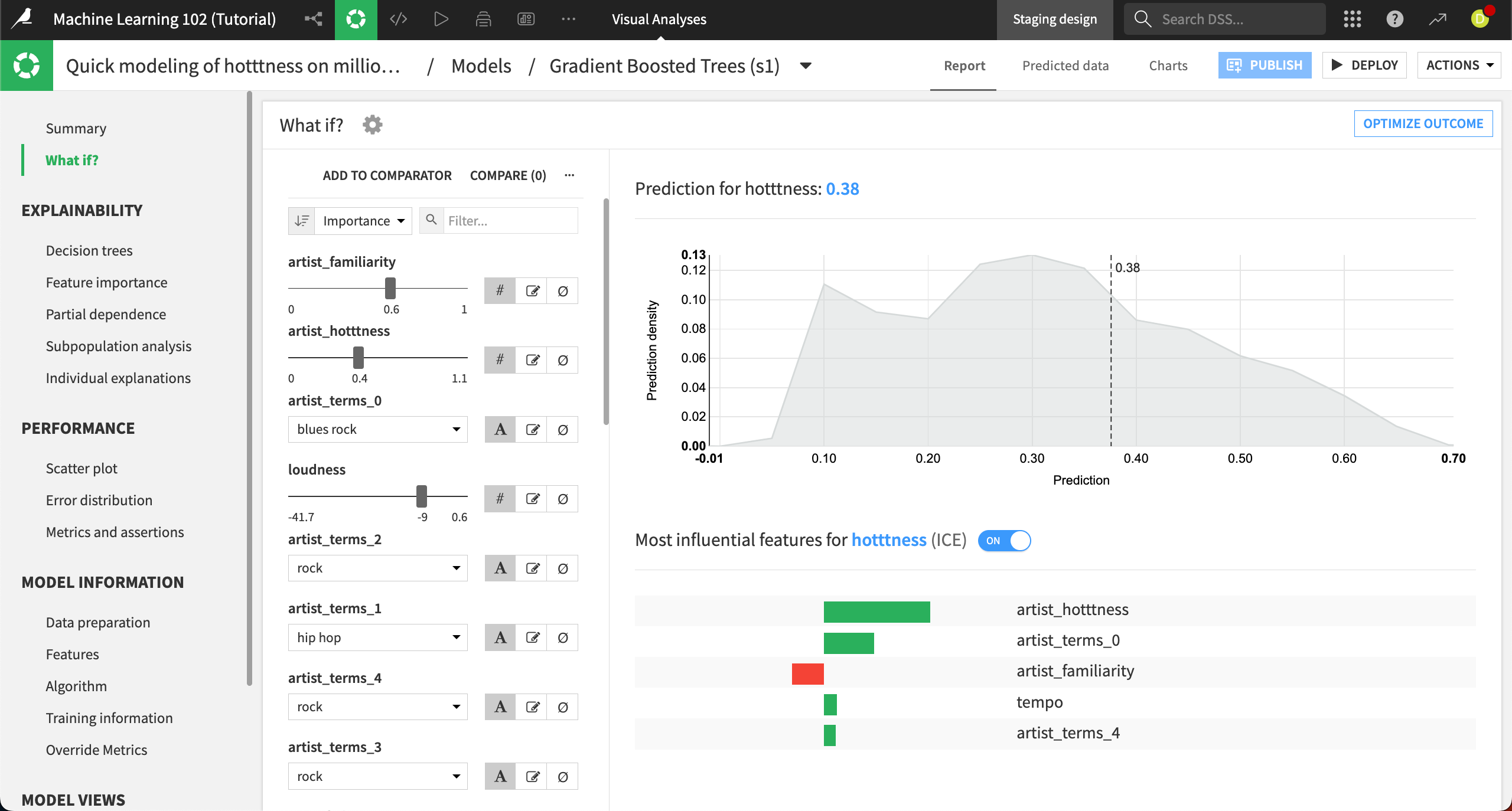
Again, the left side of the panel displays the interactive simulator where you can configure all the input features values. The right side displays the result of the prediction, along with a prediction density chart and the important features for this prediction. The prediction for this default reference record is .38, using the median inputs for each feature.
The most important features that make a song popular are the familiarity and popularity of the artist, which makes sense.
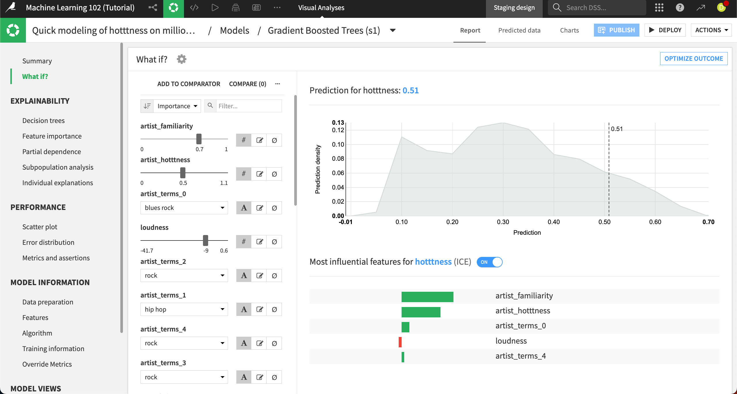
Let’s create a custom reference record: Change the artist_familiarity to
0.7and the artist_hotttness to0.5.This moves the predicted hotness all the way to .51.
Optimize outcome#
There are numerous other combinations we explore this way, changing a song’s loudness, duration, key signature, fades, and so on. To help us explore, we’ll use this record as a baseline and ask the algorithm to optimize the other factors to find a formula for a popular song.
Select Optimize outcome at the top right.
This brings you to the Outcome optimization panel. Here you can choose whether you want to search for a minimum, maximum, or specific value outcome, depending on your use case. In this example, we want to find the maximum popularity.
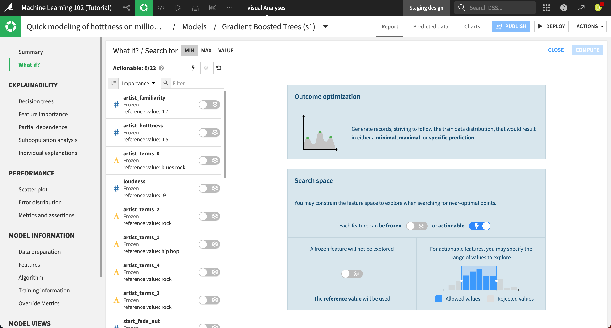
Next to Search for at the top, choose Max.
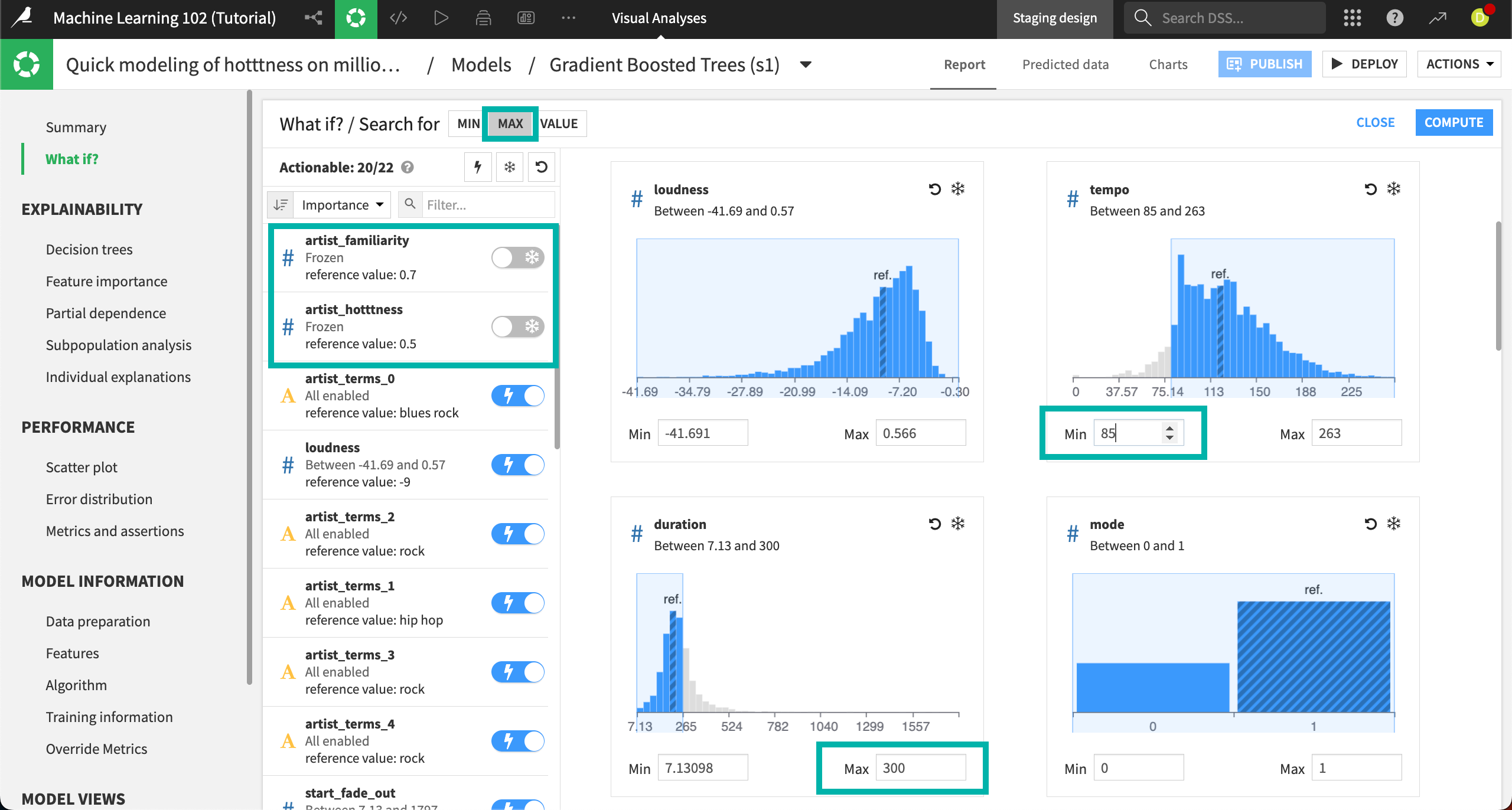
Next, we need to choose which features we want the algorithm to explore when optimizing the song popularity. By default, all features are frozen, meaning the algorithm won’t change them from the reference record when optimizing. We want to use all features, except for artist_familiarity and artist_hotttness, which are factors we can’t control (unless we give the song to a different artist). Mostly, we’re interested in changing the factors related to the song. The most efficient way to do this is first to make all features actionable, then re-freeze the two we don’t want to use.
Click on the Lightning button at the top of the features list to make all the features actionable.
Move the sliders next to artist_familiarity and artist_hotttness from Lightning to Snowflake.
This re-freezes those features so the algorithm won’t change them as it optimizes the outcome.
We also want to constrain some of the features. Again, we can do this using the distribution charts on the right.
For the duration feature, enter a Max of
300. This is given in seconds, so we’re setting the maximum song length to 5 minutes.Let’s say we also aren’t interested in making a slow song. In the tempo feature, enter a Min of
85.
Select Compute in the top right.
The Result panel contains the same parallel coordinates chart and simulated records table as in the results we saw in the explore neighborhood section, and we can interpret it the same way.
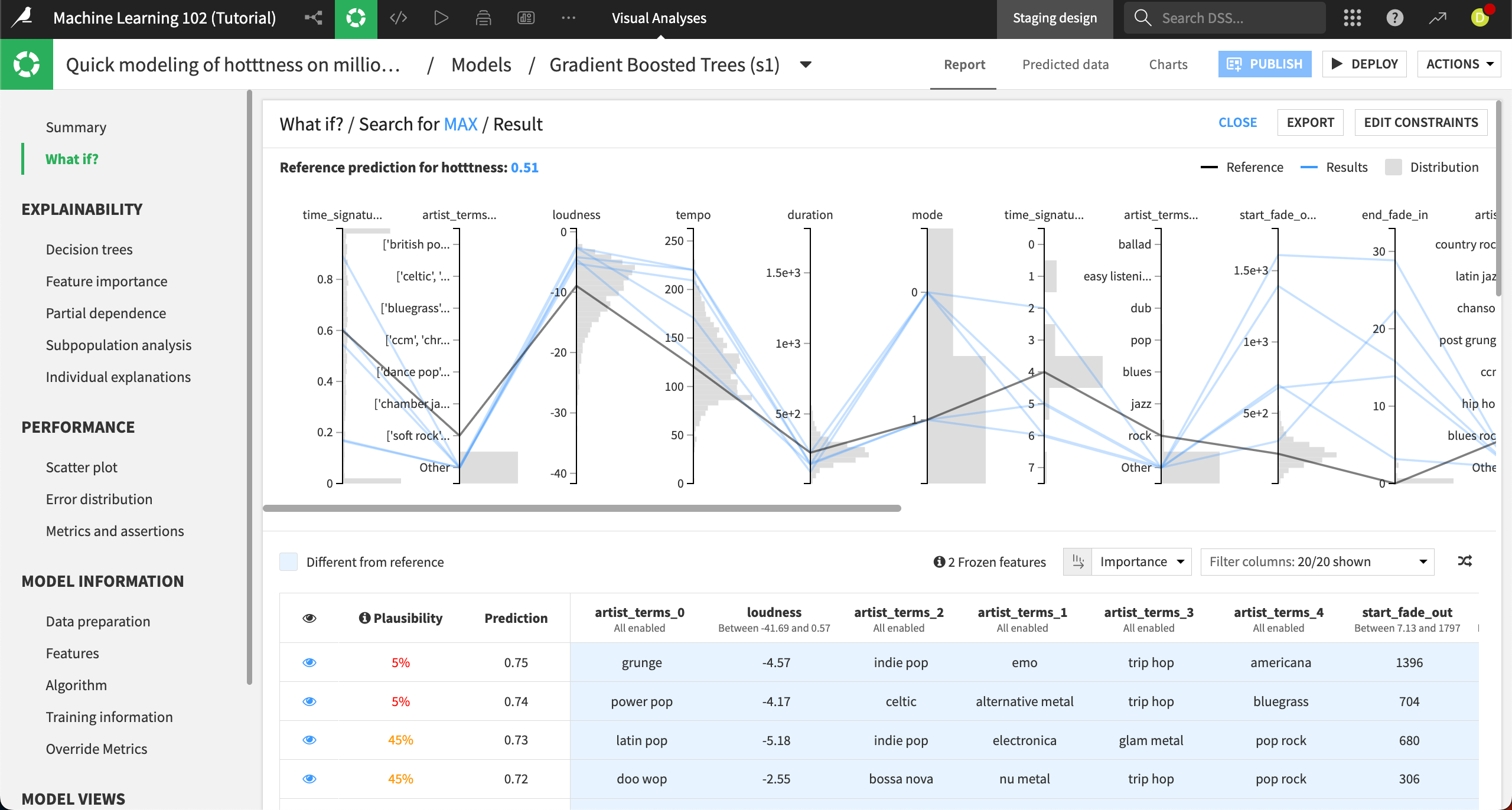
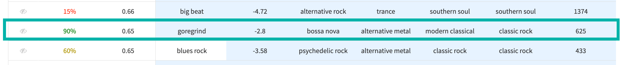
The chart shows that a song’s time signature, loudness, tempo, and fades can have a big effect on the popularity. In the table, we can see many songs with the highest predicted popularity are not very plausible. One song, with a 90% plausibility, also has a predicted popularity of .65, a big increase from our starting point of .51.
Create a What if dashboard#
After building a model and exploring the possible outcomes using What if analyses, you might want to enable dashboard consumers to perform their own custom scenarios. For example, let’s say you want to enable record company executives to explore the factors of song popularity.
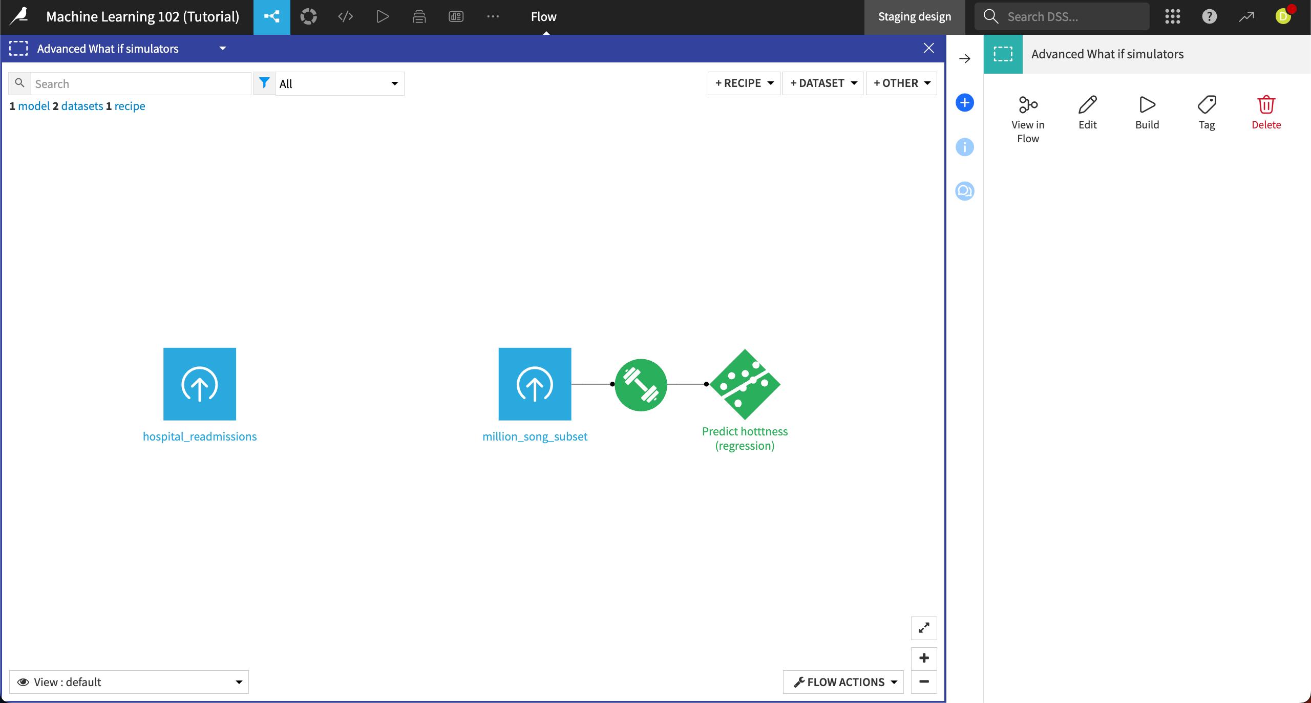
To add the What if analysis to a dashboard, we must first deploy the model to the Flow.
From the Search for Max / Result page of the Gradient Boosted Trees model, select Deploy in the top right, then Create in the info window.
The model is now deployed in the Flow.
Reopen the Predict hotttness model and navigate to the What if? panel. Click on Publish in the top right.
In the Create insight and add to dashboard info window, click Create.
In the dashboard edit mode, you can resize the What if analysis tile, and edit the properties of the tile to reorder the list of features, or hide certain features from view.
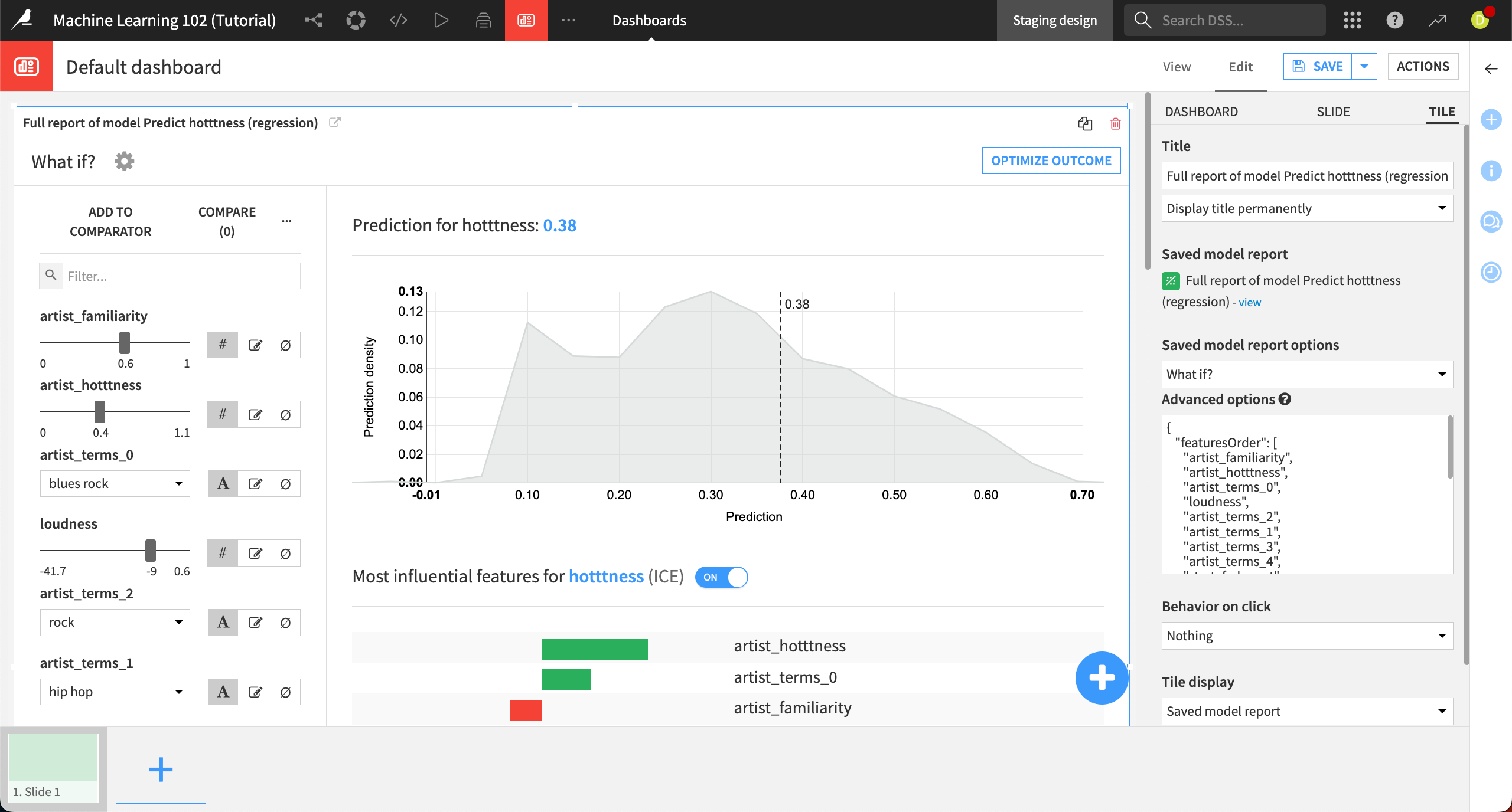
Another useful practice is to also provide a dataset tile on the page, so that dashboard consumers can copy rows from the dataset to create What if scenarios.
To interact with the What if analysis, switch to the View tab in dashboards. From here, you can also export, publish, star, and rename the dashboard in the Actions panel on the right.
Next steps#
Congratulations! You’ve learned how to use What if analysis with reference records and their counterfactuals to show scenarios according to slight individual change among the features.